2026-09-15
Nural Choudhury
Art Deco is a design style of the 1920s and 1930s built on geometric precision, symmetrical order and luxury materials, applied across architecture, graphic design and objects.
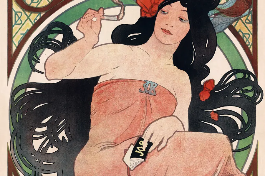
Its distinguishing line against the style it is most often confused with, Art Nouveau, is simple: Art Nouveau is organic, asymmetric and drawn from nature; Art Deco is geometric, symmetrical and drawn from the machine. Where Art Nouveau curves like a vine, Art Deco steps like a skyscraper.
Sunbursts, chevrons, zigzags, and stepped ziggurat forms, built from circles, triangles, and rectangles in a symmetrical, centred layout. Black, white and gold or chrome, with jewel-tone accents at full saturation, no pastels. All-caps geometric sans-serif type, tall and condensed, often with decorative inline or stepped terminals.
Paris, the 1925 Exposition Internationale des Arts Décoratifs et Industriels Modernes, spreading through the Jazz Age and into 1930s American skyscraper architecture and Hollywood.
Luxury branding, hospitality, entertainment and celebratory graphics that need heritage and confident modernity together, not democratic or minimal-budget positioning.
Art Deco takes its name from the Exposition Internationale des Arts Décoratifs et Industriels Modernes, held in Paris in 1925. The exhibition brought together Cubist geometry, Fauvist colour, the exoticism of the Ballets Russes and streamlined industrial forms, and it established Paris as the arbiter of modern taste. American delegations who visited went home determined to bring the style to New York, and within years it had become the dominant visual language of international modernity.
The movement drew its confidence from Machine Age optimism. The automobile, aviation, radio and electric light had transformed daily life, and Art Deco celebrated the machine’s own qualities: precision, repetition, geometric regularity and smooth surfaces. In the 1930s this hardened into the streamlined aesthetic, borrowing the aerodynamic curves of cars, trains and aircraft as a general vocabulary of speed, applied to everything from toasters to typography.
Art Deco defined itself explicitly against Art Nouveau, the style that had dominated turn-of-the-century design. It kept Art Nouveau’s conviction that decoration has value, but replaced organic curves with geometric precision and the natural with the manufactured. The Jazz Age gave it its mood: post-war release, prosperity through 1929, and a taste for spectacle that let the style move from luxury objects into mass-produced goods, cinema and popular entertainment.
Adolphe Mouron Cassandre’s poster work, including his 1931 poster for the ocean liner L’Atlantique and his 1929 typeface Bifur, set the standard for Art Deco graphic design. William Van Alen’s Chrysler Building, completed in 1930 with its stepped setbacks and stainless steel sunburst crown, remains the style’s most recognisable architectural statement. The style varied by region: French Art Deco favoured refined materials and craftsmanship, in the furniture of designers such as Jacques-Émile Ruhlmann; American Art Deco favoured vertical ambition and commercial impact, in skyscrapers and advertising; British Art Deco, including Edward McKnight Kauffer’s London Underground graphics, favoured restraint suited to corporate and institutional use.
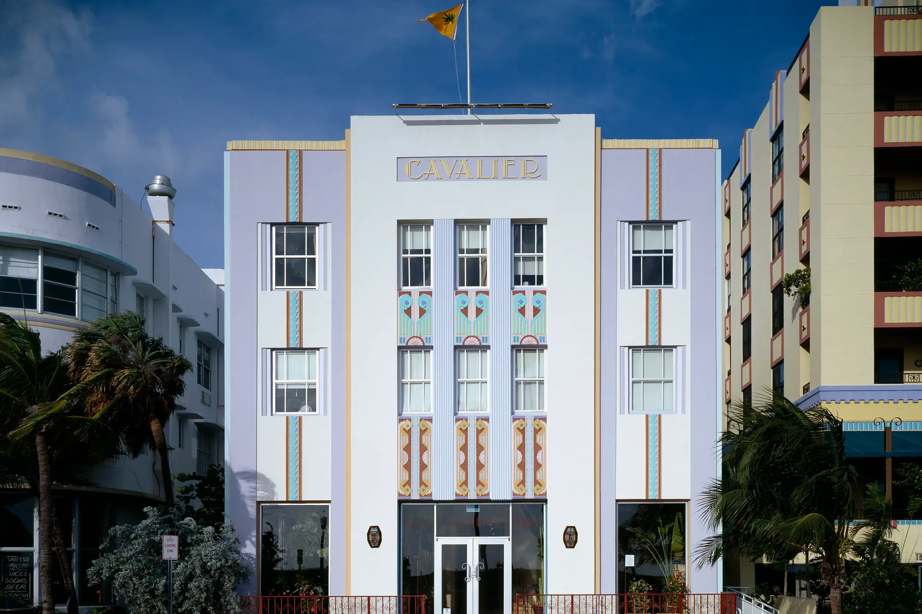
World War II ended the style’s dominance. Material shortages made its luxury emphasis impractical, and the rise of International Style modernism dismissed ornament as dishonest. Scholarly reassessment from the 1960s, including the 1966 Paris exhibition Les Années 25 and Bevis Hillier’s 1968 book Art Deco, rehabilitated it, and preservation campaigns such as the 1979 designation of Miami Beach’s Art Deco Historic District secured its buildings.
| Element | What Art Deco does | The tell |
|---|---|---|
| Colour | High contrast built on black, white and metallics, with saturated jewel tones as accents | No muted or naturalistic gradation; every relationship reads as a hard edge, not a blend |
| Form and shape | Circles, triangles and rectangles combined into sunbursts, chevrons, zigzags and stepped ziggurat profiles | Curves are geometric arcs of a circle or ellipse, never the free organic line of a growing plant |
| Typography | Geometric sans-serif, tall and condensed, set in all capitals with decorative inline or stepped terminals | Letters behave as ornament: display type is elaborated, not reduced to bare function |
| Layout and composition | Symmetrical, centred composition organised around a strong vertical or radiating axis | Balance is exact left to right, occasionally animated by radiating or stepped patterns for energy within that order |
| Materials or texture | Suggestion of polished surfaces: chrome, glass, lacquer, gold, exotic wood, rendered through highlight and gradient even in flat graphic work | Surfaces look lit, reflective and machine-finished, never matte, distressed or handmade |
| Imagery or ornament | Sunburst, fan, chevron and stepped-form motifs used as borders, frames or accents around a clear focal point | Pattern supports the hierarchy instead of covering the surface, which is what separates it from Victorian excess |

| Neighbour | What it shares | What separates them |
|---|---|---|
| Art Nouveau | Both prioritise decoration as a legitimate design value, over the plain functionalism that followed each of them | Art Nouveau is organic, asymmetric and whiplash-curved, drawn from nature, roughly 1890 to 1910; Art Deco is geometric, symmetrical and machine-derived, 1920s to 1930s |
| Bauhaus | Both build from geometric shapes and prize precision over historical revival | Bauhaus treats ornament as dishonest and reduces form to function; Art Deco is unapologetically decorative and luxurious, adding sunbursts, chevrons and metallic surface for their own visual effect |
| Mid-century modern design | Both are twentieth-century, post-traditional and comfortable with geometric structure | Mid-century modern is post-war, softer and organic-modern, built around warm materials and honest joinery; Art Deco is pre-war, harder-edged and openly ornamental, built around luxury materials and symmetrical monumentality |

Start from a geometric foundation. Build the composition from circles, triangles, and rectangles before you add a single motif, because a sunburst applied to a non-geometric layout reads as decoration bolted onto the wrong structure.
Set the composition on a symmetrical, centred axis. Reserve dynamic asymmetry for the styles that specialise in it, and use radiating or stepped patterns inside the symmetry if you want movement.
Commit to bold contrast for colour. Anchor the palette in black, white and one metallic; add jewel tones as accents at full saturation, and cut any muted or pastel tone on sight.
Choose a geometric sans-serif with genuine Art Deco character, set it in capitals for display use, and allow decorative terminals or inline effects rather than defaulting to a purely functional grotesque. See Typography Basics for the underlying letterform anatomy this style elaborates rather than replaces.
Apply motifs, sunburst, chevron, fan and stepped form, as accents at borders, frames or focal points, never as wallpaper. A single well-placed sunburst signals the style; a surface covered in them collapses into pastiche.
Treat the historical specificity honestly. If a project needs democratic or budget-conscious positioning, or has to carry dense functional data, Art Deco’s luxury connotations and decorative weight work against you rather than for you.
The most common failure is superficial motif application: a chevron border or a gold gradient dropped onto an otherwise unrelated composition creates stylistic incoherence, not a period reference. Authentic Art Deco requires the geometric foundation and the symmetry, not just the ornament borrowed from it.
The second failure is category confusion with Art Nouveau. Any organic, flowing curve or deliberate asymmetry contradicts Art Deco’s geometric commitment; a designer who reaches for a whiplash line while calling the result Art Deco has built the wrong style.
Modernist historians spent decades dismissing Art Deco as mere decoration, arguing that it never achieved the functional and social ambitions claimed by “serious” modern design, and many original buildings were demolished or left to decay before the 1960s revival. That critique still has force: the style’s luxury materials and monumental scale were, and remain, poorly suited to work that needs to signal accessibility or restraint. On screen, its high-contrast palette and dense ornament can also work against accessibility requirements, so you must test contrast and legibility rather than assume the aesthetic survives the medium unchanged.
Is Art Deco the same as Art Nouveau? No. They are the two styles designers confuse most often, but they sit on opposite sides of the same argument: Art Nouveau is organic and asymmetric, drawn from nature around 1890 to 1910; Art Deco is geometric and symmetrical, drawn from the machine through the 1920s and 1930s.
How is Art Deco different from Bauhaus if both use geometry? Bauhaus treats geometric reduction as an anti-ornament principle: form follows function and decoration is dishonest. Art Deco uses the same basic shapes to build ornament on purpose, adding sunbursts, chevrons, and metallic surfaces for visual effect rather than stripping them away.
What typefaces count as authentically Art Deco? Broadway, Bifur, and Peignot are named examples from the period, sharing tall, condensed letterforms, near-universal all-caps settings, and decorative elaboration that later functional sans-serifs abandoned.
Where should you not use Art Deco? Avoid it where the project needs democratic or budget-conscious positioning, where dense functional data has to stay legible, or where the brief calls for warmth and informality rather than monumental luxury.
Can Art Deco motifs be used sparingly without the full style? A single chevron border or simplified sunburst can signal Art Deco heritage within an otherwise contemporary design. Still, it carries a real risk of superficiality if the underlying composition is not geometric and symmetrical to begin with.
| Fact | Detail |
|---|---|
| Period | 1920s through the late 1930s |
| Origin | Paris, formalised at the 1925 Exposition Internationale des Arts Décoratifs et Industriels Modernes |
| Defining graphic designer | A. M. Cassandre (1901 to 1968), posters including L’Atlantique (1931), typeface Bifur (1929) |
| Defining building | Chrysler Building, New York, 1930, designed by William Van Alen |
| Named typefaces | Broadway, Bifur, Peignot |
| Revival milestones | Les Années 25 exhibition, Paris, 1966; Bevis Hillier’s Art Deco, 1968; Miami Beach Art Deco Historic District designated 1979 |