

2026-09-15
Nural Choudhury
Typography is the craft of shaping and spacing type so readers can recognise its letters and follow its meaning without friction.
This page covers the principles that hold across every medium: type anatomy, legibility, readability, hierarchy, spacing, and alignment. Five sibling pages cover what sits outside that scope: display typography for type at large sizes, international typography for non-Latin scripts, luxury typography for prestige register, variable typography for variable font technology, and type design process for drawing typefaces from scratch.
the vocabulary and judgement to size, space, and rank type so a reader follows it without noticing the effort, in any medium a designer works in.
every set of words a designer sets, from a body paragraph to a navigation label, before a medium’s own concerns of scale, script or register take over.
the difference between legibility and readability. A hierarchy, or a measure fixed on top of type that is not legible, still reads badly; fix legibility first, and the rest becomes calibration.
Legibility is the ease of telling one character from another. It is recognition, not comprehension: can a reader distinguish an a from an o, an I from an l, a 6 from a b? Below a legibility threshold, reading stops being difficult and becomes impossible.
Readability is different. It is the ease of sustaining attention through a paragraph, a page or a chapter of type that is already legible. A typeface can pass every legibility test and still tire a reader over a long passage, because readability depends on measure, leading, and the typeface’s fitness for continuous reading, not on whether any single letter is recognisable.
I use this distinction to diagnose complaints. A reader who says a page is hard to read after five seconds is describing a legibility problem, usually type set too small or with too little contrast against its background. A reader who abandons a long article after two paragraphs describes a readability problem, usually a measure that runs too wide or leads left at its default.
A typeface’s own construction sets its legibility ceiling before any designer touches size or spacing.
| Factor | What it does |
|---|---|
| Counters | Open, generous counters, the enclosed space inside a, e, and o, aid recognition, particularly at small sizes |
| Letterform distinction | Typefaces where I, l, and 1 stay visually distinct support faster, more confident reading |
| x-height | A larger x-height relative to cap height keeps more of a letter’s distinguishing detail inside the visible area at small sizes |
| Stroke contrast | Extreme contrast between thick and thin strokes can make the thin strokes disappear at small sizes |
Contrast between text and its background also governs legibility, but ratios, testing, and legal deadlines belong to accessibility standards. I do not repeat them here.
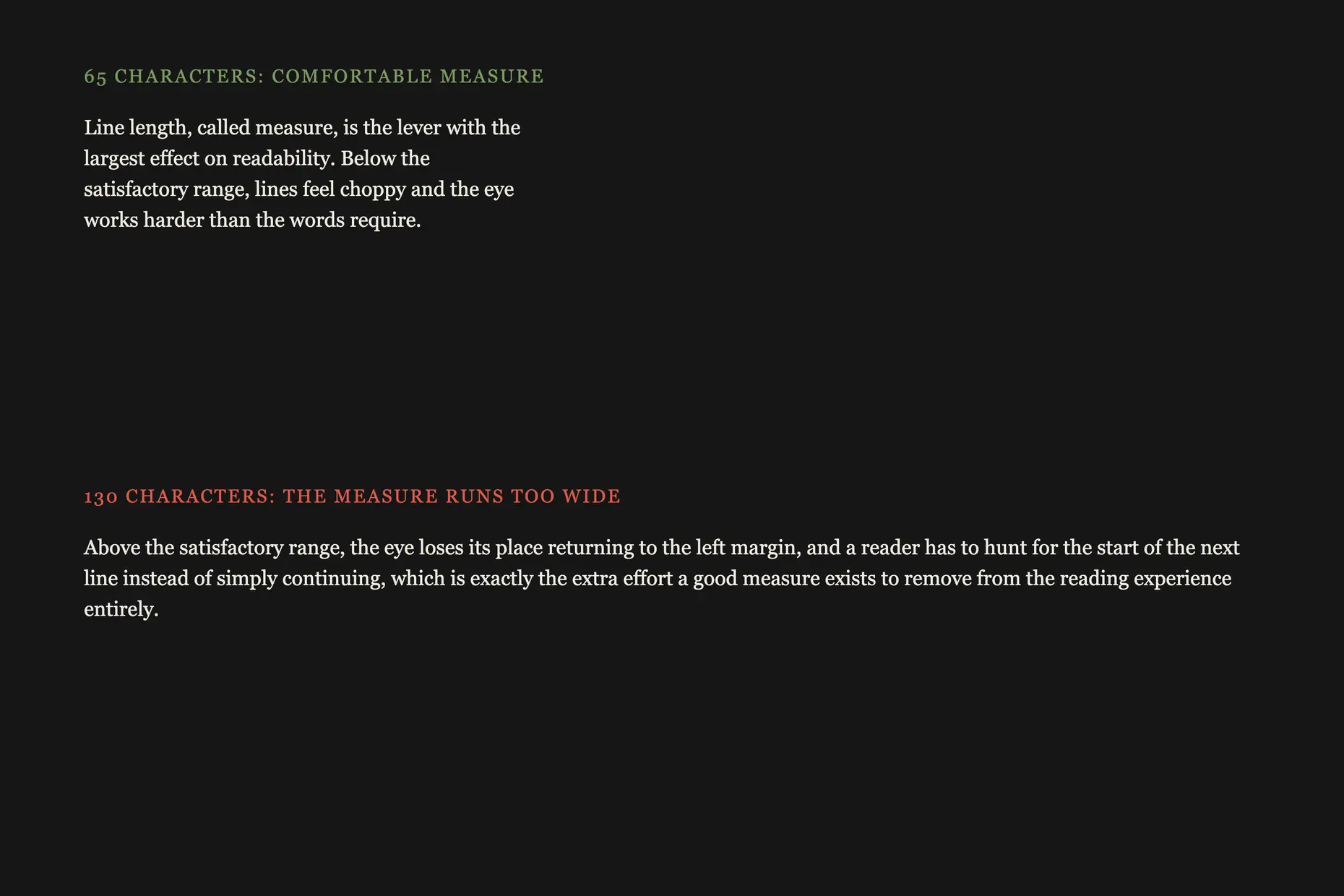
Line length, called measure, is the lever with the largest effect on readability. Robert Bringhurst’s The Elements of Typographic Style gives 45 to 75 characters as a satisfactory measure for single-column text set in a serif face. Below that range, lines feel choppy; above it, the eye loses its place returning to the left margin.
Typeface choice affects readability too, though less than the old serif-versus-sans-serif divide once suggested. Serif faces built for bookwork, such as Garamond or Caslon, have accumulated centuries of successful use in extended print. Sans-serif faces such as Inter or Roboto have proven themselves for screen reading, where their more open forms hold up better at low resolution.
Hierarchy is the set of visual signals that tells a reader what to read first, and how one piece of text relates to another. Without it, a reader has to work out the structure before absorbing the content, spending effort the hierarchy exists to save. A hierarchy is judged by whether a reader can state the ranking without reading the words, not by whether it looks varied.
| Tool | How it signals rank |
|---|---|
| Size | The most direct signal, but the difference must be large enough to read as intentional rather than as an inconsistency |
| Weight | A bold cut attracts attention against a regular weight, without needing a size change |
| Position | Elements near the top or centre draw attention before peripheral ones |
| Space | Generous space around an element reads as importance. Compositional white space across a whole page is layout principles’ territory, not this one |
| Colour | Colour reinforces a rank already established by size or weight. It rarely carries hierarchy alone |
| Style | Italics, capitals, and small capitals are secondary signals, weaker than size or weight |
Keep a hierarchy to three to five levels. Beyond that, a reader cannot hold the ranking in mind, and the extra levels stop signalling anything.

Spacing operates below a reader’s conscious notice, but it does more to decide whether type feels comfortable than most visible choices.
Letter-spacing, or tracking, is close to right by default. A well-drawn typeface ships with spacing tuned to its own forms, so adjust it only for a reason: tighten large display type to bring the letters into a more intimate relationship, and open text set in capitals, because capitals are drawn to follow lowercase letters and feel cramped alone.
Leading, the vertical space between lines, is the spacing decision with the largest effect on comfort. Body text generally wants 1.2 to 1.6 times the type size, tightened for larger type and loosened for longer lines, because longer lines ask the eye to travel farther to find the next one. Leading left at its default for every size and measure is one of the most common ways a page reads worse than it needs to.
Word-spacing sits between the two. Too tight, and word boundaries blur; too loose, and vertical rivers of white open through a paragraph, most visible in justified text, where the spacing has to stretch to fill the line.

Alignment decides where a reader’s eye returns after each line. For continuous reading, left-aligned text with a ragged right edge wins, because a reader’s eye returns to one consistent position at the start of every line.
| Alignment | Best for | Risk |
|---|---|---|
| Left, ragged right | Body text, in every medium | None done well. A bad rag creates deep gaps or protruding words |
| Right, ragged left | Captions, pull quotes, text set against a right-aligned image | Unreadable at length; the eye must search for each new line’s start |
| Centred | Invitations, certificates, short formal or ceremonial text | Unreadable at length; the eye zigzags hunting for line beginnings |
| Justified | Books, newspapers, formal print | Needs good hyphenation and a wide-enough measure, or it produces rivers of white |
Set body text left-aligned with a ragged right edge, unless the medium genuinely needs justification, in which case commit to hyphenation good enough to avoid rivers.
Choose a measure of 45 to 75 characters for continuous text, and revisit it whenever the column width changes.
Set leading in proportion to the type size and the measure, not once for a template and never again. Recalculate it whenever the size, the typeface, or the line length changes.
Limit a hierarchy to three to five levels, and give each one a treatment strong enough that a reader tells it apart without reading the words.
Test type at the size and on the device a reader will use. A headline that separates cleanly from the body on a designer’s monitor can collapse into the same visual weight on a phone.
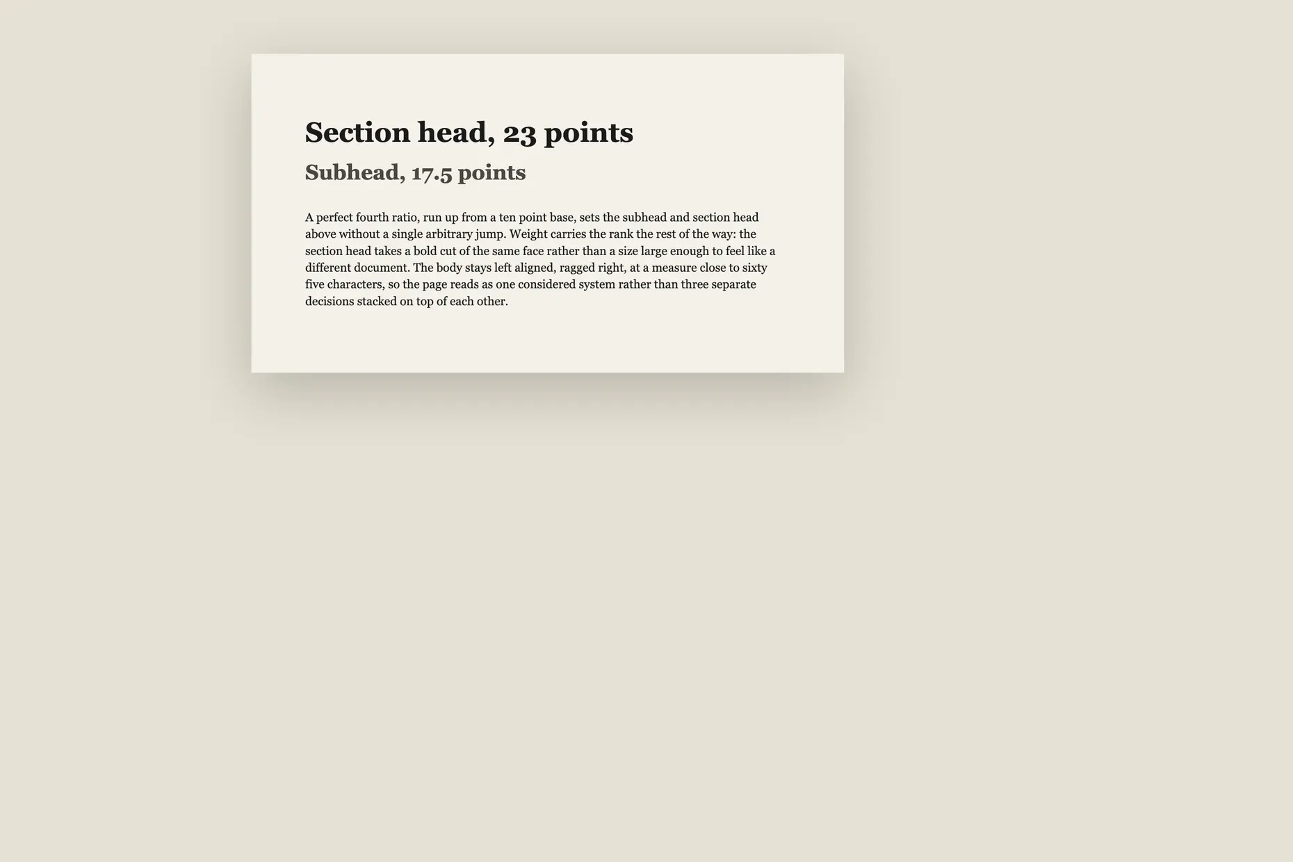
Take a long-form report: a cover, a few section heads, and pages of body text. I start with the body, not the title, because everything else calibrates against it. A 10-point serif face with 1.4 times leading and a measure around 65 characters gives comfortable reading on a page roughly six inches wide.
From there, the hierarchy follows a ratio, not a guess. A perfect fourth (1.333), run up from that 10-point base, gives a subhead around 17.5 points and a section head around 23 points, rounded to whole points for practical setting. Weight does the rest of the work: the section head gains a bold cut of the same face rather than a size jump large enough to feel like a different document.
Alignment stays left throughout: ragged right for the body, flush left for headings, so they read as part of one system rather than a decoration on top of it. None of these four decisions is unusual on its own. Repeating them in the same order, every time, is what makes the result read as a considered document rather than an assembled one.
The mistake I see most often is a hierarchy built from size alone. Two headings that differ by only a few points read as an inconsistency, not a rank, and readers can’t tell whether the difference was intended. Add weight or space to a size change and the hierarchy stops being ambiguous.
The second is leading set once, by whatever the software defaults to, and never revisited. Default leading is tuned for nothing in particular. Every change in type size, typeface, or line length changes the leading that line needs, and a page that keeps one setting throughout usually has some sizes that feel cramped and others that feel adrift.
The third is a type scale with too many steps. A scale with eight or nine sizes between body text and a headline creates increments so small that no two adjacent levels read as different. A scale earns its name by producing a small number of levels a reader can tell apart at a glance, not by covering every size a designer might want one day.
What is the difference between legibility and readability? Legibility is whether a reader can tell individual characters apart. Readability is whether a reader can sustain attention through paragraphs of type that is already legible. A typeface can be perfectly legible and still tire a reader over a long passage if the measure, leading, or typeface choice doesn’t suit continuous reading.
Why does a headline still look like body text after I made it bigger? A size increase alone often isn’t enough to signal rank, so readers see two similar options rather than a clear order. Add weight, space, or both alongside the size change, and make the jump large enough that nobody has to check.
How many hierarchy levels does a document need? Most content needs no more than three to five. Beyond that, a reader cannot hold the ranking in mind, and the extra levels function as decoration rather than structure.
Does colour count as part of a typographic hierarchy? Colour reinforces a rank already established by size or weight, but rarely creates one alone, and it makes an unreliable primary signal for readers with colour vision deficiency. Details on colour and accessibility belong in accessibility standards and colour-theory basics, not here.
Does a project need a mathematical type scale? No. A scale is a starting point for systematic thinking, not a rule. Where a particular size works better for a layout than the scale predicts, use the size that works.
| Item | Detail |
|---|---|
| Optimal measure | Robert Bringhurst’s The Elements of Typographic Style gives 45 to 75 characters per line as a satisfactory length for single-column text set in a serif face |
| Body text leading | Typographic convention sets leading between 1.2 and 1.6 times the type size, tightened for larger type and loosened for longer lines |
| Named type-scale ratios | Modular scales borrow interval names from music: major third (1.25), perfect fourth (1.333), perfect fifth (1.5), and the golden ratio (1.618) |
| Minimum colour contrast | Governed by WCAG rather than by typographic convention. See accessibility standards for the current ratios and testing requirements |
| x-height and legibility | A larger x-height relative to cap height improves recognition at small sizes, the reason typefaces built for screens, such as Verdana, set it generously |

Display typography is set large enough that individual letterforms function as graphic elements rather than as carriers of continuous prose.
Read it
International typography is the design and setting of text in writing systems other than Latin script: Arabic, Chinese, Devanagari, Cyrillic, Japanese, Korean and hundreds more, each with its own structural logic, calligraphic heritage and technical requirements.
Read it
Luxury typography is the practice of choosing and setting type so a brand reads as exclusive, established and refined before a viewer processes a single word.
Read it
A variable font is a single file that stores a continuous range of a typeface’s design, so weight, width, slant and other properties become numbers you set precisely rather than named styles you pick between.
Read it
Type design is the practice of drawing a typeface: a coherent system of letterforms, numerals, punctuation, and symbols built to work together across combinations their designer cannot predict in advance.
Read it
Digital accessibility is the practice of building products people can use, whatever their permanent, temporary, or situational disability, measured against a published standard rather than opinion.
Read it
Layout is the arrangement of elements inside a frame: what a viewer sees first, second, and third, and what the space between things does as they look.
Read it
A grid is a system of columns, gutters, margins, and baselines that fixes where content can sit before you place a single element.
Read it