

2026-09-15
Nural Choudhury
Gothic design is the pointed-arch, vertically emphasised architecture, manuscript illumination and decorative art of Latin Christian Europe, built from the 1140s to the early sixteenth century around stained glass, tracery, and dramatic light.
The same word also names two later, unrelated borrowings: the eighteenth- and nineteenth-century Gothic Revival, which quoted the medieval vocabulary in new buildings with modern engineering, and the Goth subculture, which took Gothic’s darkness into fashion and music without the architecture or the theology behind it. Designers get caught out when they confuse the three: a Victorian Gothic Revival library is not a medieval cathedral, and a horror film’s mood board is not a design system.
pointed (ogival) arches at every scale, from doorways to window tracery; elongated vertical proportions that pull the eye upward past any functional stopping point; tracery filled with trefoils and quatrefoils; blackletter display type; deep jewel-tone colour, ultramarine, vermilion, malachite, set against black and gold, lit as pools of light against dark ground rather than evenly.
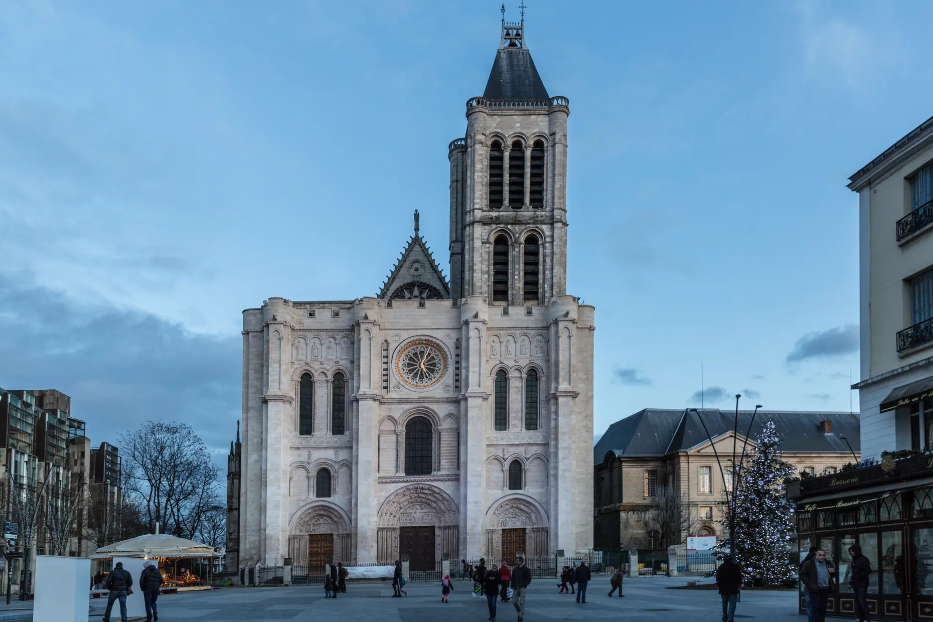
the Abbey Church of Saint-Denis, near Paris, rebuilt from 1135 to 1144 under Abbot Suger, and the pointed arch, ribbed vault, and flying buttress that let stone walls open into glass. It spread across Christian Europe through the fifteenth century and later.
fantasy and horror world-building, luxury and ceremonial branding, and church or liturgical communication where historical weight and craft are the point.
Gothic architecture began at the Abbey Church of Saint-Denis, near Paris, rebuilt between 1135 and 1144 under Abbot Suger. Suger drew on writings attributed to Dionysius the Areopagite, which described the divine as light cascading through creation, and he wanted more light and taller spaces than the Romanesque churches of his generation allowed.
The pointed arch, ribbed vault, and flying buttress made that possible. Together they concentrated structural load at discrete points rather than along solid walls, so the wall between those points could open into glass instead. Cathedral towns then competed to build higher: the choir of Beauvais Cathedral reached forty-eight metres before partially collapsing, the tallest Gothic structure attempted before or since.
The style spread from France across Christian Europe through the fifteenth century, adapting as it travelled. English Gothic developed longer naves and squared east ends; German Gothic built hall churches with aisles as tall as the nave; Italian Gothic stayed more restrained and never fully gave up classical horizontality. It persisted longest in the north, overlapping with the Renaissance and early Baroque in some regions.
The name itself started as an insult. Renaissance critics, including Giorgio Vasari, used “Gothic” to link the style to the Goths who sacked Rome, setting medieval “darkness” against Renaissance “light”. The term stayed pejorative until the Gothic Revival of the eighteenth and nineteenth centuries, when Romantic writers and architects found in it an emotional depth that Neoclassicism lacked, and the insult became a name a movement could claim.
| Element | What this style does | The tell |
|---|---|---|
| Colour | Saturated jewel tones, deep blue, vermilion, malachite, set against black, with gold reserved for sacred or important elements | Colour that appears to glow out of darkness rather than sit in neutral space |
| Form and shape | Everything narrows and lengthens upward: arches, windows, figures, and letterforms alike | The pointed arch, exaggerated well beyond structural necessity |
| Typography | Blackletter, dense angular letterforms with minimal curves, historically used for display and body text alike | Textura’s tight, uniform vertical strokes reading as woven fabric rather than isolated letters |
| Ornament | Tracery-derived pattern, trefoils, quatrefoils, flowing bar tracery, plus botanical carving and grotesques, all following structural logic | Ornament that grows out of a frame or a capital rather than sitting on top of it |
| Light | Dramatic chiaroscuro: light emerges from darkness in pools rather than illuminating evenly | Stained glass and gilding used for literal and simulated luminosity, never flat colour |
| Space | Height emphasised over breadth, sightlines broken by columns and shadow | A space whose full extent is not visible from any single viewpoint |

| Neighbour | What it shares | What separates them |
|---|---|---|
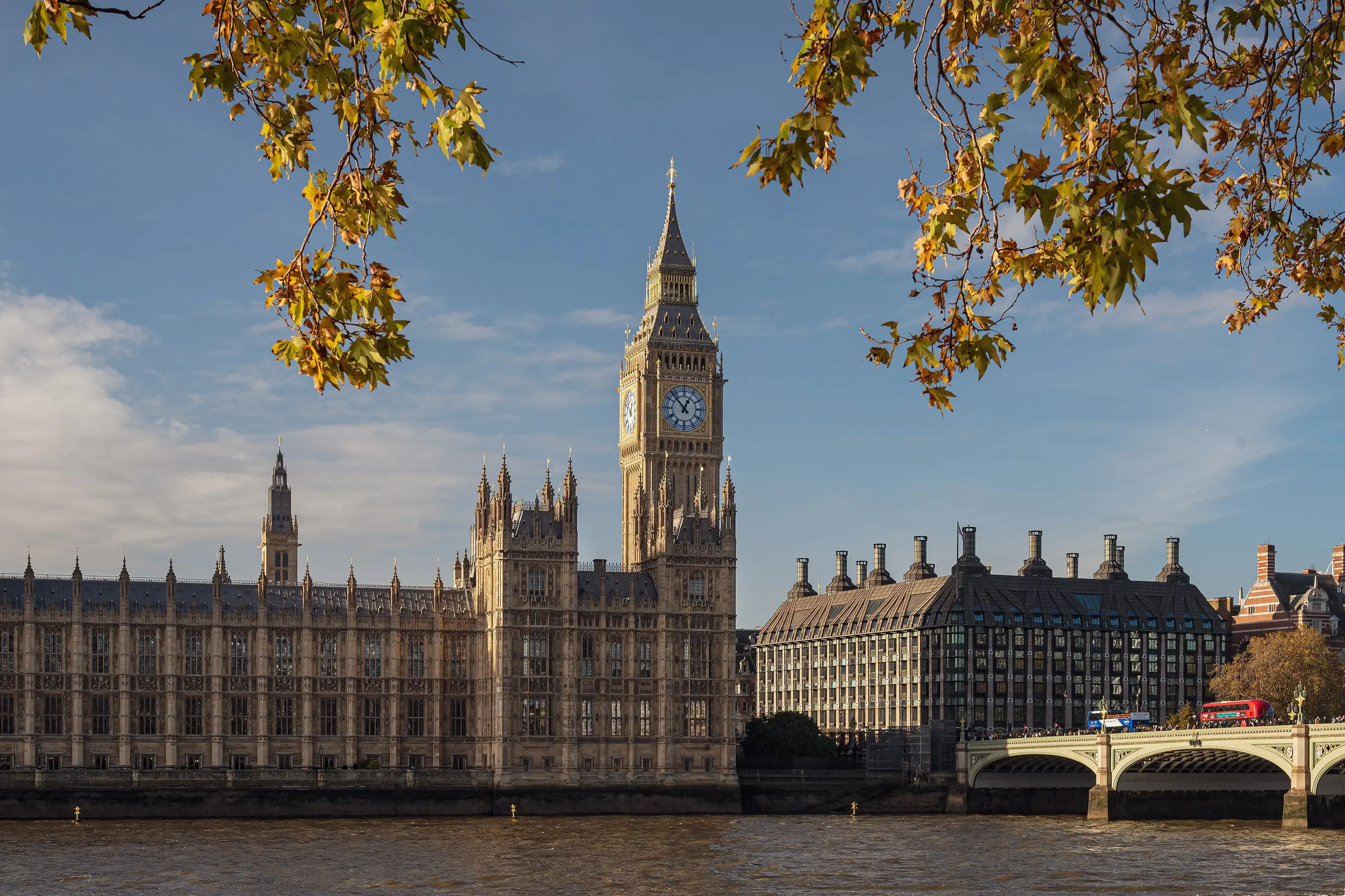
| Gothic Revival | The same vocabulary: pointed arches, tracery, blackletter | Built centuries later with modern engineering, often decorative rather than load-bearing, and self-conscious about quoting a historical style rather than inventing one |
| Goth subculture | The dark palette, the pointed silhouette, the taste for mystery | A twentieth-century music and fashion identity with no architecture or liturgy behind it. It borrows Gothic’s mood, not its system |
| Victorian design | Gothic Revival is one of Victorian design’s own revival strands | Victorian design combines several revival styles, Gothic among them, in one composition. Gothic design commits to a single coherent vocabulary throughout |
| Baroque design | Drama, scale, and ornament that carries meaning | Baroque is a seventeenth-century Counter-Reformation style built on curves, movement, and illusion. Gothic is pointed, vertical, and structurally motivated |
| Mystical-western design | Symbolic density, a dark palette, spiritual overtones | Mystical-western design draws on esoteric sources such as astrology, tarot, and alchemy. Gothic symbolism is Christian liturgical theology, legible to a specific medieval audience |
Start with the pointed arch and vertical proportion. Every other Gothic decision- the tracery, the type, the ornament- depends on that first commitment, so fix it before adding anything else.
Layer tracery-derived pattern next. Trefoils, quatrefoils, and bar tracery give a consistent secondary vocabulary at any scale, from a window to a page border.
Commit to chiaroscuro throughout. Light must emerge from a dark ground in pools, not spread evenly across the composition, or the atmosphere collapses into plain darkness.
Reserve blackletter for display type and titles. It carries the identity but defeats legibility at body length, so set running text in a sympathetic serif instead.
Let ornament grow from structure rather than sit on top of it: a pattern must emerge from a frame, a capital or a border, never fill space for its own sake. In luxury or ceremonial branding, watch the line between reference and costume, because too literal a quotation reads as fancy dress and too light a touch loses the Gothic association altogether.
Generic “medieval” is the most common failure. Without the pointed arch, tracery, and blackletter specifically, a design reads as vaguely old rather than Gothic.
Flat, even lighting undoes the effect faster than any single mistake, because chiaroscuro- light emerging from dark rather than spread evenly- is doing most of the atmospheric work. Blackletter set at body-text length or on a small screen defeats its own purpose: it was built for slow, devotional reading, not scanning, and it fails legibility at length regardless of period authenticity.
Gothic’s darkness and Christian symbolism will not suit every brand. A style built to signal sanctity and aspiration toward the divine can read as heavy or exclusionary in contexts that need warmth or secular neutrality, and forcing it past that mismatch is a common misjudgment.
The style also carries a real cost when you strip its content for mood alone. Gothic ornament and colour meant something specific to a literate medieval Christian viewer: blue for the Virgin, gold for incorruptible light, the trefoil for the Trinity. Fantasy, horror, and Goth subculture use that vocabulary regularly for atmosphere only, and a system built for meaning ends up doing decoration instead.
Is Gothic design the same as being Goth? No. Goth is a late twentieth-century music and fashion subculture that borrowed Gothic’s dark palette and pointed silhouette. It has no architecture, liturgy, or structural system behind it, and it shares a name with the medieval style rather than a method.
What is the difference between Gothic and Gothic Revival? Gothic is the medieval original, built between the twelfth and early sixteenth centuries with the technology of its own time. Gothic Revival is an eighteenth- and nineteenth-century quotation of that vocabulary, using modern construction and often decorative rather than structural.
Why does Gothic architecture use so much stained glass? The pointed arch, ribbed vault, and flying buttress moved structural load to discrete points, so the walls between them could open into glass instead of solid stone. Coloured light through that glass carried theological meaning as well as illumination.
Can blackletter typography still work today? For display type and titles, yes, where it signals Gothic identity efficiently. At body length, it hurts legibility and accessibility, so pair it with a sympathetic serif for running text.
When does Gothic suit a brief, and when does it not? It suits fantasy, horror, luxury, and ceremonial work that wants atmosphere, mystery, and historical weight. It works against briefs that need warmth, simplicity, or a secular, contemporary tone, where its darkness and religious association become a liability rather than an asset.
| Fact | Detail |
|---|---|
| Origin | Abbey Church of Saint-Denis, near Paris, rebuilt 1135 to 1144 |
| Key figure | Abbot Suger |
| Structural innovations | Pointed arch, ribbed vault, flying buttress |
| Defining cathedrals | Notre-Dame de Paris (begun 1163), Chartres Cathedral (begun 1194), Reims Cathedral (begun 1211), Cologne Cathedral (begun 1248, completed 1880) |
| Defining manuscript | Très Riches Heures du Duc de Berry, circa 1412 to 1416 |
| Gothic Revival figure | A. W. N. Pugin, Houses of Parliament, with Charles Barry |
| Typography | Blackletter, Textura the most formal variant |
| Period | Roughly 1140 to the early sixteenth century in France, persisting later in northern Europe |

Victorian design is the ornate, eclectic visual culture of Britain and its export markets during Queen Victoria’s reign, 1837 to 1901, when steam-powered printing and chromolithography made heavy ornament affordable to a middle class that had never been able to buy it before.
Read it
Typography is the craft of shaping and spacing type so readers can recognise its letters and follow its meaning without friction.
Read it