

2026-09-15
Nural Choudhury
Information architecture structures content so people can find it: choosing an organisation scheme, writing labels, building navigation and search, and testing whether the structure holds under a real task.
This page covers that structural work; its closest neighbour, information design, covers the visual side, presenting data and information through charts, dashboards, and the graphic forms that make numbers legible. If your problem is a chart nobody can read, that page is the one you want.
a structure a stranger can navigate without a tour, a scheme that matches how people already search, labels in their words rather than yours, and navigation that gets them there in as few decisions as possible.
any content collection too large for one page to hold, a website, a documentation set, an intranet, a product’s settings, a knowledge base like this one.
the organisation scheme. Get that wrong and no amount of careful labelling or a clever search box repairs it; you are polishing navigation for a structure nobody would choose on purpose.
Information architecture borrows its working vocabulary from two sources. Richard Saul Wurman organised the ways any set of information can be sorted into five schemes, remembered by the acronym LATCH: location, alphabet, time, category, and hierarchy. Abby Covert’s model of three pillars, ontology, taxonomy, and choreography, describes what a structure is made of: shared naming, classification, and the behaviour that connects the two. Together they give a practitioner two questions to ask of any structure: does everyone call this the same thing, and does the shape reflect how people think, not how the organisation happens to be arranged?

Five schemes cover almost every structural decision you will make. Pick the one that matches how people already think about the content, not the one that is easiest to build.
| Scheme | What it suits | Where it fails |
|---|---|---|
| Alphabetical | Content people already know by name: reference works, dictionaries, staff directories | A large set of similarly named items, or a visitor who does not know the exact term |
| Chronological | Content where sequence or date is the point: news archives, changelogs, event calendars | Content with no natural date, or a visitor searching by subject rather than time |
| Topical | The default for general content: subjects a visitor can guess and group by themselves | Subjects that overlap, or that only make sense from inside the organisation |
| Task-based | Software and services built around what someone came to do, such as renewing a licence | Content a visitor wants to browse rather than complete a task against |
| Audience-based | Sites serving groups with genuinely different needs, such as patients and clinicians | A visitor who does not know which audience they belong to, or belongs to more than one |
Depth against breadth is the second decision, and it is easy to make by accident rather than on purpose. A wide, shallow structure puts more choices in front of the visitor at once but gets them there in fewer steps. A narrow, deep structure hides content behind fewer choices per screen but asks for more of them in sequence.
Neither is correct by default. Match the shape to how confidently a visitor can predict which branch holds what they want. Where they cannot predict it, breadth costs less than depth.
A single scheme rarely survives contact with real content. Most working structures combine two: a primary topical hierarchy with an alphabetical index bolted on for people who already know the name, or a task-based top level with an audience filter underneath it for the rare visitor who needs both. Combining schemes is a structural decision like any other, and the rule is the same: add a second dimension only where visitors genuinely need it, not because the content happens to support it.

A label only works if it matches the words in the visitor’s head, not the words your organisation uses about itself. A menu item named after an internal programme, a department, or a product codename is a label written for the people who already know what it means.
Navigation is where the scheme becomes usable: the persistent menu that holds the top of the structure, the local menu that holds a section, the breadcrumb that shows where a visitor stands, and the links inside content that connect related material. The patterns for building each of these- mega menus, breadcrumb formats, mobile navigation- belong to UX and UI design patterns; this page keeps the decision about which of them your structure needs.
Search is a second route through the same structure, not a way around building one. A search box in front of a confusing structure returns results a visitor still cannot place, because search tells you what matched, not where they are or what else is nearby. Treat search analytics as a diagnostic instead: what people search for and fail to find is a direct report on where the structure has already failed them.

You must inventory before you organise. Know what content exists and who owns it before you design a scheme it has to fit; the audit itself belongs to content audits, run it first and bring the results here.
You must test the scheme with the people who will use it, not the team who built it. Card sorting shows you the categories a visitor would invent unprompted, and tree testing checks whether a proposed hierarchy holds up against a real task; both protocols live on user research methods.
You must write every label in the visitor’s vocabulary. Where two candidate labels compete for the same shelf, pick the one a first-time visitor would guess, not the one that is technically more precise.
You must decide depth against breadth on purpose, against the tasks the structure has to support, not the org chart that happens to exist; task analysis is where you establish what those tasks are.
Treat search as a second route, never a repair. Build the structure so a visitor who never touches the search box still arrives, then let search serve the visitor in a hurry.
A documentation site I restructured had grown around the engineering team’s own repository layout, one top-level section per internal service. Support tickets showed customers hunting through service names they had never heard of to do something ordinary, like exporting their own data.
I ran a closed card sort against the tasks in the support queue rather than the service names in the codebase, then rebuilt the top level around what a customer came to do: connect, migrate, troubleshoot. Depth dropped by one level in the process, because tasks needed fewer categories than services had. The content itself barely moved; only the shelf it sat on changed. The lesson generalised past that one site: a structure copied from how a team is organised always feels natural to the team and strange to everyone else.
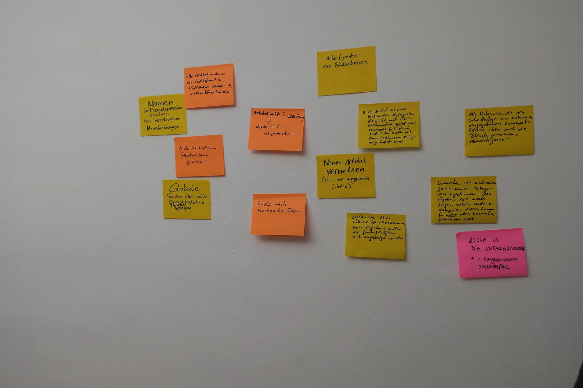
The structure that fails most often mirrors the organisation chart rather than the task. Content gets a home next to the team that owns it, not next to what the visitor is trying to do, and every visitor after that pays for the convenience with a search that starts nowhere useful. It is the failure I see most often, because it costs the organisation nothing to build and costs every visitor something to use.
Labels written in internal vocabulary look correct to the people who wrote them and opaque to everyone else. A menu item that matches a job title, a project codename, or an internal programme name is a label for the org chart, not for the visitor reading it cold.
A taxonomy can be internally consistent, every term correctly placed and every level correctly nested, and still be unusable, because correctness and findability are different properties. I have reviewed schemes that passed every classification rule and failed the first click every visitor made.
Search is often treated as the fix for a structure nobody can navigate, and it rarely is. A good search engine surfaces content faster inside a structure that already makes sense; it cannot substitute for one that does not.
What is the difference between information architecture and a sitemap? A sitemap documents a structure once it exists. Information architecture is the decision-making, the scheme, the labels, the tested hierarchy, that the sitemap then records.
Do I need a full taxonomy for a small site? No. A site with a few dozen pages usually needs one organisation scheme and clear labels, not a governed vocabulary with formal ontology work behind it.
How many clicks should it take to find anything? There is no fixed number. The old three-click rule of thumb is a guideline, not a law, and a structure that takes four or five confident steps beats one that forces three confusing ones.
Is search a substitute for a good structure? No. Search is a second route through a structure that already makes sense, and a search box cannot repair a structure a visitor could not navigate without it.
Should I combine more than one organisation scheme? Only where visitors genuinely need both routes. A topical hierarchy with an alphabetical index for people who already know the name is common; stacking three or four schemes usually signals the team couldn’t agree on one, not that visitors need the complexity.
| Item | Detail |
|---|---|
| The LATCH acronym | Richard Saul Wurman’s five ways to organise information: location, alphabet, time, category, and hierarchy |
| The three pillars | Abby Covert’s model of what a structure is made of: ontology (shared naming), taxonomy (classification), and choreography (the behaviour between the two) |
| Validation methods | Card sorting and tree testing check a structure against real visitors rather than the team who built it; both protocols live on user research methods |
| How this page differs from information design | Information architecture is structure and findability. Information design is the visual presentation of data and information. Different job, different page |

A content audit is a catalogue of every piece of content you own, scored against what it is supposed to do, so you can decide what to keep, fix, merge or kill.
Read it
User research is the systematic study of what users do, need and struggle with, combining qualitative depth with quantitative scale to ground design in evidence.
Read it
Task analysis is the systematic study of how people currently perform a task, breaking it down into the steps, decisions and knowledge each one requires.
Read it
An interface pattern is a solution to a recurring design problem, refined through enough use elsewhere that the person encountering it doesn’t have to figure out how to use it.
Read it
Information design is the craft of presenting information so it can be read and reasoned about: chart and encoding choice, hierarchy, annotation, and the honest representation of quantity.
Read it