
2026-09-15
Nural Choudhury
Coquette is a hyperfeminine visual style that crystallised on TikTok, Pinterest and Instagram in the early 2020s, built from a pink-dominant palette, bows, lace, pearls, and roses.
It borrows its imagery from Rococo decoration and mid-century femininity, but the borrowing runs through a contemporary, knowing self-presentation rather than costume. Coquette differs from kawaii in what the softness signals: kawaii’s cuteness reads as innocence and approachability, and coquette’s reads as romance and adult self-styling, as much at home on bridal stationery and lingerie packaging as on a phone screen.
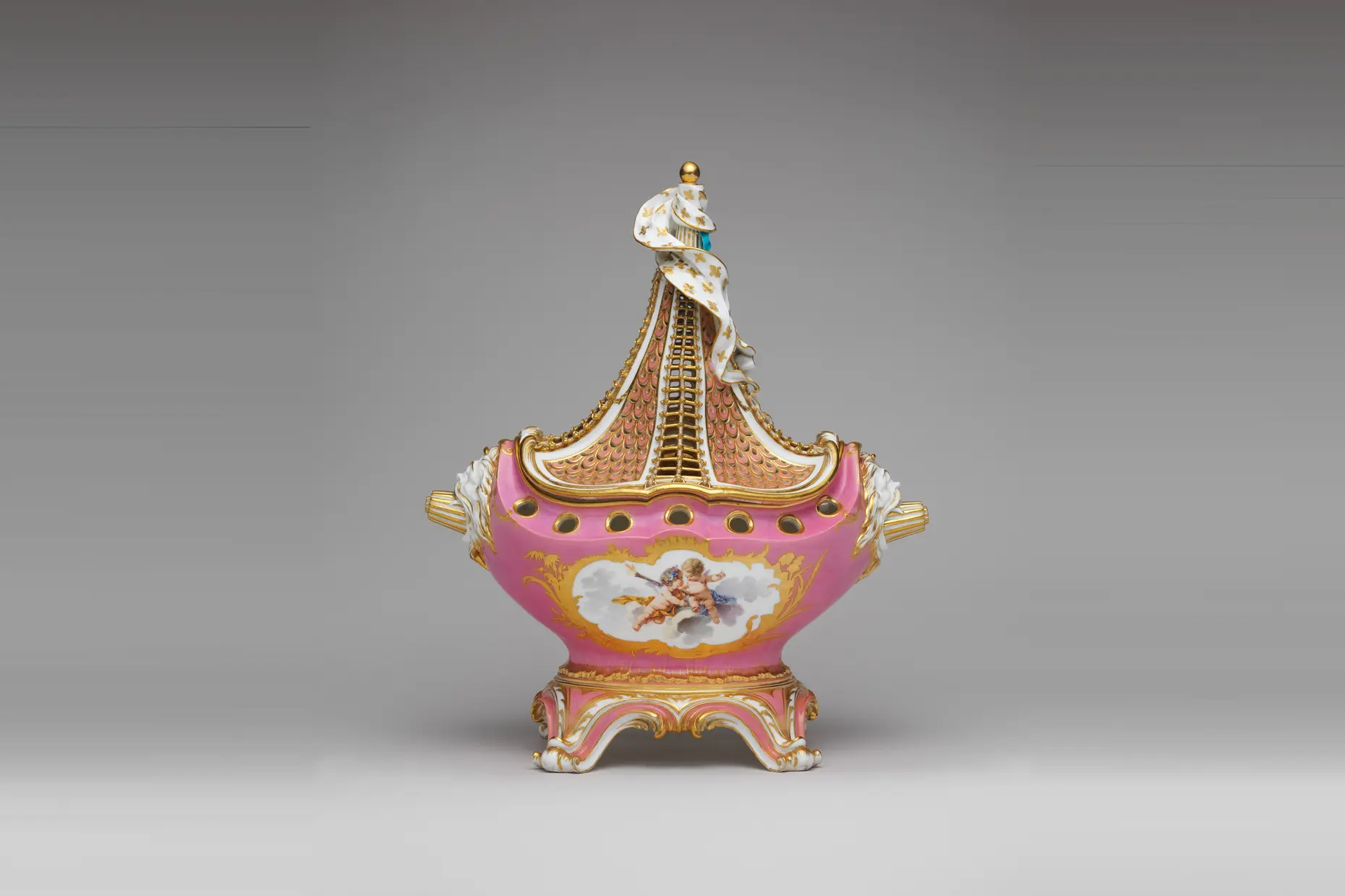
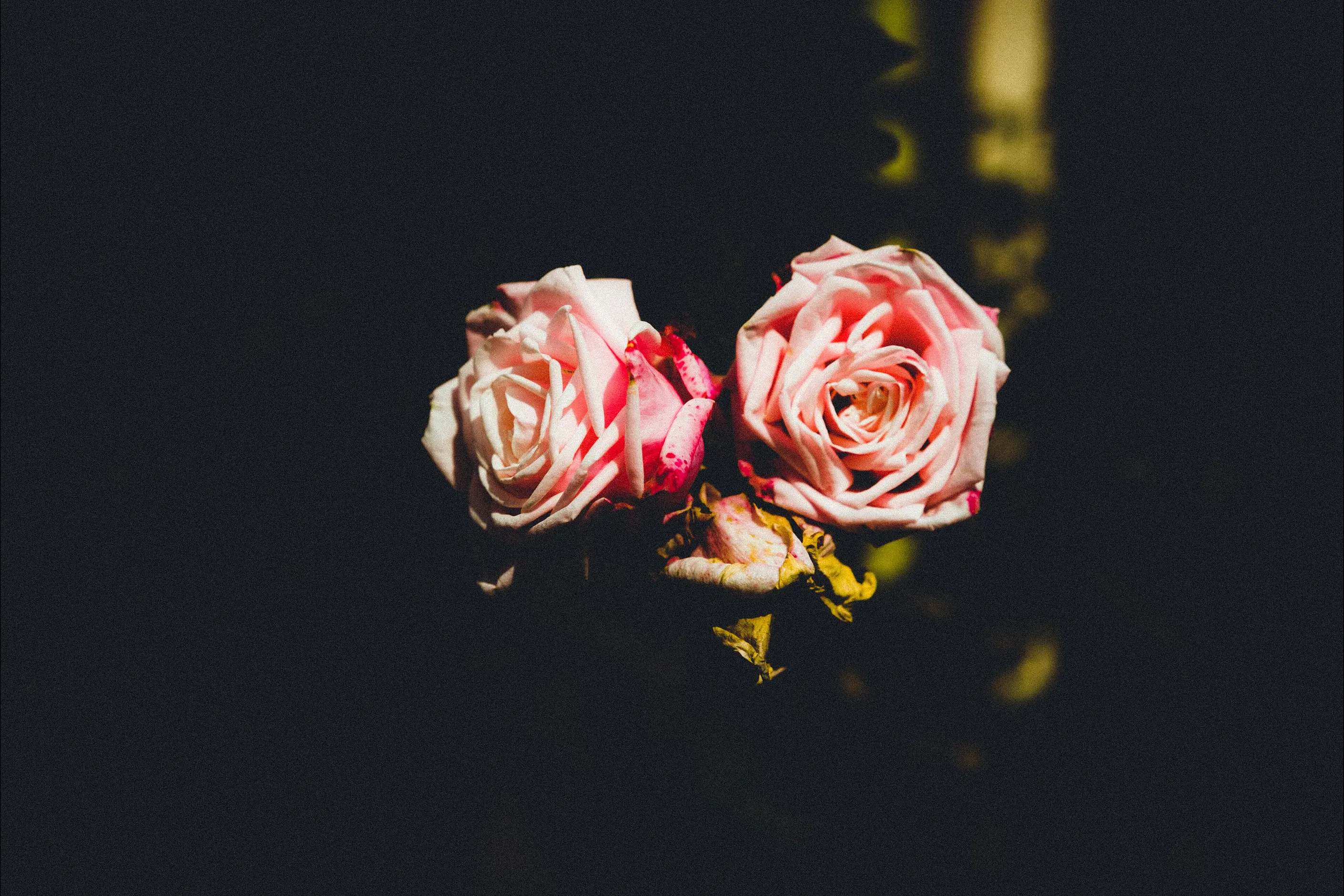
a pink-dominant palette (blush, rose, champagne pink) used as the base colour rather than an accent, paired with bows, ribbon, lace, pearls, and roses or peonies shot in soft focus and warm light. Typography leans on flowing script or a delicate, high-contrast serif, never a bold sans. The overall effect is precious and deliberately composed, not casual.
social media, not a design school. TikTok, Pinterest and Instagram communities assembled the look in the early 2020s from Rococo ornament, Sofia Coppola’s 2006 film “Marie Antoinette,” 1950s femininity, and an idealised French girl image.
beauty, bridal, lingerie, and lifestyle branding aimed at audiences who read hyperfemininity as a deliberate, sincere choice rather than a default.
Coquette formed through community curation on TikTok, Pinterest and Instagram in the early 2020s, the same process that produced neighbouring internet aesthetics such as balletcore, old money, soft girl, and clean girl. The name signals the difference from plain “girly”: a coquette is knowingly flirtatious, and the aesthetic community chose the word for a deliberate, constructed romanticism rather than an unconsidered one.
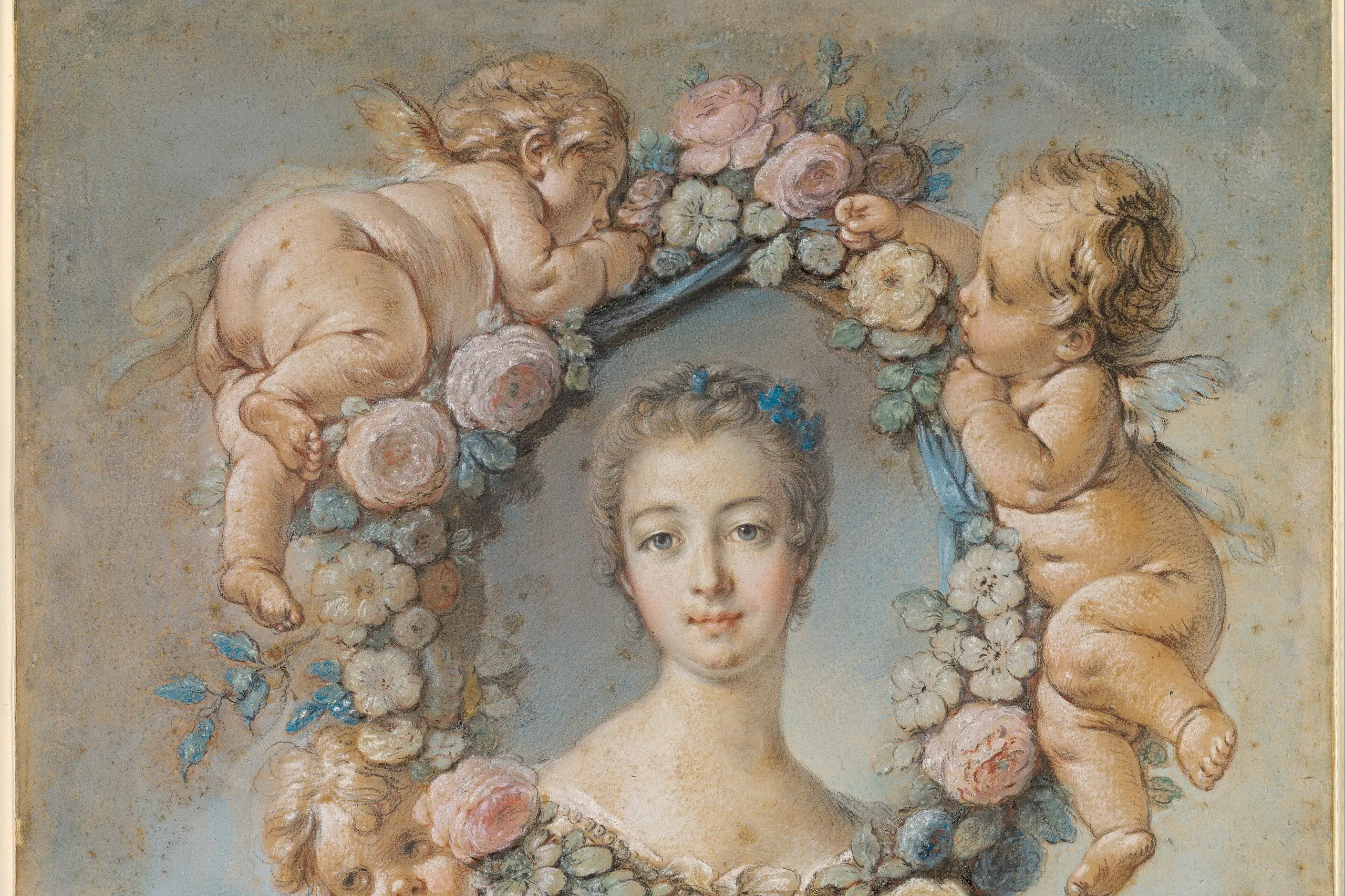
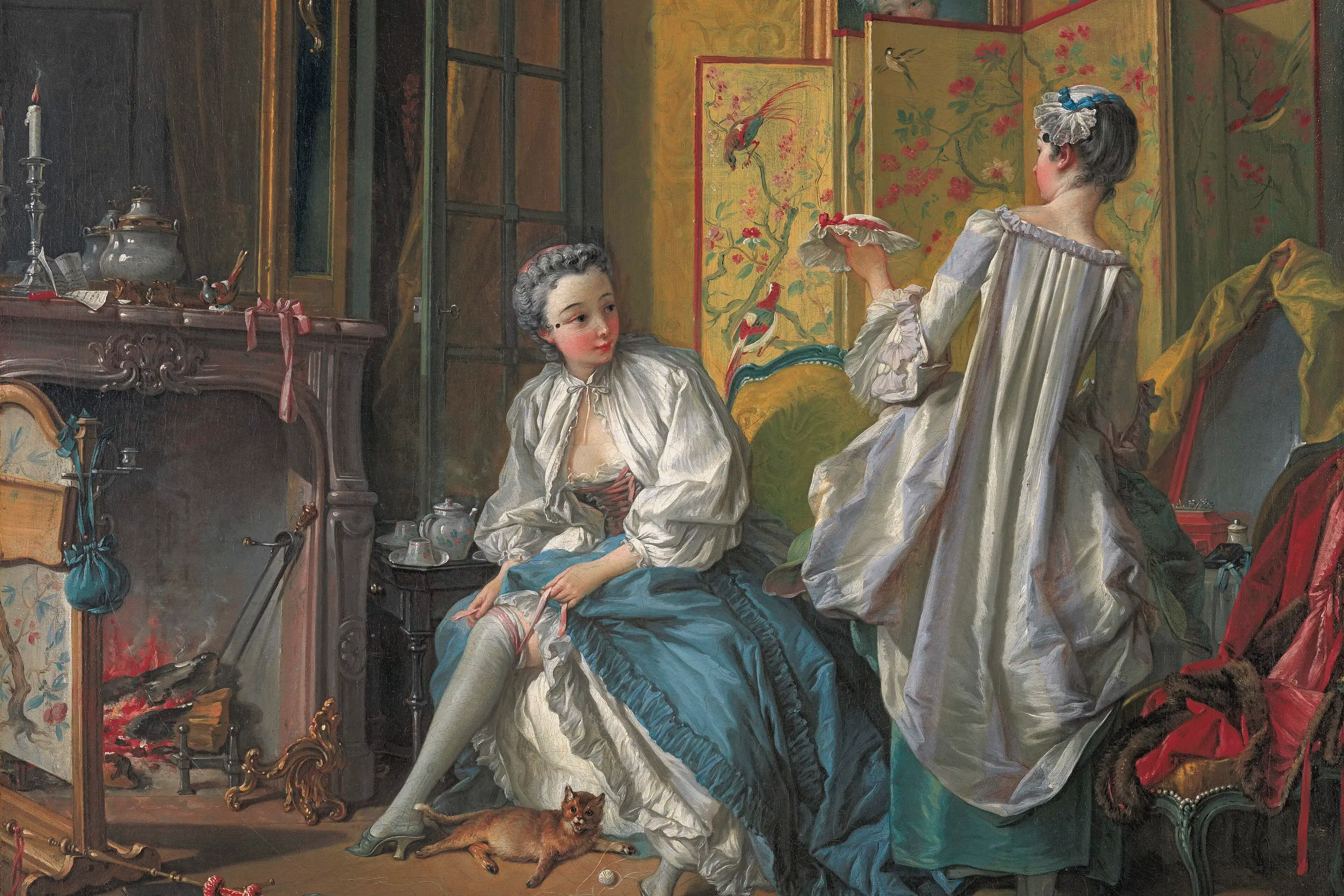
Its reference pool is historical but selective. It draws on Rococo, the eighteenth-century European decorative style built from scrollwork, shell forms, and pastoral scenes in pastel colour. Its clearest single reference point is Sofia Coppola’s 2006 film “Marie Antoinette,” whose vision of pink macarons and elaborate hairstyles shaped the aesthetic more directly than any primary eighteenth-century source. Coquette also borrows selectively from 1950s feminine dress (full skirts, pearls, groomed polish) and from an idealised French girl image of effortless romantic elegance, amplifying both toward maximalism rather than reproducing them.
The aesthetic presents itself as a reclamation. Where earlier feminist argument treated traditionally feminine dress as a mark of imposed constraint, coquette’s practitioners frame the same choices (softness, decoration, precious presentation) as self-directed rather than imposed. That framing is part of what the aesthetic communicates, not a settled fact about it.
| Element | What this style does | The tell |
|---|---|---|
| Colour | Pink is the base colour, not an accent: blush, rose, champagne pink, ballet pink, and powder pink, warmed throughout | Every white and cream carries a warm undertone; a cool white or a hot pink breaks the palette instantly |
| Motif | Bows, ribbon, lace, pearls, roses, and peonies appear as central imagery, packaging detail or repeated pattern | The bow is rarely purely functional. It is illustrated, oversized or repeated as a graphic device |
| Typography | Flowing script or delicate, high-contrast serif at light to medium weight | No bold sans-serif or geometric face survives contact with the palette |
| Layout and composition | Generous spacing, centred or symmetrical arrangement, decorative framing | Nothing dense or tightly cropped. Breathing room carries as much of the softness as colour does |
| Materials and texture | Satin, silk, tulle, velvet, and lace, referenced or literal | Surfaces are named for how they would feel, not only how they look |
| Imagery | Soft-focus photography, warm golden-hour light, staged romantic scenes | Nothing sharp, clinical or candid. Every frame reads as arranged |
| Neighbour | What it shares with coquette | What separates them |
|---|---|---|
| Kawaii design | Both build a visual language from softness, pastel colour, and precious or decorative objects | Kawaii’s cuteness signals innocence and harmlessness, drawn from a specific Japanese design and social history. Coquette’s softness signals romance and adult self-presentation, and sits as easily on bridalwear and lingerie as on a phone case |
| Shabby chic design | Both use a pastel, feminine-coded palette and layered, decorative surfaces | Shabby chic is built on visible wear: faded, distressed, deliberately imperfect finishes on real or simulated antiques. Coquette’s surfaces are pristine, and nothing in the aesthetic is meant to look used |
| Rococo design | Coquette borrows Rococo’s motifs directly: pastel pink, bows, pearls, and pastoral romance | Rococo is a documented eighteenth-century decorative style with named patrons and buildings. Coquette is a 2020s social media aesthetic that references Rococo through a 2006 film rather than through the historical style itself |
Set the palette before anything else. Choose a single warm pink as the base rather than adding pink as an accent to a neutral scheme, and check every white and cream in the system for warmth. Build the pink family (blush, rose, champagne, ballet, powder) before choosing a single motif.
Choose one or two motifs and repeat them rather than scattering bows, lace, pearls, and florals across the same composition. A single satin bow used consistently reads as intentional. A satin bow, a pearl border and a rose illustration on the same page read as decoration applied at random.
Match the typography to the palette’s softness: a script or a delicate, high-contrast serif at light to medium weight, never a bold sans or a geometric face. Give the layout room. Centred or symmetrical composition and generous spacing carry as much of the aesthetic as the colour does.
You must commit to the aesthetic sincerely or not use it. Coquette has no ironic register, and a knowing wink at its own preciousness reads as mockery of the audience the style is built for rather than as design wit. Treat it as a pastiche risk on any brief that cannot commit to genuine romantic hyperfemininity, and choose a different style rather than hedge with an ironic version of this one.
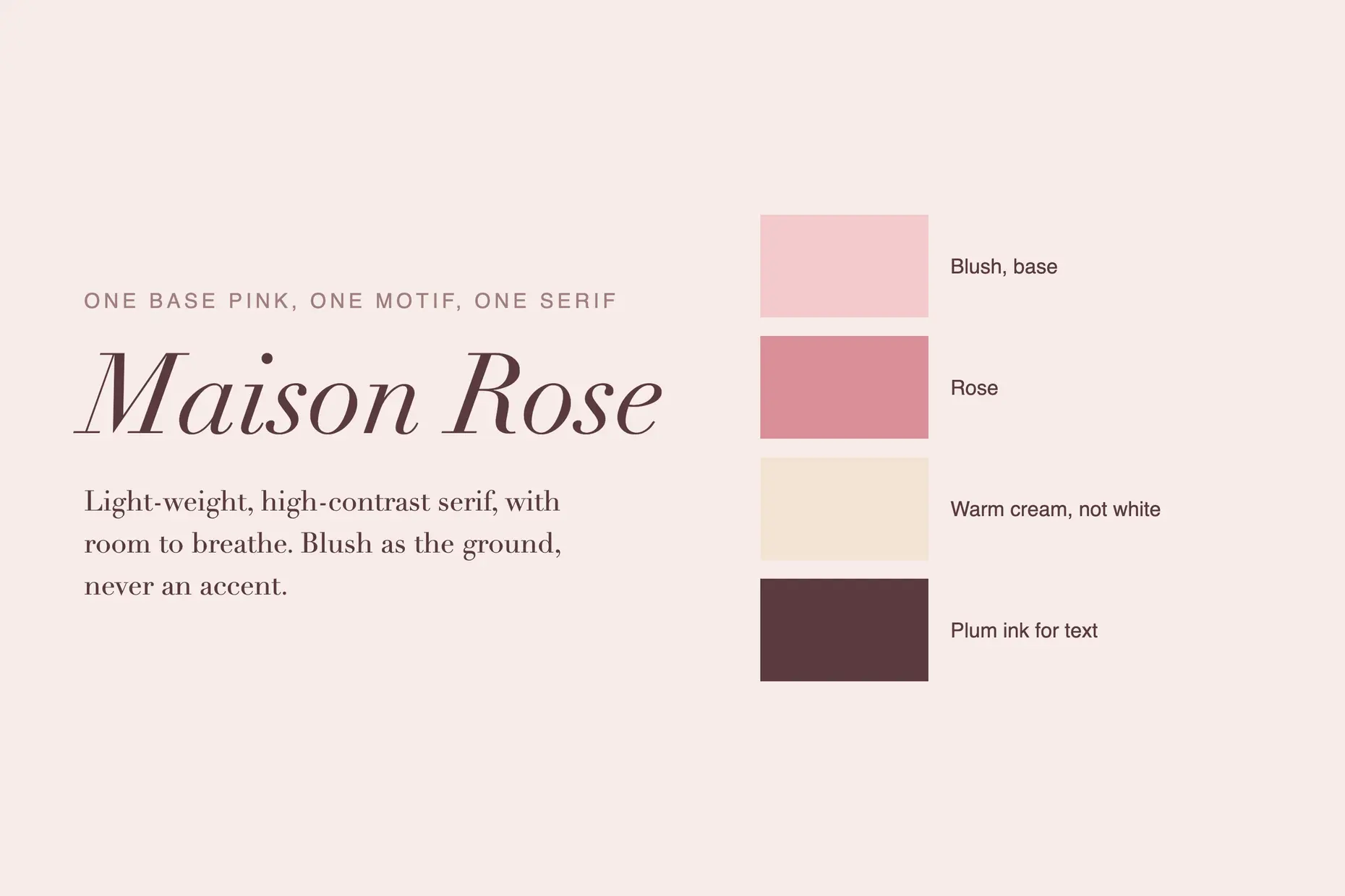
The most common failure is decoration without commitment: pink and a bow added to an otherwise neutral brand as a gesture toward “feminine” rather than as a considered palette and vocabulary. It reads as generic feminine marketing rather than coquette, and the aesthetic’s own community recognises the difference at a glance.
A related failure treats hyperfemininity as childish rather than deliberate: marketing that talks down to its audience, or that uses coquette’s softness as a synonym for simplicity. Coquette’s own self-understanding runs the other way. It presents precious excess as a considered choice rather than a limitation, and design that patronises its audience breaks that premise.
The aesthetic’s reclamation argument is contested, not settled. It answers a real feminist critique, that traditionally feminine presentation is imposed rather than chosen, by asserting that the choice is now voluntary and self-directed. That answer is a claim, not a fact, and a brand adopting coquette is stepping into an active argument about femininity rather than a neutral colour scheme.
Tone is fragile. A pink, even slightly wrong (hot pink, magenta, an unwarmed white), reads as a different aesthetic entirely, closer to Pop than to romance, and breaks the effect faster than almost any other single decision. Bold typography, angular shapes or harsh contrast anywhere in the system reads as an intrusion from a different register and undoes the coherence the aesthetic depends on.
Is coquette a design movement? No. It has no manifesto, school, or founding figure, and online communities assembled its reference pool rather than a group of practitioners working together. It is best described and applied as a dateable social media aesthetic, not inflated into a movement.
Is coquette the same as kawaii? No. Both use softness and pastel colour, but kawaii codes cuteness as innocence, drawn from a specific Japanese design history, while coquette codes softness as adult romance, drawn from Rococo and mid-century Western femininity.
Does coquette have to be pink? In practice, yes. The palette is built from pink as the base colour, not as one option among several, and every supporting colour (cream, champagne, sage) is chosen for how it sits against that pink.
Can coquette be used ironically? Not without losing its effect. The aesthetic works through sincere commitment to preciousness, and a knowingly ironic version reads as mockery of the audience rather than as a lighter take on the same style.
| Fact | Detail |
|---|---|
| Emerged | Early 2020s, through community curation on TikTok, Pinterest and Instagram |
| Name origin | From the French word for a flirtatious woman, chosen by the online aesthetic community to signal deliberate romanticism |
| Core historical references | Rococo decoration, Sofia Coppola’s 2006 film “Marie Antoinette,” 1950s feminine dress, an idealised French girl image |
| Core colour | Pink as the base colour: blush, rose, champagne pink, ballet pink, powder pink |
| Core motifs | Bows, ribbon, lace, pearls, roses, and peonies |
| Related contemporary aesthetics | Balletcore, old money, soft girl, and clean girl |
| Primary application | Beauty, bridal, lingerie, and lifestyle branding |

Kawaii (かわいい) is Japan’s cute aesthetic: rounded forms, oversized, simplified eyes, childlike proportions, and a pastel palette, developed since the 1970s into a design language for characters, consumer products, and institutional communication.
Read it
Shabby chic is an interior and graphic design aesthetic built on distressed paintwork, faded pastel colour and accumulated vintage objects, popularised by British designer Rachel Ashwell from the late 1980s.
Read it
Rococo is the light, asymmetrical, pastel decorative style that flourished in French interiors, furniture and painting from around 1720 to 1780.
Read it
Farmhouse is an interior style with roots in real agricultural buildings: pre-industrial rural houses and working farm structures, revived for contemporary homes since the early 2010s.
Read it