

2026-09-15
Nural Choudhury
Rococo is the light, asymmetrical, pastel decorative style that flourished in French interiors, furniture and painting from around 1720 to 1780.
It is Baroque’s reaction against itself: where Baroque built symmetrical, weighty rooms to proclaim royal power, Rococo scaled down to intimate salons built to please.
pastel colours (powder pink, powder blue, mint, cream) against gold and white; C-scrolls and S-curves; the shell-derived rocaille cartouche; asymmetrical rather than mirrored arrangements; cabriole legs; script typography with swash terminals; and surfaces filled with flowers, ribbons, and putti.
Paris, the Régence and the reign of Louis XV, roughly 1720 to 1780, as the aristocracy retreated from Versailles’s formal ceremony into private townhouses built for conversation and entertainment.
romantic atmosphere, feminine elegance and decorative pleasure in wedding design, luxury branding and hospitality, wherever intimacy and sensory delight matter more than restraint.
Rococo emerged as a reaction against the monumental formality of Baroque classicism, most visibly at Louis XIV’s Versailles, where symmetry, scale and ceremony expressed absolute royal power. When Louis XIV died in 1715, the French aristocracy moved from Versailles to Parisian townhouses, and social life contracted from public ceremony to private gathering.
The Régence (1715 to 1723), when Philippe d’Orléans governed during Louis XV’s minority, gave the style its formative years. New furniture forms appeared: the bergère, the canapé and the chaise longue, designed for comfortable conversation rather than formal posture. Louis XV’s reign, from 1723 to 1774, saw Rococo reach its full flowering. His mistress, Madame de Pompadour, became its greatest patron, supporting the Sèvres porcelain manufactory and setting the era’s aesthetic standards. Her signature shade, a soft rose now called Pompadour pink, still ties pink to Rococo and to aristocratic elegance.
The name derives from rocaille, meaning rockwork, and coquille, meaning shell, after the irregular ornamental forms drawn from garden grottoes and shell-encrusted fountains. It began as an insult, coined by Neoclassical critics who saw the style as a decadent deviation from rational classical principles, much as Gothic and Baroque both started as terms of abuse. The style’s association with female patrons, through Pompadour and later Marie Antoinette, shaped how contemporaries and later critics judged it: attacks on Rococo frivolity were frequently gendered, coding the style as feminine weakness against masculine reason. That legacy still colours how the style is discussed.
Rococo achieved its fullest architectural expression in the Parisian hôtel particulier, the aristocratic townhouse, where sequences of rooms ran from public reception spaces to intimate private cabinets. The Hôtel de Soubise (1735 to 1740), designed by Germain Boffrand, is a defining example: the oval Salon de la Princesse features white-and-gold boiseries curving across walls and ceiling with no clear division between them, and paintings by Charles-Joseph Natoire set into irregularly shaped panels. In painting, Antoine Watteau established the fête galante, the outdoor aristocratic party scene, as Rococo’s signature subject, with his “Pilgrimage to Cythera” (1717). François Boucher extended it into sensual mythological pastorals, and Jean-Honoré Fragonard’s “The Swing” (1767) is its most playful expression. The Sèvres and Meissen porcelain manufactories, and Parisian ébénistes such as Jean-François Oeben and Jean-Henri Riesener, carried the style into furniture and decorative objects. The style spread from France with local adaptations: German Rococo reached its most exuberant form in ecclesiastical interiors such as the pilgrimage church of Wies, Venetian painters including Tiepolo and Guardi brought Rococo sensibility to Italy, and in England, Thomas Chippendale’s furniture designs and Capability Brown’s naturalistic landscape gardens carried Rococo vocabulary against the resistance of Palladian tradition.

| Element | What Rococo does | The tell |
|---|---|---|
| Colour | Pastel register throughout: powder pink, powder blue, mint, lavender, cream, set against gold and white | No dark or saturated colour. Pink specifically, traced to Pompadour pink |
| Form and shape | Curvilinear vocabulary built from the S-curve, the C-scroll and the shell spiral, applied without mirror symmetry | The cabriole leg, swelling at the knee before tapering to a delicate foot |
| Typography | Flowing calligraphic scripts, swash terminals, ornamental initials that blur into decoration | Script faces such as Bickham or Snell Roundhand, or decorative Didone serifs where extended text is needed |
| Layout and composition | Asymmetrical balance by visual weight rather than geometric mirroring, arranged inside irregular cartouches | The rocaille cartouche: a frame with a curving, sprouting, irregular outline instead of a rectangle |
| Materials and texture | Silk, satin, porcelain and gilded bronze, soft diffused candlelight, mirrors used to multiply light | Gentle sheen and sparkle rather than glare; a room that reads as continuous ornamental surface |
| Imagery and ornament | Shells (rocaille), floral sprays, ribbons, scrollwork and putti, densely but never chaotically arranged | Organised abundance: filled surfaces that still read as restful, not merely dense |

| Neighbour | What it shares with Rococo | What separates them |
|---|---|---|
| Baroque | Curved forms, ornamental richness, a shared period boundary at the turn of the eighteenth century | Baroque is symmetrical, monumental and dramatic, built to proclaim power in palaces and cathedrals. Rococo is asymmetrical, intimate and light, built to please in salons and boudoirs |
| Neoclassicism | Direct historical succession, both operating in eighteenth-century France | Neoclassicism is the deliberate reaction against Rococo: it restores symmetry, restraint and moral seriousness against what its critics saw as Rococo excess. Where Rococo curves, Neoclassicism straightens |
| Filigree | Fine, curling ornamental line and a shared vocabulary of scrollwork | Filigree is a metalworking technique, twisted and soldered wire, that predates and outlives Rococo. Rococo borrows filigree-like curves as a graphic and decorative language across every medium, not a single craft |

Set the palette first. Commit to pastels: powder pink, powder blue, mint, lavender, or cream, with gold and white as the only accents. Dark or saturated colour collapses the lightness the style depends on.
Build asymmetry into the composition before you add ornament. Balance visual weight rather than mirroring elements: a spray of flowers on one side can balance a cascade of ribbons on the other. Bilateral symmetry reads as classical, not Rococo, no matter how much curvature or ornament you add on top.
Choose curvilinear forms over geometric ones. S-curves, C-scrolls and shell-derived cartouches must replace rectangles and unmodified circles. Set your typography in script or a refined decorative serif, never a modern sans, since a geometric sans contradicts the handcrafted, pre-industrial character the rest of the vocabulary is built on.
Fill surfaces with organised abundance rather than leaving them sparse. Rococo ornament should feel richly adorned and rhythmic, not empty and not chaotic. Light the result softly: diffuse, flattering illumination is part of the vocabulary, and harsh contrast works against it.
Treat Rococo as a pastiche risk on anything that has to carry serious information density, technical content or an authority-driven brand voice. The style communicates pleasure and intimacy specifically. Forcing it onto a context that needs to communicate rigour or restraint reads as costume rather than intent.
Rococo’s own contemporaries turned on it. Neoclassical critics in the 1760s and 1770s attacked it as frivolous against classical seriousness, feminine against masculine virtue, and aristocratically exclusive against democratic accessibility. Denis Diderot praised Jean-Baptiste Greuze’s moralising genre scenes while dismissing François Boucher’s mythologies as trifles. The French Revolution added a political charge: Rococo became identified with the aristocracy the Revolution overthrew, and Marie Antoinette’s Rococo taste, at the Petit Trianon and in her pastoral costumes, was read as evidence of royal decadence.
The gendered dimension of that critique has never fully lifted. Rococo’s association with Pompadour and Marie Antoinette meant that attacks on the style were frequently attacks on femininity itself, coding lightness and decoration as weakness. Reviving Rococo today without acknowledging that history risks repeating the same reduction in reverse, treating “feminine” as a decorative theme rather than a design decision with its own logic.
The most common contemporary failure is dilution: symmetrical layouts that keep the pastel palette and call it Rococo, or geometric forms dressed in gold and pink. Both misread the style, because asymmetry and curvilinear form are the structural decisions, not the finish. Sparse decoration fails for the same reason in the other direction: a Rococo composition with too little ornament reads as unfinished rather than restrained, because restraint was never the style’s value.
Is Rococo the same as Baroque? No. They share curves and ornamental richness, but Baroque is symmetrical and monumental, built to project power, while Rococo is asymmetrical and intimate, built for pleasure. Rococo is best understood as Baroque scaled down and lightened for private life.
Why is Rococo associated with femininity? Its greatest patrons, Madame de Pompadour and later Marie Antoinette, were women, and eighteenth-century critics coded their opposition to the style in gendered terms, attacking its lightness as feminine weakness against masculine reason. That association persists in how the style is received today, for better and worse.
Neoclassical critics attacked its frivolity through the 1760s and 1770s, and the French Revolution gave that critique a political edge by identifying the style with the aristocracy it deposed. It never disappeared entirely and returned in nineteenth-century revivals.
The coquette aesthetic, current in 2020s fashion and design, revives specific Rococo elements directly: pink palettes, bows, pearls and romantic femininity. It is a contemporary reference to Rococo vocabulary rather than a historical continuation.
Can Rococo work in digital interfaces? It can, for contexts such as wedding platforms, beauty and luxury branding, or hospitality, where romantic atmosphere serves the brand. It is a poor fit for interfaces with dense data or that require high information legibility, where asymmetry and ornament compete with function.

| Fact | Detail |
|---|---|
| Period | Roughly 1720 to 1780, centred on the Régence and the reign of Louis XV |
| Origin | Paris, in the aristocratic retreat from Versailles to private townhouses |
| Name origin | From rocaille (rockwork) and coquille (shell), originally a pejorative term |
| Key patron | Madame de Pompadour, patron of the Sèvres porcelain manufactory |
| Defining interior | The Hôtel de Soubise, Salon de la Princesse, by Germain Boffrand (1735 to 1740) |
| Defining painters | Antoine Watteau, François Boucher, Jean-Honoré Fragonard |
| Defining furniture makers | Jean-François Oeben, Jean-Henri Riesener |
| Decline | Displaced by Neoclassicism through the 1760s and 1770s, then politically discredited by the French Revolution |
| Contemporary revival | The coquette aesthetic in 2020s fashion and design |

Baroque design is a dramatic, ornamented style that used scale, contrast, and movement to overwhelm the viewer emotionally rather than persuade them rationally.
Read it
Neoclassicism is the design language of Enlightenment rationalism: geometric form, bilateral symmetry, architectural neutrals and high-contrast serif type, applied from the 1760s through the mid-nineteenth century to argue that good design discovers universal order rather than invents personal expression.
Read it
Filigree is a metalworking technique in which fine wire, usually gold or silver, is twisted, curled and soldered into open, pierced ornamental patterns.
Read it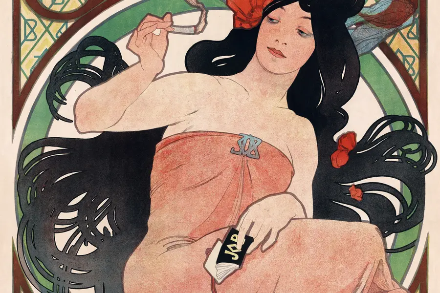
Art Nouveau is an international decorative style that ran from roughly 1890 to 1910, replacing the borrowed ornament of historical revivals with a single vocabulary drawn from plant growth, insect wings and the female form.
Read it
Victorian design is the ornate, eclectic visual culture of Britain and its export markets during Queen Victoria’s reign, 1837 to 1901, when steam-powered printing and chromolithography made heavy ornament affordable to a middle class that had never been able to buy it before.
Read it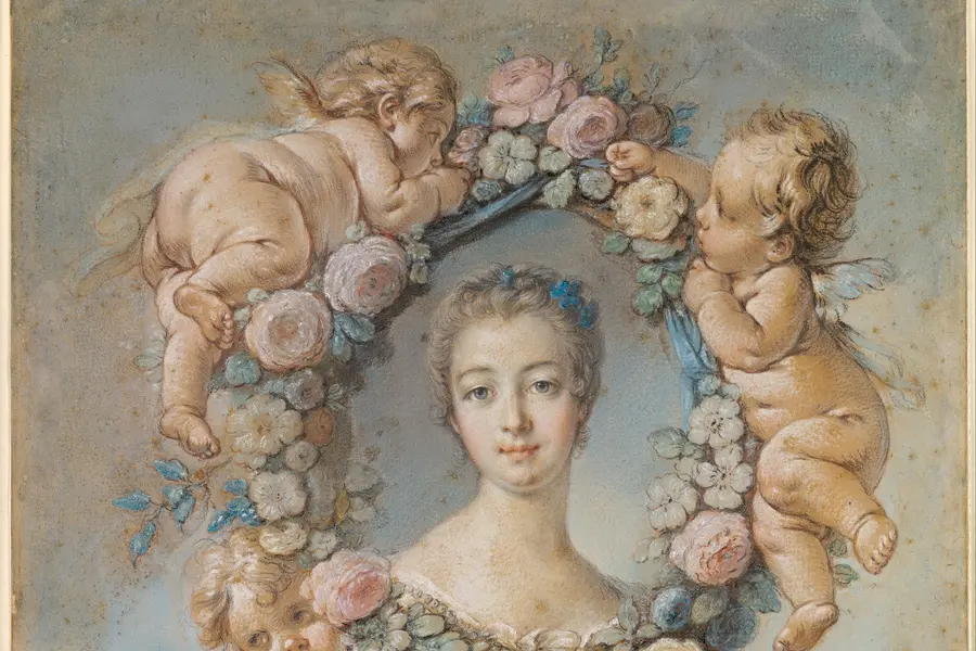
Coquette is a hyperfeminine visual style that crystallised on TikTok, Pinterest and Instagram in the early 2020s, built from a pink-dominant palette, bows, lace, pearls, and roses.
Read it
Layout is the arrangement of elements inside a frame: what a viewer sees first, second, and third, and what the space between things does as they look.
Read it
Typography is the craft of shaping and spacing type so readers can recognise its letters and follow its meaning without friction.
Read it