
2026-09-15
Nural Choudhury
Kawaii (かわいい) is Japan’s cute aesthetic: rounded forms, oversized, simplified eyes, childlike proportions, and a pastel palette, developed since the 1970s into a design language for characters, consumer products, and institutional communication.
Coquette borrows a similar pastel and pink vocabulary but stages it as adult seduction and vintage romance. Kawaii’s softness does a different job: it makes a hard message, a demanding day, or an unapproachable institution feel less threatening, and Japanese adults wear it as openly as teenagers do.
rounded forms with no sharp corners; characters with oversized, simplified eyes and a minimal or absent nose and mouth; a childlike figure where the head is as large as the body; and a pastel palette of pink, lavender, mint, and baby blue. The face carries almost the entire emotional read, and the same character is licensed across an entire product range rather than one object.
Japan, from a 1970s youth handwriting trend called kawaii-ji, taken up commercially by Sanrio from 1974 and later by San-X, Nintendo and government mascot programmes.
softening an institutional or difficult message, building comfort and stress relief into a product, or giving a brand or interface a warm, non-threatening character presence.
Kawaii took shape as a distinct style in 1970s Japan, though its visual roots reach further back into Japanese aesthetic tradition. Its immediate catalyst was youth culture: young women developed a rounded handwriting style, kawaii-ji or marui-ji, filled with hearts, stars and childlike simplification, in deliberate contrast to conventional adult penmanship. Adults initially dismissed it as regression, but it spread through school culture and into commercial design.
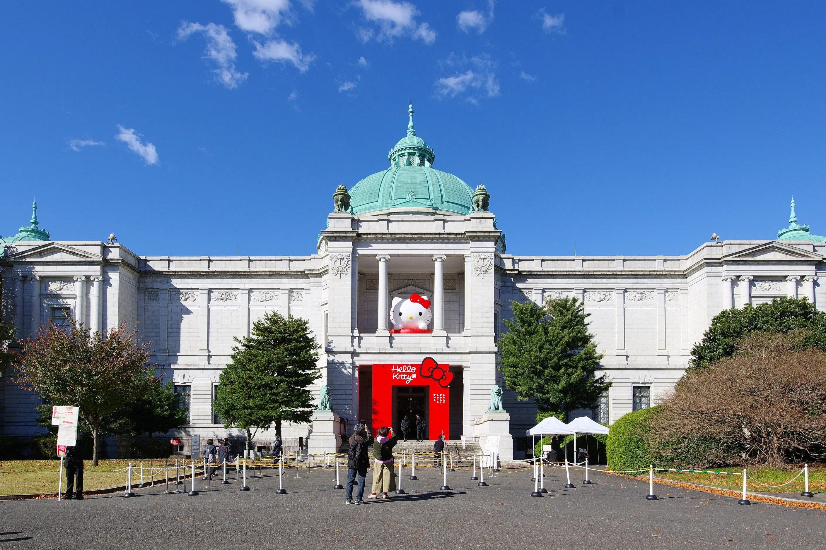
The style answered a real social pressure. Japan’s competitive educational and professional environment created demand for spaces of softness and relief, and kawaii objects supplied it: a Hello Kitty pencil case was a small zone of comfort inside a demanding school day, not only stationery.
Sanrio, founded in 1960, launched Hello Kitty in 1974, designed by Yuko Shimizu, and built a licensing empire on the character. San-X followed with Rilakkuma in 2003, and Sumikko Gurashi, and Nintendo’s Pikachu (Game Freak, 1996) carried kawaii into global gaming through Pokémon. Government and municipal bodies adopted the same visual logic for their own mascots, known as yuru-chara: Kumamoto Prefecture’s bear Kumamon and Funabashi’s pear Funassyi are among the best known, and each softens the institutional voice behind safety and tourism messaging.
Unlike Western cute marketing, which mostly targets children, kawaii’s consumer market spans age groups, and adult engagement with it, at a work desk or in a handbag, carries none of the embarrassment it might attract elsewhere.

| Element | What kawaii does | The tell |
|---|---|---|
| Colour | Restricts the palette to soft pastels, pink, lavender, mint, baby blue and cream, and keeps even stronger colours candy-bright rather than dark | A palette that stays sweet regardless of which hue is used |
| Form and shape | Replaces every angle with a curve, and rounds even inherently angular subjects, such as animals, buildings and objects, into soft versions of themselves | A subject that reads as kawaii purely because its edges have gone |
| Proportion | Uses childlike, baby-schema ratios: a head equal to or larger than the body, short limbs and a compact torso | A character drawn smaller than its viewer, so it reads as needing protection |
| Facial vocabulary | Carries almost the entire emotional read through oversized simple eyes, with a minimal or absent nose and a small curved mouth | Hello Kitty (Sanrio, 1974) has no mouth at all, so the viewer supplies the emotion |
| Typography | Softens letterforms and rounds every corner, descending from the 1970s kawaii-ji handwriting style | Circles or hearts standing in for dots, strokes that curve rather than end square |
| Materials and application | Applies one character across an entire product category, such as stationery, homewares, apparel, packaging and electronics, under a licensing model | The character, not the product’s function, is what is being sold |

| Neighbour | What it shares | What separates them |
|---|---|---|
| Coquette aesthetic | A pastel palette, bows and a broadly feminine, soft visual register | Coquette stages softness as adult seduction and vintage nostalgia; kawaii’s softness exists to make something feel less threatening, and it is used as openly by Japanese adults and institutions as by teenagers |
| Anthropomorphic design | Character faces placed onto non-human things and personified objects | Anthropomorphic design is the general technique of giving anything human traits, and it can be sharp or sinister as easily as cute; kawaii is one specific register of that technique, the rounded, simplified, non-threatening Japanese one |
| Doodle art | Simplified, naive figuration and a casual, approachable register | Doodle art is loose and spontaneous, and tolerates a rough, unrepeated mark; kawaii is a codified vocabulary where roundness, eye size and colour are precise, deliberate choices repeated across a licensing programme |

Decide what job kawaii must perform before you add a single rounded corner: comfort, a softened institutional voice, brand warmth or social facilitation. Treat it as function, not surface decoration, or the result will read as arbitrary.
Round consistently across the whole system: the icon, the headline type and the container shapes. Rounding one element and leaving the others sharp breaks the effect.
Put the emotional weight in the eyes and simplify everything else so it doesn’t compete. Keep enough detail for the expression to read; strip past that point, and the character stops communicating anything.
Scale the character down against its environment rather than letting it dominate. A figure drawn smaller than the objects around it reads as needing protection, and that vulnerability is the mechanism, not an accident.
Keep the palette pastel. If a brief needs a stronger colour, keep it candy-bright rather than dark or muted, or the sweetness the whole system depends on breaks.
Reserve kawaii for content that benefits from softness: onboarding, error states, comfort products and institutional messaging that needs to feel approachable. Don’t force it onto safety-critical instructions, dense data, or serious editorial content, where the audience needs gravity rather than warmth.
The pastiche risk sits in borrowing the Japanese-coded surface, the rounded forms, the pastel colour, without any of the function it performs. I wouldn’t reach for kawaii on an interface that has to carry dense information; the aesthetic’s job is to feel light, and a dense interface needs the opposite.

Generic Western “cute”, big eyes and pastel colour with none of kawaii’s specific vocabulary or social function, gets mistaken for the real thing. Western cute typically targets children only, and an adult who likes it can feel embarrassed by the preference. Kawaii spans every age group without that stigma, and the difference is not decoration; it is the whole cultural apparatus the look sits inside.
Forcing kawaii onto content that needs gravitas is the second failure. Safety warnings, medical information and dense data interfaces lose credibility when a mascot softens them past the point the content can bear, and an audience that needed to be taken seriously reads the cuteness as condescension instead of comfort.
Appropriation belongs here directly, not as a gesture. The characters themselves, Hello Kitty, Pikachu, Rilakkuma, are trademarked intellectual property and the commercial engine of an industry worth billions annually, and using them without a licence is a legal question before it is a style one.
The bigger risk is thinner and harder to see. Applying kawaii’s visual principles with an understanding of what they do- comfort, a softened institutional voice, social facilitation- is a genuine reference. Lifting the rounded, pastel, Japanese-coded surface purely to signal something quirky or exotic, with none of that function and no acknowledgement of where it came from, is a costume rather than a design decision.
The last failure is the quietest: technically correct kawaii, rounded, pastel, wide-eyed, that triggers no real affection in the viewer. The aesthetic has exactly one job: warmth, and an execution that gets every visual rule right while failing at that job has failed.

Why does Hello Kitty have no mouth? Sanrio’s 1974 design, by Yuko Shimizu, left the face deliberately blank. As a result, viewers project their own mood onto the character rather than reading a fixed expression. That neutrality became central to the brand’s commercial reach across products and contexts.
No. The translation captures the word but not the social function: kawaii is used by every age group without embarrassment, appears in government safety messaging, and carries a specific visual vocabulary- rounded forms, oversized eyes, pastel colour- that generic Western cuteness does not share.
What is a yuru-chara? A regional or institutional mascot built on kawaii principles. Kumamoto Prefecture’s Kumamon and Funabashi’s Funassyi are the best known, and Japanese cities, companies and government bodies use characters like them to make official communication feel approachable.
Can I use kawaii’s visual principles without referencing a specific Japanese character? Yes, and it is the more defensible route. Rounded interface elements, simplified mascots,s and pastel error states apply the underlying technique- comfort through softened form- without borrowing a trademarked character or a Japanese-coded surface you have no relationship to.
Why do Japanese adults engage with kawaii products so openly? Because the culture treats kawaii objects as a legitimate response to a genuinely high-pressure educational and professional environment, not as a childish indulgence, so a character on a desk or a bag reads as stress relief rather than as something to outgrow.
| Fact | Detail |
|---|---|
| Origin | Japan, 1970s, from the kawaii-ji youth handwriting trend |
| Sanrio founded | 1960 |
| Hello Kitty | Sanrio, 1974, designed by Yuko Shimizu |
| Rilakkuma | San-X, 2003 |
| Pikachu | Nintendo and Game Freak, 1996, via Pokémon |
| Yuru-chara example | Kumamon, Kumamoto Prefecture’s bear mascot |
| Baby-schema theory | Proposed by ethologist Konrad Lorenz |
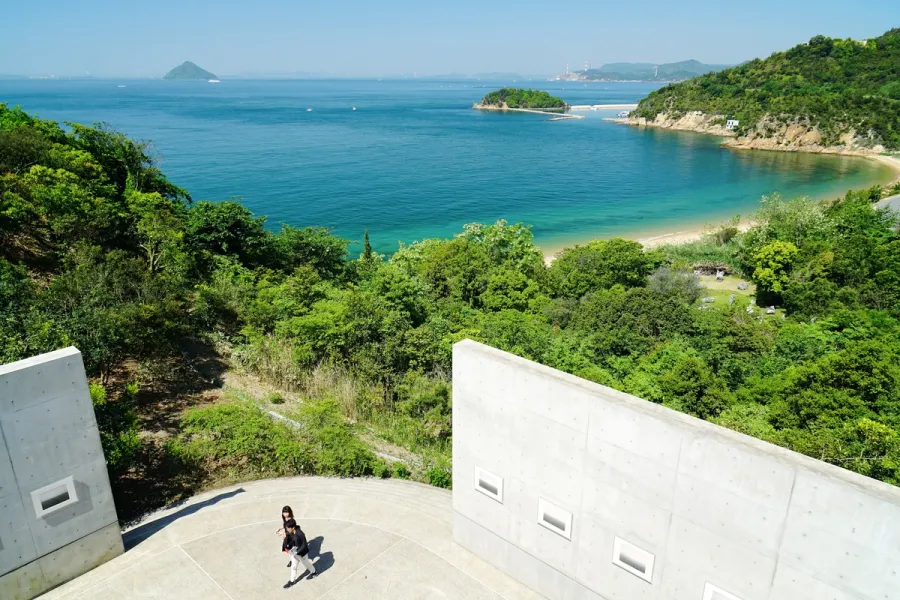
Japanese design philosophy names a group of aesthetic concepts, among them wabi-sabi, ma, kanso, shizen, and yugen, developed over centuries in Zen Buddhist and Shinto practice and applied to ceramics, gardens, architecture, and graphic design.
Read it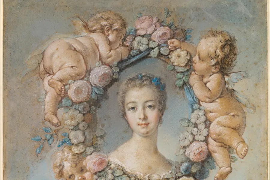
Coquette is a hyperfeminine visual style that crystallised on TikTok, Pinterest and Instagram in the early 2020s, built from a pink-dominant palette, bows, lace, pearls, and roses.
Read it
Anthropomorphic design gives a non-human object, interface or system human characteristics: a face, a voice, a temperament, so that a person relates to it rather than merely operates it.
Read it
Doodle art is the deliberate use of casual, unplanned mark-making- the loops, faces and repetitive patterns people draw while on the phone or half-listening in a meeting- as a professional visual style.
Read it
Y2K design is the visual language of computers, gadgets, fashion, and web culture from roughly 1997 to 2003, built from translucent coloured plastic, chrome and metallic surfaces, rounded bubble forms, and a saturated synthetic palette that together expressed a moment when digital technology looked purely exciting rather than troubling.
Read it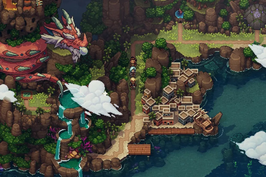
Pixel art is a raster art form built square by square on a fixed, visible grid, at a resolution low enough that every pixel is a deliberate decision rather than a technical accident.
Read it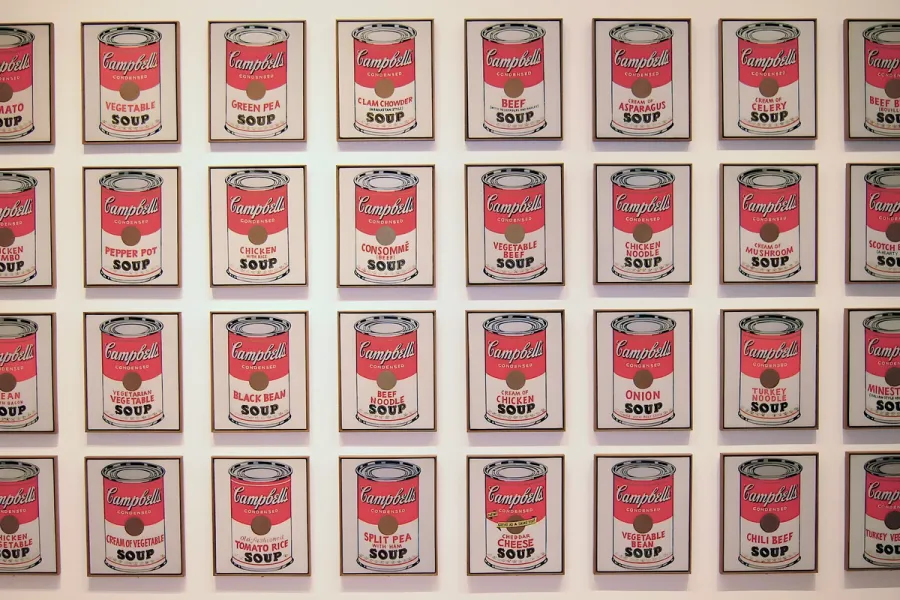
Pop Art is the movement that took commercial imagery- the soup can, the comic panel, the celebrity photograph- and treated it as fit subject matter for fine art, rendered flat, bright and mechanically precise.
Read it