

2026-09-15
Nural Choudhury
Data analysis for design is the practice of testing decisions against measured evidence, usage data, and controlled experiments, rather than defending them by opinion alone.
Design arguments where both sides have a number but no agreed metric, and dashboards nobody can act on because no one settled what they were meant to answer before anyone opened them.
Take a design decision into a room with a documented baseline, a controlled test result, and a written recommendation behind it, rather than a single chart nobody has to defend.
A metric defined before the data existed, a baseline, a segmented result from a controlled experiment, and a written finding recording what changed, how confident it is, and what to do next.
Data analysis for design has no single inventor or founding paper, unlike the Eisenhower Matrix or the MoSCoW method. It is an amalgam of three separate traditions that converged on product and design teams over the course of a century.
The statistical foundation is Ronald Fisher’s 1935 book The Design of Experiments, which introduced randomised allocation and the significance test, the machinery still underneath every A/B test run today. Google Analytics, launched in November 2005 after Google acquired Urchin Software Corporation, gave ordinary teams the first free, general-purpose tool for measuring site behaviour, moving analysis out of specialist statistics departments. Fred Reichheld’s Net Promoter Score, published in Harvard Business Review in December 2003, added a third strand: reducing a business outcome to one trackable, comparable number.
That third strand has since become contested. In Net Promoter 3.0 (Harvard Business Review, November 2021), Reichheld and co-authors Darnell and Burns acknowledged that Net Promoter Score had become gamed and misused. It introduced earned growth rate, a complementary metric built from accounting data rather than survey scores. CMSWire’s State of the Digital Customer Experience research has since recorded NPS falling from the second to the eighth most used customer-experience metric, and a 2022 paper in the Journal of the Academy of Marketing Science found methodological flaws in the score itself.
The folk version of this history, that data-driven design began with the growth-hacking movement of the 2010s, understates it by seventy-five years. What changed in the 2010s was not the method. It was the cost of running it, once free analytics tools and cheap experimentation platforms put statistical testing within reach of a small design team rather than a dedicated research function.

Run these in order. Skipping an earlier step to save time is the most common way a data-informed decision goes wrong.

A checkout redesign, walked through the six steps.
Baseline: over the four weeks before any change, checkout converts 840 of 40,000 sessions that reach it, 2.1 per cent once averaged across weekdays and weekends.
Hypothesis: usability testing flagged an account-creation step before payment as the point most users abandon, so removing it should lift conversion.
Test: an A/B split runs for three weeks, half of checkout sessions see the new flow without the account-creation step and half see the old one, chosen to reach the sample size a two-percentage-point lift needs at 95 per cent confidence.
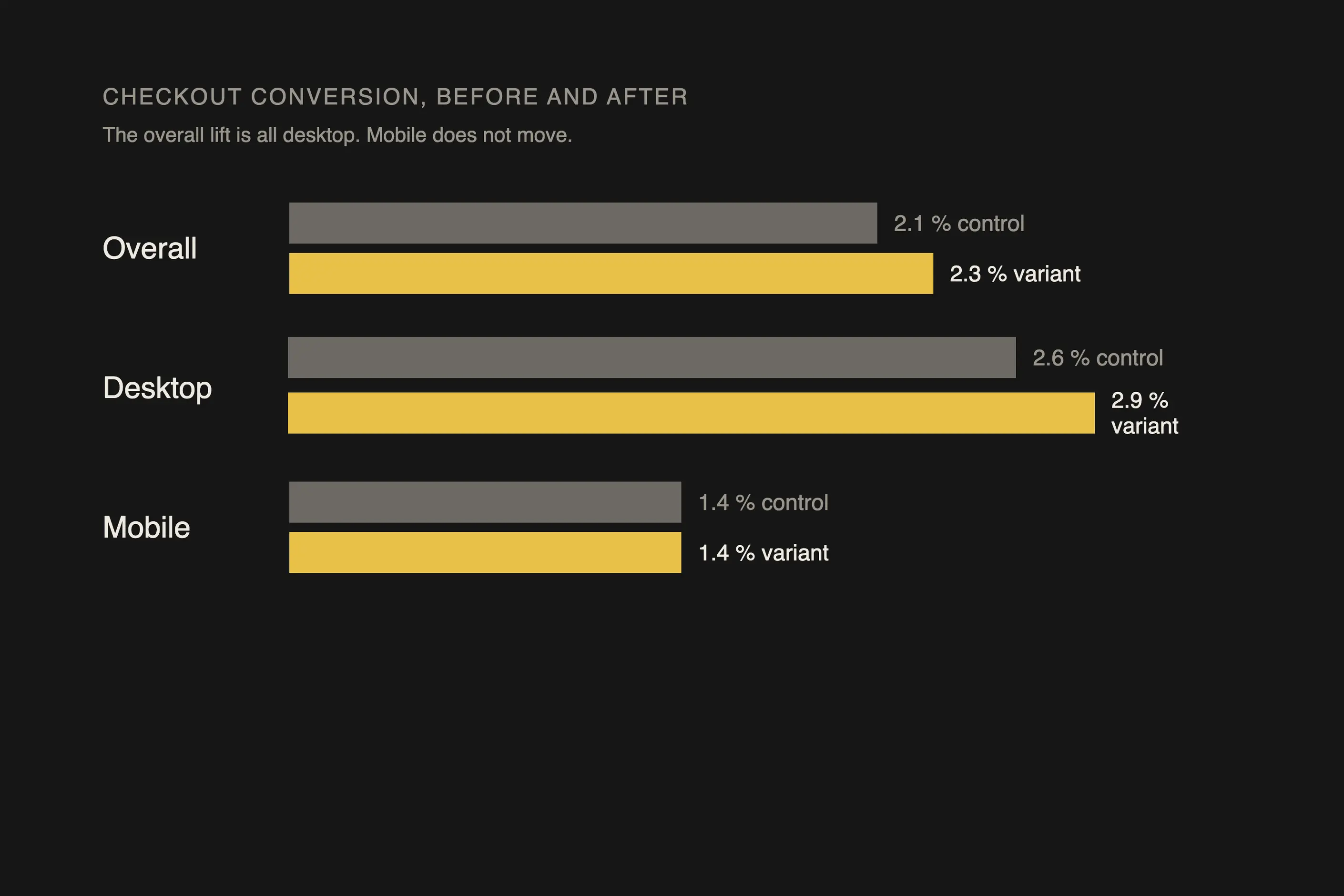
Result: the variant converts 912 of 39,400 sessions (2.3 per cent), a 0.2 percentage point lift and a 10 per cent relative improvement, reaching significance in the third week.
| Segment | Control | Variant |
|---|---|---|
| Desktop | 2.6 per cent | 2.9 per cent |
| Mobile | 1.4 per cent | 1.4 per cent |
| Overall | 2.1 per cent | 2.3 per cent |
The lift holds on desktop but is flat on mobile, so the account-creation step was never the mobile problem. That finding points the mobile investigation elsewhere.
I have seen a metric chosen because it was easy to move, not because it reflected the experience, get gamed the moment a team was measured on it. I have watched a button made impossible to miss inflate clicks while it buried content the user needed. I treat a metric as a proxy for the experience, never as the experience itself, and I keep a second metric, usually satisfaction or task completion, in view alongside whichever number is the headline.
Two metrics moving together have never told me that one caused the other. I have seen a checkout redesign ship the same week as a seasonal traffic spike and take credit for a conversion lift it may have contributed nothing to. I trust only a controlled experiment, where the variable under test is the sole difference between groups, to separate a cause from a coincidence.
I do not trust a result that reaches significance on a handful of conversions; that is noise dressed as a finding. Every test carries a minimum sample size for the effect it is trying to detect, and I have stopped a test early because the early numbers looked good, a practice researchers call peeking, only to watch the false positive rate climb well beyond the stated confidence level. I calculate the sample size the effect requires before the test starts, not after the graph looks convincing.
That doesn’t mean a test can’t stop early. Group Sequential Testing and mixture SPRT permit principled early stopping while controlling the false positive rate by design, and platforms including Optimizely, Statsig, and Eppo now implement them. If your test is running on one, my rule for peeking stands: fix the sample size before you start and don’t look early.
Web analytics, by construction, measure the users still using the product. A user who abandoned it entirely after one bad experience leaves no trail for me to analyse, so a dashboard built only from active users has, every time, underweighted the failure it should be catching most. I cross-reference usage data with churn, exit surveys, or research among people who left, not only the users the dashboard can show me.

combining measured evidence, usage metrics, experiment results, and funnel data with design judgement to validate a decision instead of asserting it from opinion alone.
No. The six steps need an analytics tool that is already tracking the product, a documented baseline, and the discipline to define the metric before making a change, not a dedicated data team.
Long enough to reach the sample size the effect requires, given current traffic. A small effect on low traffic can take weeks; a large effect on high traffic can resolve in days.
Skipping the baseline. Without a documented figure from before the change, no after-the-fact comparison is credible, no matter what the dashboard shows afterwards.
Does this replace user research? No, they answer different questions. Quantitative data show what changed and by how much; research explains why. Run both together rather than choosing one instead of the other.
| Fact | Detail |
|---|---|
| Statistical foundation | Ronald Fisher formalised randomised allocation and the significance test in The Design of Experiments, 1935 |
| Customer-outcome metric | Fred Reichheld’s Net Promoter Score, published as “The One Number You Need to Grow”, Harvard Business Review, December 2003 |
| General-purpose web analytics | Google Analytics launched November 2005, after Google’s acquisition of Urchin Software Corporation |
| Data protection standard | The EU General Data Protection Regulation, enforceable from 25 May 2018 |
| Named inventor | None. The practice combines separate statistical, analytics, and customer-research traditions rather than one method with one creator |

User research is the systematic study of what users do, need and struggle with, combining qualitative depth with quantitative scale to ground design in evidence.
Read it
A content audit is a catalogue of every piece of content you own, scored against what it is supposed to do, so you can decide what to keep, fix, merge or kill.
Read it
Task analysis is the systematic study of how people currently perform a task, breaking it down into the steps, decisions and knowledge each one requires.
Read it
A service blueprint is a diagram that maps what a customer experiences against the staff actions and systems that produce it, on one shared timeline.
Read it
A design sprint is a five-day process that takes a team from a business problem to a tested prototype, revealing whether an idea works before it is built.
Read it
An idea evaluation matrix is a structured scoring tool that ranks competing ideas against a shared set of weighted criteria, typically value, effort, and risk, so a team can compare options that all look plausible consistently rather than by whoever argues loudest.
Read it