
2026-09-15
Nural Choudhury
International typography is the design and setting of text in writing systems other than Latin script: Arabic, Chinese, Devanagari, Cyrillic, Japanese, Korean and hundreds more, each with its own structural logic, calligraphic heritage and technical requirements.
This page covers designing with non-Latin writing systems and their distinct typographic conventions. Typography basics cover the Latin fundamentals, type anatomy, legibility, hierarchy and spacing that this page assumes you already know.
the ability to recognise which structural family a script belongs to, predict how that family behaves under layout, and catch the failure modes that only show up once real words in that script sit on a real page.
any brand, product or editorial project that sets text in a script other than Latin, whether that is a single bilingual interface or a type family built to serve several scripts at once.
treat the script you do not read as a different structural problem, not a translated version of Latin. Test the actual script, at the actual size, with a native reader, before the layout is fixed.
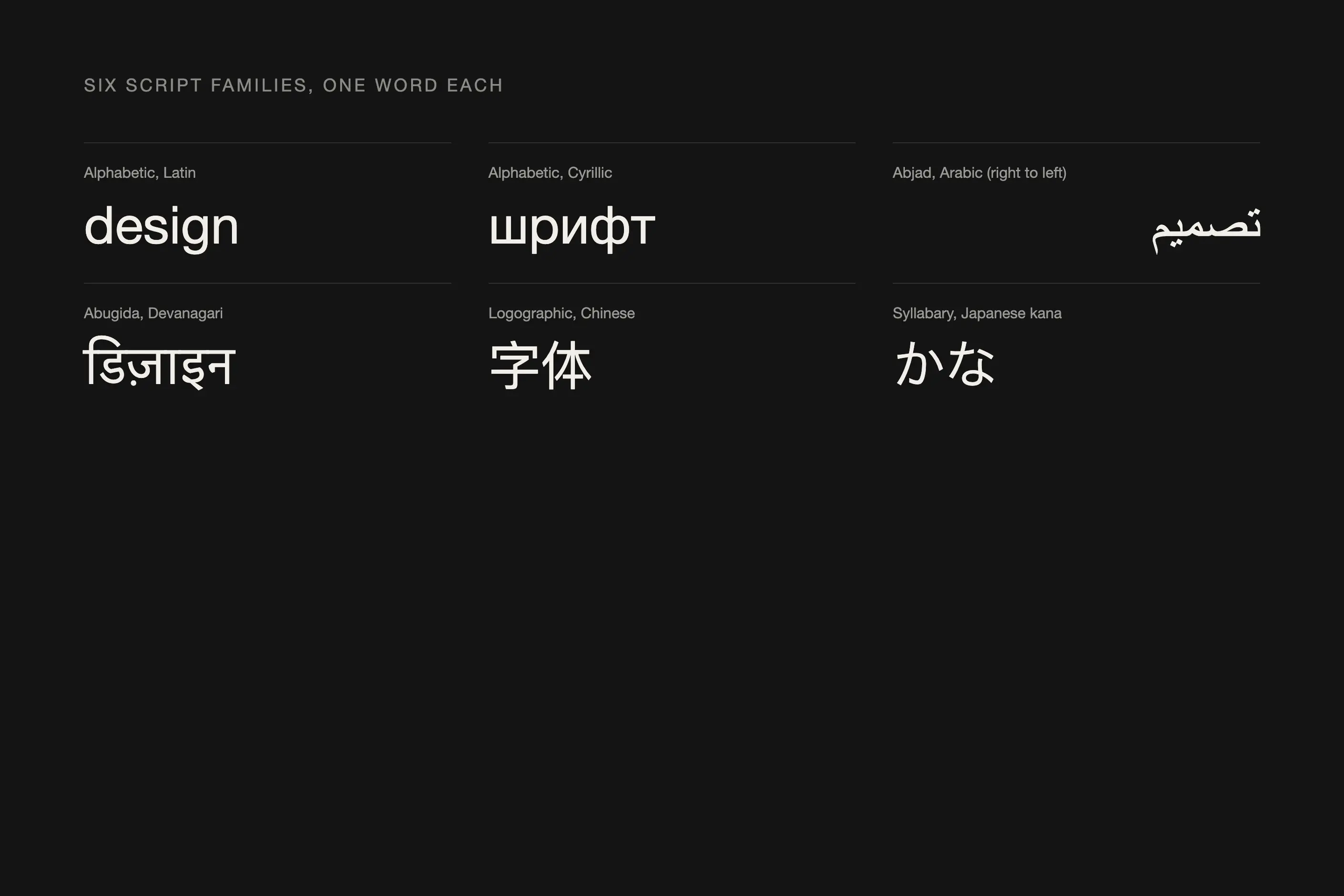
Scripts fall into five structural families. Alphabetic scripts assign one character to one sound: Latin, Cyrillic and Greek all work this way. Abjads write consonants and treat vowels as an optional mark, as Arabic and Hebrew do. Abugidas build a syllable from a base consonant plus a vowel modification, as Devanagari and Thai do. Logographic scripts assign a character to a word or a unit of meaning, as Chinese does. Syllabaries assign a character to a whole syllable, as Japanese hiragana and katakana do.
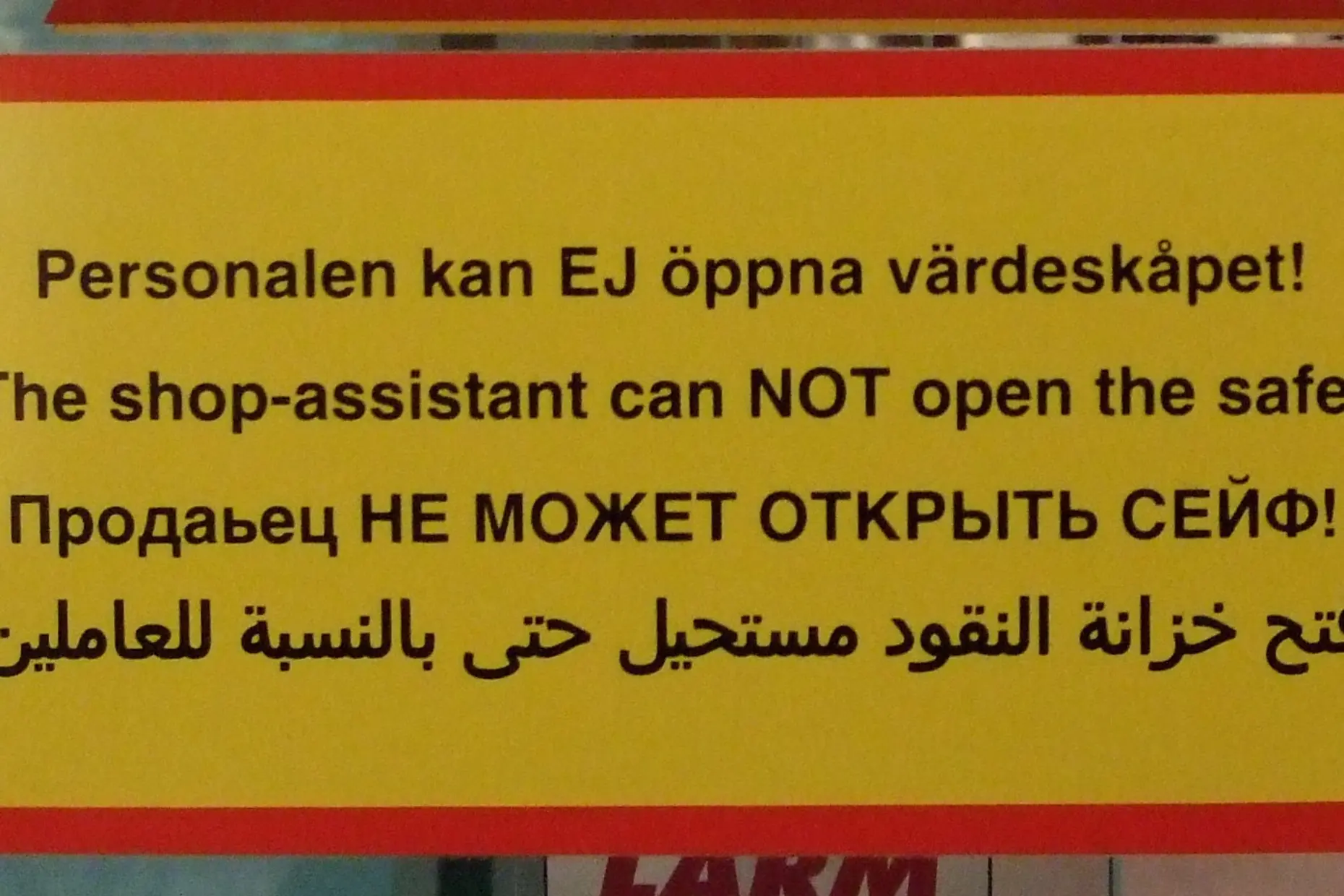
Direction follows from structure but not always. Latin, Cyrillic and most abugidas read left to right. Arabic and Hebrew read right to left, and that reversal changes the whole layout logic, not just the text: navigation, page numbers and reading order all flip with it. Chinese, Japanese and Korean can be set vertically, in columns that run right to left, or set horizontally left to right, and both remain in current use. A document that mixes scripts with different directions needs bidirectional handling, so a line of Latin sitting inside Arabic still reads left to right while the Arabic around it reads right to left.
| Script | System type | Direction | Trap for a designer who only knows Latin |
|---|---|---|---|
| Arabic | Abjad | Right to left | Letters change shape by position and connect within a word, so isolated glyphs or a mirrored Latin layout break the joins |
| Chinese | Logographic | Left to right, or vertical in columns that run right to left | No spaces between words, so line breaking on whitespace fails |
| Devanagari | Abugida | Left to right | The headline bar and vowel marks need more vertical room than Latin’s line height gives them, so text set from Latin metrics clips |
| Cyrillic | Alphabetic | Left to right | Some letters look identical to Latin but represent different sounds, and letterforms vary by language, so a borrowed Latin shape is often wrong |
| Japanese | Logographic plus two syllabaries | Left to right, or vertical in columns that run right to left | Three visually distinct systems sit in one sentence and must be weighted to read as one |
| Korean | Alphabetic, combined into syllable blocks | Left to right, or vertical in columns that run right to left | Spacing tuned for Latin’s letter-by-letter rhythm misaligns the block rhythm |
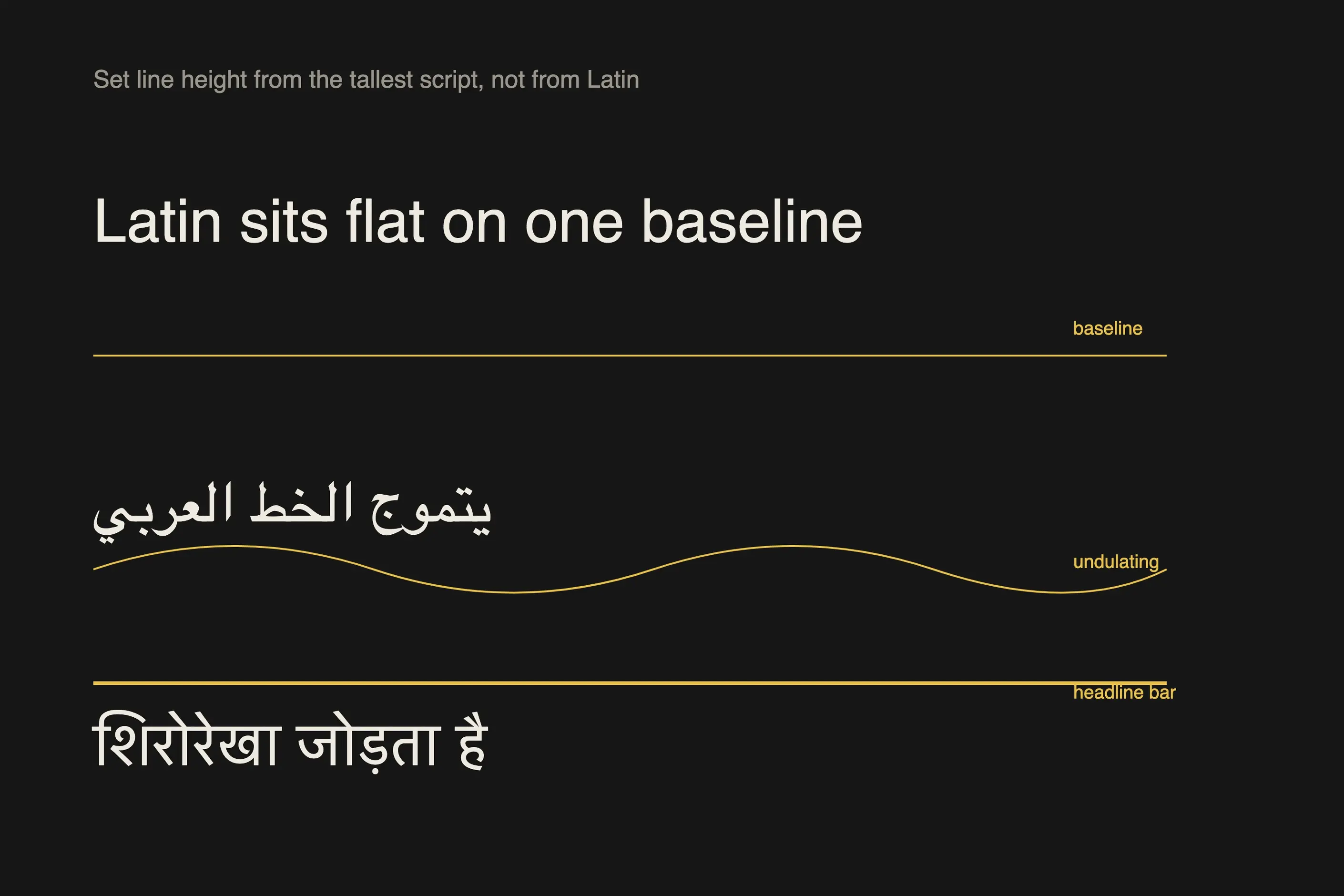
Arabic carries a calligraphic heritage that Arabic typography treats as a live tradition, not a historical footnote. Letters connect within a word and change shape by position- initial, medial, final or isolated- so the same letter looks different at the start of a word than at the end. The baseline is not fixed as in Latin: Arabic text undulates above and below a median line, and that rhythm is deliberate.
Chinese characters are logographic. Each one is a unit of meaning rather than a sound, and each fits in its own square regardless of how many strokes it takes. There are no spaces between words, so readers parse word boundaries from context, and traditional Chinese, used in Taiwan, Hong Kong, and overseas communities, uses different character forms from simplified Chinese, used in mainland China, for the same words.
Devanagari sets Hindi, Sanskrit, Marathi and other languages around a headline bar, the shirorekha, a horizontal line that connects characters across the top of a word and breaks at each word boundary. Consonants and vowel marks combine below, above, before or after the base consonant. When consonants cluster without a vowel between them, they merge into a conjunct form, sometimes stacked, sometimes joined. Getting the conjuncts and the vowel marks to render correctly is a font-engineering problem before it is a layout one.
Cyrillic is alphabetic like Latin, and some characters share Latin’s shape by ancestry. Still, the resemblance is the trap: a character that looks identical to a Latin letter often represents a different sound, and letterforms vary by language. Serbian Cyrillic is not Russian Cyrillic. Treating Cyrillic as Latin letters in a different alphabet, rather than its own set of proportions and terminals, is the mistake I have watched most often with this script.
Japanese mixes three scripts in a single sentence: kanji, the Chinese characters adapted for Japanese and carrying meaning, hiragana, the soft, curved syllabary used for native words and grammar, and katakana, the angular syllabary used for loanwords and emphasis. A Japanese typeface has to harmonise all three into one visual system, and it usually needs a matching Latin character set too, since Japanese text often mixes in English.
Korean Hangul is alphabetic at the letter level; individual jamo represent sounds, but those letters combine into square syllable blocks rather than running letter by letter, as does English. More than 11,000 possible precomposed syllable blocks exist, and a typeface either ships each block as a precomposed character or builds it from components at render time. Either way, the visual rhythm is block by block, not letter by letter.
Identify the script’s structural family and direction before choosing a typeface or setting a grid. Abjads and abugidas need vowel marks and conjuncts to render correctly. Logographic and syllabary scripts need line-breaking logic that does not depend on word spacing. Right-to-left scripts need the whole layout logic reversed, not just the text.
Choose type by testing the actual script at the actual size, not by matching x-height or point size across scripts on a spec sheet. Set line height from the tallest script in the document, not from Latin metrics: Devanagari’s vowel marks and Arabic’s baseline undulation both need more vertical room than Latin gives them.
Rebuild a right-to-left layout from its own logic rather than mirror a left-to-right one. Design navigation, numbering, and reading order for right-to-left reading from the start, not flipped after the layout is finished.
Bring in a native reader before you ship. A font with broken Arabic joins, a mispositioned Devanagari matra, or a wrongly borrowed Cyrillic letterform is often invisible to a designer working outside that script and obvious to a reader inside it.
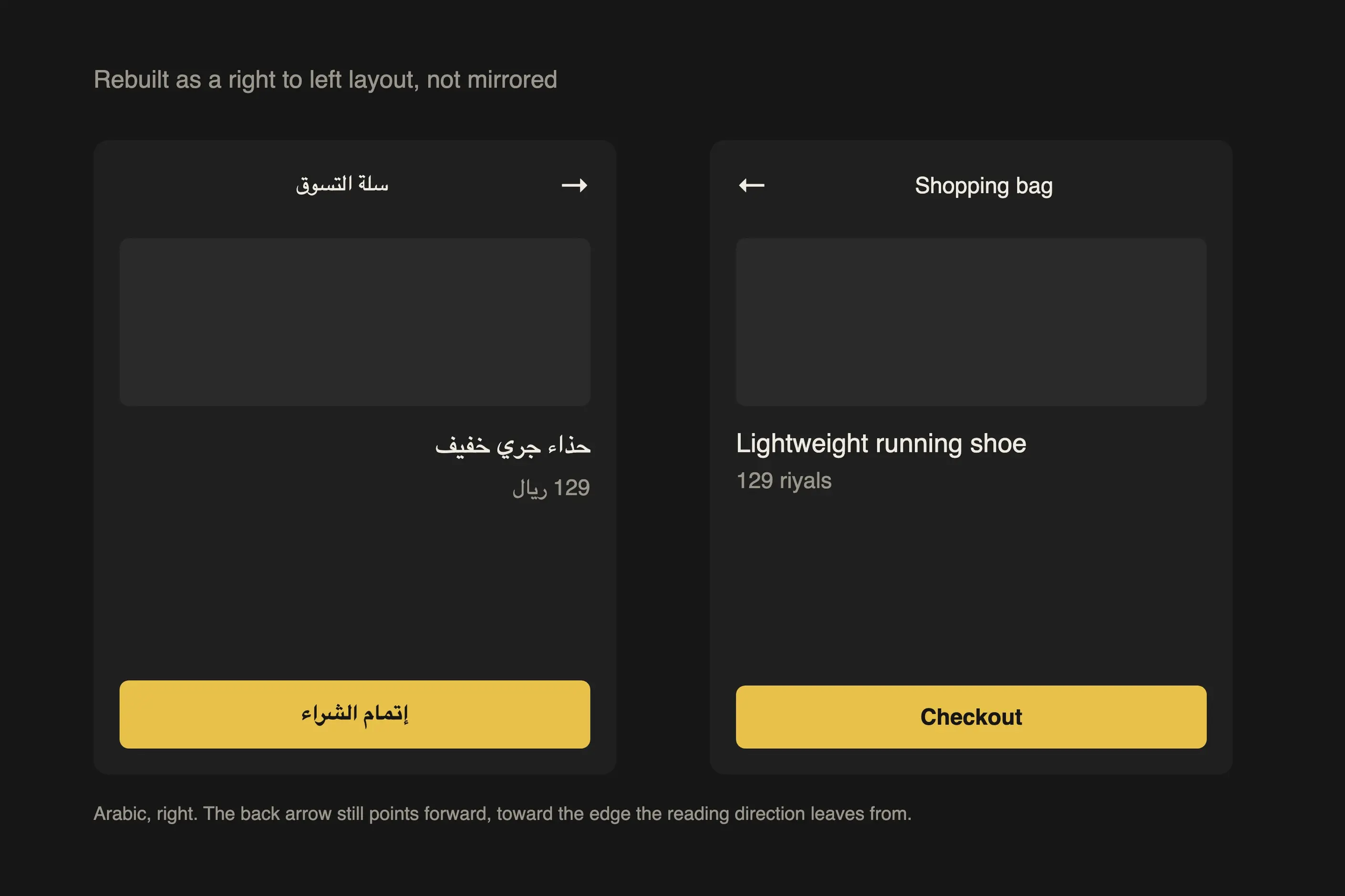
Take a retail app adding an Arabic interface for a right-to-left market. The instinct is to take the English layout and flip it. That reverses the icons and the reading direction without fixing the logic underneath: a “back” button that pointed right in English still needs to point right in Arabic, because right is now forward.
The Arabic typeface gets chosen and tested on its own terms: does it join correctly, does its baseline undulation read cleanly at the interface’s smallest size, does its weight sit level with the Latin typeface carrying the numerals and English labels. Line height is set by the Arabic script’s vertical needs, not the English specification. Only once the Arabic layout works as an Arabic layout does it get checked against the English version for consistency, not the other way round.
I have watched three mistakes recur. A Latin typeface gets paired with a non-Latin one chosen only because the x-heights match on a spec sheet. The pairing looks fine in a font-preview panel and falls apart the moment real words in both scripts sit side by side.
Line height gets set from Latin metrics and carried across the whole document. Devanagari’s vowel marks or Arabic’s baseline undulation then clip against the line above or below, because Latin’s vertical needs are smaller than theirs.
A right-to-left layout gets produced by mirroring a left-to-right one. The visual direction flips, but the layout logic underneath- what counts as forward and what counts as primary- does not, and the result reads backwards to a right-to-left reader even though every element has technically moved to the correct side.
Can I use the same typeface for Latin and Arabic text? Only if the Arabic design was built for that pairing, or you have tested the two together. Matching x-heights on a spec sheet does not guarantee they read as a pair.
Does a right-to-left layout mirror a left-to-right one? No. Mirroring reverses the visual direction without correcting the underlying logic of what is primary, what is forward and what a reader expects to find first.
How many scripts does a project need before it counts as multilingual typography? Two is enough. The moment a document or interface mixes two writing systems, you are managing bidirectional text, vertical alignment and weight harmonisation, the same problems a project with ten scripts has.
Can I set Devanagari or Arabic at the same line height as my Latin text? Not on Latin’s line height. Devanagari needs room for its headline bar and vowel marks, and Arabic needs room for its baseline undulation. Set the line height from the taller script.
Who should check a script I do not read myself? A native reader, ideally one with design or typography literacy in that script. Faults such as broken Arabic joins, or a wrong Devanagari conjunct, are often invisible to an outsider and obvious to a reader inside the script.
| Fact | Detail |
|---|---|
| Script classification | Five structural families: alphabetic, abjad, abugida, logographic and syllabary |
| Arabic character forms | Around 100 or more distinct positional forms once initial, medial, final and isolated variants are counted |
| Chinese character coverage | Comprehensive traditional Chinese font coverage needs around 13,000 characters; simplified Chinese needs somewhat fewer |
| Devanagari headline bar | The shirorekha connects characters within a word and breaks at each word boundary |
| Korean Hangul syllable blocks | More than 11,000 possible precomposed syllable blocks, though not all appear frequently |
| Direction categories | Left to right, right to left, bidirectional, and vertical with columns running right to left |

Typography is the craft of shaping and spacing type so readers can recognise its letters and follow its meaning without friction.
Read it
Type design is the practice of drawing a typeface: a coherent system of letterforms, numerals, punctuation, and symbols built to work together across combinations their designer cannot predict in advance.
Read it