

2026-09-15
Nural Choudhury
Type design is the practice of drawing a typeface: a coherent system of letterforms, numerals, punctuation, and symbols built to work together across combinations their designer cannot predict in advance.
This page covers creating a typeface from concept through to release: design DNA, character development, spacing, engineering, and testing. Typography basics covers using a typeface once it exists, its anatomy, legibility, hierarchy, and spacing in application, and does not draw the letterforms themselves.
a working sequence for drawing a typeface, from the handful of characters that fix its design DNA through to a file that ships, spaced correctly and engineered to survive real use.
designing a fully custom or commissioned typeface. A designer choosing between existing fonts wants typography basics instead.
the design DNA in the control characters. Every later decision, from character-set expansion to spacing to engineering, inherits whatever inconsistency sits in those first few letters.
Every typeface begins with a use case: text reading, display headlines, signage, interface labels, or a specific brand application. The use case pulls every later decision in a direction, since a face for a paragraph of body text and a face for a sixty-point headline solve different problems.
Planning fixes the project’s scope before a single letterform gets drawn.
| Decision | What it fixes |
|---|---|
| Character-set scope | Basic Latin, extended Latin, Cyrillic, Greek, or further scripts; scope sets the size of the whole project |
| Weight range | A single weight or a full family from hairline to black; each added weight multiplies the drawing work |
| Style variations | Uprights only, italics, condensed and extended widths, each needing coordination with the rest of the family |
| OpenType features | Ligatures, small caps, old-style figures, and stylistic alternates; each adds design and engineering work beyond the base character set |
| Variable font axes | Whether the typeface interpolates between drawn masters rather than shipping as fixed weights |
The axis technology itself belongs to Variable Typography: Responsive Fonts, Dynamic Type and Modern Web Design. Deciding whether a project needs it, and drawing the masters it interpolates between, stays here.

Type design typically begins with a handful of characters that establish the design’s fundamental decisions before the work expands to the rest of the alphabet.
| Character | What it establishes |
|---|---|
| Lowercase n and o | Stroke weight, curve handling, proportions, and rhythm; many designers start here |
| Lowercase a and g | Whether the design’s decisions hold up in more complex forms; the two-storey a and g reveal personality fastest |
| Uppercase H and O | Proportions and stroke weight at larger sizes, and how straight and curved elements relate |
| A test word | Setting the core characters together, “hamburgers” is a common choice, reveals whether they work in combination, not only alone |
I test the core letters together before drawing anything else, because a character that looks right alone can still clash next to another.
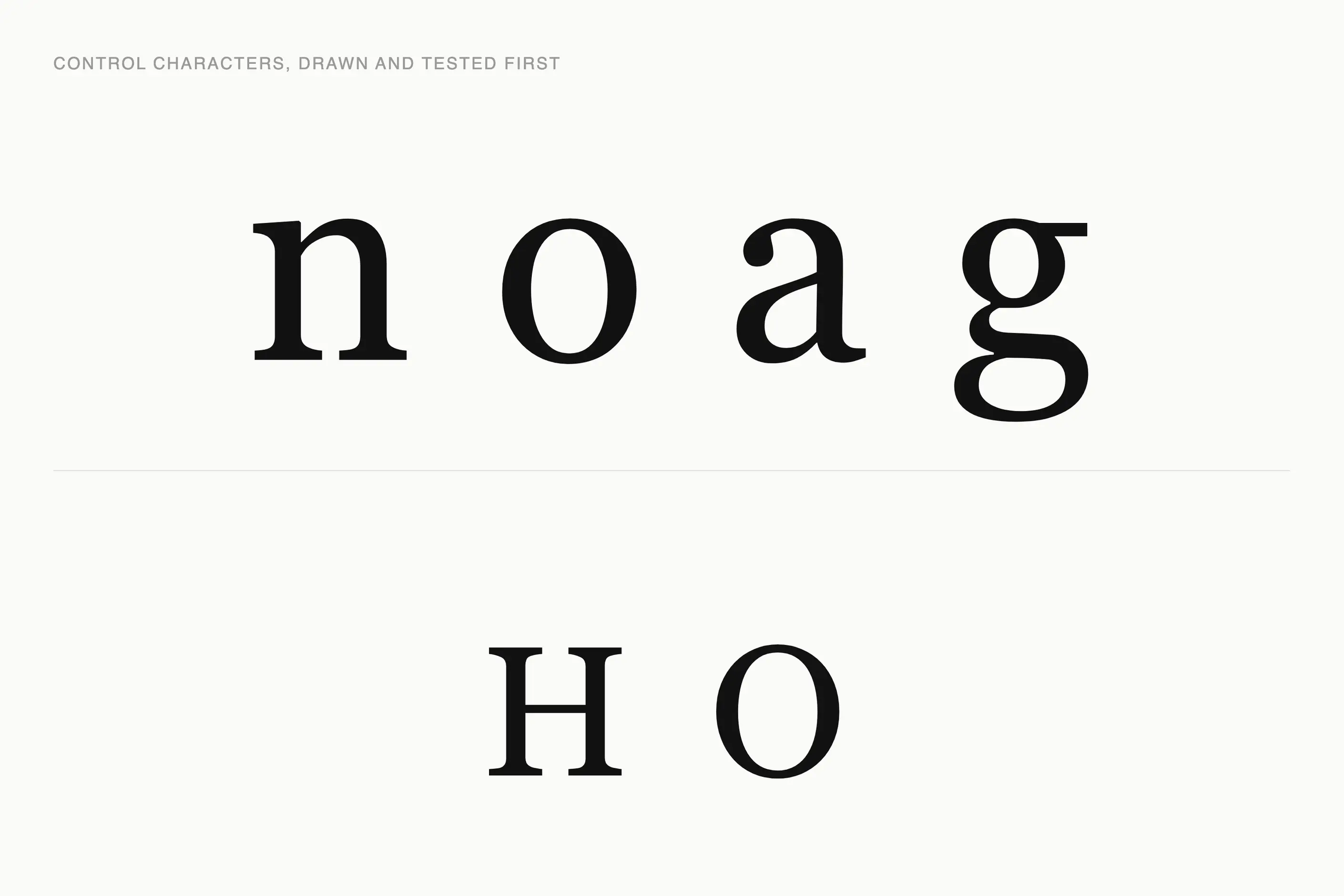
The core characters fix a set of decisions that then propagate across the whole character set.
| Decision | The choice |
|---|---|
| Stroke contrast | The relationship between thick and thin strokes; high contrast reads as elegant, low contrast reads as sturdy and even |
| Stress angle | Where a round character’s thinnest point sits; vertical stress reads as formal, angled stress references calligraphic origin |
| X-height | The height of lowercase letters against capitals and ascenders; a larger x-height helps small-size reading, a smaller one reads as classical |
| Counter shapes | The enclosed space inside a letter; open counters help legibility at small sizes, tighter counters read as denser |
| Terminal treatment | How a stroke ends: rounded, squared, angled, sheared, bracketed; terminals do more than most other details to set a typeface’s personality |
I settle the stress angle and the stroke contrast before anything else, because both are expensive to change once forty characters already carry them. A typeface with inconsistent stress reads as unsettled even to a viewer who cannot say why.
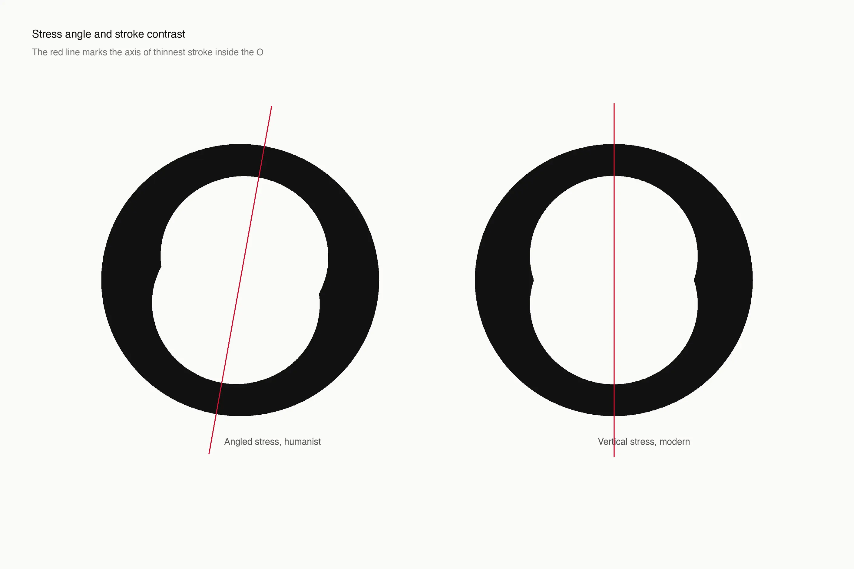
With the design DNA settled, the same decisions extend outward. Many characters derive from others: the m follows the n, the b often mirrors the d, and patterns like these repeat systematically. A smaller group, s, g, k, and x among them, needs its own solution.
Numerals carry their own choice: lining figures sit at cap height for tabular and technical use, and old-style figures vary in height to sit inside running text. Punctuation, currency symbols, and diacritical marks each need to harmonise with the letter designs at the same scale and weight, not borrow an unchanged shape from elsewhere.
Extended language support turns a Latin alphabet into several projects. Cyrillic and Greek carry their own structural logic rather than a Latin adaptation, and each further script, Arabic, Hebrew, and Devanagari among them, is close to a separate undertaking with its own tradition. Covers setting text in those scripts once they exist; this page stops at drawing them.
Spacing decides whether a typeface reads as an even block of grey or a page pocked with light and dark patches, and it matters as much as the letterforms themselves. A typeface’s spacing has to work automatically across every pairing it will ever meet, unlike hand lettering, where a designer adjusts spacing per combination.
Each character carries built-in spacing in its left and right sidebearings, the space designed into each side before letters combine. I group similar shapes for a consistent approach rather than judge every character in isolation. Some pairs still misbehave: AV, To, and Ty are the classic offenders, and a professional typeface’s kerning table holds hundreds or thousands of class-based adjustments for pairs like these.
Not every pair earns a kerning entry. I prioritise the common pairs and the worst collisions, and accept that a handful of rare combinations will never be perfect. I test throughout with control strings, “nnnooon” for evenness and “HOHOHO” for capitals, then in real text, because a string can pass while a real word still collides.
A finished set of drawings still needs engineering before it works as a font file. OpenType features do the programming: automatic ligatures replace fi and fl with a designed combined form, contextual alternates change a letterform by its position in a word, and stylistic sets let a user switch on swash capitals or alternate figures. Outline quality, consistent metrics, and correct naming matter as much as any single feature, since a font with redundant points behaves unreliably even when every letterform looks right.
Screen display raises a separate problem: converting a letterform to a pixel grid at small sizes distorts it. Hinting gives a renderer instructions on what to preserve and how to round, and manual hinting still beats automated hinting for a text face read at small sizes.
A variable typeface adds its own engineering layer: masters that share the same number of points in the same order. Hence, they interpolate cleanly, with every intermediate state checked for kinks or bulges. Drawing those masters and testing interpolation is this page’s job. What an axis does once shipped belongs to Variable Typography: Responsive Fonts, Dynamic Type and Modern Web Design.
Testing runs throughout, not only at the end. Proof sheets set every character systematically, comparison tests place the new design next to established typefaces, and context tests check it in the documents, interfaces, or signage it was built for. I return to a typeface after a break before calling it finished, since fresh eyes catch what a long session stops noticing.
A typeface ships as a licence, not a sale: desktop for installation, web for embedding on a site, and app for embedding in an application, each typically priced differently. Distribution then runs through a foundry’s own site, a retailer, a subscription service, or a direct commission for one client with its own ownership terms.
Knowing when to stop is its own judgement call. A typeface can be refined without limit, and releasing before the character set, the spacing, and the engineering hold together consistently costs more in support than the extra weeks would have cost in polish.
Fix the use case before drawing a single character. You must know whether the typeface is for text, display, signage, or an interface, because that decision sets the stroke contrast, the x-height, and the weight range you plan for.
Draw the control characters first: n, o, a, g, H, and O, and test them together as a word before extending to the rest of the alphabet. Don’t begin systematic expansion until the design DNA in those few letters is settled.
Space as you draw, not after. Build sidebearings into each character as you finish it, and revisit the whole set once real text reveals what a control string missed.
Engineer for the platforms the typeface will meet in practice. You must check hinting on a text face intended for small screen sizes, and check interpolation across the full range on a variable typeface, not only at its named instances.
Decide the licensing model before release, not after a first customer asks. A desktop, web, or app split settled in advance is simpler to sell against than one improvised for a first enquiry.

Take a text typeface commissioned for a financial publication: one weight to start, extending to a bold once the regular holds. I draw n, o, a, and g first and test them as a word, checking stroke contrast and x-height against the publication’s smallest expected size. Text set at eight or nine points is where a weak decision shows first.
With the DNA settled, I expand to the full lowercase, then uppercase, testing each new group in a word string before moving on. Spacing follows immediately behind character drawing rather than waiting for a full alphabet, because a typeface spaced only at the end usually needs whole groups redrawn to fix what spacing alone cannot solve.
Kerning comes last, once sidebearings hold up across control strings and real text. I prioritise the pairs the publication’s own headlines and tables use, and accept a handful of rare combinations will stay imperfect. I hint the regular weight manually before release, since financial tables at small sizes are exactly where automated hinting falls short.
The mistake I see most often is expanding the character set before the design DNA is settled. A designer who moves from n and o straight to the full lowercase, then discovers the g doesn’t sit comfortably next to the a, ends up redrawing half the alphabet instead of fixing four characters. Settle the control characters completely, tested together as a word, before anything else expands.
The second is leaving spacing until the end. Spacing isn’t decoration added once the letterforms exist; it’s what makes a typeface work as continuous text. A typeface with beautiful individual letters and neglected sidebearings still reads as amateur the moment it sets a paragraph.
The third is a first typeface with a weight range nobody asked for. A new type designer often plans a family from hairline to black before finishing a single weight to a professional standard, and the range multiplies the drawing work long before the design itself is proven. One weight, drawn and spaced to a standard that holds up in real text, teaches more than five weights rushed to completion.
six, lowercase n, o, a, and g, and uppercase H and O, tested together as a word. Fewer than that, and later characters have nothing to inherit
Does a typeface need a full weight range to be useful? No. A single weight, drawn and spaced to a professional standard, is more useful than a five-weight family rushed to completion.
What is the difference between spacing and kerning? Spacing is the sidebearing built into every character, and it has to work automatically across every pairing a typeface will meet. Kerning adjusts the pairs that still misbehave once automatic spacing is in place, AV and To among the classic offenders.
Does a variable typeface need different letterform decisions than a static one? No. The fundamental decisions stay the same; a variable typeface draws masters at each axis extreme and tests every interpolated state between them, which is why interpolation testing sits inside engineering rather than as a separate step.
when the character set, the spacing, and the engineering hold together consistently across the sizes and contexts it was built for, not when it feels finished. Recognising sufficient quality for release is a judgement call, not a fixed standard.
| Fact | Detail |
|---|---|
| Design applications | Glyphs, RoboFont, and FontLab are professional type design applications, each with a different workflow and community |
| Control test word | “Hamburgers” is a standard word for testing whether core characters work together, not only in isolation |
| Control strings | “nnnooon” tests spacing evenness; “HOHOHO” tests capital spacing |
| Licence types | Desktop, web, app, and enterprise licences cover most commercial typeface distribution, each priced and scoped differently |
| Distribution channels | Foundry-direct sale, retailers, and subscription services such as Adobe Fonts and Google Fonts are the main channels typefaces reach users through |

Typography is the craft of shaping and spacing type so readers can recognise its letters and follow its meaning without friction.
Read it
A variable font is a single file that stores a continuous range of a typeface’s design, so weight, width, slant and other properties become numbers you set precisely rather than named styles you pick between.
Read it
International typography is the design and setting of text in writing systems other than Latin script: Arabic, Chinese, Devanagari, Cyrillic, Japanese, Korean and hundreds more, each with its own structural logic, calligraphic heritage and technical requirements.
Read it
Luxury typography is the practice of choosing and setting type so a brand reads as exclusive, established and refined before a viewer processes a single word.
Read it
Display typography is set large enough that individual letterforms function as graphic elements rather than as carriers of continuous prose.
Read it