

2026-09-15
Nural Choudhury
Motion graphics is design that treats time as a material, alongside space, colour, and type.
A moving image can build anticipation, show relationship, or announce change in ways a static one cannot.
This page covers motion as a strategic material: how it expresses a brand’s character, how it makes data legible, how it works in broadcast and title design, and how a design leader sets direction for a team’s motion output. For the mechanics of timing, easing curves and interface motion patterns, animation-principles is the practitioner reference.
a way to judge and direct motion work you may not personally produce: a brand’s motion signature, a data visualisation that shows change rather than decorates it, a broadcast identity, and the vocabulary to brief and review all three.
brand and marketing motion, data visualisation, broadcast and title design, and any leadership role that sets a team’s motion standards. It does not cover interface micro-interaction timing, easing curves or component animation; animation-principles owns that ground.
define the brand’s motion pace before anyone opens a timeline. Every later decision, fast or slow, sharp or soft, follows from that one choice, and reversing it after production means re-animating work already built.
Motion graphics did not begin on a screen. It began in film and broadcast, in title sequences, network idents and lower thirds, decades before software put animation on every designer’s desktop.
Saul Bass’s title sequences for Alfred Hitchcock’s films showed that a title sequence could set tone and mood before a single scene played, a discipline broadcast designers still practise in network idents and sports packaging.
The practice systematised as design moved onto screens. Google’s Material Design documentation, published as part of its design system, gave interface motion a shared vocabulary: choreography, easing curves, duration tokens.
That vocabulary now lives on animation-principles. This page inherits it and does not repeat it.

Motion behaves differently depending on what it is being asked to do. The question that governs the work changes with the context.
| Context | Governing question |
|---|---|
| Brand and marketing | What is this brand’s pace, and does the movement match it? |
| Data visualisation | Does this transition reveal a change in the data, or decorate it? |
| Broadcast and title design | Does this stay legible under the technical constraints of the format? |
A brand has a visual signature: colour, type, logo. It also has a temporal one. Fast, energetic movement reads as a different personality from slow, deliberate movement, even with identical colour and type on screen.
Define the signature before producing a single frame. Is this brand fast or slow, sharp or soft, geometric or organic?
Place it on a small number of spectra and write the answer down. A motion signature that exists only as a feeling in one senior designer’s head cannot be briefed, reviewed or defended when new work starts.
The signature must hold across every touchpoint: the logo reveal, social content, a product demonstration film, and any interface motion built to the timing and easing that animation-principles documents. A brand that moves fast in its title sequence and slow in its app onboarding does not feel like one brand.
A static chart shows a state. An animated chart can show a change: this value became that value, this rank overtook that rank, this trend accelerated. The animation is only worth building if the movement itself is the information.
The test is simple. Ask what the animation reveals that a static before-and-after image could not.
A bar that grows to its final height reveals nothing a labelled bar already shows. A bar chart that reorders to show one category overtaking another reveals the overtake, which a static image cannot.
Transition, not decoration, is the job. A pie chart that spins before settling adds delay without adding information.
A map that fades between two data years with no guide to what changed asks the viewer to spot the difference alone. Both fail the same test: the movement decorates the chart rather than explaining it.
Broadcast motion design is the oldest branch of the craft and among the most disciplined, because it works inside constraints a product designer rarely meets: fixed frame rates, safe areas across different screens, and legibility at a viewing distance the designer cannot control.
A title sequence sets tone before the content starts. A broadcast identity, a network’s on-air look or a sports package’s graphics, gives a channel a recognisable character across thousands of hours of unrelated content. A lower third carries information over live footage and must stay legible without competing with whatever is happening behind it.
These constraints transfer only partly to digital work. A designer moving from interface motion to broadcast work will find the vocabulary familiar and the tolerances stricter.
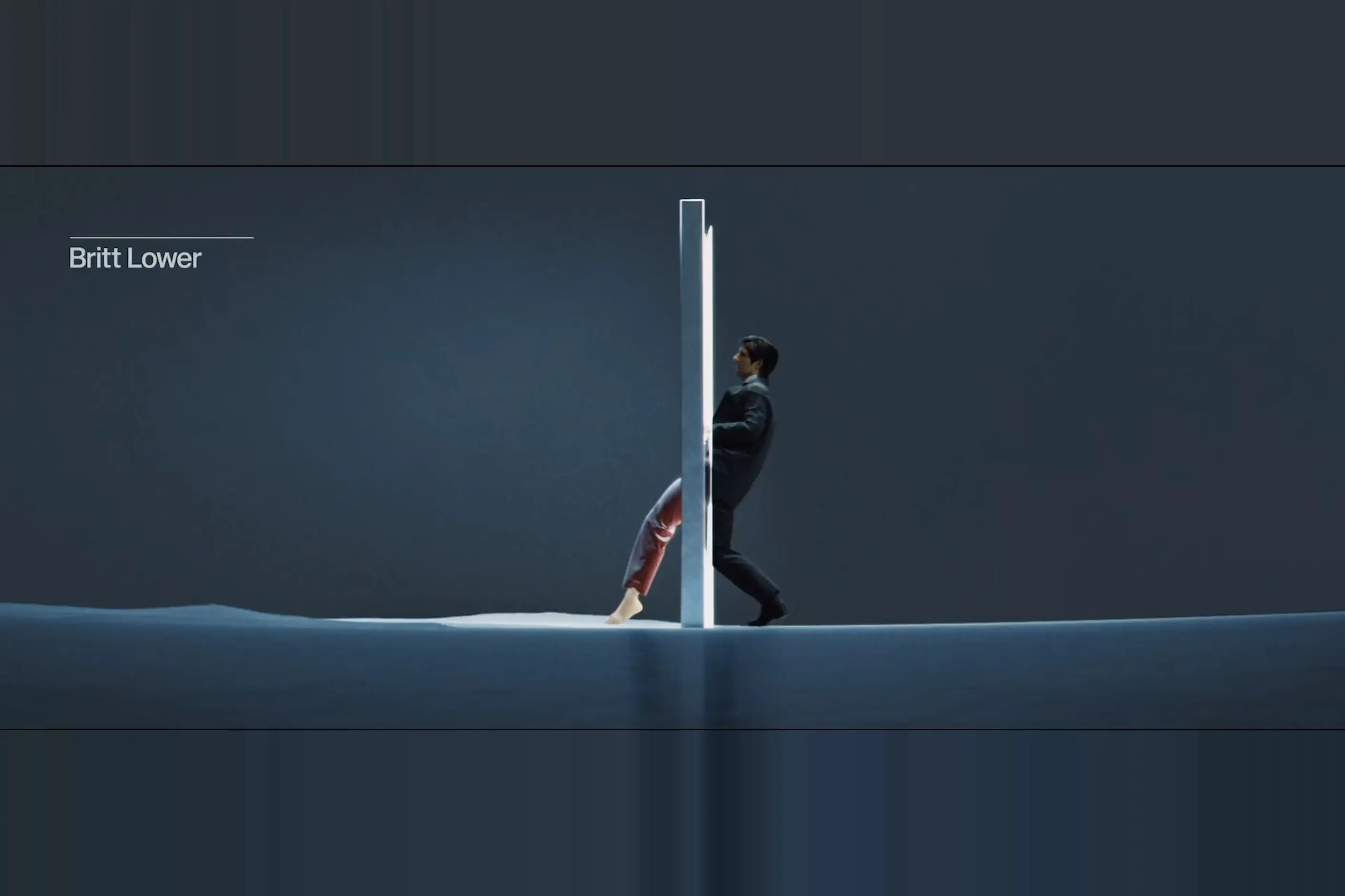
Set a team’s motion direction before delegating motion work, not after. Build a short reference library: the micro-interactions, transitions, and brand films that show what good looks like for this brand, and share it before the first review.
You must define the brand’s spectra: fast to slow, sharp to soft, playful to serious. Write down where this brand sits on each. This is the document a reviewer points to instead of relitigating taste on every piece of work.
You must decide when to specialise. General product designers can handle interface micro-interactions once animation principles have set the baseline. Brand films, data visualisation and broadcast packaging usually need a specialist: the timing intuition and tool efficiency a generalist has not built.
You must justify the cost before commissioning the work. Motion is expensive to produce and expensive to change.
Ask what the movement earns: comprehension, brand recognition, or a genuine functional improvement, and weigh it against the hours a specialist will spend building and revising it. If the honest answer is that it only looks good, do not commission it.
Consider a brand refresh for a retail company moving from discount positioning to premium. The brief calls for an identity that reads as confident and calm rather than urgent. The first motion mockups come back full of fast, springy movement, because that is the only vocabulary the team already has, built for interface work.
The fix is not to redo the animation frame by frame. It is to write the brand’s motion spectra before touching a timeline again: this brand sits at the slow, deliberate end of timing, and the soft, dissolving end of transitions.
The next round of mockups treats that document as the brief, not as a note attached after the work is done.
The same spectra then govern a chart used in the brand’s investor materials: a transition that dissolves rather than snaps, movement slow enough to read as considered. One written signature, reused across a logo reveal, a title sequence and a chart, is what makes a brand feel like one brand in motion.
A motion language specified and never built. The symptom: the brand deck has a motion section, spectra defined, reference examples attached, and no piece of production work matches it.
The cause: the document was written once, presented once, and never turned into a brief for the people building the work. The fix: attach the spectra document to every motion brief, not only to the identity presentation, and review new work against it directly.
Brand motion that contradicts the brand’s pace. The symptom: a brand positioned as calm and premium ships micro-interactions with sharp, energetic easing, because the team building interface motion never saw the brand’s motion signature.
The cause: interface motion and brand motion are usually built by different people, on different timelines, referencing different documents or none at all. The fix: the spectra that define the brand’s pace must reach the interface team too, even though animation principles govern their day-to-day timing and easing choices.
A chart animation that hides its own transition. The symptom: a data visualisation animates on load every time it appears, whether the underlying data changed. or not
The cause: the animation was built as a loading flourish rather than as a representation of change, and nobody asked what the movement was supposed to show. The fix: animate only on a genuine change in the data, and design the transition to make that specific change legible. If nothing changed, do not animate.
Motion approved on a fast laptop. The symptom: motion work signed off in a review room, on capable hardware, plays late, drops frames or stutters on the device most of the audience uses.
The cause: approval happened on the smoothest available machine, on the best available connection, which describes almost nobody’s viewing conditions. The fix: review motion on a mid-range device, on an ordinary connection, before sign-off. A broadcast package or brand film that only works on ideal hardware has not been tested.
Does every product need motion:
No. For interface timing and easing decisions, start with animation principles rather than this page. Motion earns its place when it solves a functional problem, not by default.
How do I brief a motion specialist if I do not animate myself:
Give them the brand’s spectra document and the reference library, not a shot list. A specialist working from a clear signature needs far less back-and-forth than one guessing at taste.
Can I test motion the way I test static design:
Not with the same methods. Motion is hard to isolate in an A/B test. Watch real sessions, review on real devices, and treat qualitative language such as smooth or sluggish as a real signal.
When does data visualisation not need animation:
When a static before-and-after image shows the same change just as clearly, cut the animation.
Who owns the technical implementation of motion tokens:
Design-systems-architecture. This page covers the creative decisions behind a motion signature, not the token structure that carries them into code.
| Fact | Detail |
|---|---|
| Origin | Broadcast and film title design; broadcast idents remain one of the most disciplined production contexts in the craft |
| Systematisation | Google’s Material Design documentation gave interface motion a shared vocabulary of timing tokens and easing curves |
| Practitioner reference | animation-principles covers timing, easing curves and interface motion patterns in detail |
| Common interchange formats | Lottie, JSON-based and exported from After Effects, and Rive, built on interactive state machines, both run across web and mobile |
| Token ownership | Motion tokens and their technical implementation sit with design-systems-architecture, not with this page |

Animation principles are the small set of rules, developed for hand-drawn character animation, that make movement read as caused by weight and intent rather than as an arbitrary jump between two states.
Read it
An interface pattern is a solution to a recurring design problem, refined through enough use elsewhere that the person encountering it doesn’t have to figure out how to use it.
Read it
Information design is the craft of presenting information so it can be read and reasoned about: chart and encoding choice, hierarchy, annotation, and the honest representation of quantity.
Read it
A brand personality vocabulary does not settle an argument about taste; it exposes whose opinion is doing the work.
Read it
Design systems architecture is the set of structural decisions that let a design system keep working as an organisation grows: how tokens layer, how components are organised and configured, and how the code that implements them is housed, built, and shipped.
Read it