
2026-09-15
Nural Choudhury
A brand personality vocabulary does not settle an argument about taste; it exposes whose opinion is doing the work.
Two people can agree a brand is bold and mean opposite things, and no dictionary fixes that by writing a cleverer definition. What the vocabulary buys a team is making the disagreement visible and nameable, rather than letting it dissolve into whoever is most senior in the room.
A review that stalls because two people read the same agreed word, bold say, in opposite senses, and neither can point to a definition to settle it.
Ask which sense of a trait a piece of work expresses, and what the opposite would look like, instead of relitigating whether the word was the right choice.
A short ranked vocabulary, three to five traits, each with a chosen sense, a rejected opposite and a named owner, that a designer can work from without asking permission.
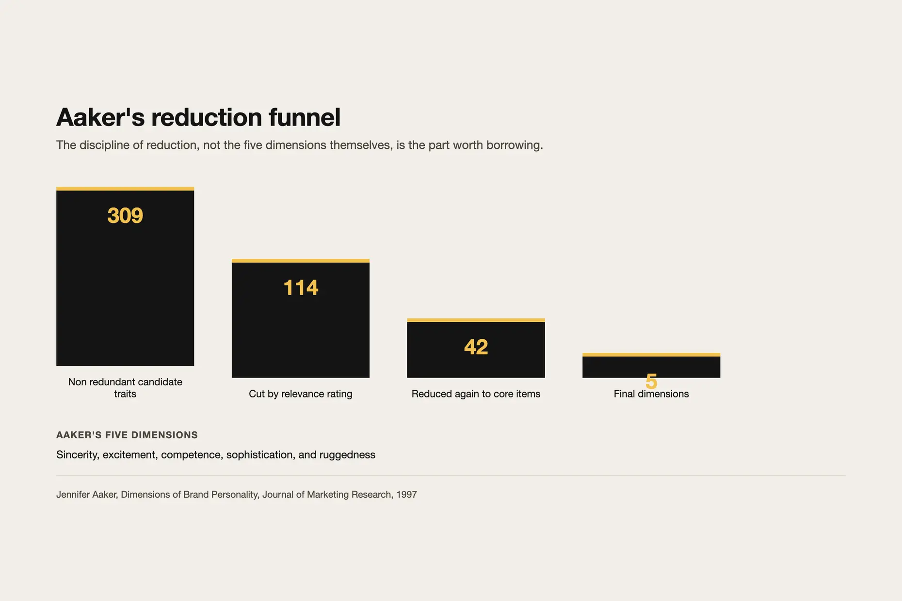
Jennifer Aaker published the academic foundation, “Dimensions of Brand Personality”, in the Journal of Marketing Research in 1997. Her scale reduces to five dimensions, sincerity, excitement, competence, sophistication, and ruggedness, and she reached them by discarding heavily: 309 non-redundant traits, cut to 114 by relevance rating, reduced again to 42 items. That discipline of reduction, not the five dimensions themselves, is the part worth borrowing here.
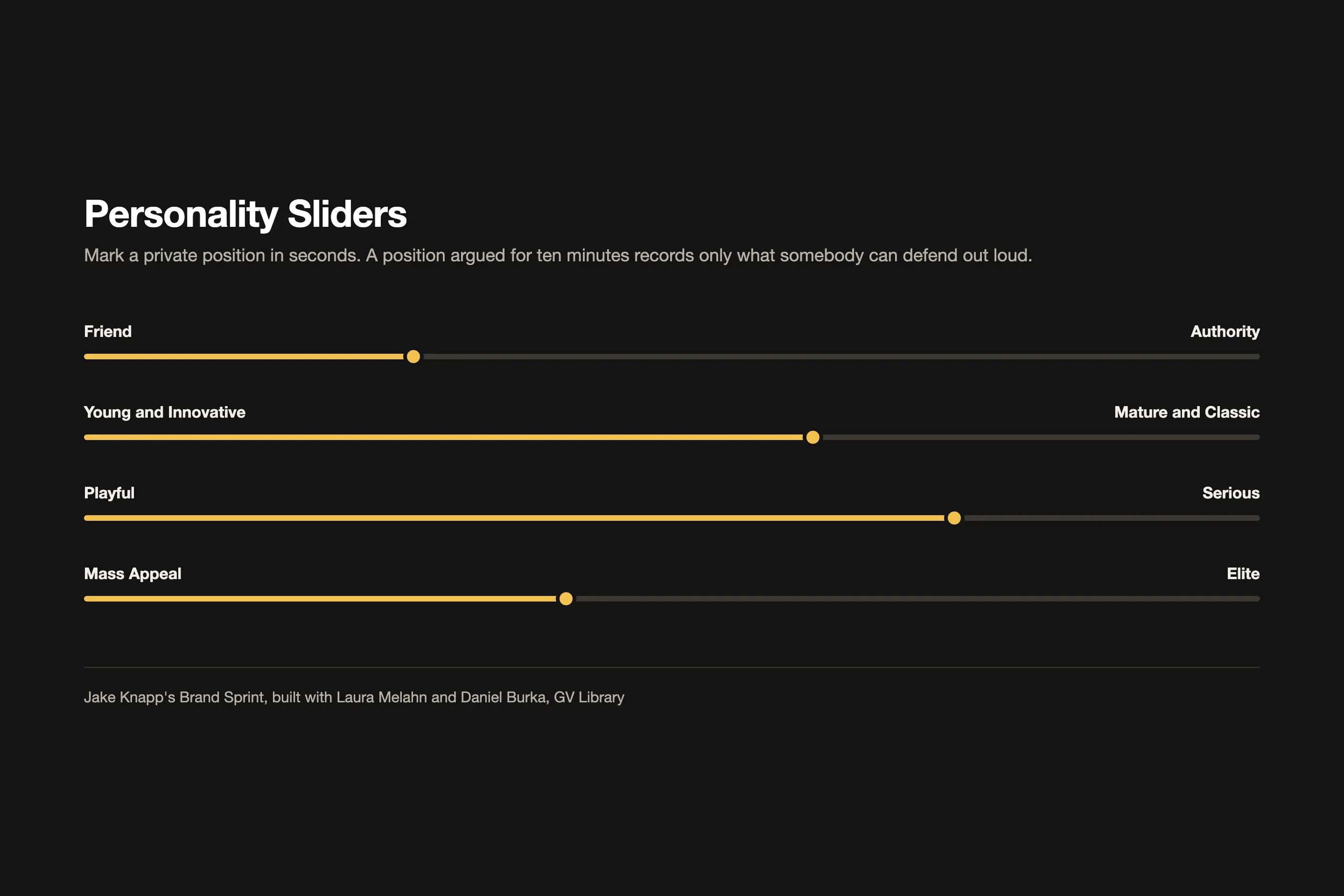
Most workshop formats in practice descend from Jake Knapp’s three-hour Brand Sprint, built with Laura Melahn and Daniel Burka and published in the GV Library. Its Personality Sliders exercise asks people to mark a private position on ranges such as Friend to Authority or Playful to Serious before anyone speaks, on the theory that a position marked in seconds records a belief, and one argued for ten minutes records only what somebody can defend out loud.
The vocabulary on this page inherits Aaker’s discipline and Knapp’s pacing, not their specific instruments. It is a working list built for one exercise, not a validated scale.
Distribute the long list of candidate traits with definitions attached, and require people to read them before they sort, not after. That single sequencing choice removes most of the ambiguity that shows up later.
Sort the traits into three piles: we are, we are not, we are torn. Protect the we-are-not pile specifically, because teams under-populate it, and it carries most of the information in the exercise.
Record each person’s sort before any discussion starts. Cards move once people begin defending them, and the first reading is the data you want.
Vote on the survivors, roughly a quarter as many votes per person as there are options, cast simultaneously so nobody’s vote follows somebody else’s. Discuss only the traits where the sorts disagreed, and ask each side which sense of the word they read.
Rank what survives down to three, with one trait held highest. For every trait you keep, you must be able to name a credible competitor who could claim its opposite and stay in business. If nobody could, drop it: it is a quality standard, not a personality.
Give every trait you keep a sense number, a rejected opposite, and an owner, whether that is visual identity, product behaviour, or editorial voice. A trait without an owner is a slide, not a decision.
I hand over the ranked table, not the workshop that produced it. Once a trait carries a sense number and a rejected opposite, a designer can work from it directly, and I keep only the rank order and the arbitration path for myself, because those are what a team re-litigatesase a deadline approaches.
What I check is not the visual work but the sentence behind it: which sense of the word did you use, and what would the opposite look like? An answer to both in one breath tells me the trait was learned. A pause tells me it was only quoted from the slide.
The conversation that goes wrong is two people defending opposite routes under the same word, bold, with equal conviction, and the room reading it as a taste argument for the most senior person to settle. The question that fixes it is the same one every time: which sense, and what would the opposite look like? It turns a fight about whose taste is better into a question about which definition was intended, and that question does not need me in the room to answer.
I know a team has it once somebody cites a sense number in a review without my prompting, or rejects a route by naming what the trait forbids rather than saying it feels off. That’s why I stop sitting in on reviews.

The table below keeps 33 of the master list’s 39 traits. Six read as near-synonyms of another entry already here, or too narrow to travel outside one culture, so they are cut: certain and realistic overlap practical, formal overlaps reserved and exclusive, preppy does not travel outside one culture’s schooling system, simple overlaps effortless, and smart’s seven senses span clever, dynamic, and sophisticated without adding one of its own.
| Trait | What it means | What it looks like in practice | Often confused with |
|---|---|---|---|
| Adventurous | Willing to break the team’s own conventions and try new methods | Overruns the grid at least once per journey, a saturated accent against a desaturated base, motion with slight overshoot | Reckless, which ships nothing coherent at all |
| Clever | Shows inventiveness rather than showing off | One deliberate typographic idea per surface, wit placed in an empty state rather than a headline | Witty, which is the humour itself rather than the ingenuity behind it |
| Creative | Produces work of genuine originality rather than a template filled in | Original pairings rather than stock illustration, copy that reframes a category cliché | Experimental, which signals the work might not hold up yet |
| Curious | Eager to learn, drawn to what has not been explained | Editorial content that asks a question rather than closing it, exploratory navigation | Adventurous, which is about risk rather than attention |
| Dynamic | Vigorously active and energetic | Fast transitions, kinetic type, imagery caught mid-action rather than posed | Futuristic, which is about time rather than energy |
| Effortless | Removes decisions from the user rather than adding polish for its own sake | One family, two weights, defaults pre-filled, no bounce in the motion | Practical, which is about function rather than the user’s workload |
| Emotional | Appeals to feeling openly rather than reasoning someone into a position | Copy that names how someone feels, imagery of unguarded expression | Sincere, which is about honesty rather than expressiveness |
| Everyday | Ordinary, for daily use rather than a special occasion | Plain language, functional imagery, no aspirational styling | Humble, which is a stance rather than a register |
| Exclusive | Restricted to a few, high-class and expensive | Invitation-only access patterns, generous white space, limited-run language | Sophisticated, which is about taste rather than access |
| Experimental | Tentative, functioning as a test rather than a finished claim | Beta labelling, a visible version number, copy that invites correction | Creative, which does not signal it might not work |
| Futuristic | Ahead of the times, rejecting traditional forms | Variable type pushed to an extreme, speculative interface patterns | Dynamic, which is about energy rather than time |
| Humble | A modest, low estimate of one’s own importance | Understated claims, customer voice ahead of brand voice, no superlatives | Everyday, which is a register rather than a stance |
| Industrial | Harsh and uncompromising, in an aesthetic sense | Condensed grotesque type, monospaced labels, all-caps at small sizes | Rugged, which is weathered rather than mechanical |
| Mysterious | Deliberately withholds explanation | Copy that reveals in stages, motion that obscures before it shows | Reserved, which withholds without inviting curiosity |
| Nostalgic | A wistful yearning for a former time | Period-accurate type and colour references, archival imagery | Timeless, which refuses a period rather than choosing one |
| Optimistic | Expects and reflects a favourable outcome | Bright, high-key colour, copy that states an outcome rather than a caveat | Sincere, which is about honesty rather than disposition |
| Organic | Elements that fit together as parts of a natural whole | Irregular or generative forms, palettes drawn from a natural source | Raw, which implies unprocessed roughness rather than harmony |
| Polished | Refined and flawless in execution | Consistent grid discipline, considered micro-interaction, no visible seams | Sophisticated, which is about the audience rather than the execution |
| Practical | Concerned with actual use over theory | Copy led with the task, no decorative interface, defaults that reflect the common case | Effortless, which is about the user’s workload rather than function |
| Professional | Worthy of a profession, competent and assured | Consistent, restrained styling, no informal tone in a critical flow | Often claimed by everyone. Test it against the opposite before you keep it |
| Progressive | Favours reform and new ideas, develops in stages | Copy that takes a position on a live debate, a visible product roadmap | Futuristic, which is about aesthetic rather than values |
| Raw | In its natural, unprocessed state and undisguised | Visible grain, hard directional light, copy that keeps the rough edit | Rugged, which is weathered by use rather than unprocessed |
| Relatable | Lets someone feel they can relate to it | Copy in the reader’s own words, ordinary settings, customer stories over case studies | Everyday, which is about occasion rather than identification |
| Reserved | Slow to reveal emotion or opinion | Restrained copy, generous white space, colour used sparingly | Humble, which understates rather than withholds |
| Rigorous | Severely exact and precise | Data labelled with method and margin of error, no rounded claims | Scientific, which is a domain rather than a standard |
| Rugged | A roughly broken surface, or furrowed by hardship | Visible wear, hard-wearing materials in imagery, no soft shadows | Industrial, which is mechanical rather than weathered |
| Scientific | Conforms to the principles of exact science | Method stated beside a claim, uncertainty shown beside a figure | Rigorous, which is the standard rather than the domain |
| Sincere | Free from pretence, proceeding from genuine feeling | A consistent first-person voice, no stock photography of actors | Humble, which is about self-regard rather than honesty |
| Sophisticated | Worldly-wise, pleasing to educated and cultured taste | A restrained palette, considered typographic detail, no exclamation marks | Exclusive, which is an access signal rather than a taste signal |
| Technical | Belongs to a field, skilled in its practical use | Terminology used correctly, diagrams in place of metaphor | Scientific, which is a method rather than a trade skill |
| Timeless | Without a particular period, refuses to date | Type with no era-specific reference, colour that will not look dated in five years | Nostalgic, which chooses a period rather than refusing one |
| Wise | Shows sound judgement built on experience | Copy that counsels rather than sells, a point of view earned over time | Rigorous, which is precision rather than judgement |
| Witty | Amusingly clever in speech or writing | Copy with a visible sense of humour, a headline that rewards a second read | Clever, which is the ingenuity itself rather than the humour |
The most common failure is a vocabulary that describes whoever is most senior in the room. Bold, ambitious, and visionary arrive attached to a self-image rather than a market position, and they resist challenge because disagreeing with the trait reads as disagreeing with the person. The sharper test is asking what the audience would notice at all: a trait nobody outside the room would notice is a portrait, not a personality.
The second failure is a trait so broad it excludes nothing. Professional, trusted, and innovative fail the opposite test outright, since no competitor claims the reverse, and a vocabulary that cannot reject a design is decoration rather than direction. These belong in a quality standard, not a personality list.
The third failure is a vocabulary that never leaves the room where it was agreed. I have watched a ranked, sensed trait list sit in a slide deck while the copy shipped from whoever was fastest that week, because nobody put the sense and the forbidden move where a copywriter or a developer would see them day to day. A vocabulary that lives only in a workshop file has already failed, whatever it says.
How many traits should a vocabulary keep:
Three, ranked, with one at the top. Twenty traits let a team accept anything as on brand, which means nothing is off brand, and a vocabulary that cannot reject a design has stopped doing its job.
What is the fastest way to test whether a trait is worth keeping:
Ask whether a credible competitor could claim its opposite and stay in business. If nobody could, the trait is a quality standard (such as professional or trusted), not a personality trait, and it belongs somewhere else.
Does the vocabulary need to be built from Aaker’s five dimensions:
No. Aaker’s paper is where the discipline of reducing a long list to a working set comes from, not a scale a brand has to be scored against. A vocabulary built for one exercise, kept to a handful of sensed and ranked traits, does the job either way.
What happens when two people read the same trait in opposite senses:
Ask which numbered sense each person read and what the opposite of that sense would look like. That question is answerable and delegable, unlike whose taste in bold is better, which only the most senior person in the room can settle.
| Fact | Detail |
|---|---|
| Originating research | Jennifer Aaker, “Dimensions of Brand Personality,” Journal of Marketing Research, 1997, volume 34, pages 347 to 356 |
| Aaker’s five dimensions | Sincerity, excitement, competence, sophistication, and ruggedness |
| Aaker’s reduction funnel | 309 non-redundant traits, cut to 114 by relevance rating, reduced again to 42 items |
| Common workshop format | Jake Knapp’s three-hour Brand Sprint, built with Laura Melahn and Daniel Burka, published in the GV Library |
| Personality Sliders ranges | Friend to Authority, Young and Innovative to Mature and Classic, Playful to Serious, Mass Appeal to Elite |
| Recommended trait count | Three, ranked, with one held highest |
| This vocabulary | 33 defined traits, reduced from a master list of 39 |

Brand architecture is a naming decision, not a diagram to produce.
Read it
A brand sprint is a time-boxed workshop that compresses brand strategy, verbal identity, and visual identity development into one structured engagement with a fixed team and a fixed calendar.
Read it
A team isn’t misaligned because it lacks a vision; it is misaligned because the cadence that surfaces disagreement before it hardens doesn’t exist.
Read it
Design documentation earns its keep when it removes a decision from a developer’s inbox, not when it is complete.
Read it
A content audit is a catalogue of every piece of content you own, scored against what it is supposed to do, so you can decide what to keep, fix, merge or kill.
Read it