
2026-09-15
Nural Choudhury
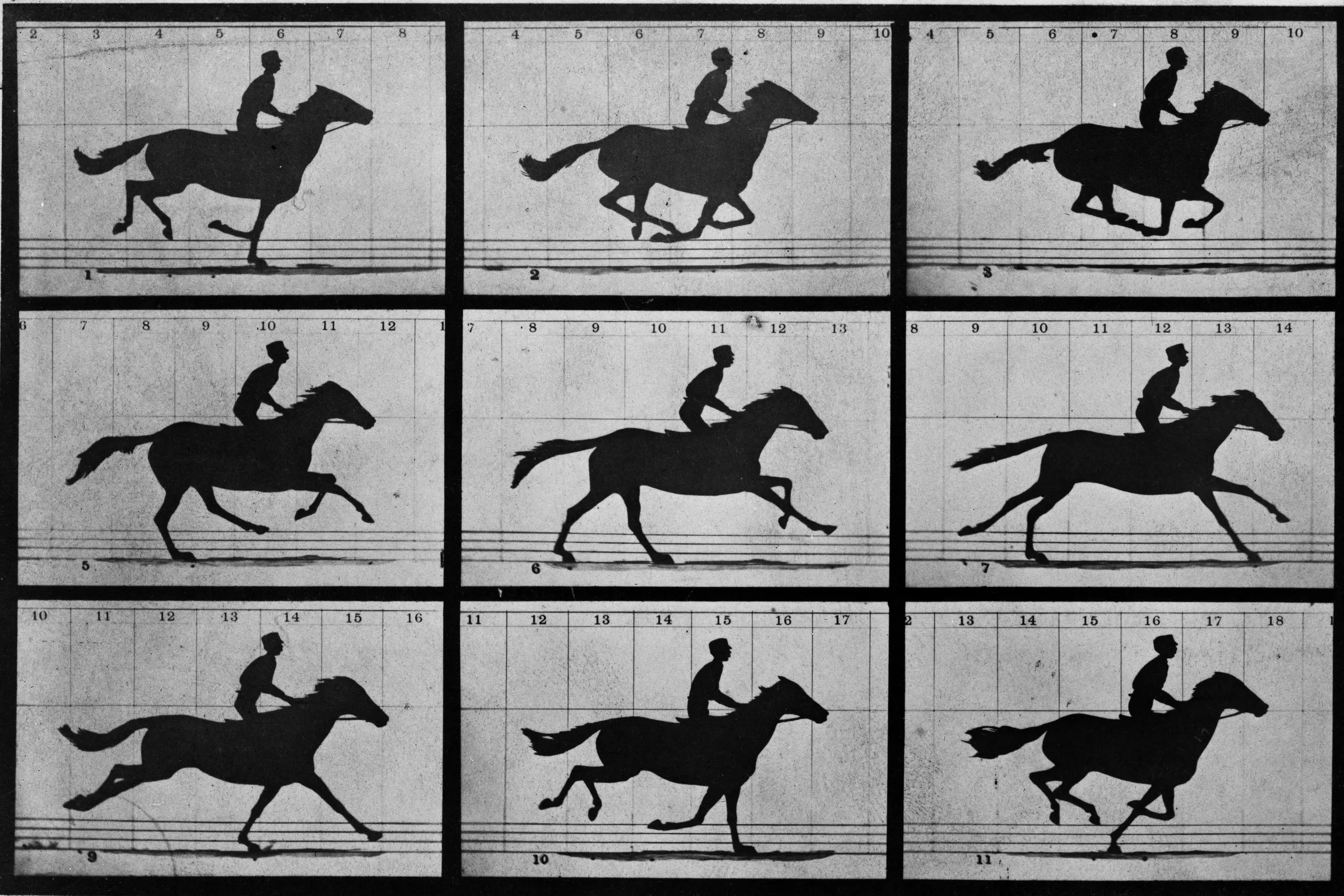
Animation principles are the small set of rules, developed for hand-drawn character animation, that make movement read as caused by weight and intent rather than as an arbitrary jump between two states.
This page references that vocabulary: the twelve classic principles, easing and duration, and the interface motion patterns built from them. Its sibling page, Motion graphics, covers motion as a design material across branding, data visualisation, and broadcast; this page stays inside product interfaces and the systems that hold them.
interface motion that reads as intentional. State changes explain themselves, and users trust that the system responded rather than stalled.
product interfaces, component libraries, and the design systems that hold them, wherever an element enters, exits, or changes state.
duration and easing chosen for the distance and weight of the thing moving, not copied from a showcase reel. Get this wrong, and every other refinement sits on a shaky base.
The twelve principles come from Walt Disney Studios animators working through the 1930s. Two of them, Ollie Johnston and Frank Thomas, formalised the set in their 1981 book, The Illusion of Life: Disney Animation. The book was written for hand-drawn character work, decades before a screen could animate anything on its own.
Most motion designers I know would agree the principles migrated cleanly into games, three-dimensional animation, and interfaces because the underlying problem never changed: moving is read as caused by mass and intent, not as a value ticking from zero to one.
Each principle solves a different part of that problem. A handful carry directly into interface work; the rest still shape how a designer thinks about weight and timing, even when they don’t translate literally.
| Principle | What it does |
|---|---|
| Squash and stretch | Deforms an object on impact or acceleration, to show mass while conserving its volume |
| Anticipation | A small wind-up before the main move, so the viewer is primed for it |
| Staging | Composes the frame so the one idea that matters reads without competition |
| Straight ahead vs pose to pose | Animates frame by frame for organic chaos, or from key poses and in-betweens for control. Interface work is almost always pose to pose |
| Follow-through and overlapping action | Loose parts keep moving and settle after the main mass has stopped |
| Slow in and slow out | Objects accelerate and decelerate rather than starting or stopping instantly. This is easing, the base of everything in the next section |
| Arcs | Natural motion follows a curved path, not a straight line |
| Secondary action | A supporting motion that enriches the primary move without competing with it |
| Timing | The number of frames given to an action, which sets its weight, speed, and emotional read |
| Exaggeration | Pushes a pose or a timing past literal reality, for clarity and energy |
| Solid drawing | Real weight, volume, and balance, so a pose reads even as a silhouette |
| Appeal | The charisma that makes a design and its motion satisfying to watch, not just correct |
Two questions decide most interface animations: how should it accelerate, and how long should it take? Neither has a single right answer, but each has a default and a reason to leave it.
| Easing type | Curve | What it suits |
|---|---|---|
| Linear | Constant speed throughout | Continuous loops only, such as spinners and marquees |
| Ease-out | Fast start, gentle stop | Entries. The default for most UI motion |
| Ease-in | Slow start, fast finish | Exits and dismissals |
| Ease-in-out | Eased at both ends | On-screen state changes, such as toggles and progress |
| Spring, critically damped | Snaps to rest with no overshoot | Decisive state changes and focus moves |
| Spring, underdamped | Overshoots the target, then settles | Playful entrances and pop-ins |
| Spring, overdamped | A slow crawl with no bounce | Heavy or premium-feeling fades |
Spring easing works from mass, stiffness, and damping rather than a fixed duration, and it is the only style that stays natural when interrupted mid-motion. A fixed-duration curve has to restart from the beginning; a spring can retarget from wherever it currently sits.
| Duration band | What it is for | Range |
|---|---|---|
| Instant | Micro-feedback: a button depress, a toggle flip | 100 to 150 milliseconds |
| Standard | Most interface transitions: menus, cards, and dropdowns | 200 to 300 milliseconds |
| Deliberate | Larger or spatial moves: modals and page transitions | 400 to 500 milliseconds |
| Slow | Scene-level or narrative motion, rare inside a working interface | 700 milliseconds and above |
Pick the band from how far the element travels and how large it is on screen, never from a number that looked right somewhere else. A small toggle at 500 milliseconds feels stuck; a full-screen modal at 100 feels like a glitch.
These are the shapes duration and easing get poured into on a product screen.
| Pattern | What it does |
|---|---|
| Enter and exit | An element animates as it is added to, or removed from, the visible screen |
| Feedback | Confirms that an input landed, such as a button depress, a ripple, or a toggle flip |
| Guidance | Directs attention or teaches, such as an onboarding nudge or an empty-state hint |
| Delight | A personality moment, used sparingly, such as a playful bounce on success |
| Stagger | Offsets the start of many elements so a list cascades in rather than snapping in together |
| Shared-element transition | One element persists and morphs between two states, such as a card expanding into a detail view |
| Scroll or gesture driven | Motion tied to scroll position, drag distance, or velocity, rather than to a timer |
Every pattern in that table is built on transform and opacity, the two properties a browser or a native renderer can animate on the compositor rather than the main thread. Animate anything else, such as width or top, and the risk is jank: a dropped frame whenever the layout has to be recalculated mid-animation. At 60 frames per second, that budget is 16.7 milliseconds; at 120 frames per second, it is half that.
Choose duration based on the distance and weight of what is moving, not on a value that looked right in someone else’s product.
Default to ease-out on anything entering the screen and ease-in on anything leaving it. Reserve linear easing for continuous loops only.
Animate transform and opacity. Where a design calls for a change in width or height, use a scale transform and let the content reflow inside it, so the layout is never recalculated mid-animation.
Give every animation a purpose test: state the problem it solves in one sentence. If the only honest answer is that it looks good, cut it, or move the idea to Motion graphics, where a decorative motion moment has a home.
Agree on a shared motion vocabulary before a review starts, not during it. Fast, snappy, and too slow mean nothing until the team maps them to real numbers.
Watch a review in context and on repeat. A flaw invisible on a single pass surfaces the second or third time through, and it rarely surfaces at all when the clip is judged in isolation from the surrounding interface.
Take a modal opening over a full interface. The trigger button anticipates the tap first: a four per cent scale down over eighty milliseconds, principle six from the table above, made concrete. The backdrop fades in on ease-in-out across two hundred milliseconds. At the same time, the modal enters on ease-out, scaling up from ninety-six per cent to full size over two hundred and fifty milliseconds, comfortably inside the standard duration band.
Nothing about the width or position of the surrounding content changes, so only transform and opacity do the work, and the frame budget holds. Close the modal and every value reverses rather than restarts, so a second tap on the trigger while the modal is still closing retargets the animation instead of queuing behind it.
The mistake I see most often, and have made myself, is copying a duration from a showcase rather than choosing it for the distance travelled. A value that felt right on a hero image looks sluggish on a four-pixel toggle nudge, because nothing scaled the timing to the size of the move.
Easing spent on opacity earns less than easing spent on position or scale, because a fade has no direction to accelerate along. A heavy spring curve applied to opacity alone does more work in the code than it does on screen. Save the elaborate curves for anything that travels or resizes.
Uninterruptible motion is the next most common fault. If a user taps the trigger again while the first animation is still running, the interface must retarget, not queue a second identical animation behind the first.
prefers-reduced-motion left unhandled is the one I treat as non-negotiable, not a style choice. A user who has told their operating system to limit motion is stating a vestibular safety requirement, not a preference. This is a conformance matter, and Accessibility standards own the testing and the legal deadlines around it. What belongs here is only the obligation: every animation this page describes needs a reduced or no-motion path.
Should I use a spring or a fixed-duration curve? Use a spring wherever the motion might be interrupted, such as a drag or a repeated tap, because it can retarget from its current position. Use a fixed duration where the motion always plays from start to finish, such as a one-off dismissal.
How long should an animation run? Start from the duration table above and adjust for the size of the move. A full-screen transition earns more time than a small state change, never the reverse.
Does every state change need motion? No. Run the purpose test first. If the animation does not explain a change or confirm an input, the state change is clearer without it.
What handles accessibility? The obligation to provide a reduced-motion mode described above in Accessibility standards.
Which principle matters most for interface work? Slow in and slow out, principle six. Almost every other principle on this page refines that idea: nothing starts or stops instantly.
| Fact | Detail |
|---|---|
| Origin | Ollie Johnston and Frank Thomas, The Illusion of Life: Disney Animation, 1981; formalised from 1930s Walt Disney Studios practice |
| Frame budget | 60 frames per second gives roughly 16.7 milliseconds per frame; 120 frames per second gives roughly 8.3 milliseconds |
| Compositor-safe properties | Transform and opacity animate without triggering a layout recalculation; most other CSS properties do trigger one |
| Reduced motion | prefers-reduced-motion is an operating-system-level signal a user sets; conformance testing sits with Accessibility standards |
Motion graphics is design that treats time as a material, alongside space, colour, and type.
Read it
Digital accessibility is the practice of building products people can use, whatever their permanent, temporary, or situational disability, measured against a published standard rather than opinion.
Read it
A design system is a governed set of reusable components, patterns and rules that a team uses to build consistent digital products at scale, and it is neither a static style guide nor a component library on its own.
Read it
An interface pattern is a solution to a recurring design problem, refined through enough use elsewhere that the person encountering it doesn’t have to figure out how to use it.
Read it