

2026-09-15
Nural Choudhury
Choosing a product metric is a design decision, not an analytics task, because the metric you pick decides the behaviour a team produces.
Hand that choice to whoever owns the dashboard, and you inherit their definition of success, blind spots included. A design leader who cannot defend the population and the window behind a number is arguing from someone else’s assumptions.
The argument where marketing quotes one retention number and product quotes another and both are correct, because nobody agreed on the population and the window before either side ran the query.
Choose or defend a metric in the room where it becomes a target, rather than discovering afterwards that the number the team optimised for made the product worse.
A short table of the metrics worth using, what each one hides, and what it makes a team do, plus the habit of asking for the population and the window before trusting any figure handed to you.
No single person invented product measurement, but several named contributions still shape how teams choose what to track.
Sean Ellis, who worked on growth at Dropbox, LogMeIn and Eventbrite, coined the term North Star metric: the single measure that best captures the core value a product delivers. John Cutler’s later test on the framework is the useful part: if a team can move its North Star directly, without improving the product underneath it, the metric is wrong.
Dave McClure, formerly of PayPal and later 500 Startups, gave a 2007 Ignite Seattle talk, Startup Metrics for Pirates, built on the mnemonic AARRR: acquisition, activation, retention, referral, revenue. It forces a funnel view, so a team obsessing over acquisition while activation leaks is pouring water into a hole bucket.
Kerry Rodden, Hilary Hutchinson and Xin Fu published the HEART framework at ACM CHI in 2010, in Measuring the User Experience on a Large Scale: Happiness, Engagement, Adoption, Retention and Task Success. The paper is explicit that a team should pick only the categories mapping to its goal, not track all five.
Charles Goodhart, writing on UK monetary policy in 1975, is the source of the law that carries his name: any observed statistical regularity tends to collapse once pressure is placed on it for control purposes. The phrasing most teams quote, “when a measure becomes a target, it ceases to be a good measure,” came from the anthropologist Marilyn Strathern in 1997.

You must name the population before you look at a number. State whether a user means a device, an account, a logged-in identity, a household or a paying seat, and exclude staff, test traffic and bots from every count.
You must fix the window to the product’s rhythm, not to whatever is convenient for the report. Messaging products run on a daily rhythm, payroll on a monthly one, tax filing on an annual one, and a window borrowed from a different rhythm will always look wrong.
Write the population and the window next to the metric, not just the number. A retention figure without both is not comparable to anyone else’s retention figure, including your own from last quarter.
You must pick one output metric per initiative and pair it with guardrail metrics that are not the goal but must not degrade. Kohavi, Tang, and Xu, in Trustworthy Online Controlled Experiments (2020), call the combined view the Overall Evaluation Criterion: a composite that favours long-term outcomes over short-term clicks. Apply Cutler’s test to any candidate North Star before adopting it. If the team can move the number directly without changing the product, reject the metric and choose another.
You must version the metric definition the way you version code. Renaming an event, adding a filter, or upgrading an SDK produces a step change that looks like a real shift unless you log the definition change against it.

I hand over the choice of population and window once someone on the team can defend both without me in the room. What I keep is the veto over which metric becomes a target for the wider team, because that decision sets what everyone downstream will optimise for, and I would rather be the one who has to answer for it.
I check in with one question rather than a review meeting: if this number doubled tomorrow, what would we do differently? If the answer is nothing, the metric is decorative,e and I say so before it goes on a dashboard.
The conversation that goes wrong is a report arriving with a number and no definition attached. I do not argue with the number. I ask who is in the denominator, and most of the time that question is the whole conversation, because the number was never wrong; it was just answering a question nobody had agreed to ask.
I know someone has got it when they bring me the population and the window before I ask for them, and when they flag a metric that is rising for the wrong reason without being prompted. At that point I stop checking their numbers and start reading their conclusions instead.

Marketing reports 40 per cent retention. Product reports 12 per cent. Neither team is lying.
Marketing counts anyone who reopened the app within thirty days of installing it, against everyone who installed it in that window. Product counts only the people who returned on exactly day thirty, against a cohort fixed at the start of the month. Same product, same rough time period, two different populations and two different windows, and both numbers answer different questions correctly.
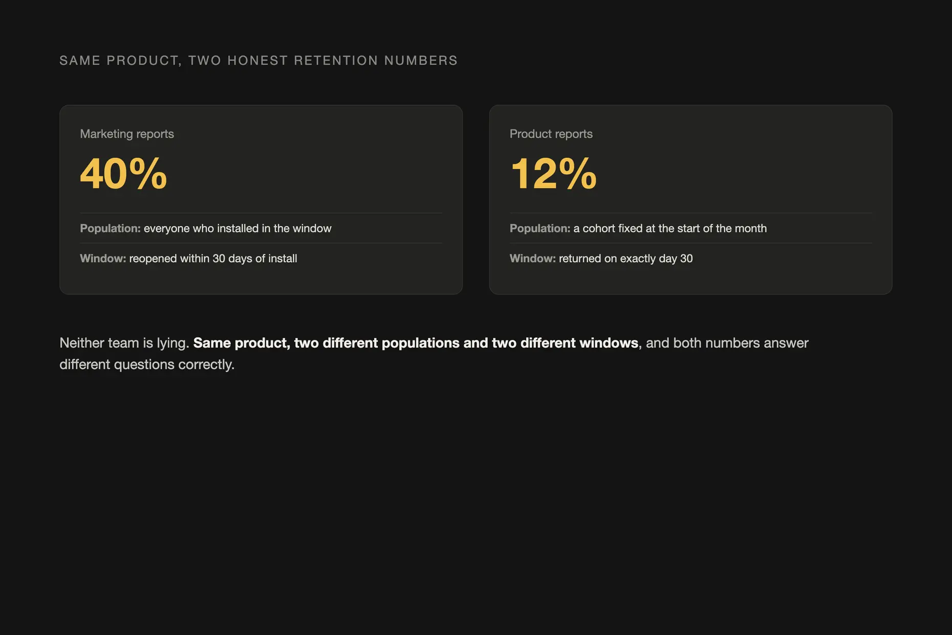
Putting both definitions on one slide ends the argument in a way that arguing about the number never will. The question moves from “whose number is right” to “which question needs answering”, and for a design decision about onboarding, the day-thirty figure is usually the one that matters, because it describes durable use rather than a habit that has not yet formed.
The metric moves while the experience gets worse. A button made impossible to miss will inflate clicks while it buries the content underneath it. Treat every metric as a proxy for the experience, never as the experience itself, and keep a second metric in view, usually satisfaction or task completion, alongside whichever number is the headline.
Vanity metrics that only ever rise. Cumulative downloads, registered accounts and page views can only go up, and no decision depends on any of them. Apply Ellis’s doubling test out loud: if this number doubled, what would the team do differently? If nobody can answer, replace it.
Survivorship bias in a retention number. A retention figure, by construction, only describes people who are still using the product. Everyone who found it unusable has already left and is absent from the denominator, so a dashboard built only from active users has underweighted exactly the failure it should be catching. Cross-reference usage data with churned-user interviews and exit surveys, not only the users the dashboard can show you.
The dashboard nobody has ever decided from. Most dashboards fail because they were built by adding, never by removing. A number with no comparison, no sample size and no owner accountable for acting on it earns a place on a screen but never earns a decision, and it is worth cutting rather than maintaining.
Fewer than the analytics tool offers. One output metric per initiative, its guardrails, and nothing that fails the doubling test: if it doubled, would anyone in the room do anything differently.
How do I stop a team from gaming the metric I gave them? Pair it with a guardrail metric that must not degrade, and check the guardrail as often as the target. A number that rises while its guardrail falls is gamed, not a result.
Is NPS worth keeping at all? Only alongside a second, accounting-based measure. Reichheld’s own 2021 correction introduced earned growth rate precisely because a single survey score had become easy to manipulate.
Ask what decision was last made because that number moved. If nobody can name one, it is decoration, not measurement.
Do I need an analyst to run this well? No. The discipline is naming the population and the window before you trust a number, which is a leadership habit, not a technical skill.
| Metric | What it measures | What it misses, and what it makes a team do |
|---|---|---|
| Retention | Whether the same cohort keeps returning, over a chosen window | The population (device, account, identity) and window (N-day, rolling, bracket) are rarely stated, so two true figures for the same product can disagree by a wide margin. Makes a team chase win-back tactics without knowing which one moved the number |
| Churn | The share of customers lost in a period, against a stated base | The standard definition divides losses by customers held at the start of the period, not by customers acquired during it, and swapping the denominator can make the same loss look far worse or far better. Makes a team spread retention spend evenly when the real losses are concentrated in a few large accounts |
| Daily active users | Unique people who open the product in a day | “Active” is a definition choice, and teams under pressure widen it rather than growing the base of real users. Makes a rising DAU read as good news even when only the definition moved |
| Lifetime value | Revenue expected from an average customer across their time with you | This is revenue, not profit, and money years away is worth less than money today. Makes a team extend the assumed customer lifetime, the easiest way to inflate the figure |
| Return on investment | The return on an investment against its stated cost | Outside variables move gains too, and only a held-out control group can isolate one campaign’s effect. Makes a team attribute a lift to whichever campaign shipped most recently |
| Net Promoter Score | Self-reported likelihood to recommend, promoters minus detractors | Reichheld, with Darnell and Burns, conceded in Net Promoter 3.0, Harvard Business Review, November 2021, that the score had been gamed and misused, and introduced earned growth rate as an accounting-based complement. Makes a team chase one survey score that response bias already skews |
| Fact | Detail |
|---|---|
| North Star metric | Coined by Sean Ellis, formalised into the North Star Framework by John Cutler and Amplitude |
| AARRR framework | Dave McClure, Startup Metrics for Pirates, Ignite Seattle, 2007 |
| HEART framework | Kerry Rodden, Hilary Hutchinson and Xin Fu, Measuring the User Experience on a Large Scale, ACM CHI, 2010 |
| Goodhart’s law | Charles Goodhart, 1975, on UK monetary policy; the common phrasing is Marilyn Strathern’s, 1997 |
| NPS correction | Fred Reichheld, Darnell and Burns, Net Promoter 3.0, Harvard Business Review, November 2021 |

Data analysis for design is the practice of testing decisions against measured evidence, usage data, and controlled experiments, rather than defending them by opinion alone.
Read it
A team isn’t misaligned because it lacks a vision; it is misaligned because the cadence that surfaces disagreement before it hardens doesn’t exist.
Read it
User research is the systematic study of what users do, need and struggle with, combining qualitative depth with quantitative scale to ground design in evidence.
Read it
Task analysis is the systematic study of how people currently perform a task, breaking it down into the steps, decisions and knowledge each one requires.
Read it