
2026-09-15
Nural Choudhury
A design system is a governed set of reusable components, patterns and rules that a team uses to build consistent digital products at scale, and it is neither a static style guide nor a component library on its own.
This page covers designing, building and governing a design system from first principles through to scale, with Atomic Design as the organising model. Design systems architecture covers the technical infrastructure that carries it: token hierarchies, component APIs, repository strategy, and distribution.
a shared vocabulary and a governed set of components that let more than one team ship consistent products without renegotiating the basics on every project, and a defensible answer for why a screen looks the way it does.
any organisation building more than one digital product, or building one product at a scale where a single designer can no longer hold every screen in their head.
adoption. A system nobody uses is a portfolio piece. Build it with the teams who will use it, not for them, and make the approved path faster than the alternative before you ask anyone to switch.
Design guidance moved through four stages as digital products multiplied. Printed brand guidelines defined colour, typography, and logo use for a single medium. Digital style guides moved that guidance online but stayed disconnected from the code that shipped.
Component libraries came next, collecting reusable interface elements without the governance to keep them current. The design system, as the term is used now, combines components, documentation, governance, and tooling into one maintained whole.
Brad Frost formalised the method most design systems now use to organise that whole in 2013, naming it Atomic Design. His starting observation was that design conversations happened at the wrong level of granularity: teams discussed whole pages when the working units were far smaller. He borrowed the vocabulary from chemistry, where atoms combine into molecules and molecules into organisms, with each level holding properties the level below it does not.
The token, the other concept this page owns, has a separate origin. Jina Anne coined the term design token in 2014 while working on the Salesforce Lightning Design System, naming the practice of storing a single design decision as one referenced value rather than repeating it inline.
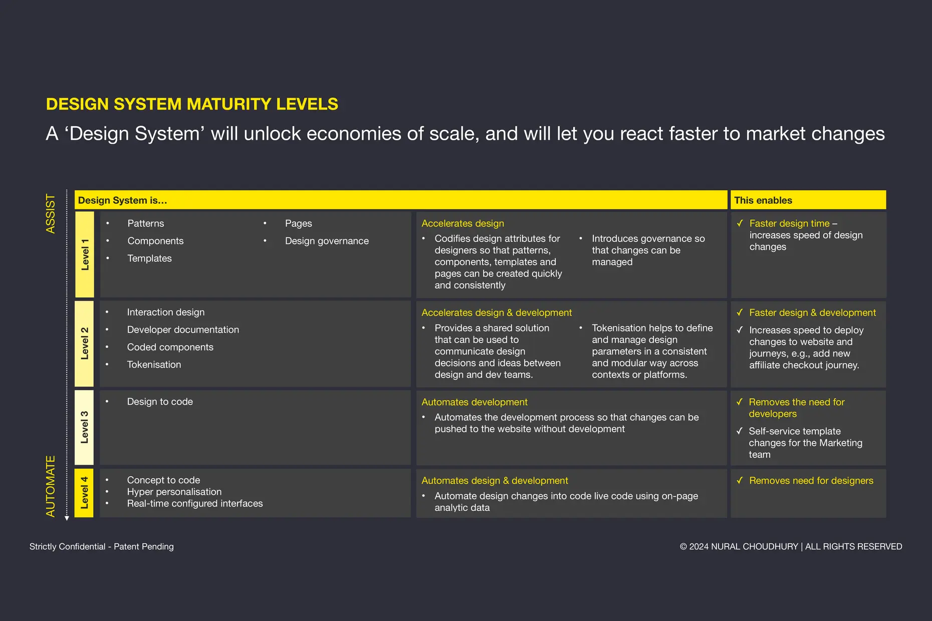
A design system is not a component library. A component library is the set of parts: buttons, inputs, cards. A design system includes the parts plus the standards that govern how each is built, when it is used, and who decides what changes; these standards make the parts trustworthy when more than one team uses them.
Used well, a design system produces four kinds of consistency.
| Consistency | What it means |
|---|---|
| Visual | Every element looks like it belongs to the same family, so users build familiarity as they move through a product |
| Functional | Interactions behave the same way everywhere a user meets them, so a pattern learned once applies throughout |
| Internal | Teams across the organisation build from the same foundation instead of duplicating and diverging |
| External | Brand expression holds across platforms, devices, and touchpoints, so the app and the website read as one thing |
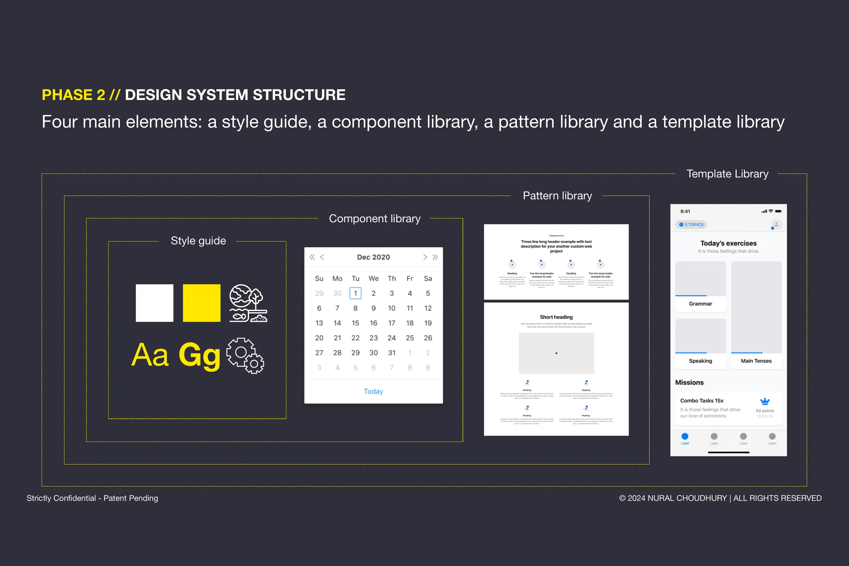
Atomic Design gives a design system a shared vocabulary for talking about interface construction at the right level of granularity, borrowed from chemistry’s move from elements to compounds to organisms.
| Stage | What it is | Example |
|---|---|---|
| Atoms | The smallest building blocks, meaningless on their own | A colour value, a type style, and an input in isolation |
| Molecules | A small group of atoms functioning together as one unit | A search field: an input, a label, and a button combined |
| Organisms | Complex components built from molecules and atoms | A page header, a navigation bar, and a card grid |
| Templates | Page-level structure with organisms placed, and no real content yet | A dashboard layout, a listing page structure |
| Pages | Templates filled with real content and data | The homepage a user loads, edge cases included |
The methodology holds because it matches how modern frontend frameworks are built. React, Vue, and Angular all assemble interfaces from components, so a design vocabulary organised the same way maps directly onto implementation. It also gives designers, developers, and stakeholders one precise language for a conversation that used to be argued in vague terms such as element or section.
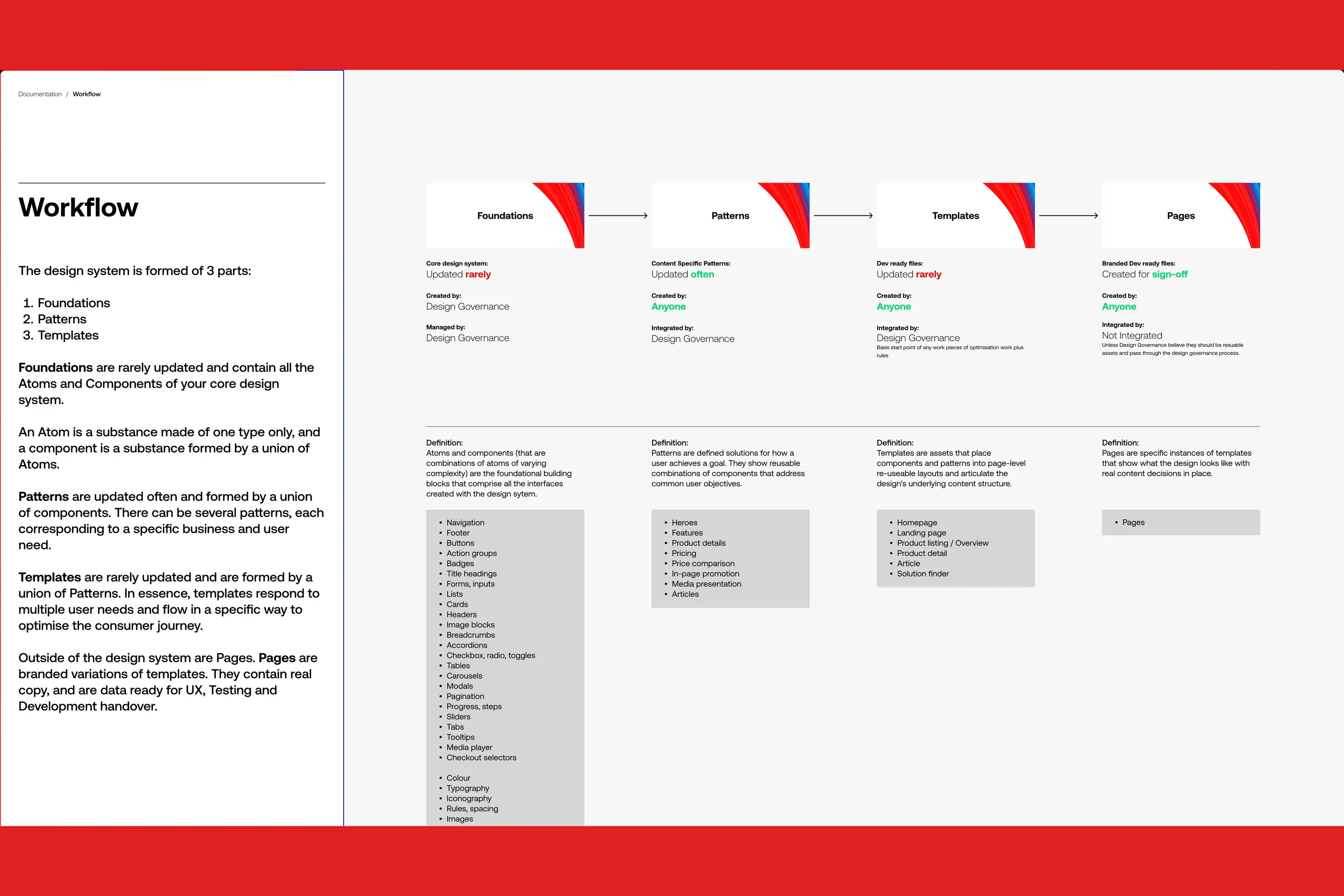
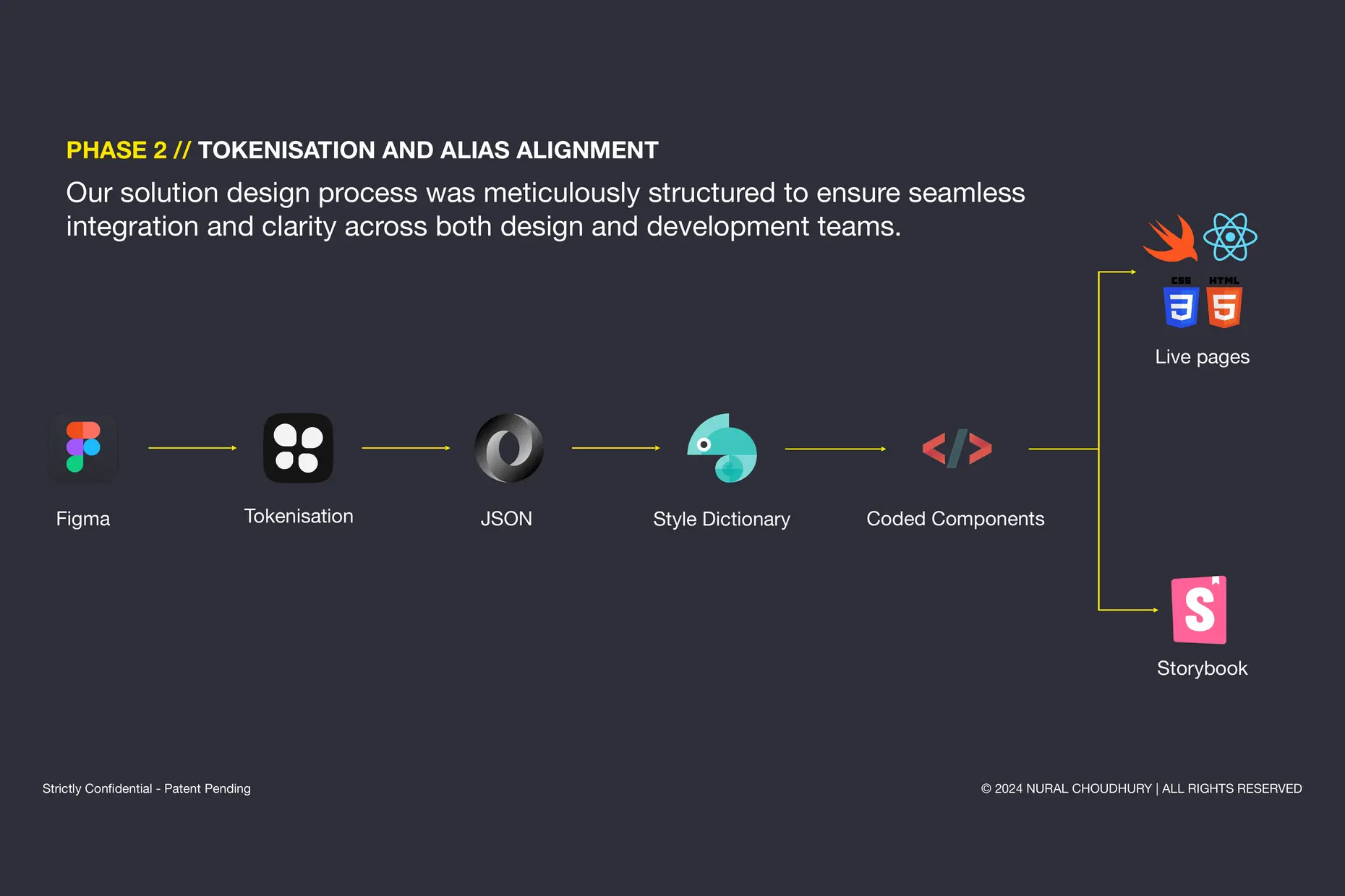
A design token is a named value that stores a single design decision. A codebase references a semantic token, such as a primary action colour, instead of hard-coding a specific value, and every product that consumes the token inherits the same decision.
Tokens exist because raw values do not scale. A colour used in forty places cannot be changed forty times without drift, while a token changed once propagates everywhere it is referenced. That is what makes theming, dark mode, and white-labelling possible without rebuilding each surface by hand.
Design systems architecture covers how tokens are organised into a hierarchy, exposed through component APIs, and distributed across a codebase. This page stops at the concept, because the technical implementation is a different discipline from the design decision it carries.
Start with an audit, not a build. Inventory every version of every interface element already in production before you design anything new: how many button styles exist, where colour has drifted, and which patterns repeat under different names. Skipping the audit produces a system that duplicates what teams already have instead of replacing it.
Agree on principles and naming before you build a single component. You must decide what trade-offs the system resolves in whose favour, and lock in naming conventions for components, variants, and tokens before the first one ships. Renaming after adoption costs more than agreeing the names up front.
Choose a governance model deliberately.
| Model | How it works | Fits best |
|---|---|---|
| Centralised | One dedicated team owns and builds the whole system | Large organisations, early system maturity, tight control |
| Federated | Product teams contribute components; a core team sets and maintains standards | Multiple product teams, strong team autonomy |
| Hybrid | A central team owns the core; product teams own their own extensions | Most systems, once the system has matured |
Build the highest-impact foundations first: typography, colour, and spacing, then the components teams reach for daily. Document every component to the same standard: its states, its variants, when to use it, when not to, and how to implement it in code. An undocumented component is one only its author can use correctly.
Launch with a pilot, not a mandate. Run the system with one team first, fix what breaks, then widen the rollout. You must make the approved path measurably faster than the alternative before you push for broad adoption, because a harder approved path loses to the familiar unapproved one every time.
Build the business case in numbers your organisation already tracks: design and development hours saved, defects avoided, and onboarding time shortened, weighed against the cost of the system team, tooling, and migration. I have not found one savings multiplier that holds across organisations, so measure your own baseline before and after rather than borrowing someone else’s percentage.
I have watched systems fail for the same three reasons, in different organisations, every time.
A system built in isolation from the teams meant to use it never earns their trust. When a central team designs and ships components without the people who will implement and extend them, the system arrives as an instruction rather than a tool, and teams route around it the first time it slows them down.
Assuming adoption rather than earning it is the second failure. Publishing a system and declaring it mandatory does not make it used. A design system competes with the familiar, unapproved way teams already work, and it only wins if the approved path is genuinely faster and better supported.
A component library mistaken for a design system is the third, and the most common. A folder of reusable buttons and cards with no governance, no documentation standard, and no named owner is not a design system. It drifts the moment two teams need slightly different things from the same component, because nothing decides which version wins.
Is a component library the same as a design system? No. A component library is the set of parts. A design system is the parts plus the governance, documentation, and standards that keep them consistent and current as the organisation changes around them.
Does every organisation need Atomic Design specifically? No, but most benefit from some granular vocabulary that separates indivisible elements from the compositions built from them. Atomic Design is the most widely adopted version of that vocabulary, not the only one.
How big does a team need to be before a design system pays for itself? There is no fixed threshold. The case strengthens once more than one product team is building similar interfaces independently, because that is where duplicated effort becomes visible and measurable.
Who owns the design system? Ownership must sit with whichever governance model the organisation chose, named explicitly, rather than left implicit. An unowned system degrades the first time two teams disagree about a component.
| Item | Where it stands |
|---|---|
| Atomic Design | Formalised by Brad Frost in 2013, organising interfaces into atoms, molecules, organisms, templates, and pages |
| Design tokens | The term was coined by Jina Anne in 2014, while working on the Salesforce Lightning Design System |
| Accessibility baseline | WCAG conformance, testing, and legal deadlines are covered on Accessibility standards, not repeated here |
| Token architecture | Hierarchy, component APIs, repository strategy, and distribution are covered on Design systems architecture, not repeated here |

Design systems architecture is the set of structural decisions that let a design system keep working as an organisation grows: how tokens layer, how components are organised and configured, and how the code that implements them is housed, built, and shipped.
Read it
Digital accessibility is the practice of building products people can use, whatever their permanent, temporary, or situational disability, measured against a published standard rather than opinion.
Read it
A team isn’t misaligned because it lacks a vision; it is misaligned because the cadence that surfaces disagreement before it hardens doesn’t exist.
Read it
Design documentation earns its keep when it removes a decision from a developer’s inbox, not when it is complete.
Read it