
2026-09-15
Nural Choudhury
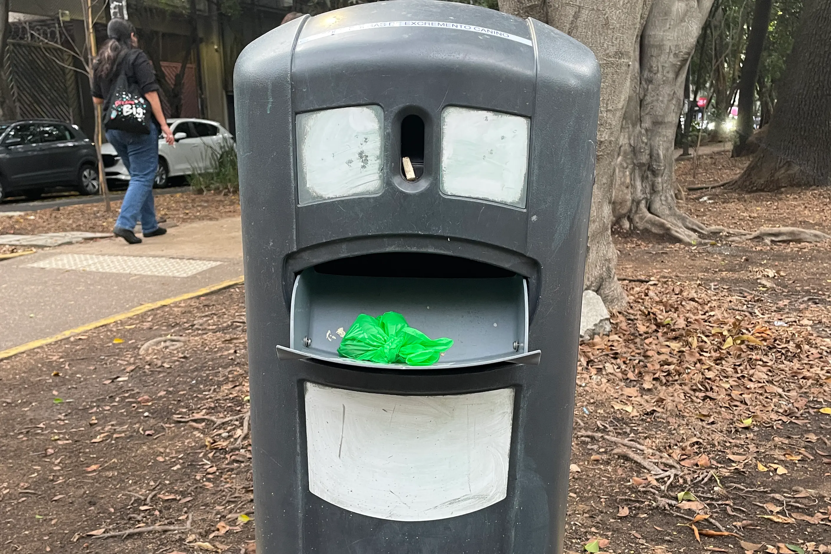
Anthropomorphic design gives a non-human object, interface or system human characteristics: a face, a voice, a temperament, so that a person relates to it rather than merely operates it.
The mechanism behind it is a cognitive reflex that fires on almost no visual evidence, the same reflex that reads two dots and a curve as a face. Kawaii design is the neighbour it most often gets folded into, but kawaii is a specific Japanese aesthetic built on cuteness. In contrast, anthropomorphic design is the broader mechanism kawaii draws on and produces authoritative or unsettling characters just as readily as cute ones.
paired elements near the top of a form read as eyes, a horizontal element below reads as a mouth, and slight asymmetry adds character where a perfectly symmetrical face reads as neutral. In an interface, a name, a voice with its own pitch and pace, a pause before responding, and a conversational tone (“Oops!” rather than “Error encountered”) do the same job without a literal face.
functional forms that happened to look human, face-like vehicle fronts from the early twentieth century, and a direct line through streamlining, Pop and Memphis design into digital interface agents.
consumer products and interfaces that benefit from a relationship rather than a transaction, and contexts where a persistent, approachable presence lowers the barrier to first use.
This style exploits a cognitive reflex, not a design invention. Human vision is tuned to detect faces from minimal cues, so two dots and a curve are read as a face, and pareidolia, the same reflex that finds a face in the Moon or in an electrical socket, fires automatically and unconsciously. The philosopher Daniel Dennett called this related habit the intentional stance: the default assumption that anything moving with apparent purpose has beliefs and wants, which is why a robot vacuum that navigates around furniture seems determined rather than merely programmed.
Some of the earliest anthropomorphic objects were accidental. Handles shaped to fit a hand and vessels with spouts read as mouths before any designer intended a face, and some ancient cultures deliberately gave ceremonial vessels and tools face-like features for spiritual reasons rather than decorative ones. Trains, ships and early cars carried face-like fronts, headlights as eyes and grilles as mouths, closely enough that design vernacular still calls a clock front a face and a curved surface a belly.
Twentieth-century product design formalised the habit. Streamlined objects of the 1930s and 1940s often carried face-like fronts to suggest speed and approachability, Pop design of the 1960s deliberately exaggerated faces and body parts in furniture and objects, and Memphis and postmodern design gave objects a pronounced apparent personality against modernist anonymity. Digital technology then extended the habit from objects to agents: interface characters from Clippy to Siri, Alexa, Copilot, and Google Assistant gained names, voices, and apparent personalities, presenting as entities rather than tools.

| Element | What this style does | The tell |
|---|---|---|
| Form and proportion | Positions paired elements near the top of a form to read as eyes, with a horizontal element below as a mouth | Two dots and a curve are enough; the object needs no literal face |
| Expression | Angles the “eyebrows” and mouth to signal a mood, and varies symmetry to add character | Slight asymmetry reads as personality; perfect symmetry reads as neutral |
| Colour | Uses warm colour for friendliness, cool colour for calm and dark colour for gravity | The palette is chosen for emotional signal, not for chromatic harmony |
| Motion and timing | Builds in a pause before responding and shapes animation as bouncy, smooth or jerky | An instant, uniform response reads as mechanical; a considered pause reads as thought |
| Voice and language | Gives the system a name, a pitch and pace, and a conversational tone rather than error codes | “Oops!” instead of “Error encountered” |
| Behavioural consistency | Repeats the same responses, apologies and quirks across every touchpoint | A system that varies its personality between screens breaks the illusion |

| Neighbour | What it shares | What separates them |
|---|---|---|
| Kawaii design | Rounded forms, simple faces and cuteness used to make something feel approachable | Kawaii is a specific Japanese aesthetic of cuteness with its own history and social function; anthropomorphic design is the wider mechanism kawaii draws on, and it produces authoritative or unsettling characters as readily as cute ones |
| Doodle art | Loose, simplified faces and figures built from a few marks | Doodle art is a hand-drawn mark-making style; anthropomorphic design is a strategy applied to a product’s actual form, voice or behaviour, and it does not have to look drawn at all |
| UX/UI design patterns | Both shape how an interface communicates with a person | UX/UI patterns cover the usability of an interface’s structure; anthropomorphic design is one technique within that discipline, aimed at emotional attribution rather than task completion |

Define the personality before you design anything else. Decide what traits the system has and how it responds under normal conditions and under failure, and write the answers down so the character survives contact with a team and a product roadmap.
Match the personality to the relationship the product offers. A professional tool should carry less personality than a companion product, and a system aimed at children or isolated or elderly users should carry more caution than either.
Match the level of anthropomorphism to the system’s real capability. A simple rules-based assistant must not present as a sophisticated conversational partner: the mismatch is where trust breaks.
Commit to one end of the uncanny valley. A design must read as clearly artificial or convincingly human; the halfway point, close to human but not quite, unsettles rather than charms.
Carry the personality consistently across every touchpoint: visual form, language, motion, sound. A character that behaves generously in marketing copy and coldly in the error state was never a character, only decoration.
That last point is the pastiche risk worth naming directly. A mascot added late to a product to cover a weak feature or a cold interaction is decoration rather than design, and a reader who meets the character before the product does the work will notice the gap.
The uncanny valley is this style’s most literal failure mode. The roboticist Masahiro Mori observed that a positive response to a robot’s human-likeness rises with realism, until an almost-but-not-quite-human appearance triggers revulsion; the same effect appears in behaviour: a system that responds almost like a person, but not quite, reads as wrong rather than merely mechanical.
Microsoft’s Clippy is this corpus’s standard cautionary example: a character built to help became infamous for interrupting, because its persistence read as intrusion rather than assistance. An anthropomorphic character with no sense of when to withdraw damages the product it was meant to soften.
Capability mismatch is the deeper problem. Human-like presentation creates an expectation of human-like understanding, memory and judgement, and a user who believes a system understands them may share information, rely on advice or trust a decision the system is not equipped to handle. When that mismatch is deliberate, friendliness becomes a tool for extracting more data or engagement than a neutral interface would, and combined with dark patterns, it becomes manipulative rather than merely optimistic.
Attachment is the least discussed failure and the most human one. People have reported real grief when a robot vacuum stops working, or a virtual assistant is discontinued, and children, elderly users and isolated users form attachments to anthropomorphic systems more readily than most, with less scepticism to protect them. This is where a friendly mascot stops being a charm and becomes a liability: the relationship it created can outlive, or outweigh, what the product can give back, and the designer who built the character is responsible for what it leaves behind.
anthropomorphism is the automatic tendency to perceive human qualities in a non-human thing, while personification is the deliberate literary technique of assigning human traits to an object for effect. A designer practises personification on purpose and relies on anthropomorphism, the audience’s automatic response, to make it land.
Is a friendly mascot always manipulative? No. The difference is whether the personality matches the system’s real capability and is disclosed honestly, not whether the interface has a character at all.
because the effect applies to behaviour as well as appearance. A voice assistant that responds almost, but not quite, like a person creates the same unease as a robot that looks almost, but not quite, human.
no. A professional tool handling dense data needs minimal personality, and an educational or companion product can carry more, with the level following the relationship the product offers rather than a house style.
children anthropomorphise naturally and have not yet developed the scepticism adults bring to a friendly voice or a named assistant, so design aimed at them carries a higher duty of care.
| Aspect | Detail |
|---|---|
| Definition | Giving human characteristics, a face, a voice or a temperament, to a non-human object, interface or system |
| Intentional stance | The philosopher Daniel Dennett’s term for the default assumption that a purposefully moving thing has beliefs and wants |
| Uncanny valley | The roboticist Masahiro Mori’s observation that near-human appearance or behaviour triggers discomfort rather than warmth |
| Cited failure case | Microsoft’s Clippy, an interface character whose persistence read as intrusion |
| Named voice assistants | Siri, Alexa, Google Assistant, Copilot |
| Named product design | Alessi products by designers including Philippe Starck and Marc Newson; the Volkswagen Beetle’s face |

Kawaii (かわいい) is Japan’s cute aesthetic: rounded forms, oversized, simplified eyes, childlike proportions, and a pastel palette, developed since the 1970s into a design language for characters, consumer products, and institutional communication.
Read it
Doodle art is the deliberate use of casual, unplanned mark-making- the loops, faces and repetitive patterns people draw while on the phone or half-listening in a meeting- as a professional visual style.
Read it
An interface pattern is a solution to a recurring design problem, refined through enough use elsewhere that the person encountering it doesn’t have to figure out how to use it.
Read it
Pop Art is the movement that took commercial imagery- the soup can, the comic panel, the celebrity photograph- and treated it as fit subject matter for fine art, rendered flat, bright and mechanically precise.
Read it