
2026-09-15
Nural Choudhury
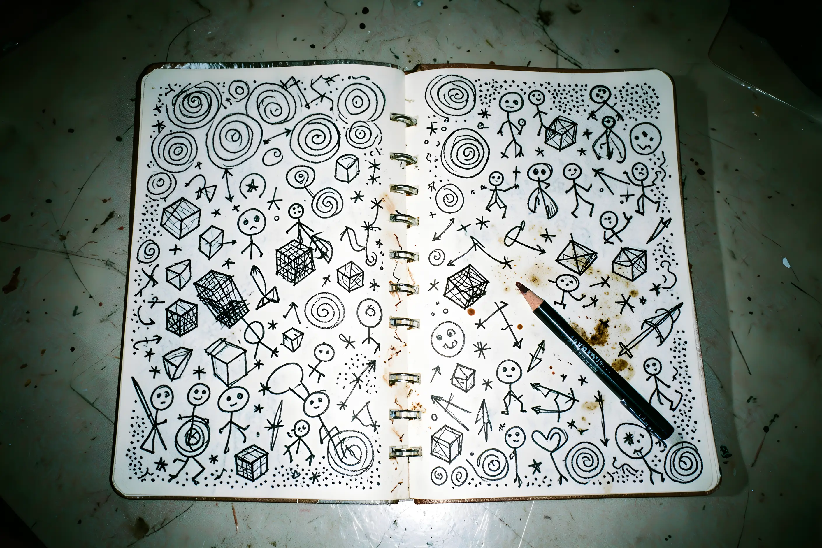
Doodle art is the deliberate use of casual, unplanned mark-making- the loops, faces and repetitive patterns people draw while on the phone or half-listening in a meeting- as a professional visual style.
It differs from hand-lettering, which polishes handwriting into a controlled craft, by doing the opposite: doodle art keeps the wobble, the unclosed line, and the visible speed of the original mark, because those are evidence that the drawing is human.
wobbling, uneven line weight, shapes left open, obsessive hatching or fill patterns, and naive figures, stick people, simple faces, that read as ideas rather than likenesses. Marks look fast and unrevised.
a line of artists who treated the idle mark as finished work, from Paul Klee and Saul Steinberg to Keith Haring’s subway chalk drawings, a lo-fi, DIY culture that values rawness over polish, and a contested strand of research into why people doodle while they listen.
brand and editorial work that needs to signal informality, process and human presence against a field of polished competitors, and educational material that benefits from feeling approachable rather than authoritative.
Doodle art has no founding movement or manifesto. It has a lineage instead: artists who took the mark people make without thinking and made it their whole practice.
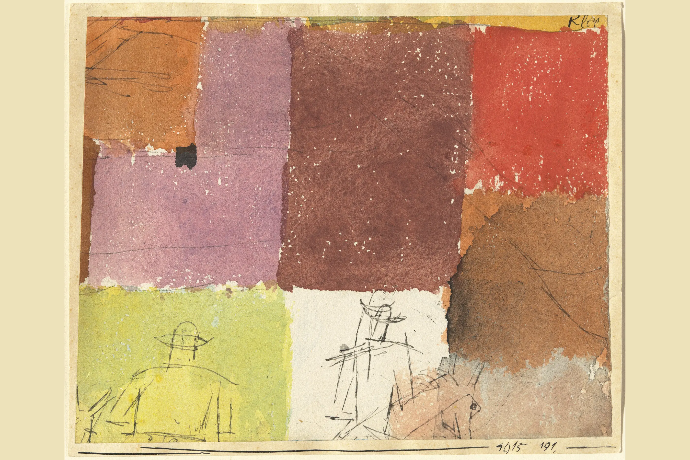
Paul Klee described drawing as an active line on a walk in his Pedagogical Sketchbook of 1925, and his small pen drawings, a comic rider on a stick-legged horse or a few figures scratched over watercolour, carry the loose, wandering line the style still depends on.

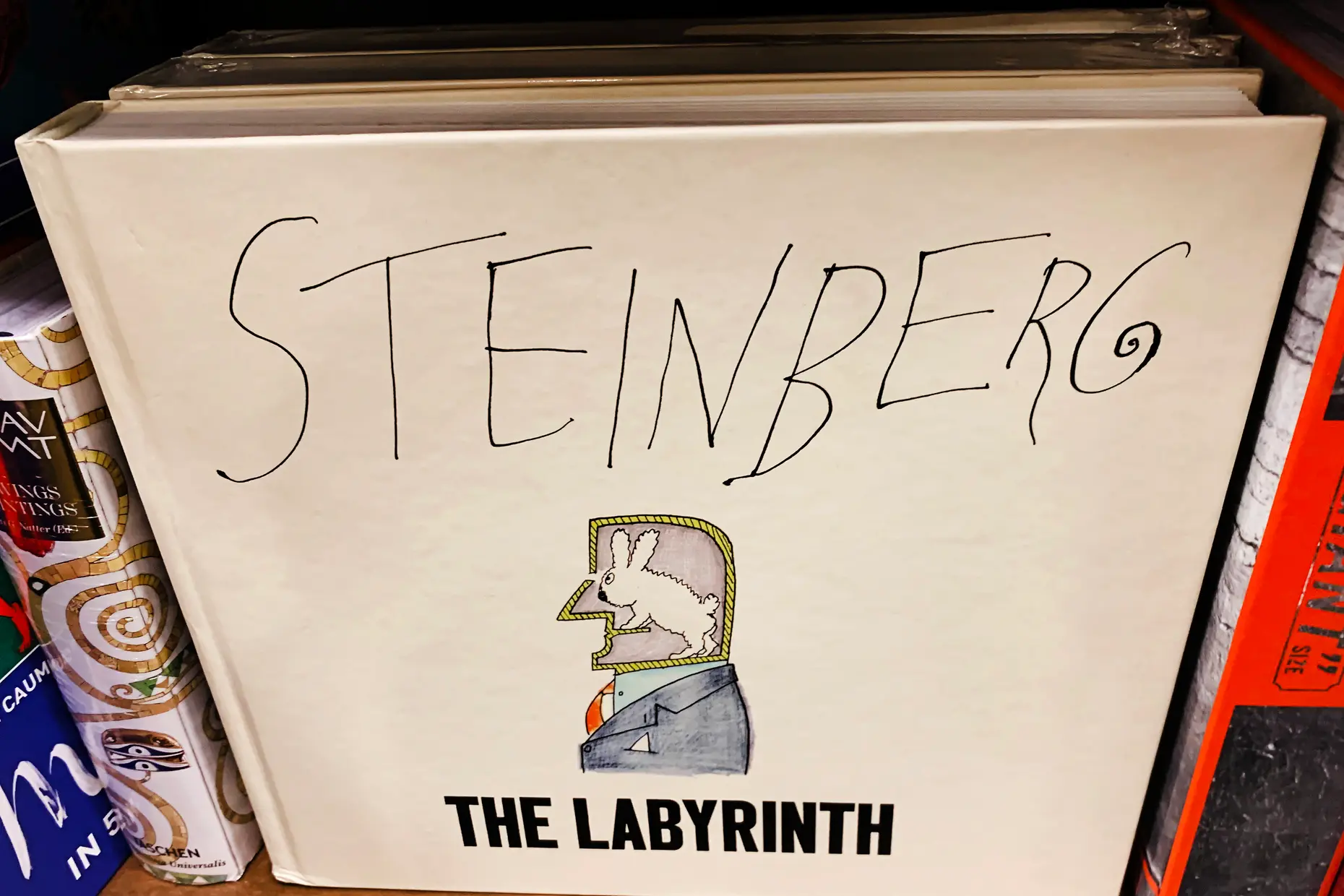
Saul Steinberg built a career on it. His line drawings for The New Yorker, which ran for almost sixty years and include the 1976 cover View of the World from 9th Avenue, look like elaborate doodles and carry sharp visual wit. Deirdre Bair’s 2012 biography records him as the Picasso of the art form known as the doodle.
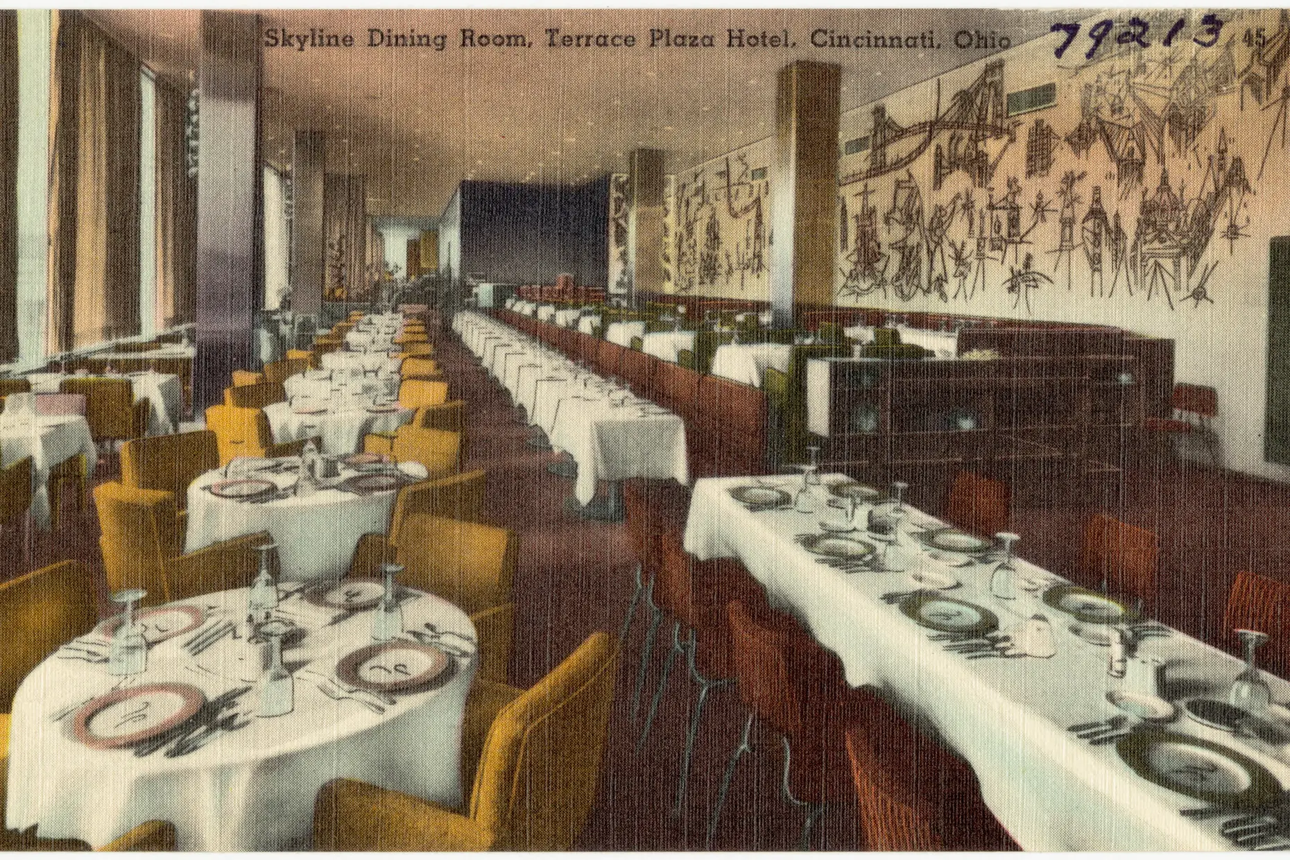
Keith Haring took the doodle into public space. Between 1980 and 1985 he made thousands of chalk drawings on the black paper panels that covered empty advertising slots in the New York subway: crawling babies, barking dogs and dancing figures, drawn fast, in one continuous line, in front of commuters. He called the subway his laboratory, and the drawings made the case that a quick mark could carry an idea to anyone who passed.

The line continues in working artists today. Shantell Martin draws large black-and-white compositions live, in marker, with a recurring cast of faces and characters. Jon Burgerman fills colourful surfaces with googly-eyed creatures.

In editorial illustration, Christoph Niemann shows how casual-seeming marks can carry real conceptual wit. Mailchimp and Dropbox took the same qualities into mainstream brand work.
The research case is weaker than it is often presented. Jackie Andrade’s 2009 study at the University of Plymouth found that people who shaded shapes while listening to a dull phone message recalled 29 per cent more of it than those who only listened.
A larger study by Spencer-Mueller and Fenske in 2024, across 222 participants, found doodling neither reduced mind-wandering nor improved recall, and note-taking did better. Treat the memory claim as unproven.
The style’s more recent charge is cultural. It runs alongside lo-fi music’s tape hiss and punk’s DIY ethos, privileging visible process over professional finish, and it now works as a counter-signal to AI-generated and algorithmically smooth imagery: a wobbling line claims a hand, not a model, made it.
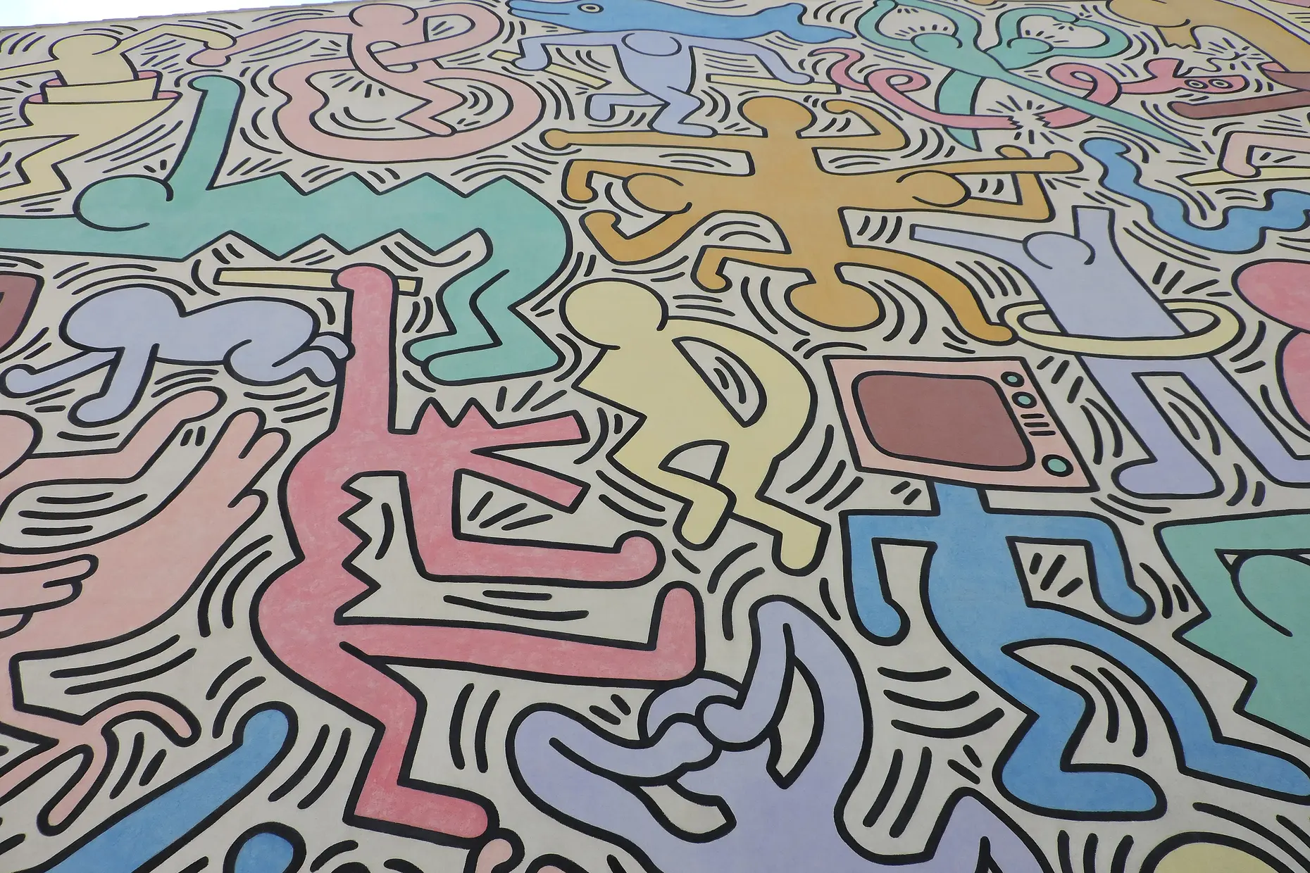
| Element | What this style does | The tell |
|---|---|---|
| Line | Uses the full evidence of a hand at speed: variable weight, breath and pressure, tool character left visible | Lines wobble and shapes fail to close cleanly |
| Fill and pattern | Fills space obsessively with hatching, stippling and loops rather than flat colour | Density accumulates from many small, similar but not identical marks |
| Figuration | Reduces figures to symbolic shorthand, a face standing for face-ness rather than a likeness | Stick people and basic cartoon forms, held at one consistent level of simplification |
| Composition | Shows thinking rather than a finished layout: arrows, labels and crossed-out elements sit alongside the drawing | Visual notes look like annotated thought, not a designed page |
| Process | Keeps revision visible instead of erasing it | Marginal additions and crossed-out marks remain in the final piece |
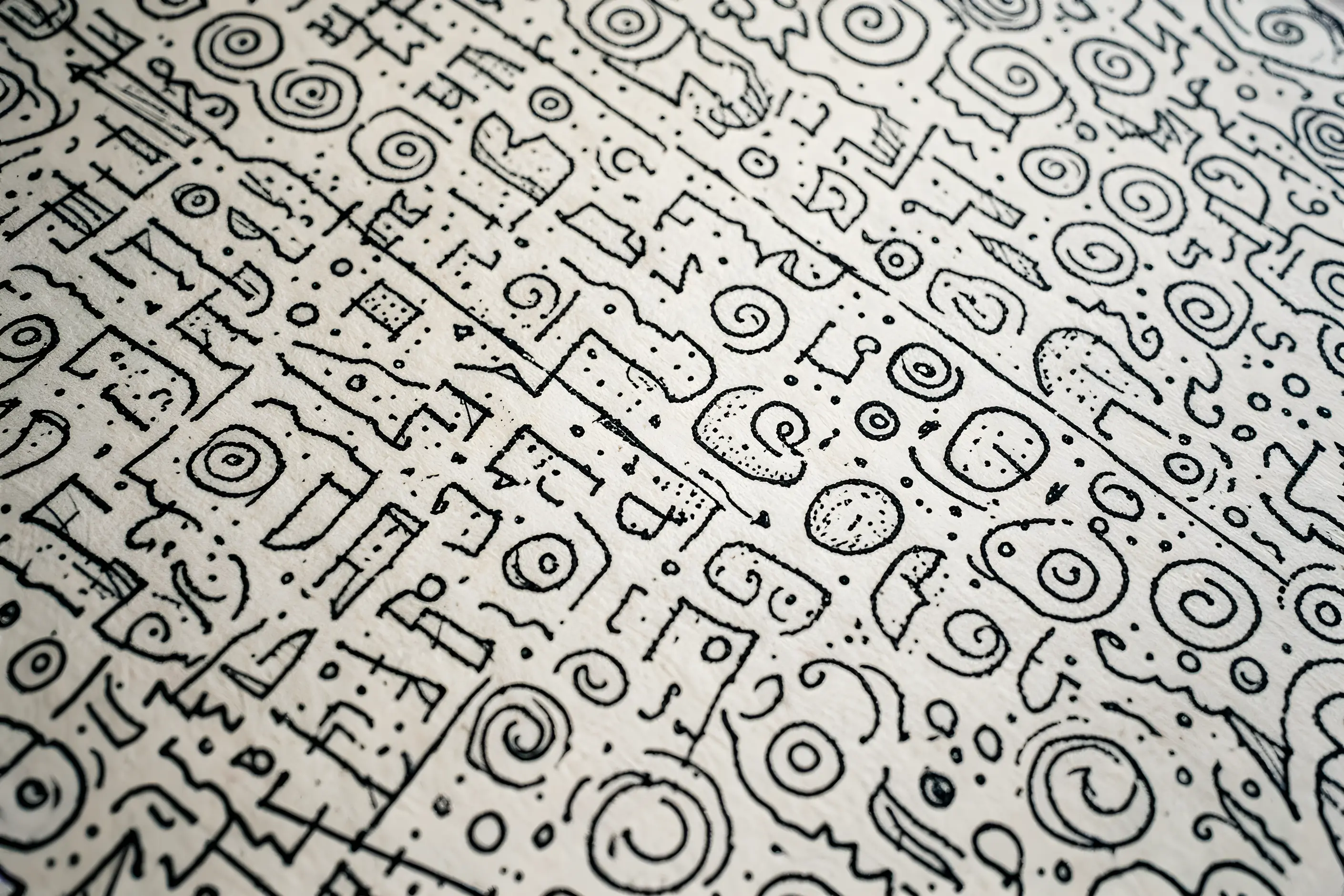
| Neighbour | What it shares | What separates them |
|---|---|---|
| Hand-lettering renaissance | Both foreground the human hand and reject vector precision | Hand-lettering is skilled, controlled handwriting refined into a craft; doodle art keeps the unrevised, unplanned mark as the point, not the polish |
| Kawaii design | Both use simplified, naive figuration and read as approachable | Kawaii is a designed cuteness system built on specific proportions, colours and cultural meaning; doodle art is unstructured and defined by its spontaneity, not by cuteness |
| Mixed media design | Both value visible process and a handmade quality over seamless digital finish | Mixed media combines distinct materials and techniques within one piece; doodle art is a single, consistent mark-making style, usually pen or line-based |
Draw fast and select from the results, rather than engineering a controlled drawing to look loose afterwards. Genuine spontaneity comes from the process; added roughness on top of a careful drawing reads as false.
Fix a consistent tool and a consistent level of figuration before you start producing brand or editorial work, so recurring elements read as one voice rather than a mix of styles. Choose digital tools that do not fight the style: default smoothing and shape-recognition features remove the variation the style depends on, so favour brushes that preserve pressure and speed, or draw on paper and scan.
Know when to stop. A doodle communicates its idea early, and further elaboration drains the energy that made it work in the first place.
The pastiche risk here is “doodle style” as controlled imitation of spontaneity: smooth digital lines dressed up with fake wobble. Engineered looseness reads as engineered.
The most common failure is over-control: lines too smooth, shapes too regular, resulting in something “doodle-style” rather than an actual doodle. Forced naivety is the figurative version of the same mistake: naive drawing that feels performed rather than unconscious, which tends to read as condescending.
A subtler failure is missing energy: loose-looking marks drawn slowly, so the process contradicts the result. Brand systems built on this style also struggle to stay consistent across applications and over time, since spontaneity resists the same rules that keep a system coherent.
The style carries a context limit. Informality that signals approachability in one setting undermines authority in another. It does not belong on legal, medical or emergency material, where precision and seriousness are the actual requirement.
No. It values spontaneity and imperfection over execution skill; the wobbly lines and unfinished shapes are features, not defects.
Who are the best-known doodle artists? Saul Steinberg and Keith Haring are the reference points: Steinberg for the witty, elaborate line on the page, Haring for the fast, public, one-line drawing, with Paul Klee behind both. Working today, Shantell Martin and Jon Burgerman have each built a recognisable practice on the doodle.
Does doodling help you remember? The evidence is mixed. Andrade’s 2009 study found a 29 per cent gain in recall, but a larger 2024 study found no benefit, and note-taking worked better.
How do I preserve the spontaneous quality in professional work? Draw fast and spontaneously, then select the successful results rather than carefully engineering loose marks afterwards. The spontaneity has to come from the process.
Can digital tools produce authentic doodles? Some digital brushes get close, but scanning hand-drawn work or drawing on a pressure-sensitive tablet tends to retain more of the hand quality. Default smoothing algorithms work against the style.
What is the difference between an authentic doodle and “doodle style”? An authentic doodle comes from actual spontaneous drawing. Doodle style is a controlled imitation of that look, and it tends to read as false because the style’s appeal depends on genuine spontaneity.
When should I not use doodle aesthetics? Where formality, authority or precision is the point- legal documents, medical information, emergency communication- doodle aesthetics work against the message.
| Aspect | Detail |
|---|---|
| Definition | Casual, unplanned mark-making used deliberately as a professional visual style |
| Grounding | Psychological research on doodling: attention maintenance, memory encoding, stress relief |
| Visual traits | Wobbling line, variable weight, obsessive fill, naive figuration, visible process |
| Named examples | Christoph Niemann’s editorial illustration; Mailchimp and Dropbox brand illustration direction |
| Key contexts | Editorial illustration, brand identity, educational material, interface elements, whiteboard-style animation |
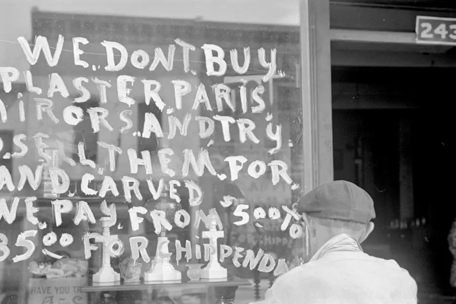
Hand lettering is the craft of drawing or painting custom letterforms for a single application, rather than setting a typeface.
Read it
Kawaii (かわいい) is Japan’s cute aesthetic: rounded forms, oversized, simplified eyes, childlike proportions, and a pastel palette, developed since the 1970s into a design language for characters, consumer products, and institutional communication.
Read it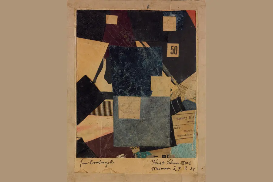
Mixed media design combines two or more materials or techniques, such as photography, illustration, hand-drawn mark-making, and digital compositing, inside one composition, so the contrast between media carries meaning no single medium could carry alone.
Read it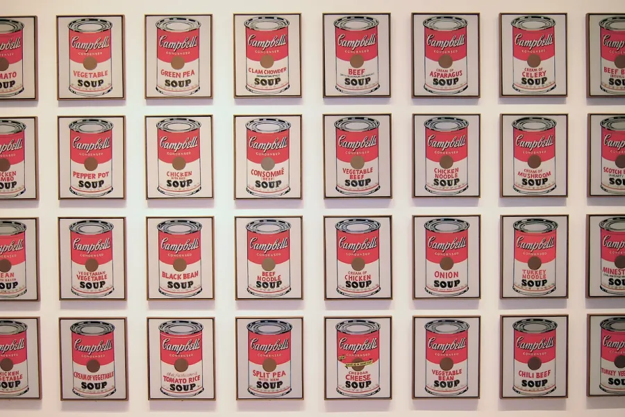
Pop Art is the movement that took commercial imagery- the soup can, the comic panel, the celebrity photograph- and treated it as fit subject matter for fine art, rendered flat, bright and mechanically precise.
Read it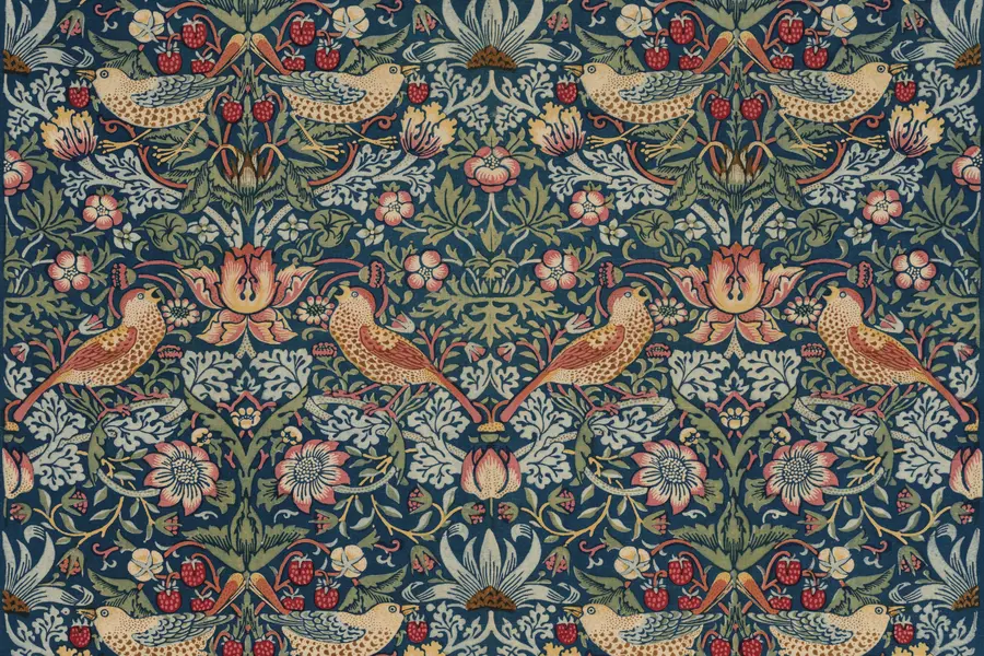
The Arts and Crafts movement is a design and social reform movement that began in Britain in the second half of the nineteenth century, built around dense botanical patterns, honest materials and visible handcraft, as a direct reaction against industrial factory production.
Read it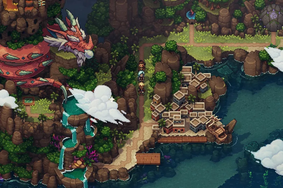
Pixel art is a raster art form built square by square on a fixed, visible grid, at a resolution low enough that every pixel is a deliberate decision rather than a technical accident.
Read it
Y2K design is the visual language of computers, gadgets, fashion, and web culture from roughly 1997 to 2003, built from translucent coloured plastic, chrome and metallic surfaces, rounded bubble forms, and a saturated synthetic palette that together expressed a moment when digital technology looked purely exciting rather than troubling.
Read it