

2026-09-15
Nural Choudhury
Pop Art is the movement that took commercial imagery- the soup can, the comic panel, the celebrity photograph- and treated it as fit subject matter for fine art, rendered flat, bright and mechanically precise.
It emerged independently in Britain and the United States through the mid to late 1950s and dominated contemporary art by the early 1960s. Where kitsch borrows sentimental imagery in earnest, and postmodernism quotes historical styles with knowing irony, Pop Art holds its subject at a cool, ambiguous distance: it neither mocks consumer culture nor endorses it, and that unresolved tone is the thing a Pop Art image does that neither of its neighbours quite does.
flat, saturated CMYK colour; hard, clean outlines with no visible brushwork; appropriated commercial or celebrity imagery; Ben-Day dot or halftone patterns enlarged to visible scale; and serial repetition of a single image across a grid.
Britain’s Independent Group from 1952, and the New York scene of Andy Warhol, Roy Lichtenstein, Claes Oldenburg and James Rosenquist through the early 1960s.
advertising, packaging and music or fashion graphics that want to comment on consumer culture, celebrity or mass production while keeping a knowing, unresolved tone rather than sincere endorsement or outright satire.
Pop Art’s first stirrings appeared in London, where the Independent Group met at the Institute of Contemporary Arts between 1952 and 1955. The loose collective, including Eduardo Paolozzi, Richard Hamilton and the critics Reyner Banham and Lawrence Alloway, studied American mass culture with fascinated curiosity rather than the disdain typical of European intellectuals at the time.
Paolozzi’s collage “I was a Rich Man’s Plaything” (1947) is often cited as the first Pop artwork, combining pulp magazine imagery with the word “POP” firing from a pistol. Hamilton’s “Just what is it that makes today’s homes so different, so appealing?” (1956), made for the “This Is Tomorrow” exhibition, is the movement’s most cited early statement: a small collage cataloguing consumer goods and mass media with genuine interest under its irony.
The American development began in the late 1950s and reached cultural prominence in the early 1960s. It arrived independently through the same, even more saturated, commercial environment. Jasper Johns and Robert Rauschenberg prepared the ground, though they are usually classified as Neo-Dadaists or precursors.
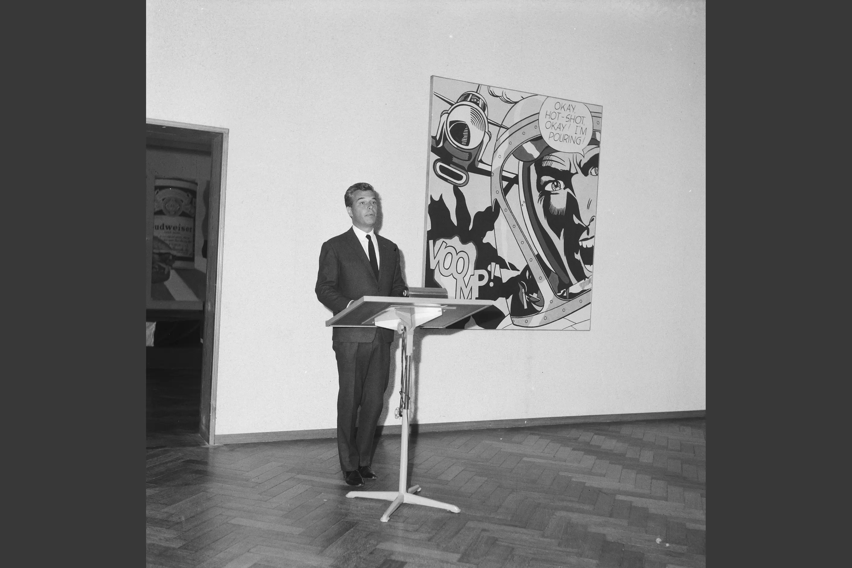
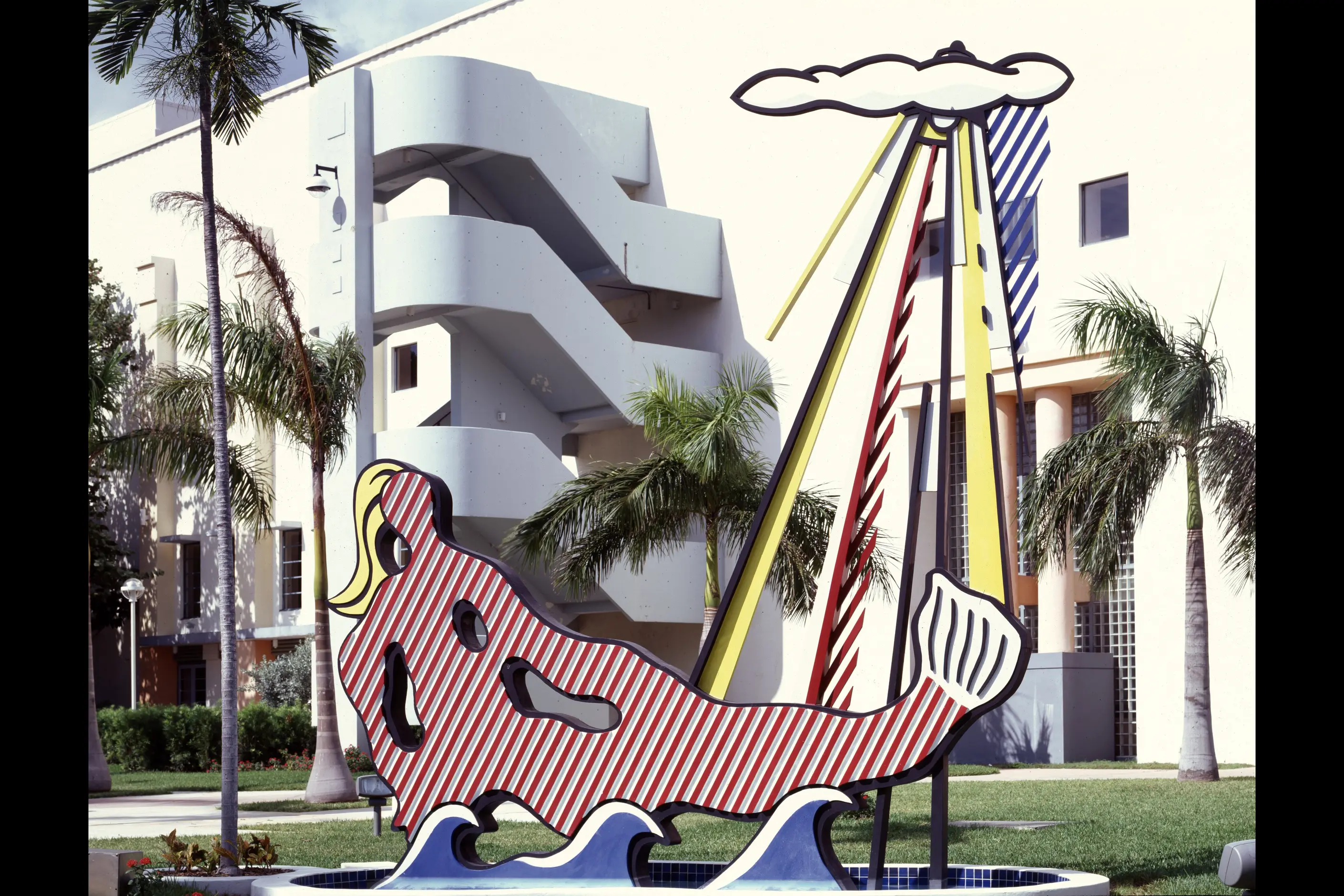
Andy Warhol came from commercial illustration and painted Coca-Cola bottles, Campbell’s Soup cans and celebrities with deadpan neutrality, using silkscreen and serial repetition to challenge romantic ideas of authorship. Roy Lichtenstein enlarged comic book panels to monumental scale, reproducing their Ben-Day dot printing and bold outlines while carefully recomposing rather than merely blowing them up.
James Rosenquist, also from commercial art, fragmented and recombined advertising imagery at billboard scale. Claes Oldenburg remade everyday objects, typewriters, toilets, hamburgers, in soft fabric at altered scale.

| Element | What Pop Art does | The tell |
|---|---|---|
| Colour | Uses the bright, flat CMYK palette of commercial printing rather than mixed or tonal hues | Unapologetically synthetic brightness with no attempt to describe natural light |
| Form and shape | Defines forms with clear, hard outlines filled with solid colour | No painterly brushwork, drips or gestural texture anywhere in the piece |
| Typography | Borrows comic and advertising lettering conventions when type appears | Bold, commercial letterforms rather than considered editorial type |
| Layout and composition | Arranges a single image or a small set of images in a grid or series | Repetition across a grid, not a single hero image |
| Materials or texture | Reproduces print production artefacts as visible surface pattern | Ben-Day dots or halftone screens enlarged until the dot itself is legible |
| Imagery or ornament | Appropriates existing commercial or celebrity imagery rather than inventing new imagery | The subject is recognisably borrowed: a soup can label, a comic panel, a press photograph |
| Neighbour | What it shares with Pop Art | What separates them |
|---|---|---|
| Kitsch design | Both take commercial and mass-produced imagery seriously as visual material | Kitsch is sincere and sentimental about its source; Pop Art holds its source at ironic, unresolved distance |
| Postmodernism in design | Both quote existing imagery rather than inventing from scratch | Postmodernism quotes historical styles and architectural language with knowing irony; Pop Art quotes contemporary commercial and celebrity imagery specifically |
| Memphis style | Both use bold, flat, saturated colour without apology | Memphis is Milan furniture and product design built from clashing pattern and asymmetric form; Pop Art is appropriated commercial imagery rendered in fine art media |
Start with source material that is iconic and immediately recognisable. Warhol chose Campbell’s Soup cans partly because they carried comfort and familiarity; Lichtenstein chose comic panels that condensed a whole emotional narrative into one frame. Choose imagery that already carries the cultural association you need, rather than inventing a new image and hoping it reads as Pop.
Transform the source rather than reproducing it unaltered. Shift its scale, repeat it in series, apply non-naturalistic colour, crop it, or juxtapose it against something unrelated. Reproducing found imagery without transformation is copying, not Pop Art.
Hold ironic distance in the tone. State the material plainly rather than praising or condemning it: the ambiguity is the point, not a hedge.
Execute with technical precision: flat, saturated colour; crisp edges; and any Ben-Day dot or halftone pattern kept visible as pattern rather than smoothed into a gradient. A Pop Art treatment applied to a brief that wants sincerity, rather than commentary on consumer culture, is a pastiche risk: use the vocabulary because the brief is genuinely about mass culture, celebrity or commerce, not because the palette looks confident.
Pop Art’s own appropriation strategy carries a real critique. The original Pop artists, mostly white, male and educated, appropriated commercial imagery made by anonymous designers and cultural products from communities they did not belong to. Contemporary designers must weigh that history: appropriation that critiques a powerful institution differs from appropriation that exploits a marginalised community, and the difference matters more than the visual result.
Pop Art’s appropriation of copyrighted imagery also created lasting legal questions. Warhol faced lawsuits over his use of photographic source material, and the boundaries of transformative use remain contested in court. Designers should understand their jurisdiction’s legal exposure before appropriating protected imagery.
The movement’s critique of consumer culture has itself been thoroughly commercialised: Warhol prints sell for millions, his imagery appears on mugs and tote bags, and “the Pop Art effect” is a filter in photo editing apps. Deploying the vocabulary does not automatically carry critical content. The visual style can serve purely decorative or commercial ends as easily as it can serve commentary, and a designer using it should know which the brief wants before reaching for it.
Is Pop Art satire or celebration of consumer culture? Neither, deliberately. Warhol presents consumer imagery with affectless neutrality and lets the viewer bring their own response. That unresolved position is more useful for commercial design than a simple stance in either direction.
What is the difference between Pop Art and advertising that borrows from it? Pop Art appropriated advertising’s imagery and techniques for fine art; advertising has since borrowed the vocabulary back for campaigns that want an art-aware, knowing tone. The loop runs both ways, which is itself a Pop Art subject.
Why do Ben-Day dots matter so much to the look? Lichtenstein enlarged this ordinary print production technique until the dots themselves became visible and aesthetically interesting, making the mechanics of mass reproduction part of the image rather than hiding them. A halftone pattern stayed legible as pattern, one of the clearest tells of the style.
Where is Pop Art vocabulary a bad fit? Anywhere the brief calls for sincerity rather than commentary, or where appropriated imagery would exploit a community the designer has no standing to borrow from. The style’s ironic distance reads as cynicism or evasiveness when the subject genuinely needs a straight position.
| Fact | Detail |
|---|---|
| Origin | Mid-1950s, developed independently in Britain and the United States |
| British group | Independent Group, Institute of Contemporary Arts, London, 1952 to 1955 |
| Key British figures | Richard Hamilton, Eduardo Paolozzi, Peter Blake |
| Key American figures | Andy Warhol, Roy Lichtenstein, Claes Oldenburg, James Rosenquist |
| First cited Pop artwork | Eduardo Paolozzi, “I was a Rich Man’s Plaything,” 1947 |
| Early statement work | Richard Hamilton, “Just what is it that makes today’s homes so different, so appealing?,” 1956 |
| Signature technique | Ben-Day dot and halftone patterns enlarged to visible scale |
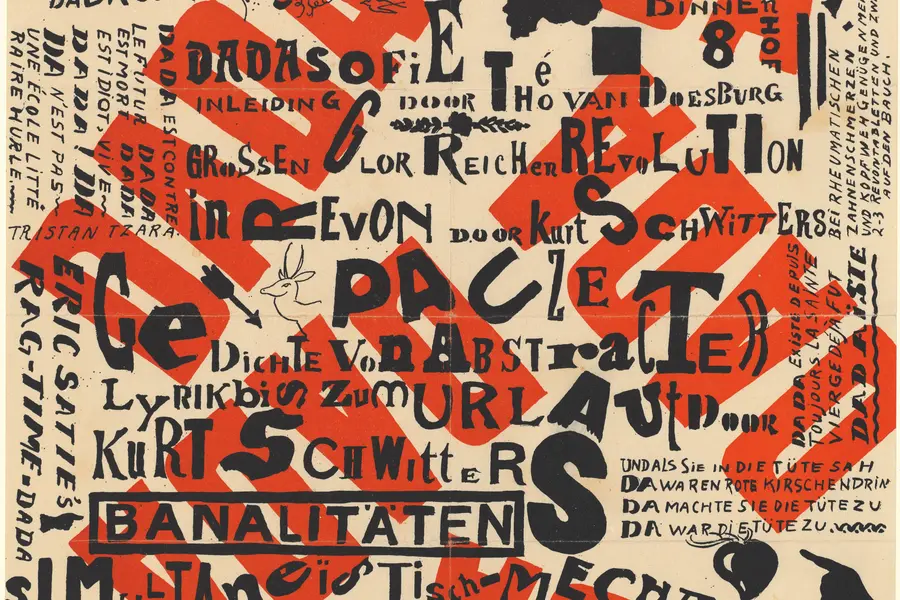
Dadaism is an anti-art movement that began in Zurich in 1916, using deliberate absurdity, chance operations and appropriated imagery to reject beauty, meaning and rationality after the First World War exposed their bankruptcy.
Read it
The Bauhaus is a German school of art, craft and design that operated from 1919 to 1933.
Read it
Minimalism in design reduces a composition to the elements it cannot function without, so colour, form, type, and space each carry more weight because there is less to look at.
Read it
Postmodernism in design is a movement that began in the late 1960s and crystallised through the 1970s and 1980s, rejecting modernism’s claim to universal rules: the grid, the neutral sans, the belief that “less is more.” Where the International Typographic Style and Bauhaus functionalism treated a small set of principles as correct for any brief, postmodernism treated those principles as one convention among many, worth quoting, distorting or discarding as the project demanded.
Read it
Y2K design is the visual language of computers, gadgets, fashion, and web culture from roughly 1997 to 2003, built from translucent coloured plastic, chrome and metallic surfaces, rounded bubble forms, and a saturated synthetic palette that together expressed a moment when digital technology looked purely exciting rather than troubling.
Read it
Kawaii (かわいい) is Japan’s cute aesthetic: rounded forms, oversized, simplified eyes, childlike proportions, and a pastel palette, developed since the 1970s into a design language for characters, consumer products, and institutional communication.
Read it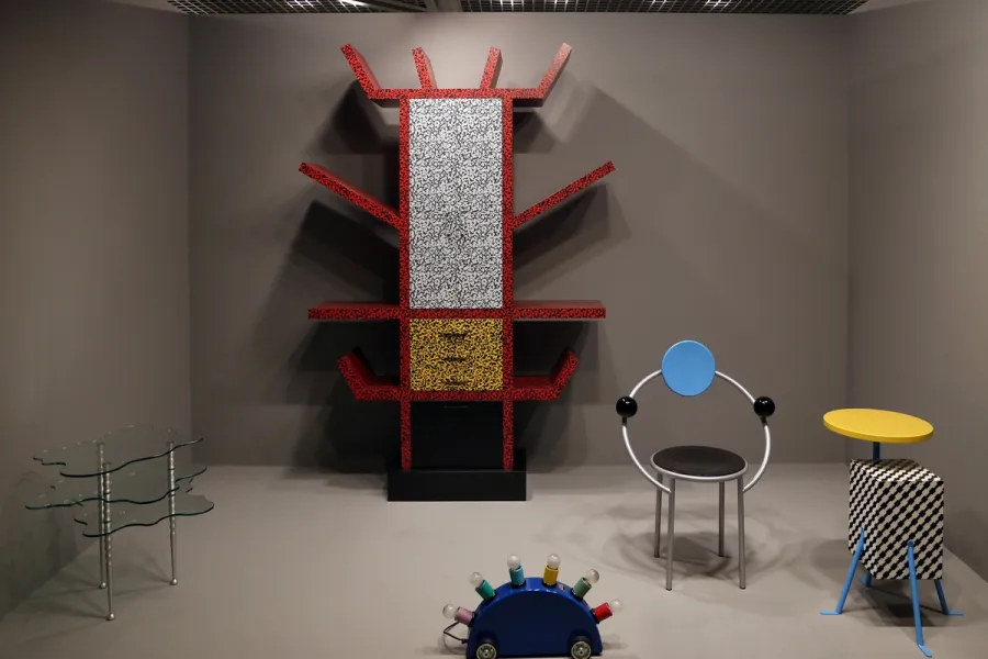
Memphis is a design movement founded in Milan in December 1980, known for stacked geometric forms, clashing colour and patterned plastic laminate applied to furniture, objects and graphics.
Read it
Kitsch is a critical term before it is a design vocabulary: coined in nineteenth-century Munich to describe cheap, sentimental art sold to tourists and undiscriminating buyers, it names objects that chase immediate emotional pleasure rather than sophisticated restraint.
Read it