

2026-09-15
Nural Choudhury
A grid is a system of columns, gutters, margins, and baselines that fixes where content can sit before you place a single element.
It turns layout into a repeatable decision made once, instead of a fresh judgement call for every headline and image.
This page covers grid anatomy, why grids exist, how to build your first grid, and where grids go wrong across print, web, and app design. Advanced grid systems cover modular, compound, and hierarchical grid architectures for content one basic grid cannot hold. Layout principles cover composition, hierarchy, and balance independent of any grid.
consistent placement decisions across every page or screen, faster layout work because the structural argument happens once, and a shared vocabulary with developers who build the same columns and gutters in code.
any layout with more than a handful of recurring elements: editorial pages, marketing sites, app screens, and slide decks, wherever content repeats across a set of pages or components.
choose the column count based on what your content genuinely needs, not habit or convention. Every later decision inherits this one, and a wrong column count is the hardest mistake to correct once content has been placed.
Before grids were codified, designers made layout decisions individually: where a headline sat, how wide a column ran, how much space surrounded an image. Each choice stood alone, and the result was inconsistency between pages and across a publication.
Swiss designers in the 1950s and 1960s instead systematised structure. Josef Müller-Brockmann, working alongside Max Bill and others, argued for making structural decisions once at the system level, then placing every element according to that system. His 1961 book, Grid Systems in Graphic Design, became the field’s reference text and argued that grids were not only practical but ethical: they favoured clarity and objectivity over the designer’s personal expression.
Karl Gerstner extended the same logic into a modular system for Capital magazine. He divided the page into a matrix of cells rather than columns alone, so wildly varied content (small images beside large ones, dense text beside pull quotes) could still sit inside one consistent order.
That modular approach is the seed of the grid architectures Advanced Grid Systems teaches. This page keeps the historical account because the anatomy it produced (the column, the gutter, the module) belongs here.

A grid is built from five components, and each does a specific job.
Columns are the vertical divisions that carry most of a grid’s structure. The number of columns sets how much flexibility the grid offers: content can span one column or several, but never sit between them. More columns give more possible widths, at the cost of a structure that is easier to misuse.
| Column count | Suits |
|---|---|
| Three | Simple layouts with limited content variety: magazine features, plain landing pages, presentation slides |
| Four | Text mixed with images and pull quotes, still simple enough to manage |
| Six | Moderate complexity, common in editorial design, content spanning two, three or six columns |
| Twelve | The digital standard, because twelve divides evenly by two, three, four, and six, and content can span any proportion from a twelfth to the whole width |
The trap is using more columns than the content needs. A simple text page rarely needs twelve-column flexibility, and matching the grid to content complexity is the first judgement call in building one.
Gutters are the spaces between columns, and they stop content running together. Narrow gutters create a tight, integrated composition; wide gutters give each column room to read as distinct.
The choice follows the content: a data table can need narrow gutters to fit information, while long-form editorial copy can want wide ones for easier reading. Gutters must stay consistent within a grid, because inconsistent gutters read as an error even when a reader cannot name why.
Margins are the space around a grid’s edges. They frame content and keep it off the page or screen edge. Book design carries centuries of margin tradition: the inner margin allows for binding, the outer margin gives thumb space, and classical proportion made the bottom margin the largest of the four.
Digital margins are less formal but still matter. Content running to the screen edge feels cramped, and mobile layouts have pushed margins narrower, commonly to 16 to 24 pixels a side, without removing them.
The baseline grid is the horizontal counterpart to columns: a series of lines spaced at the text’s line height. Text on the baseline aligns across columns even when font sizes differ, and this gives a page its vertical rhythm. Typography basics covers the line-height and leading values a baseline grid is built from; this page covers only the structural role the baseline plays inside a grid.
Modules appear once you add horizontal divisions to the vertical columns. The grid then becomes a matrix of rectangular cells.
Content can then occupy any combination of modules, two wide by three tall, four wide by one tall, and each combination keeps a proportional relationship to the whole. Gerstner’s Capital grid, described above, is the clearest early example of modular thinking done well.
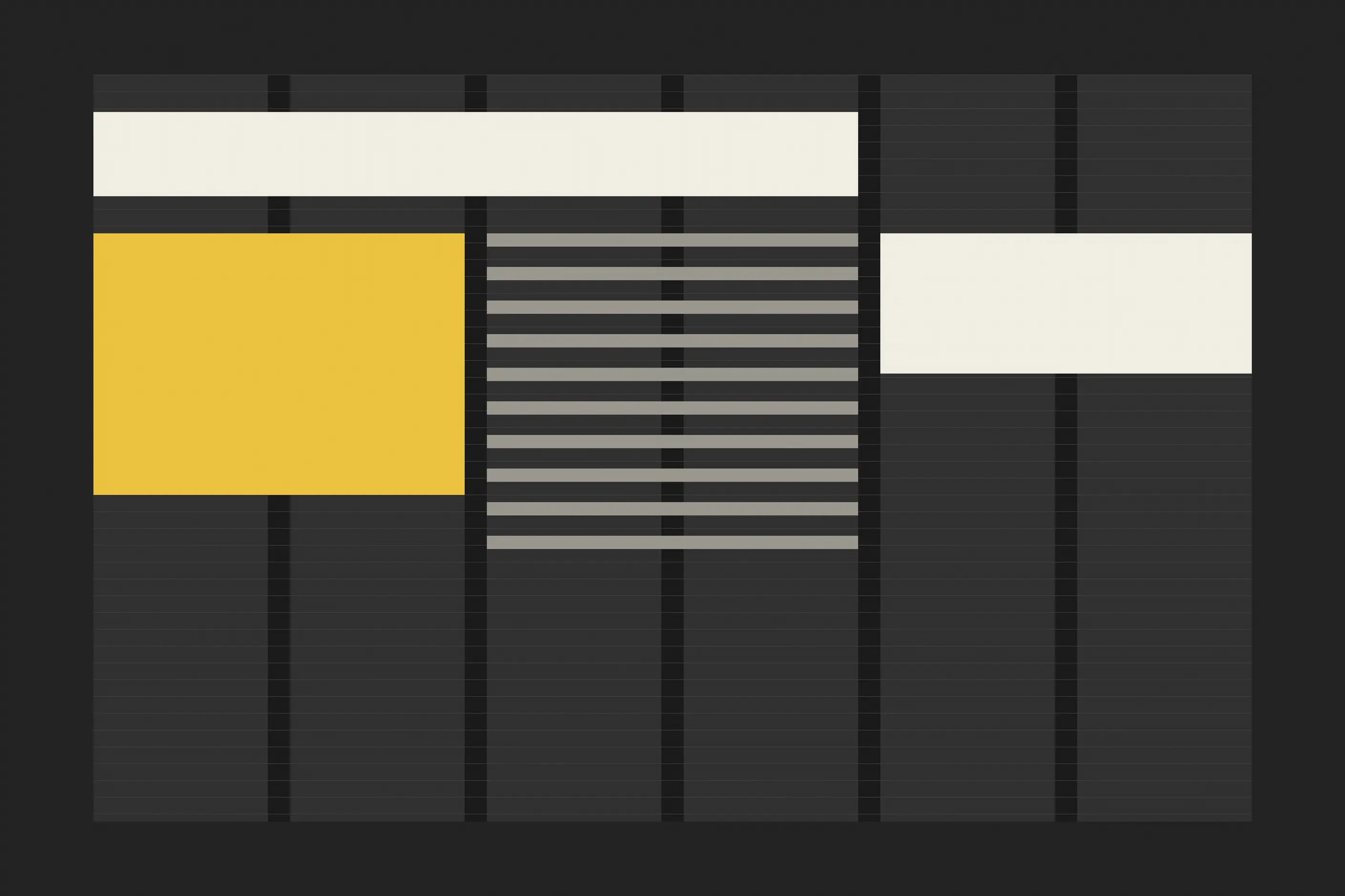
Build the grid from the content, not the other way round.
Start with the content. Before you choose a column count, list what you are organising: body text, images, captions, pull quotes, sidebars, data tables.
Note where content varies (a single full-width image on one page, a three-image spread on another) and where it carries a hierarchy of primary, secondary, and tertiary material. Answer these questions before you touch a column setting.
Choose your column count from that list. Flowing text with occasional images rarely needs more than three or four columns.
Sidebars, multi-column text, and varied image arrangements justify six to twelve. Component-based digital products usually want twelve, on the understanding that twelve columns demand more discipline to use well than three do.
Set proportions next. Derive margins, gutters, and columns from a single base unit so they relate mathematically rather than by eye: an 8-pixel base unit might put margins at 48 pixels and gutters at 24, with columns filling what remains.
Classical proportions (the golden ratio, root rectangles) do the same job by another method. Either way, no grid measurement should be arbitrary.
Test with real content before you finalise anything. Placeholder text and grey boxes hide the problems that real headlines, real images and real data tables reveal. Place them, then look for cramped or over-spaced results, awkward wrapping, and content the grid cannot accommodate at all.
A grid built for print, the web, and an app follows the same logic but not the same convention.
| Context | What the convention is |
|---|---|
| Print editorial | Multiple grid variants for different content types, baseline grids for text, hanging lines to align elements across spreads |
| Book design | A single text block sized by classical proportion, with the inner margin narrower than the outer to allow for binding |
| Web | The twelve-column grid collapses at breakpoints, for instance twelve on desktop, six on tablet, and four on mobile |
| App | Spacing set in multiples of a base unit, 8dp under Material Design, with safe areas and minimum touch target sizes respected regardless of the column math |
| Design system | Layout decisions build on a shared spacing scale and a set of layout components rather than a page-by-page grid. Design systems architecture covers how that scale becomes a token hierarchy |
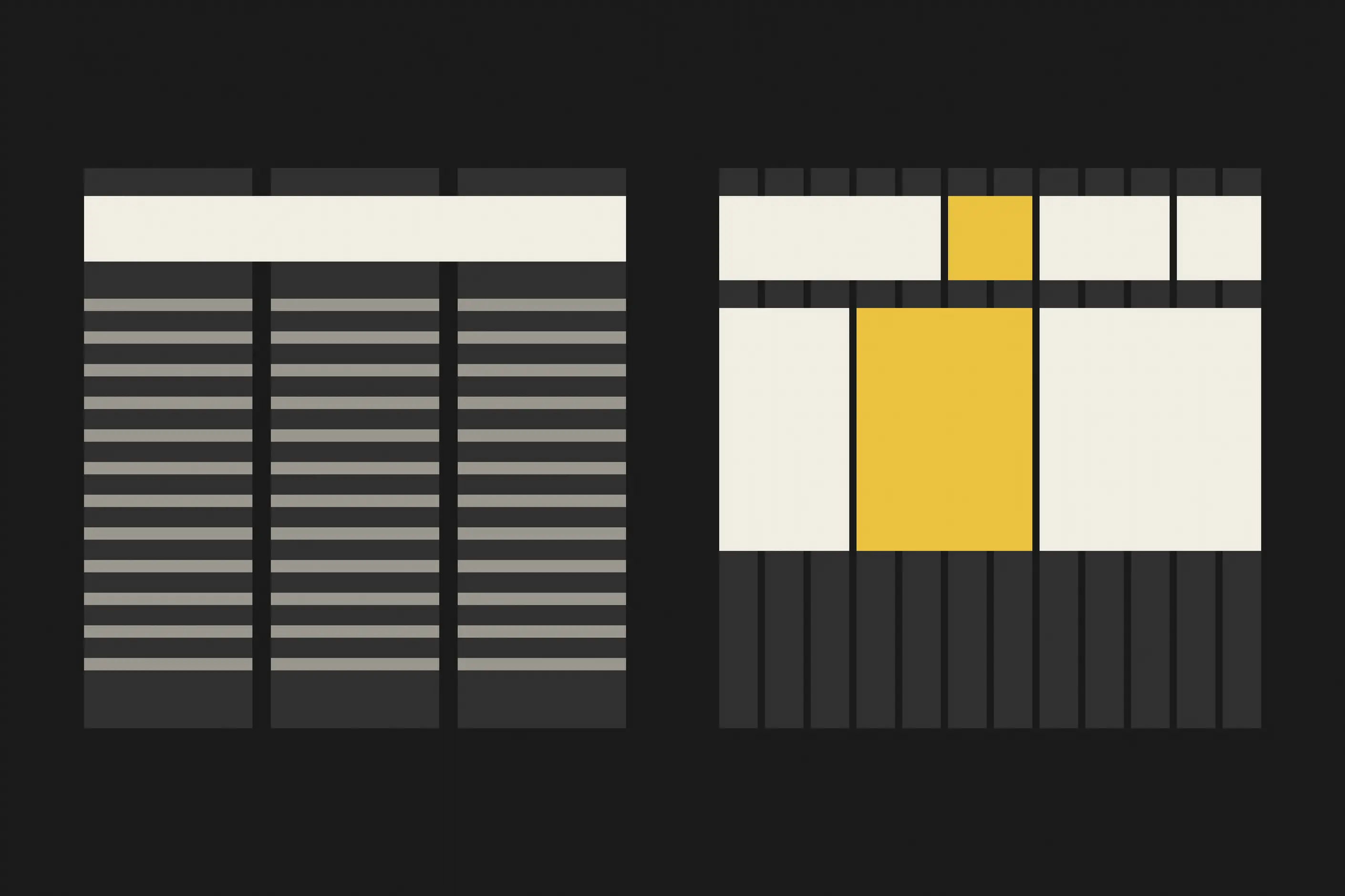
Take a page that needs three text columns, one full-width image and a data table, a common brief for an editorial feature. Reach for twelve columns only if the content justifies it: here, six columns cover it, since the text can run two columns wide with a third left for a sidebar, the image can span all six, and the table can span whatever width its data needs.
Set the base unit to 8 pixels, set margins to six units and gutters to three, and run the baseline grid at the body text’s line height. Then drop in the real headline, the real image at its actual crop, and the real table. If the table’s columns cannot fit inside the grid’s columns without forcing an odd wrap, the grid is telling you the count is wrong, not the content.

The first failure is building the grid before you know the content. A grid drawn from habit, or copied from another project, gets tested against real headlines and images only after it is already in use, and by then changing it costs more than starting over.
The second is choosing a column count for neatness rather than for the content’s shapes. Twelve columns because a framework defaults to twelve, or three because three looks tidy, both skip the only question that matters: what widths this content needs.
The third is a baseline grid abandoned the moment real copy arrives. It is straightforward to hold a baseline grid against a static mockup and considerably harder to hold it once body copy varies in length, headings interrupt it, and images do not land on clean baseline multiples. Most teams stop enforcing it here, and the vertical rhythm it was meant to deliver quietly disappears.
Match the count to content complexity rather than to habit. Three or four columns suit mostly flowing text, six suits editorial mixes, and twelve suits component-based digital products that need to slice content many different ways.
Do I need a baseline grid for digital work? Less often than for print, because browser rendering makes exact baseline alignment harder to hold and component-based layouts work against it. The underlying principle, consistent vertical spacing, still matters even where literal baseline snapping is not enforced.
When should I break the grid deliberately? When an element needs to signal that it is different: a full-bleed image, a pull quote pushed outside the column structure. A deliberate break reads as a decision; an accidental one three pixels off the grid edge reads as a mistake.
What is the difference between this page and advanced grid systems? This page covers the components of one basic grid (columns, gutters, margins, baselines, and modules) and how to build and apply a single grid well. Advanced grid systems cover combining multiple grids, modular systems, and hierarchical structures for content too complex for one grid.
| Fact | Detail |
|---|---|
| Müller-Brockmann’s reference text | Grid Systems in Graphic Design, published 1961 |
| Twelve-column grid, digital popularity | Popularised for web design by the Bootstrap framework, because twelve divides evenly by two, three, four, and six |
| Common mobile margin | 16 to 24 pixels a side |
| Material Design base unit | 8dp, with spacing and sizing set in multiples of it |
| Minimum touch target size | 44 points on iOS; 48dp on Android under Material Design |

An advanced grid system extends a single-column grid into a set of related structures: modular grids add rows to columns, compound grids layer two grids for extra intersection points, hierarchical grids nest smaller grids inside larger ones, and responsive grids reorganise the whole structure as the viewport changes.
Read it
Layout is the arrangement of elements inside a frame: what a viewer sees first, second, and third, and what the space between things does as they look.
Read it
Typography is the craft of shaping and spacing type so readers can recognise its letters and follow its meaning without friction.
Read it
Design systems architecture is the set of structural decisions that let a design system keep working as an organisation grows: how tokens layer, how components are organised and configured, and how the code that implements them is housed, built, and shipped.
Read it