
2026-09-15
Nural Choudhury
Layout is the arrangement of elements inside a frame: what a viewer sees first, second, and third, and what the space between things does as they look.
A grid gives that arrangement structure, but none of the principles that make it work- hierarchy, balance, rhythm, white space, proportion, tension, and focal point- come bundled with the grid. This page covers those principles; grid anatomy itself belongs to basic grid systems.
the ability to say precisely what is wrong with a layout that feels off, and the judgement to fix it without rebuilding the whole composition.
any composition with more than one element on it, a poster, a slide, a product screen, a report page, a shop window, whether or not it sits inside a grid.
decide the single focal point before you touch anything else. Every other principle here either supports that decision or works against it.
Seven judgements govern how a composition reads. Each is independent of grid structure: a grid gives you columns to place things in, not an opinion on which one wins attention first.
| Principle | What it controls | The mistake that breaks it |
|---|---|---|
| Hierarchy | What the viewer sees first, second, and third | Every element given the same size and weight, so nothing wins |
| Balance | Whether the composition feels stable or lopsided | Symmetry mistaken for balance, when the weight needs an asymmetric distribution instead |
| Rhythm | The pace at which the eye moves through repeated elements | Intervals that are almost but not quite consistent, which reads as an error rather than a choice |
| White space | Grouping, separation, emphasis, and rest | Treated as whatever is left over once the content is placed, instead of assigned on purpose |
| Proportion | The size relationship that holds a hierarchy together at every scale | Contrast between sizes too subtle to register, so two different things look the same |
| Tension | The energy created by how elements relate to each other and to the edges | Tension that arrives by accident, from careless placement, rather than by decision |
| Focal point | Where the eye enters the composition | A focal point competing with two or three others for that same entry |
Some of these lean on tools this page does not own. Contrast and colour intensity feed both hierarchy and balance, but the physics of colour, the wheel, the schemes, simultaneous contrast, belong to colour theory basics. Type size and weight feed hierarchy and proportion too, and type anatomy itself belongs to typography basics.
Proportion also borrows two standing conventions worth knowing rather than deriving your own: the golden ratio, roughly 1 is to 1.618, and the rule of thirds, which places a focal point on one of four intersecting lines rather than dead centre. Neither is mandatory. Both are faster starting points than guessing, and both fail the moment you apply them without checking whether the content wants that proportion at all.

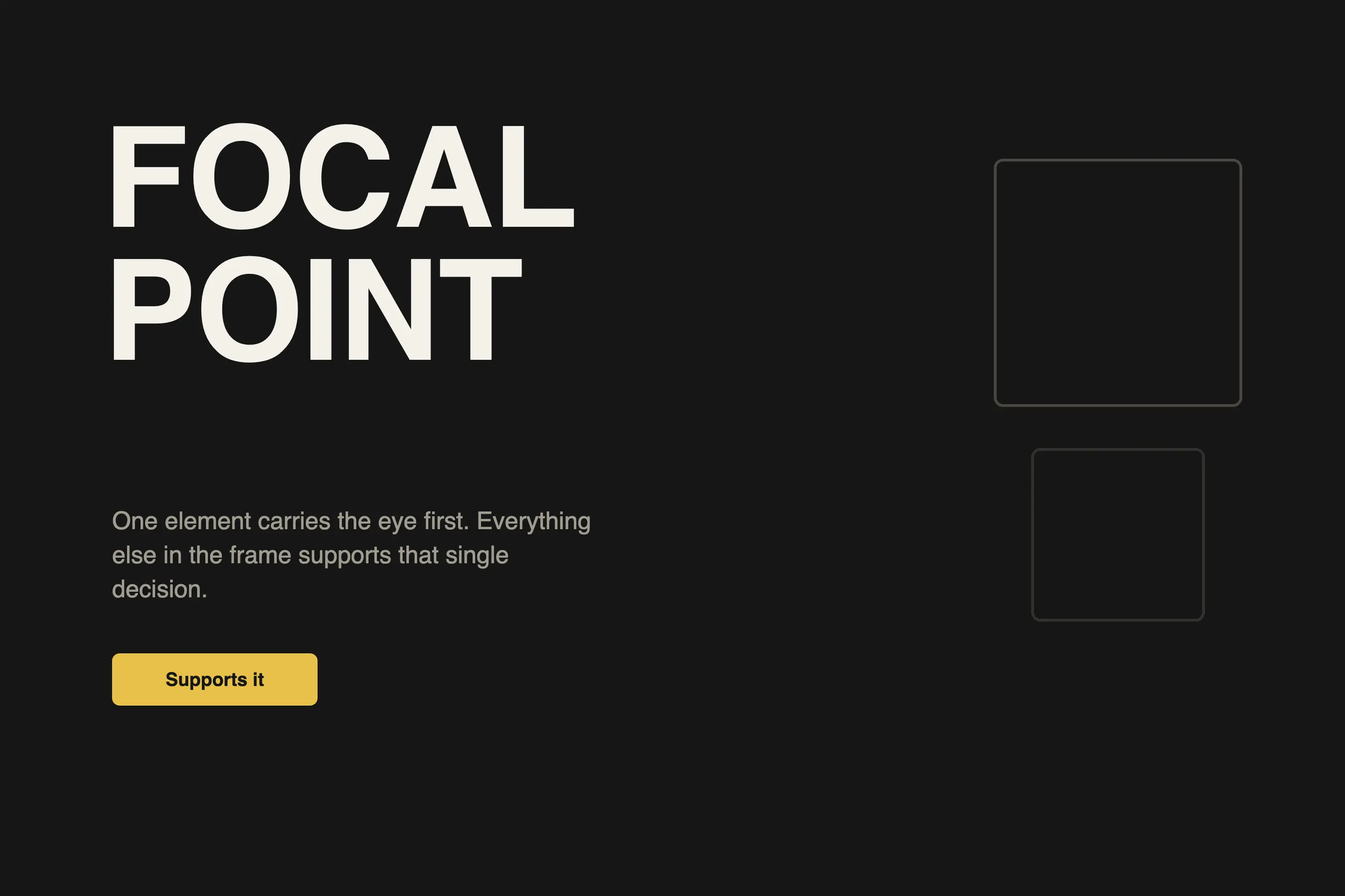
Decide your focal point before you place anything else, in one sentence: what should the viewer see first.
Build hierarchy around that decision using scale, contrast, weight, position, and isolation. Make these agree with each other rather than pulling in different directions, because a large, high-contrast, isolated element competing with a second one cancels the hierarchy both were meant to create.
Choose your balance on purpose. Ask whether the content wants formality or energy, then commit to symmetrical or asymmetrical. Don’t default to symmetry because it is easier to execute than figuring out where the asymmetric weight needs to sit.
Assign your white space. Decide what it groups, what it separates, and what it leaves alone. It must not be whatever is left over once everything else is placed, because viewers read unassigned space as an accident rather than room to breathe.
Set a rhythm and hold it. Once you establish an interval, whether regular, progressive, or varied, keep it consistent enough that a deliberate break in it reads as a signal rather than a mistake.
Check proportion at the size people will see it, not the size it was designed at. A ratio that looks harmonious in a mockup can collapse on a phone screen or fall apart across a printed spread.
Resolve or intend every tension if an element sits near an edge or overlaps another; that has to be a decision you made, not a side effect of running out of space.
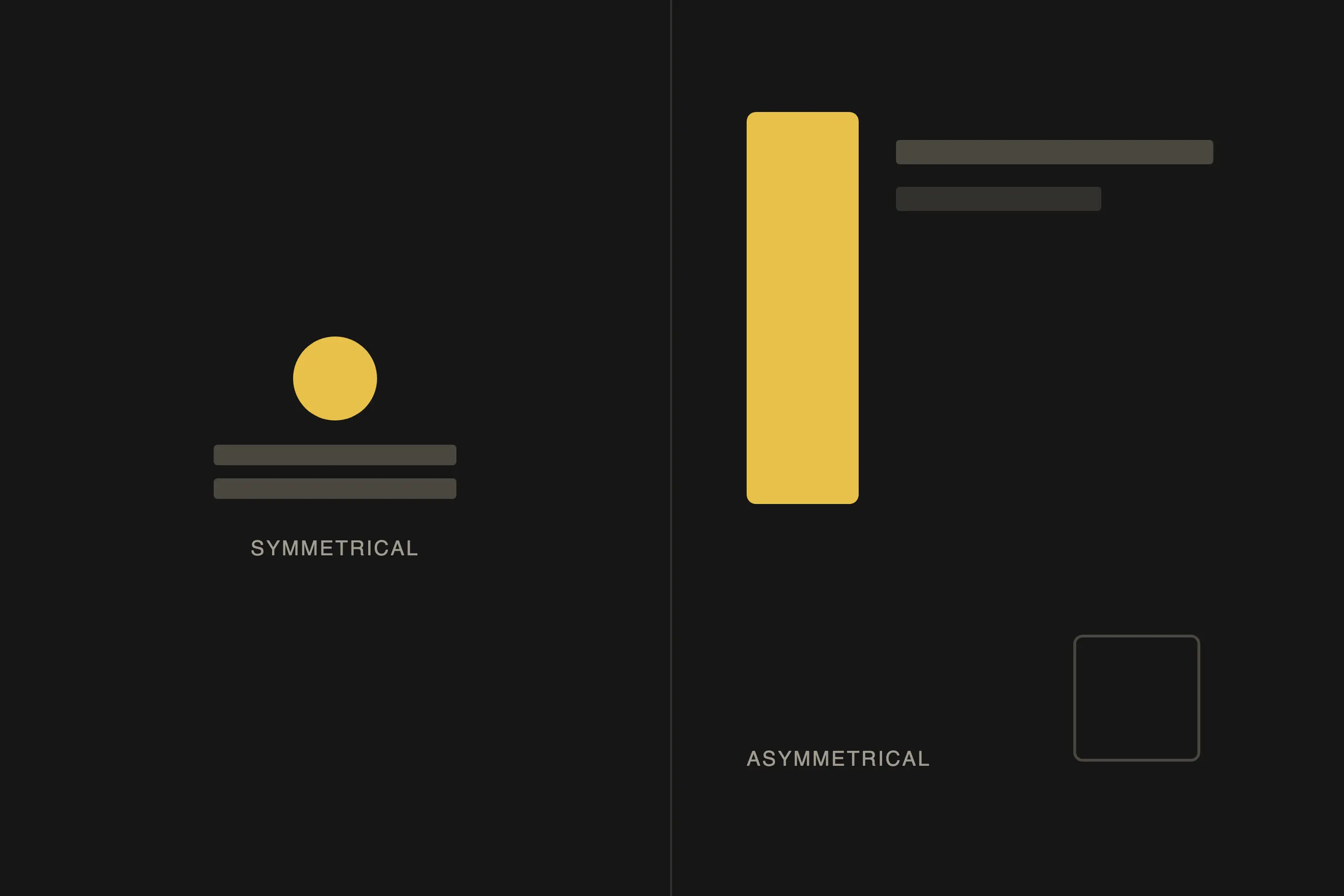
Take a one-page announcement: a headline, a supporting line, an image, and a call to action, four elements in one frame.
Start with the focal point. If the headline carries it, everything else must visibly support it: size the image down, and place the call to action where it’s found once the headline has landed, not before.
Hierarchy follows from there. Scale carries most of the weight: headline largest, supporting line next, call to action distinct but not competing with the headline for entry. Colour and weight can reinforce this scale relationship, but they should never contradict it.
Balance should match the tone. An asymmetric arrangement, headline on the left, a larger image on the right, gives the piece energy. Centring everything adds formality, and you should choose one approach rather than blend them.
White space comes last, and it is not an afterthought despite arriving last in this sequence. The gap above the headline should read larger than the gap below it, so the eye moves down through the composition instead of settling in the middle of the frame. The gap between the image and the call to action should match the gap between the headline and the supporting line, so the rhythm holds across both halves of the layout.
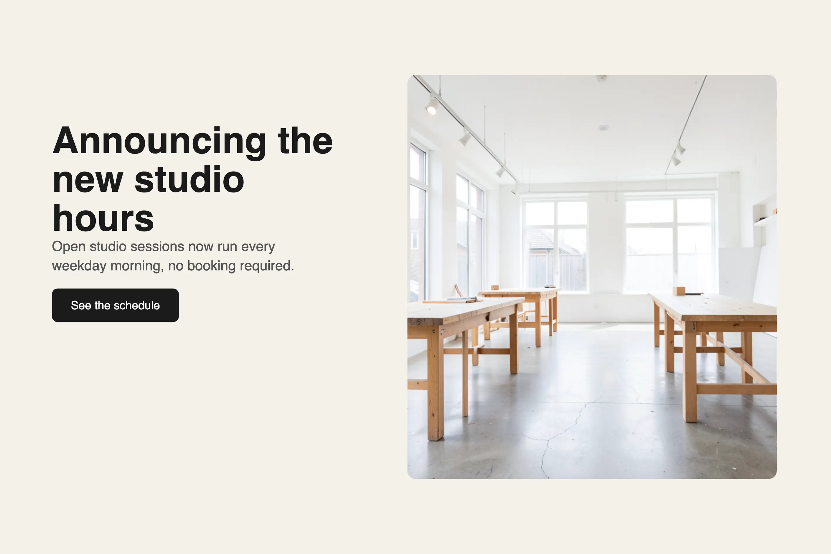
The most common mistake I see is symmetry mistaken for balance. Mirroring elements across a centre line is one way to reach balance, not the definition of it. A composition can be perfectly balanced while being wildly asymmetric, and forcing symmetry onto asymmetric content usually creates the lopsided feeling it was meant to avoid.
The second is treating white space as leftover. Once the content is placed, whatever gap remains gets accepted as fine, rather than assigned on purpose. Space between element groups signals separation, space around a single element signals emphasis, and leftover space signals nothing, which a viewer reads as carelessness even when they cannot say why.
The third is a focal point competing with two or three others. This usually happens when a layout has to satisfy several priorities at once, and each one gets equal visual weight because nobody was willing to rank them. A composition with three focal points has none: the eye lands nowhere, hesitates, and moves on to something else entirely.
All three mistakes share a root. Each treats a compositional decision as something the layout will resolve on its own, rather than something you decide before you place the first element.
Do layout principles apply the same way in print and digital? The principles hold; the constraints differ. A magazine spread is fixed and can commit to a precise proportion at one size, while a responsive page must hold its hierarchy and focal point as the frame changes shape.
Do I need a grid before I can apply these principles? No. A grid gives you a structure to place decisions inside, and most professional work uses one, but hierarchy, balance, rhythm, white space, proportion, tension, and focal point are compositional judgements you can apply to a single unstructured page. See basic grid systems for the structure itself.
How many focal points should a layout have? One. A second element can support it, lead to it, or follow it, but a layout with two elements built to be seen first is a layout with none, because the eye has nothing left to resolve the competition between them.
What is the fastest way to diagnose a layout that feels wrong but I cannot say why? Ask what the focal point is. If you cannot answer in one sentence, that is usually the real fault, often disguised further down as a hierarchy or balance problem instead.
Does more white space always mean better design? No. White space has to be assigned to a job, grouping, separation, emphasis, or rest, and space with no job reads as empty rather than considered. More space without a purpose is the same mistake as leftover space, just in a larger quantity.
| Fact | Detail |
|---|---|
| Golden ratio | Approximately 1 is to 1.618, used as a size relationship for proportion decisions |
| Rule of thirds | Divides a frame into a three by three grid, placing focal points on the intersecting lines rather than the centre |
| Western reading order | Left to right, top to bottom, the convention behind the early attention bias toward top left placement |
| Jan Tschichold’s New Typography | Established asymmetric balance as a systematic alternative to centred symmetry |
| Modular scale | A set of sizes generated by a consistent multiplier, used to keep proportion coherent across a hierarchy |
A grid is a system of columns, gutters, margins, and baselines that fixes where content can sit before you place a single element.
Read it
An advanced grid system extends a single-column grid into a set of related structures: modular grids add rows to columns, compound grids layer two grids for extra intersection points, hierarchical grids nest smaller grids inside larger ones, and responsive grids reorganise the whole structure as the viewport changes.
Read it
Colour theory is the study of how colours relate to each other on the wheel, across value, saturation, and temperature, and in combination so that you can reason through a decision rather than feel it.
Read it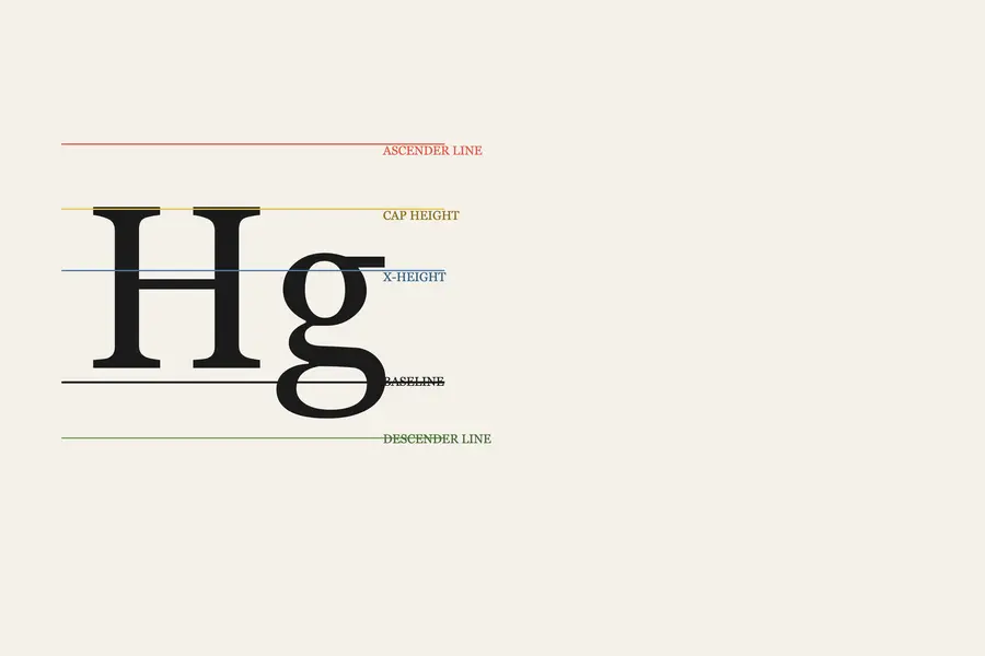
Typography is the craft of shaping and spacing type so readers can recognise its letters and follow its meaning without friction.
Read it
Editorial design is the practice of shaping a sequence of pages or screens.
Read it
An interface pattern is a solution to a recurring design problem, refined through enough use elsewhere that the person encountering it doesn’t have to figure out how to use it.
Read it