

2026-09-15
Nural Choudhury
An advanced grid system extends a single-column grid into a set of related structures: modular grids add rows to columns, compound grids layer two grids for extra intersection points, hierarchical grids nest smaller grids inside larger ones, and responsive grids reorganise the whole structure as the viewport changes.
This page covers sophisticated grid systems for design leaders: modular, compound and hierarchical architectures, mathematical foundations, responsive behaviour, and governance at scale. basic-grid-systems covers grid anatomy and the first grid you build; I am assuming you have already built one.
a structural vocabulary for content a single grid cannot hold: annual reports mixing data visualisation and narrative, design systems serving many product teams at once, and dashboards combining charts, tables, and controls in one view.
multi-format editorial systems spanning print and digital, product design systems at scale, and any interface with more than one content type competing for the same space.
choose the mathematical proportion before you draw a single module. Every module, every breakpoint, and every governance rule you write afterwards inherits that one choice.
Josef Müller-Brockmann’s programme grids extended the Swiss column grid into repeatable systems that could run across an entire publication, not just a single page. basic-grid-systems covers Karl Gerstner’s modular grids and their origin in more depth, so I am assuming that background here. Compound and hierarchical thinking followed the same publishers into digital products, where one grid rarely served every screen.
Ethan Marcotte named the final shift in his 2010 A List Apart article, “Responsive Web Design,” which gave the industry a term for a grid that reorganises itself rather than scaling in place.
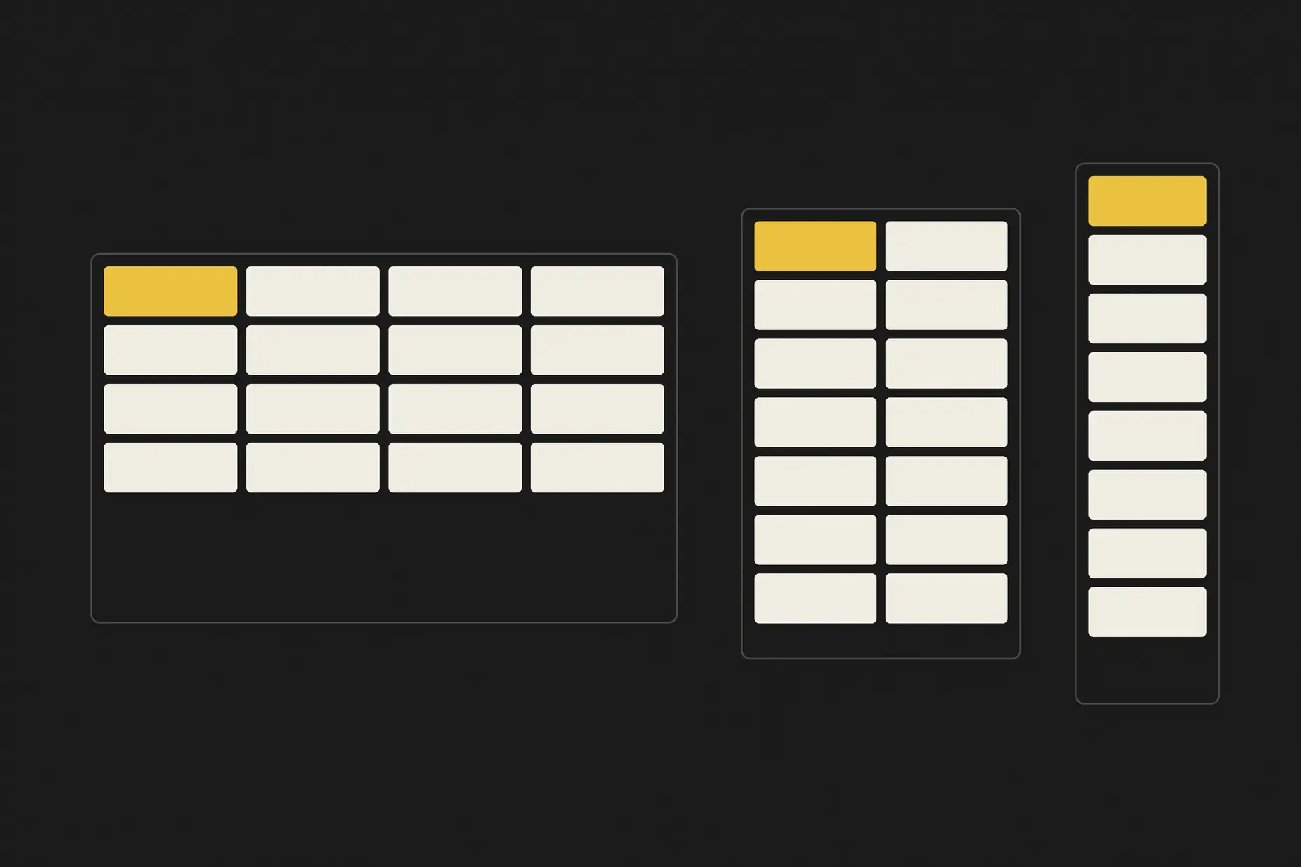
A single column grid handles predictable content: text flowing down the page, images at consistent sizes, layouts that repeat. Once a project mixes data visualisation, marketing content, and a dashboard in one system, a single grid starts working against the content instead of for it. The table below is a starting point, not a rulebook.
| Structure | What it adds | Best fit | Main risk |
|---|---|---|---|
| Modular | Row divisions on top of the columns | Mixed content types under one mathematical logic | Modules sized without a consistent ratio |
| Compound | A second grid layered over the first | Publications or products with genuinely different sections | A structure nobody outside the original team can use |
| Hierarchical | Smaller grids nested inside a master grid’s regions | Dashboards and enterprise software with many independent panels | A simple page inheriting structure it does not need |
| Responsive | Rules for how the structure reorganises by viewport | Any product spanning phone to desktop | Content that shrinks instead of reorganising |

Modular grids anchor every spatial decision to the module’s proportion, so the choice of ratio matters more than it does in a plain column grid. basic-grid-systems covers what a module is and how to build your first one; this section is about which ratio to pick, not what a module is.
| Proportion | Ratio | Effect on the module |
|---|---|---|
| Square | 1:1 | Maximum flexibility, no directional pull |
| Golden ratio | 1:1.618 | Dynamic tension between width and height |
| Root-2 | 1:1.414 | Halves and doubles cleanly, so modules scale across formats |
| Fibonacci-derived | Varies | Hierarchy that feels natural rather than mechanical |
I default to root-2 for anything that has to survive a format change, print to digital or desktop to mobile, because the halving relationship holds at every step. I reach for the golden ratio only when the brand’s own visual language already uses it elsewhere, so the module reinforces something the reader has seen before. Fibonacci-derived proportions suit editorial work with a genuine hierarchy of importance between elements; they are wasted on a grid where every module carries equal weight.

Compound grids layer two structures over each other: a three-column grid over a four-column grid creates twelve shared intersection points, offering more alignment options than either grid alone. I choose the two grids so they share gutters and a baseline, or the design reads as noisy rather than sophisticated. A primary grid handles the main content; a secondary grid handles navigation, a sidebar, or a feature layout that needs the extra structure only occasionally.
Hierarchical grids nest instead of layering: a master grid divides the page into regions (header, content, sidebar, footer), and each region carries its own grid for the content inside it. I keep the gutter ratio consistent across levels: a 32-pixel master gutter halving to 16 pixels at the regional level and 8 pixels at the component level, so the nesting reads as one system rather than three unrelated ones. Dashboards and enterprise software with many independent panels are the clearest case: each panel needs its own internal logic, but a shared ratio keeps the whole screen legible.
A responsive grid doesn’t just scale; it reorganises: columns collapse, content reorders, and sections hide below a threshold. I choose breakpoints from the content, not from device widths. The two questions that matter are where a line of text goes too short to read and where an image gets too small to serve its purpose.
| Context | Typical width | Typical columns |
|---|---|---|
| Mobile | 320 to 480 pixels | 2 to 4 |
| Tablet | 768 to 1,024 pixels | 6 to 8 |
| Desktop | 1,200 pixels and above | 12 |
Treat these as a starting point and add a breakpoint only where real content breaks, not where a device category changes. CSS Grid expresses the behaviour directly:
.grid-container {
  display: grid;
  grid-template-columns: repeat(12, 1fr);
  gap: 24px;
}

@media (max-width: 768px) {
  .grid-container {
    grid-template-columns: repeat(4, 1fr);
    gap: 12px;
  }
}
I design mobile first and decide what content matters most before I decide what disappears, collapses, or reorders below that priority. A framework grid such as Bootstrap or Tailwind is a reasonable starting point, but I check its defaults against the proportion I have already chosen rather than adopting them wholesale.
A grid system only holds if it is documented well enough that someone who did not design it can use it correctly. I write down every dimension and calculation, the breakpoint behaviour, and the exceptions, because asking the person who built it is not a governance model once a team grows past a handful of people. design-systems-architecture covers token hierarchy and component repository strategy; I am linking to it rather than repeating that guidance here.
Review the grid at the same cadence as design critique, not as a separate audit nobody has time for. Check new components against the grid before they ship, and catch drift during that review rather than months later, when it is expensive to unwind.
Audit your content before you touch a grid: list every content type the system must hold, and its spatial needs, before you pick a structure. Choose your proportion first: square, golden ratio, root-2, or Fibonacci-derived. Every module, breakpoint, and governance rule you add afterwards inherits it.
Build the simplest structure that serves the content. Reach for a compound or hierarchical grid only once a single modular grid demonstrably fails. Test the grid against real content, not placeholder text, at every breakpoint you have defined.
Document the specification before you hand it to anyone else: dimensions, breakpoints, exceptions, and one example each of correct and incorrect use. Set a review cadence before you ship the first component built on it, not after the tenth team has built on top of it.
Take a 1,200-pixel-wide content area with 60-pixel margins, leaving 1,080 pixels to divide. Twelve columns at 70 pixels with 20-pixel gutters fill that width exactly: 12 times 70 plus 11 times 20. A root-2 module at 70 pixels wide comes out at 99 pixels tall, so a viewport around 700 pixels tall holds roughly seven rows.
That single modular grid is the base. A compound layer for a marketing section might overlay a four-column grid on the twelve, sharing the same 20-pixel gutter so that a feature image can span four compound columns. At the same time, the surrounding article stays on the twelve-column base. At the 768-pixel breakpoint, the structure drops to four columns, and the module ratio stays root-2, so nothing on the page suddenly reads as a different system.
I have watched a compound grid ship that only the person who designed it could use. The two layers were never documented, so every new component became a guess; within months, nobody trusted the grid, and everyone worked around it.
Mathematical proportion applied where the content does not care is another failure I see often. Not every dashboard widget needs a golden ratio module; sometimes a plain square unit is more legible, and the golden ratio only adds friction the content never asked for.
Nested grids solve a genuine problem for dashboards and enterprise software, but I have seen them applied to a simple marketing page that then became expensive to change. Every edit required reasoning about three levels of structure for content that only needed one.
when content has real vertical variation, mixed image sizes, or data alongside narrative text. If content flows predictably down the page, a column grid serves better with less overhead.
enough to handle where content genuinely breaks, usually three to four. Add a breakpoint because a line of text or an image failed, not because a device category exists.
yes, as long as every grid shares gutters and a baseline, and you document when each one applies. Without that shared logic, a compound system reads as inconsistency rather than sophistication.
document it, run a review cadence tied to design critique, and use templates that enforce the proportion you chose. Audit for drift on the same schedule, not only when something visibly breaks.
| Fact | Detail |
|---|---|
| Golden ratio | 1:1.618, an irrational proportion used in geometric composition since antiquity |
| Root-2 ratio | 1:1.414, the proportion behind ISO 216 paper sizes such as A4 |
| Minimum touch target | 44 by 44 pixels, per Apple’s Human Interface Guidelines |
| Responsive web design | Named by Ethan Marcotte in A List Apart, 2010 |
| CSS Grid Layout | A W3C standard for two dimensional layout, supported by all major browsers |

A grid is a system of columns, gutters, margins, and baselines that fixes where content can sit before you place a single element.
Read it
Layout is the arrangement of elements inside a frame: what a viewer sees first, second, and third, and what the space between things does as they look.
Read it
Design systems architecture is the set of structural decisions that let a design system keep working as an organisation grows: how tokens layer, how components are organised and configured, and how the code that implements them is housed, built, and shipped.
Read it
A design system is a governed set of reusable components, patterns and rules that a team uses to build consistent digital products at scale, and it is neither a static style guide nor a component library on its own.
Read it
Typography is the craft of shaping and spacing type so readers can recognise its letters and follow its meaning without friction.
Read it