
2026-09-15
Nural Choudhury
Colour management is the discipline of specifying a colour precisely enough that a printer, a signage vendor and a web team can all reproduce it the same way, then documenting that specification.
Hence, an organisation applies it consistently without you in the room. This page covers how to specify, manage and document colour across media and teams using standardised systems, profiles and governance, so colour stays consistent from screen to print. This includes the perceptual side: the wheel, the schemes, and how colours relate to each other Colour Theory Basics: Palettes, Contrast, Psychology and Accessibility Guide.
a way to specify a colour so precisely that a printer, a signage vendor, and a web developer all produce the same result, plus the governance to keep that consistency as a team and a product range grow.
brand identity systems, print and packaging production, physical products, and any interface that has to match a printed identity.
choose your primary brand colours from a gamut that survives CMYK print, before you touch a swatch book or a HEX picker. A colour that only exists on screen is a promise production cannot keep.
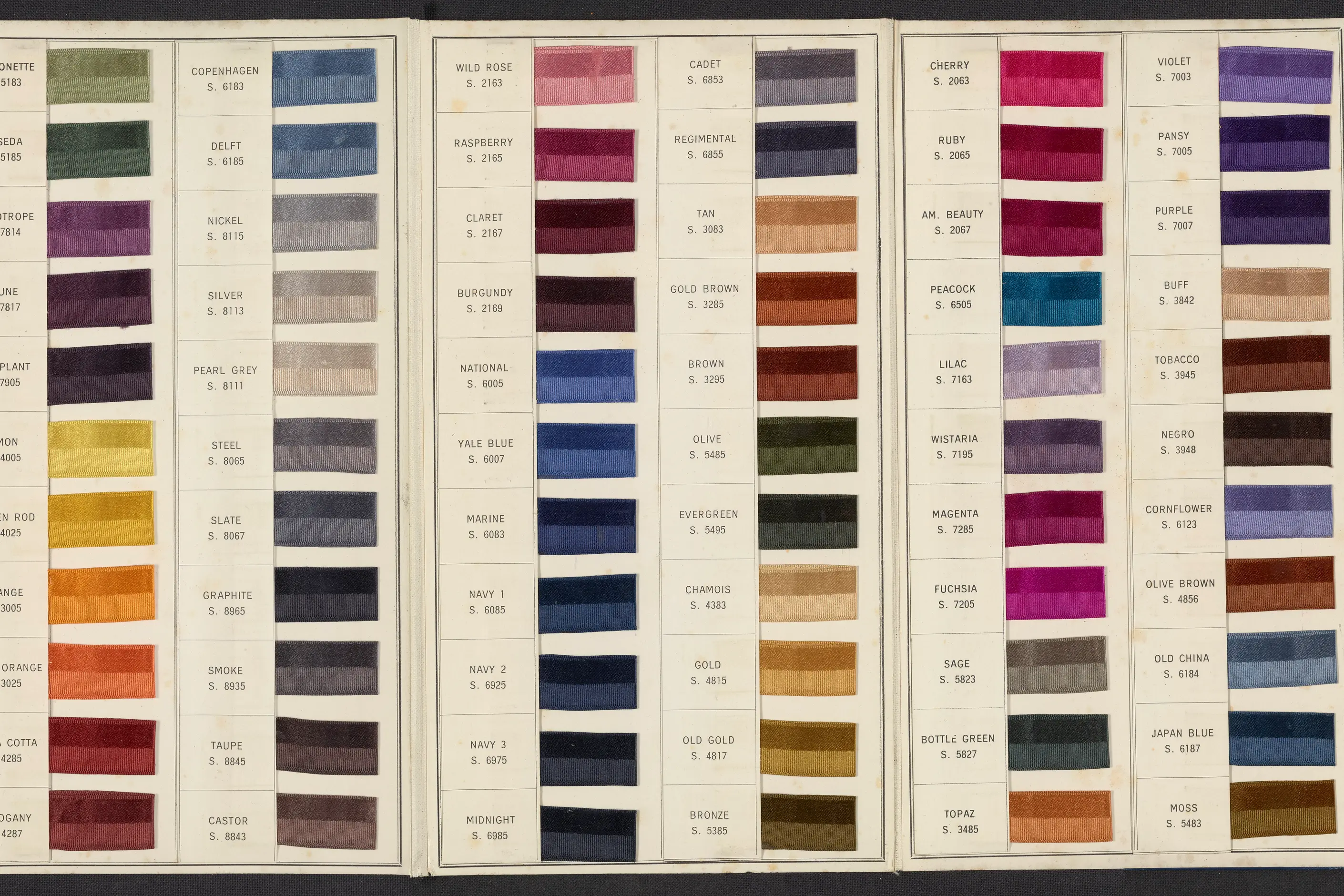
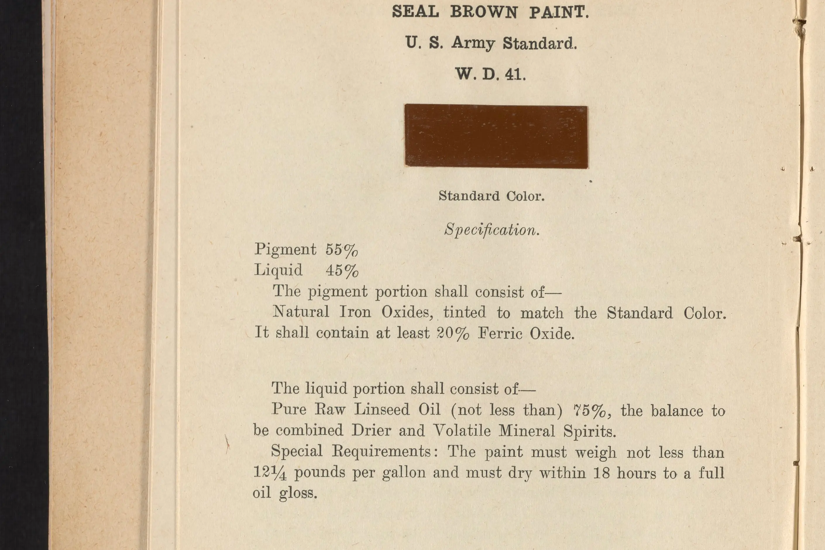
The systems below predate digital colour by decades. Pantone became the print industry’s ink matching standard in the 1960s: physical swatch books let a designer and a printer agree on an exact ink before a sheet ran. Munsell, from the early 1900s, was the first system to order colour scientifically by hue, value, and chroma rather than by pigment.
RAL followed in 1920s Germany for industrial paint and coatings, and NCS in Sweden, describing colour as the eye perceives it rather than how it is mixed. The International Colour Consortium standardised device colour profiles in the 1990s, which is why a monitor and a printer can now speak the same colour language.

Precise colour communication needs a standardised reference. “A nice blue” is not a specification. “Pantone 286 C” is.
| System | What it specifies | Where it is used | Its limit |
|---|---|---|---|
| Pantone Matching System | An exact physical ink or coating, in coated and uncoated versions | Print, packaging, and physical products | Spot colours cost extra, so most projects reserve Pantone for the primary brand colour and use CMYK process colour elsewhere |
| RAL | Industrial and architectural paint and coating colours by a four digit code | Architecture, manufacturing, and product design | Built for physical coatings only, with no screen or print equivalent |
| NCS | Colour as the eye perceives it, by blackness, chromaticness, and hue | Design decisions and cross media communication | Describes appearance, not a specific ink or pigment mix |
| Munsell | Colour ordered scientifically by hue, value, and chroma | Soil science, dentistry, and other fields needing scientific precision | More precision than most design work requires |
Digital colour uses different systems. HEX and RGB specify the same additive red, green, and blue values for a screen, while HSL describes the same colour by hue, saturation, and lightness, which is more intuitive to adjust by hand. LAB describes lightness and two colour opponents, and is the system accessibility contrast calculations use.
Document a brand colour in every system its media require: Pantone for print, HEX and RGB for screens, RAL if a physical product needs one. Do not assume one value converts cleanly into the others. It rarely does without a deliberate conversion step.
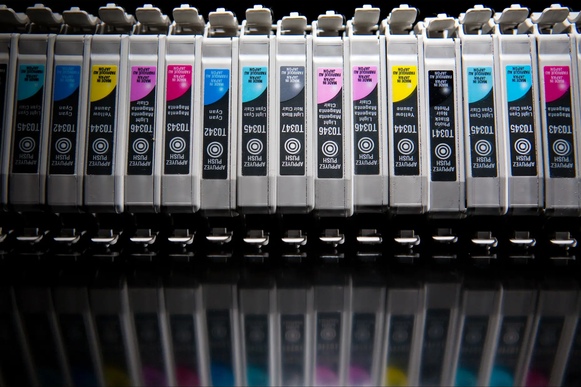
Screen and print use different colour models. RGB is additive: screens add red, green, and blue light, and all three at maximum make white. CMYK is subtractive: print subtracts light with cyan, magenta, yellow, and black ink, and all four at maximum make close to black.
The practical problem is gamut. The RGB gamut a screen can display is wider than the CMYK gamut a press can print, so a vibrant screen colour can look dull once it reaches paper. Spot colours, exact inks mixed to a Pantone formula, are more accurate than CMYK process colour and more expensive.
Managing colour across media means controlling the whole chain, not just the specification. Calibrate displays with a hardware colourimeter, because an uncalibrated monitor shows colour that won’t match the final output. Use ICC profiles, which describe how a specific device reproduces colour so that software can translate between a monitor’s profile and a printer’s.
Soft proof in design software before you commit to print, to catch a gamut problem while it still costs nothing to fix. For work where colour must be exact, produce a hard proof on the actual stock, and attend the press check for a high-value run rather than trust the proof alone.
Choose primary brand colours that survive translation to CMYK, because a colour a press cannot reproduce becomes a permanent source of variation. Specify a value for every medium your brand touches, and define an acceptable tolerance rather than chasing an exact match across screen, print, and physical material.

Colour psychology is often reduced to a formula: blue for trust, green for nature, red for urgency. Treat it as research-based and context-specific instead. What a colour signals depends on industry convention, culture, and what a competitor already owns, and an effect measured in one retail or healthcare setting does not transfer automatically to another.
Psychology is one input among several. It has to sit alongside brand identity, accessibility, and what a press or a screen can reproduce, and none of those defers to it automatically.
A colour system is more than a palette. It defines which colours exist, how each is used, and who is responsible for keeping both up to date.
| Role | Purpose |
|---|---|
| Primary | One to three core brand colours, distinctive and reproducible across every medium |
| Secondary | Supporting colours and tonal variants that extend the palette without diluting it |
| Accent | Used sparingly, for emphasis and calls to action |
| Neutral | Greys, black, and white for backgrounds, text, and structure |
| Semantic | Functional meaning such as success, warning, error, and information |
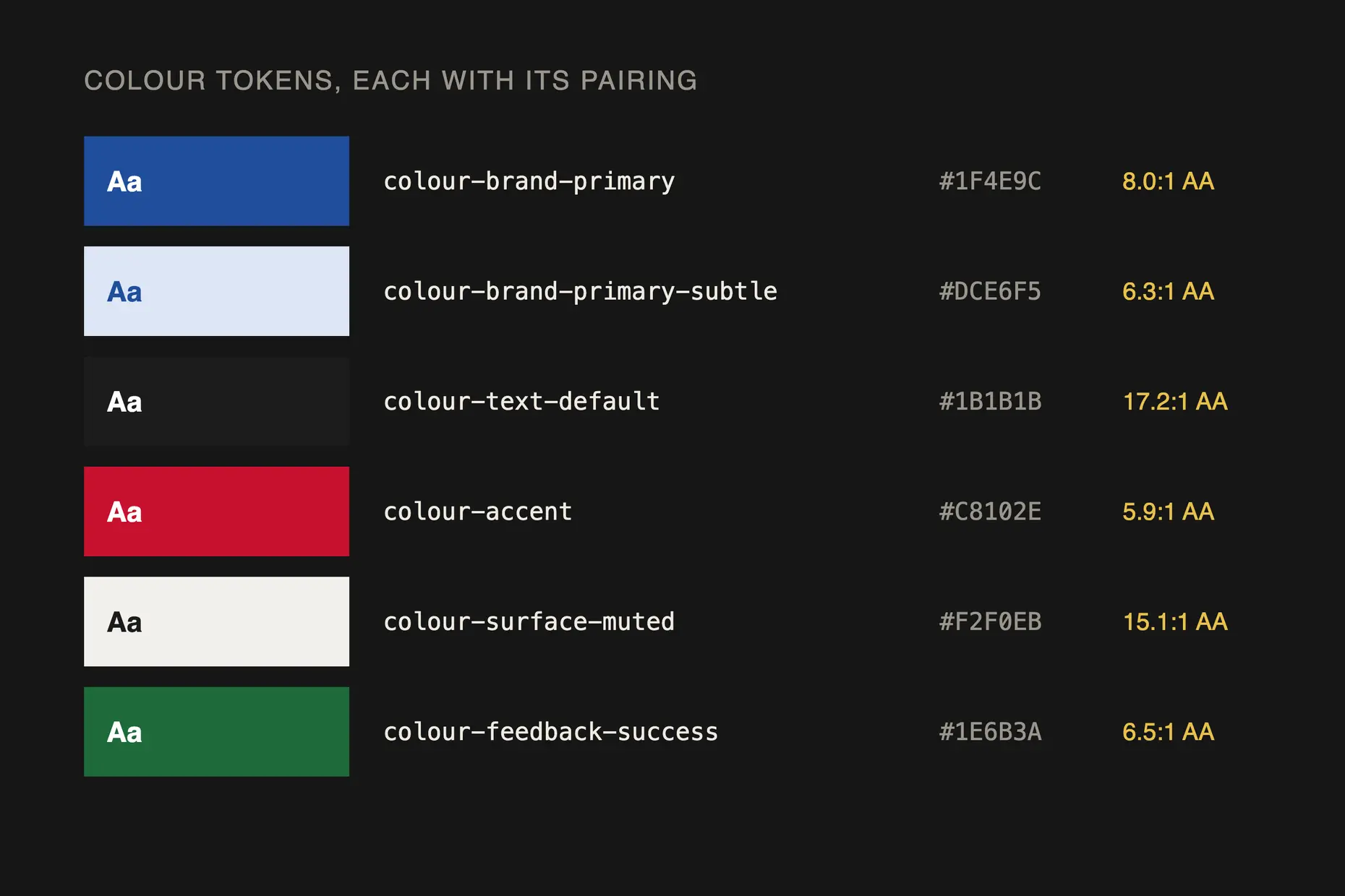
Implement the palette as design tokens, named values such as colour-brand-primary rather than a HEX code hardcoded in every file, so a single change propagates across design and code. Put the tokens in the design tool library the team uses. A colour that exists only in a document gets recreated from memory.
Build accessibility into the palette and the token set itself, not into a final check before launch. If every token already meets a contrast minimum against its intended background, no designer has to remember to test it, and the compliant choice becomes the easy one. Conformance ratios, colour vision deficiency, and testing tools are covered Accessibility Standards: WCAG, Inclusive Design and Digital Accessibility Guide.
A colour system needs an owner, a change process, and a way to tell users what changed and when, or it drifts. Periodically audit actual usage against the documented system. A palette nobody enforces becomes a suggestion.
Specify every brand colour in every system it touches: a Pantone reference for print, a HEX and RGB value for screen, a RAL or paint code if a physical product needs one. Never leave a colour as “the blue”. A vague description is not a specification anyone downstream can act on.
Choose your primary colours from a gamut that survives CMYK before you commit to a screen-only palette. Check a candidate colour against a CMYK conversion early, and if it falls outside the printable range, treat that as a decision to revisit rather than a problem to solve later at the press.
You must calibrate the screen you use to make colour decisions. Do not approve a colour on a display you have not calibrated, because you are approving light, not colour, and the two are not the same thing on an uncalibrated screen.
Build your palette as tokens from the first version, not as a retrofit. Give every token an accessible pairing before a designer needs one, so the system defaults to compliant rather than depending on someone to check.
Take a single primary brand colour through specification. Start from the perceptual choice, a blue that fits the identity, then convert it to CMYK first, to confirm it survives print. If it falls outside gamut, nudge it inside gamut rather than accepting a colour you cannot print consistently.
Once the CMYK value holds, derive the rest: a Pantone reference from a physical swatch book for spot printing, a HEX and RGB value for screens, and a RAL code if the brand uses a physical product such as signage or packaging. Document all four values against one name, brand-primary so a printer, a developer, and a signage vendor work from the same source rather than translate a HEX code on their own judgement.
Soft proof the result before it goes to print, and calibrate the screen you view the proof on. A value that has not been through this sequence is a colour choice, not a specification.
I have watched a brand colour get approved on screen, then discover it was outside the CMYK gamut only once the first print run reached the press. The fix at that point is a compromise nobody chose on purpose, made under deadline, and it becomes the colour the brand lives with.
I have seen a HEX value treated as the source of truth for a printed identity, because it was the value everyone had on hand. A HEX code describes light on a screen. It does not describe ink, and treating it as if it does guarantees a mismatch the first time the identity meets a printed page.
I have seen proofing done on an uncalibrated screen, which is worse than no proofing at all, because it produces false confidence. A proof approved on a monitor showing the wrong colour is not a proof. It is a guess wearing the authority of a proof.
neither is first. Choose the colour perceptually, confirm it survives conversion to CMYK, then derive every other value, Pantone, HEX, RGB, and RAL, from that confirmed colour.
yes, for any print or physical production work. A calibrated display is the baseline for any colour decision; without one, you are approving light, not colour.
fewer than feels safe. One to three primaries, a small set of secondaries, and semantic colours for function; a system too large to remember gets worked around rather than used.
in the palette and the token set, not as a check before launch; build every token to a contrast minimum against its intended background, and the compliant choice becomes the default.
some. Perfect consistency across screen, print, and physical material is not achievable, so define a tolerance in advance rather than discover one under deadline at a press check.
| Fact | Detail |
|---|---|
| Pantone Matching System | Spot colour, ink matching standard for print, established in the 1960s |
| RAL | Industrial and architectural colour standard originating in 1920s Germany |
| International Color Consortium | Founded in the 1990s to standardise the ICC device colour profiles that colour management depends on |
| RGB versus CMYK gamut | A screen’s RGB gamut is wider than a press’s CMYK gamut, which is why screen colour can look dull once printed |
| Design token | A named colour value, such as color-brand-primary, referenced by design tools and code so one change propagates everywhere |

Colour theory is the study of how colours relate to each other on the wheel, across value, saturation, and temperature, and in combination so that you can reason through a decision rather than feel it.
Read it
Digital accessibility is the practice of building products people can use, whatever their permanent, temporary, or situational disability, measured against a published standard rather than opinion.
Read it
A design system is a governed set of reusable components, patterns and rules that a team uses to build consistent digital products at scale, and it is neither a static style guide nor a component library on its own.
Read it
Design systems architecture is the set of structural decisions that let a design system keep working as an organisation grows: how tokens layer, how components are organised and configured, and how the code that implements them is housed, built, and shipped.
Read it