
2026-09-15
Nural Choudhury
Colour theory is the study of how colours relate to each other on the wheel, across value, saturation, and temperature, and in combination so that you can reason through a decision rather than feel it.
A pairing that looks fine alone can fail against a real background at a real size.
This page covers how colours relate perceptually and psychologically: the wheel and its schemes, the three dimensions, contrast and harmony, and the judgement calls that turn theory into a working palette. Colour-systems covers what happens once you have chosen that palette: colour spaces, matching systems, proofing and management across media and teams.
A working vocabulary for why colour combinations feel harmonious or clash, so you can discuss a colour decision in shared terms rather than settle it by preference. It also flags when a technically correct scheme still doesn’t work.
Any colour set that has to hold together, brand palettes, interface colour, print, and environmental colour, before a tool converts any of it to a hex value or an ink formula.
Value contrast, before hue. A relationship that looks distinct in a swatch often collapses once tested at the size and proportion it will run at.
Isaac Newton built the first colour wheel in 1666, bending the visible spectrum into a circle to show that red and violet, the two ends of the spectrum, sit next to each other rather than apart. Johann Wolfgang von Goethe added an account of how colour is perceived, published as Theory of Colours in 1810.
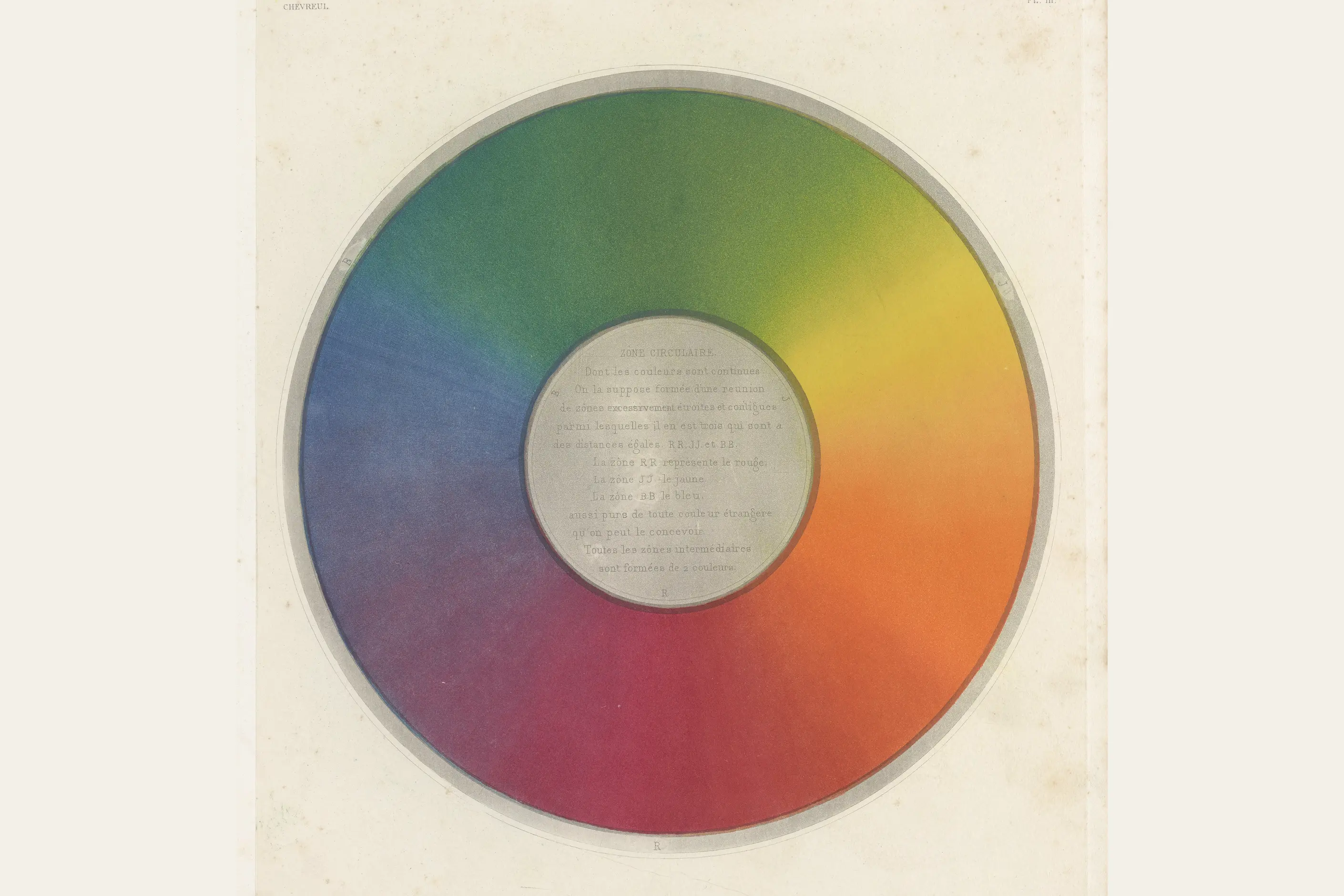
Michel Eugène Chevreul, running the dye works at the Gobelins tapestry factory, identified the effect now called simultaneous contrast and published it in 1839. Colour changes its apparent appearance depending on what sits next to it, a finding this page returns to below.
Johannes Itten built colour into a teaching discipline at the Bauhaus in the 1920s, and Josef Albers continued that work at Yale, publishing Interaction of Colour in 1963. The wheel that survives from this lineage is a teaching tool rather than a scientific model of human colour perception, and it remains reliable.
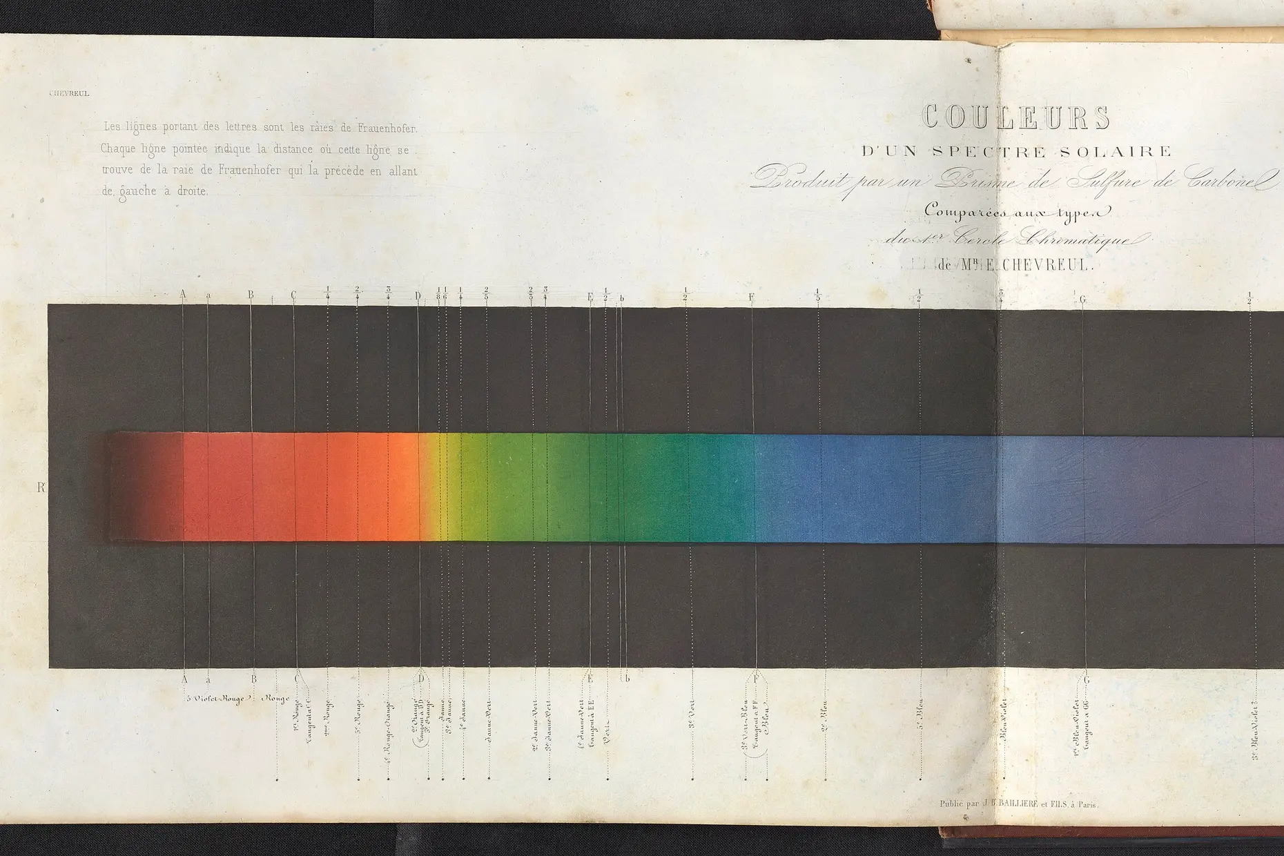
Traditional colour theory arranges the wheel around three primaries: red, yellow, and blue, colours you cannot mix from others. Mixing two primaries gives a secondary, orange, green, or violet, and mixing a primary with a neighbouring secondary gives a tertiary such as red-orange or blue-green.
Printing and screens use different primaries: cyan, magenta, and yellow for ink; and red, green, and blue for light; and colour systems cover how those spaces convert and where they clip. The traditional wheel stays useful because its relationships hold regardless of which primary set built it.
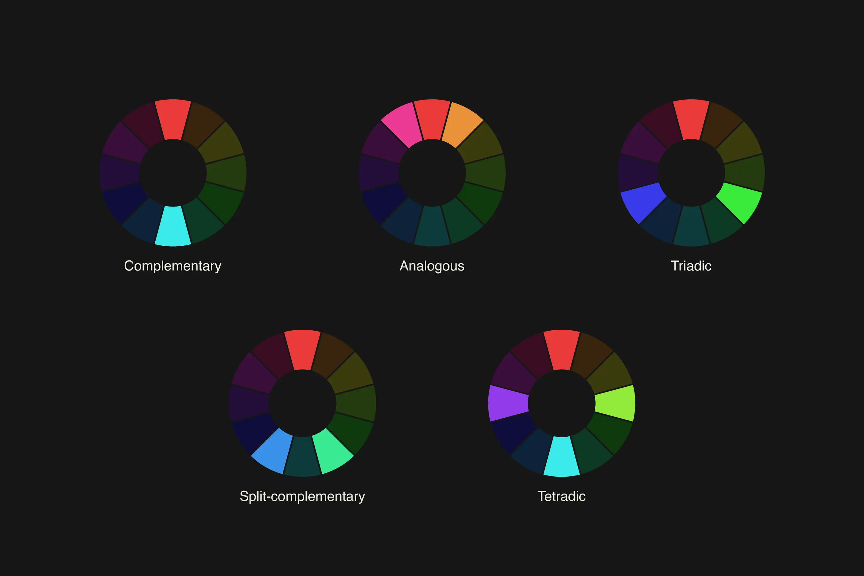
The wheel’s real value lies in the relationships it reveals, not the hues themselves. Five schemes recur, and each is a starting point to test, not a formula to apply without checking it.
| Scheme | How it is built | What it suits |
|---|---|---|
| Complementary | Two hues directly opposite the wheel, such as red and green | Maximum contrast and emphasis; each hue intensifies the other, so it works better as an accent than as two large adjacent fields |
| Analogous | Three or four hues that sit next to each other, such as blue through blue-green to green | Calm, unified palettes, backgrounds and supporting colour, though the set often needs a complementary accent to create a focal point |
| Triadic | Three hues spaced evenly around the wheel, such as red, yellow, and blue | Variety with structure; works best with one hue dominant and the other two used as support rather than in equal weight |
| Split-complementary | One hue plus the two neighbours of its complement, such as yellow with red-violet and blue-violet | Contrast with less of the vibration a pure complementary pair can produce |
| Tetradic | Four hues forming a rectangle on the wheel | Range and complexity; hard to balance, and works only when one hue is allowed to dominate the other three |
These schemes describe hue relationships only. Value, saturation, and temperature decide most of what happens next.
Hue is what most people mean when they name a colour: red, blue, green. It is also only one of three dimensions that determine how a colour behaves next to another.
| Dimension | What it controls |
|---|---|
| Value, light to dark | Reading order and hierarchy. Two hues at the same value blend together even when the hues themselves differ, and two hues at different values separate even when the hues are close |
| Saturation, vivid to muted | Attention. A saturated colour against a muted field is read first, and a palette held at one saturation everywhere gives the eye nowhere to land |
| Temperature, warm to cool | Apparent depth. Warm hues appear to advance and cool hues appear to recede at the same physical distance, a genuine perceptual effect rather than a matter of mood |
Value matters more than hue for almost every practical decision, and when a pairing is not working, I check value before I touch hue.
Contrast ratios and colour vision deficiency are conformance requirements, and accessibility standards cover the numbers and the testing, not this page. The perceptual point worth keeping is that two colours can read clearly apart to one viewer and barely apart to another, which is why a wheel relationship alone never confirms a pairing works.
Temperature also shifts within a single hue: a red leaning orange reads warmer than a red leaning violet, and a grey can carry a warm or a cool undertone at an identical value. These shifts decide whether a palette reads as one family more than the named hues do.

Josef Albers’s central claim was that colour is relative, not absolute. Place a mid-grey square on white, and it reads dark; place the same grey on black, and it reads light, and the grey itself has not changed.
The same shift happens with hue and temperature: a neutral grey reads warm against blue and cool against orange, because a colour pushes its neighbours toward its complement. A colour chosen from a swatch library will not read the same way inside the actual design, so I test pairings in context, not in isolation.
Proportion shapes how a scheme reads as much as the scheme itself. A complementary pair used in equal amounts fights, while the same pair used unequally, one colour dominant and the other reserved for a small area, creates emphasis instead of tension.
A common starting ratio runs around sixty per cent dominant colour, thirty per cent secondary, and ten per cent accent, treated as a ratio to test rather than a rule to follow mindlessly. Where colours meet matters too: two complements at high saturation can vibrate at the edge, an uncomfortable flicker some viewers see more strongly than others.
Lowering the saturation, or running a thin neutral line between the fields, settles it. Two similar hues at similar values do the opposite: they merge, and the edge disappears exactly where you need it to hold.

Colour carries association, and association is a cultural convention rather than a fixed effect a hue produces in every viewer. Red does not create urgency by itself; in many Western interfaces, red signals warning and calls to action by convention, and that convention varies by culture.
| Colour | Common Western convention | Cultural variation |
|---|---|---|
| Red | Warning, urgency, calls to action | Signals luck and celebration in Chinese culture rather than danger |
| White | Purity, simplicity, weddings | Signals mourning in many South and East Asian cultures |
| Yellow | Optimism, caution | Can read as cowardice in Western idiom, and as sacred in some Asian contexts |
| Green | Nature, safety, financial growth | Can signal infidelity in some cultures rather than safety |
| Blue | Trust, stability, corporate identity | Among the more consistently positive associations across the cultures studied, though still not universal |
Context within a single culture shifts the reading: red on a stop sign reads as danger, red on a restaurant sign reads as appetite, and the hue has not changed. Treat any association in the table as a starting hypothesis to check against the audience and the context, not as a rule.

Start from a scheme, not from a single hue. Pick complementary, analogous, triadic, split-complementary, or tetradic based on how much contrast the palette needs, then treat the result as a draft rather than a finished set.
Set value before you set anything else. Decide which elements must read first, and give them the value contrast to do it, independent of which hues you have chosen.
Vary saturation on purpose. Reserve full saturation for the elements that must be found first, and desaturate the rest so they recede.
Test the palette at the proportions it will run at, not at swatch size. Sixty per cent of a screen in an accent colour reads differently from ten per cent.
Check temperature consistency across the whole set, including your neutrals. A cool grey next to a warm red can undercut a palette that is otherwise correct.
Take a product interface that needs one clear primary action per screen. A split-complementary scheme gives contrast without the vibration a pure complementary pair risks at that scale: a base blue, with warm accents pulled from red-violet and orange.
Set the base blue at low saturation across the interface, because it carries most of the surface and needs to recede. Reserve full saturation for the accent marking the primary action, so it reads first.
Check the value gap the primary action needs against its background, as accessibility standards cover that, not the wheel relationship. Then check proportion: a warm accent covering a third of the screen instead of the small area it was designed for stops reading as an accent and starts fighting the base colour for attention.
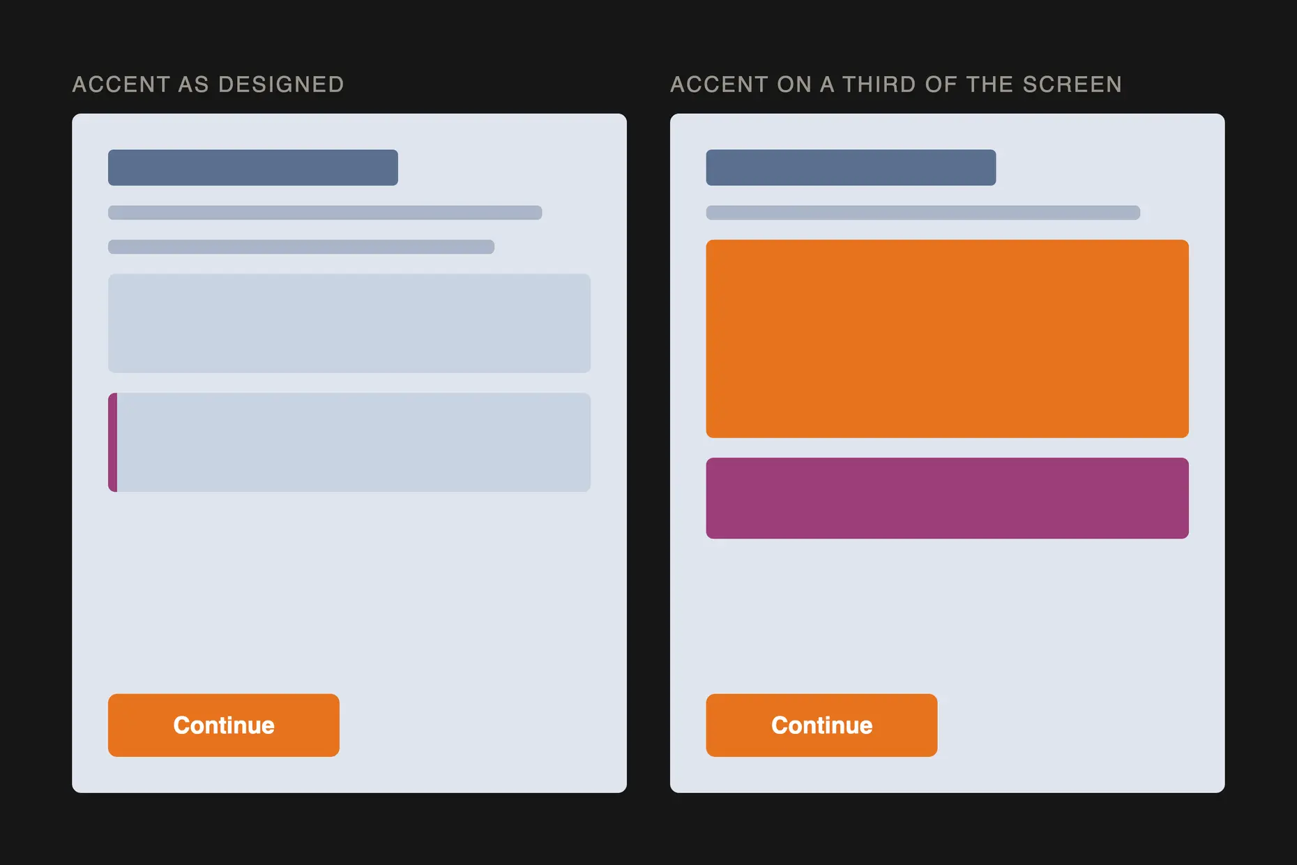
The mistake I see most often is a palette built correctly on the wheel and never tested at the proportions it will run at. A split-complementary scheme balanced as three even swatches can fall apart once one colour covers sixty per cent of a screen, and another covers three per cent instead of the ten it was designed for.
The second is saturation held constant across the whole palette, so nothing recedes and the eye has nowhere to land. I have watched a team add a colour to solve this when the fix was to desaturate three colours they already had.
The third is pursuing harmony as the goal rather than as a means: a palette can follow every scheme rule correctly and still fail because nothing in it stands out. Contrast is not the enemy of harmony, and a harmonious palette with no contrast has no hierarchy left, which is what most of colour does in an interface.
Because legibility and hierarchy depend on how light or dark something is against its neighbour, not on which hue it carries. Two different hues at the same value blend, while two similar hues at different values separate cleanly.
No. It is a starting ratio worth testing, not a formula to apply without checking how the palette reads at the size and context it will run at.
No. A scheme describes hue relationships only, and contrast ratios and colour vision deficiency are separate conformance requirements that accessibility standards cover in full.
No. Even familiar Western associations, red for warning, white for purity, reverse in other cultures, so treat any association as a hypothesis to check against the audience.
No. Pick one relationship, usually the one with the amount of contrast the content needs, and spend the rest of the work on value, saturation, and proportion.
| Fact | Detail |
|---|---|
| First colour wheel | Isaac Newton, 1666 |
| Colour perception theory | Johann Wolfgang von Goethe, Theory of Colours, 1810 |
| Simultaneous contrast, first published | Michel Eugène Chevreul, 1839, from his work at the Gobelins dye works |
| Bauhaus colour teaching | Johannes Itten, 1920s |
| Interaction of Color | Josef Albers, 1963 |
| Primary colours, traditional wheel | Red, yellow, and blue |
| Five wheel-based schemes | Complementary, analogous, triadic, split-complementary, and tetradic |
| Common proportion guideline | Roughly sixty per cent dominant colour, thirty per cent secondary, ten per cent accent, treated as a starting point rather than a rule |

Digital accessibility is the practice of building products people can use, whatever their permanent, temporary, or situational disability, measured against a published standard rather than opinion.
Read it
Colour management is the discipline of specifying a colour precisely enough that a printer, a signage vendor and a web team can all reproduce it the same way, then documenting that specification.
Read it
Material Design is Google’s design language for building interfaces: a codified set of colour roles, type scale, shape rules, elevation and motion, shipped as ready-made components for Android, Flutter and the web.
Read it
Layout is the arrangement of elements inside a frame: what a viewer sees first, second, and third, and what the space between things does as they look.
Read it
A design system is a governed set of reusable components, patterns and rules that a team uses to build consistent digital products at scale, and it is neither a static style guide nor a component library on its own.
Read it