
2026-09-16
Nural Choudhury
A headless architecture is a way to build a design system so content, design decisions, interaction logic, and visual style live in four separate layers, each ignorant of the layers above it.
This page covers the architecture itself: what each layer owns, what must not cross a seam, and how to judge whether a given seam is earning its cost. Design systems covers what a design system is and the token concept; Design systems architecture covers the token and component layers, token hierarchy, component API design, repository strategy, and distribution. This page does not repeat either.
a system where a visual redesign, a new brand, or a new channel is a change at one layer, not a rebuild of everything above and below it.
any product that already has, or will soon have, more than one brand, more than one presentation surface, or a genuine expectation of a redesign it cannot yet specify.
deciding where a seam actually belongs. A seam placed where nothing varies is pure indirection, and it is the single most common way this architecture fails to pay for itself.
Four layers sit between raw content and what a user sees, each with a narrow job and a strict boundary on what it can know.
| Layer | What it owns | What it must not know about | What the seam buys you |
|---|---|---|---|
| Content | Presentation-agnostic data, copy, structured fields, and assets, exposed through an API | Page templates, layout, or how the data will be styled | Content can be restructured, reused across channels, and repurposed for a new brand without touching a template |
| Tokens | Raw design decisions, colour, spacing, type scale, held as platform-agnostic values | Which components consume them, or what any one brand currently looks like | A decision changed once propagates everywhere it is referenced, so a redesign is a token change rather than a rebuild |
| Components | Unstyled, accessible UI primitives: state logic, keyboard behaviour, focus management, and accessibility wiring | Visual style, or which brand or theme is rendering the primitive | The same interaction logic serves every brand and every visual treatment without re-testing accessibility each time |
| Presentation | Token variables bound to headless primitives at the render layer, the actual look | The content’s structure, or the primitive’s internal state machine | Changing a brand’s look is a presentation-layer change, and nothing else in the system moves |
The layers stack in a fixed direction. Content and tokens are the two inputs. Components consume tokens but never content directly, and take their data as props passed in from above. Presentation is where a token variable and a headless primitive finally meet, and it is the only layer that is allowed to know both exist.
Each seam between layers is a promise: the layer below will not change in a way that the layer above needs to know about, provided the contract at the seam holds. A colour token can be renamed internally as long as the semantic name a component references stays stable. You can rewrite a component’s internal state machine as long as its accessible behaviour and prop contract don’t change. The seam is where you buy the freedom to change one side without touching the other, and that freedom is the entire reason the architecture exists.
This is not free. Four layers with strict seams cost more to set up than one file that mixes content, style, and behaviour, and every seam adds indirection someone has to learn before they can trace a bug through it. The architecture is worth that cost only where something genuinely varies independently: brand, channel, or platform. Where nothing varies, the seam is a tax with no return.

Test each candidate seam against a real, foreseeable variation before you build it. You must be able to name what varies on each side: a second brand, a native app alongside the web client, a redesign already scheduled, not a hypothetical one you cannot yet describe.
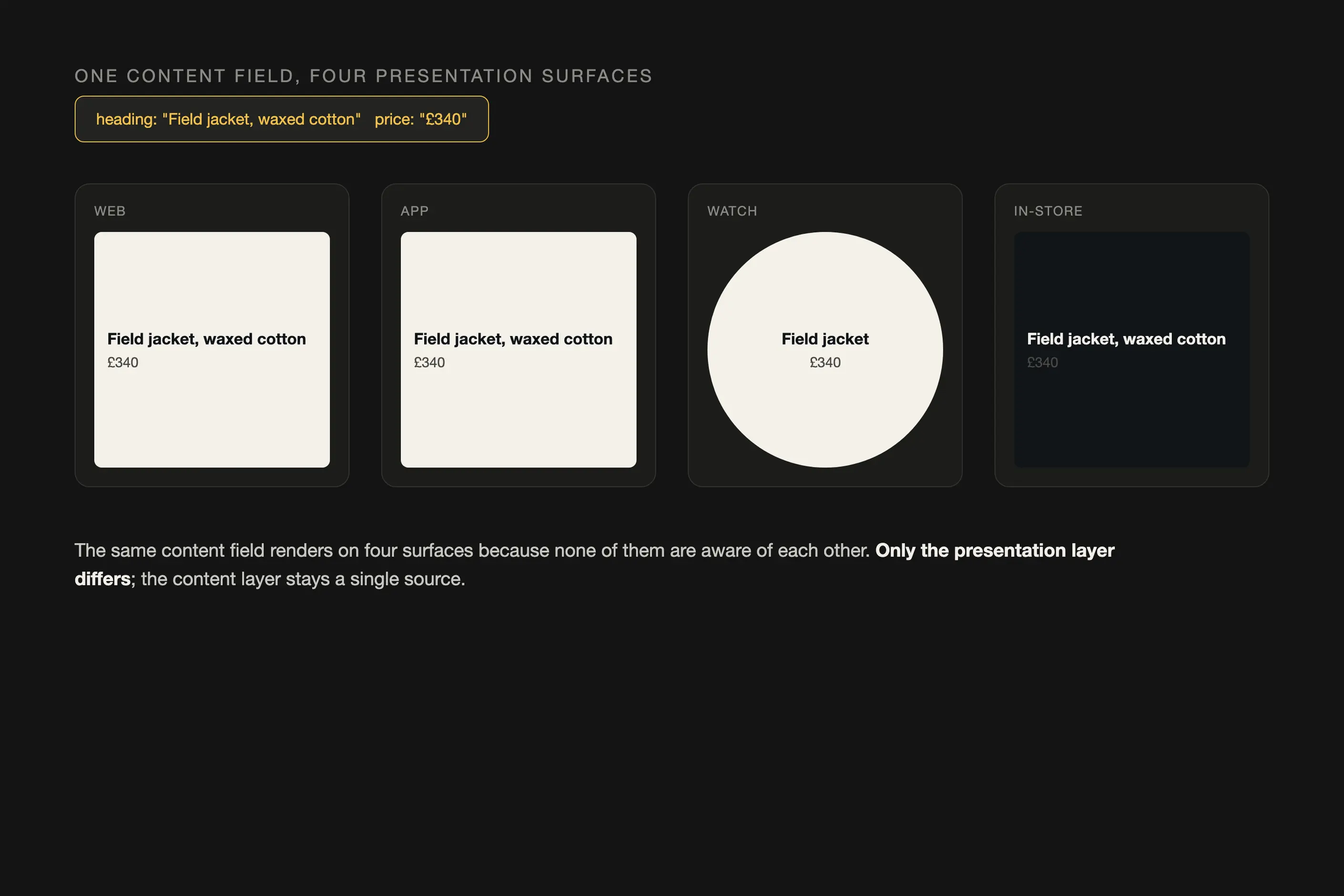
Model content around its meaning, not around one page’s layout. You must design a content field, such as a product description or an author byline, so it makes no assumptions about where it will appear or how wide its container will be. A content model built around a single template’s content widths is not decoupled from that template, whatever API sits in front of it.
Keep a design token a decision, not a description of the current look. You must name a token for what it means, colour.action.primary, not for what it currently renders as, colour.blue-600. A token named after its appearance survives exactly until the appearance changes, which defeats the reason it exists.
Build components against behaviour, not against a brand’s visual language. You must give a primitive its states, its keyboard interactions, and its accessibility roles, and leave every visual property to be supplied from outside. If a component has an opinion about its own colour or spacing, that opinion belongs one layer up, and it must move there before the redesign this architecture was meant to make cheap turns out not to be cheap.
Bind at the render layer, and bind there only. You must resolve which token variables apply to which primitives at the point where a page actually renders, for a specific brand or theme, and never earlier. Binding earlier reintroduces the coupling the architecture was built to remove, one layer at a time.
Accept the cost where the variation is real, and cut the seam where it is not. Where a product genuinely has one brand, one platform, and no scheduled redesign, a full four-layer split is over-engineering, and a simpler build will outperform it on every measure that matters until the variation actually arrives.

Take a product that ships one brand today and has a second brand confirmed for next year, on the same underlying interface.
Start at the content layer. The existing pages hold copy and imagery mixed directly into page markup, so the first move is to pull that content into a headless API: fields named heading, body, and hero image, none of them aware of which template will render them. This is the slow, unglamorous part, and skipping it is the most common shortcut, because the templates still work today without it.
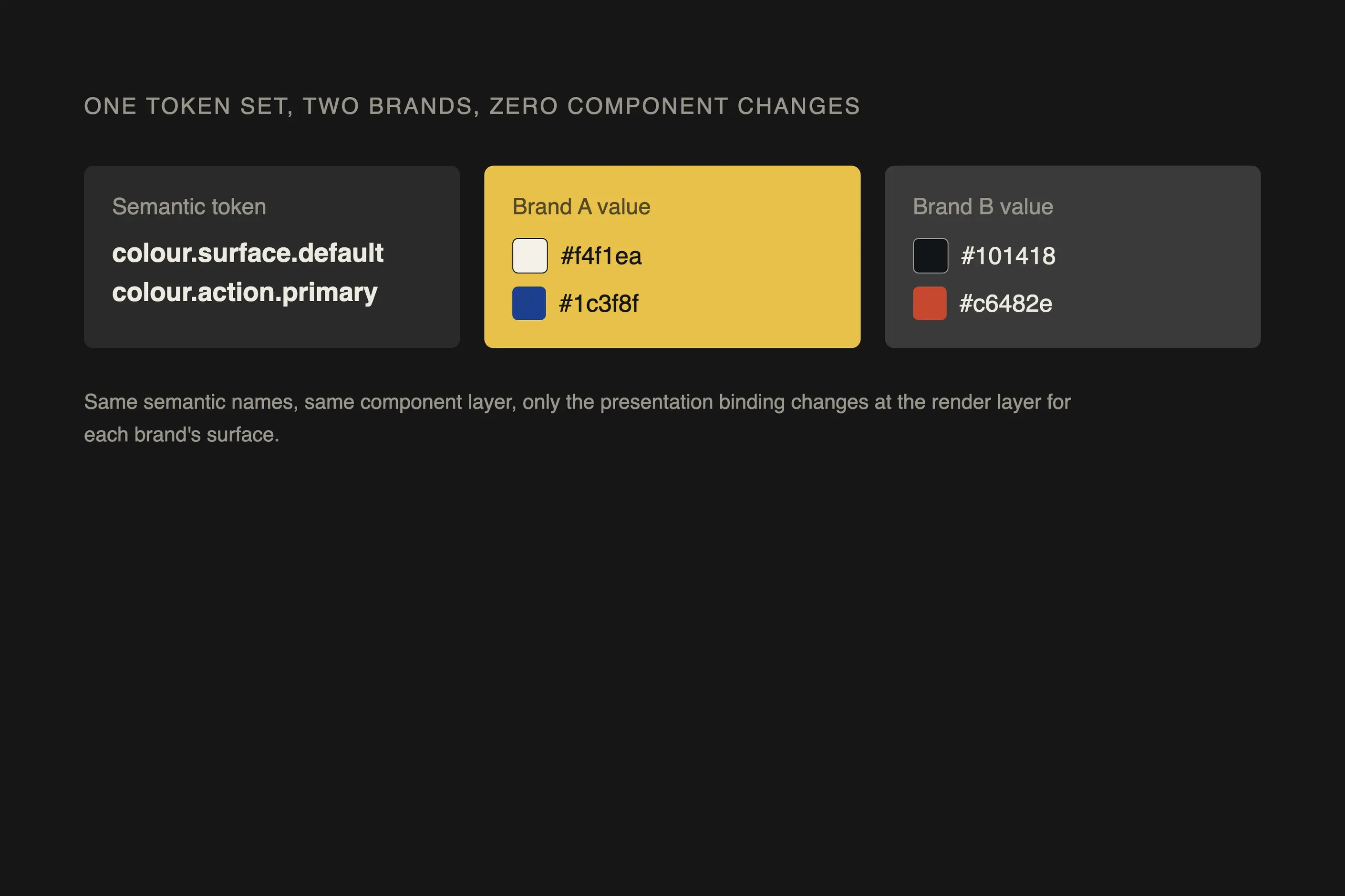
Move to tokens next. Extract every colour, spacing and type value currently hard-coded across the interface, and name each one for what it means rather than what it currently looks like. The first brand’s palette becomes a set of semantic tokens: colour.surface.default, colour.action.primary, each pointing at a primitive value. Nothing about the components changes yet.
Build or audit the component layer against those semantic tokens, not fixed values. A button primitive should expose the states it needs: default, hover, disabled, and reference colour.action.primary for its background, with no hard-coded hex value anywhere inside it. Confirm the primitive’s accessibility behaviour, focus order, and keyboard handling are intact and independent of colour or spacing.
Only then does the second brand become cheap. Add a second token set that assigns different primitive values to the same semantic names, and bind that set at the presentation layer for the second brand’s surface. The content layer does not change. The component layer does not change. Only the presentation binding changes, which is the payoff the whole architecture was built to deliver.
I have watched a seam get introduced where nothing varies, most often the moment a team reads about this architecture and decides every layer must exist regardless of the product in front of them. A content API for a single static page, a token layer for a brand with no second brand in sight, buys nothing but a longer path to trace when something breaks. A seam earns its keep only against a variation you can name, not one you are hedging against.
Presentation logic leaks into a component primitive constantly, usually a small distance at a time. A primitive that starts unstyled acquires one hard-coded margin to fix a layout bug under deadline, then a fixed colour for a state nobody had a token for yet. Each addition looks harmless on its own. Within a few releases, the primitive is no longer unstyled, and every consumer that assumed it is inherits the same visual assumption whether they want it or not.
Tokens encode a brand’s current look rather than its decisions almost as often. A token named colour.blue-600 or spacing.24px is describing a value, not a decision, and it survives exactly until someone wants that value to change. When the promised redesign finally arrives, a system full of appearance-named tokens still needs the same manual sweep through every component the architecture was meant to avoid.
Content modelled around one page’s layout is the fourth failure, and the hardest to spot early because the first template it serves works perfectly. A content field built to fit a specific column width, or a content type that only makes sense inside one page structure, cannot actually be reused anywhere else. The API exists, but the decoupling it was meant to buy never happened, because the content was never made presentation-agnostic in the first place. The test is simple: could this content render correctly inside a template nobody has designed yet? If the honest answer is no, the content layer has not done its job.
headless describes one technique, content or logic exposed through an API with no presentation baked in. Decoupled describes the outcome across all four layers. A headless CMS gives you a decoupled content layer; it doesn’t, by itself, give you decoupled tokens, components, or presentation.
Does every product need all four layers? No. The architecture pays for itself where something genuinely varies independently: brand, platform, or a scheduled redesign. A single-brand, single-platform product with no redesign in view carries the cost of four layers for a return it will never collect.
Here, the tokens layer is one of the four; the internal structure of that layer- primitive, semantic, and component tokens- and how they are distributed is covered in Design systems architecture, not repeated here.
How is this different from a design system? A design system is the governed set of components and standards a team builds and maintains. This architecture is one way to structure that system’s layers so content, decisions, logic, and style stay independent of each other. A design system does not require this architecture, and this architecture is worth little without the governance a design system provides.
| Item | Where it stands |
|---|---|
| Content layer | Presentation-agnostic data exposed through an API, decoupled from any one page template |
| Tokens layer | Platform-agnostic design decisions that compile into production styling variables; internal hierarchy covered on Design systems architecture, not repeated here |
| Components layer | Unstyled, accessible UI primitives carrying state logic and accessibility, with no visual style of their own |
| Presentation layer | The only layer permitted to bind token variables to component primitives, done at render, not earlier |

A design system is a governed set of reusable components, patterns and rules that a team uses to build consistent digital products at scale, and it is neither a static style guide nor a component library on its own.
Read it
Design systems architecture is the set of structural decisions that let a design system keep working as an organisation grows: how tokens layer, how components are organised and configured, and how the code that implements them is housed, built, and shipped.
Read it
Digital accessibility is the practice of building products people can use, whatever their permanent, temporary, or situational disability, measured against a published standard rather than opinion.
Read it
Design documentation earns its keep when it removes a decision from a developer’s inbox, not when it is complete.
Read it