

2026-09-15
Nural Choudhury
Mobile-first design starts with the smallest, most constrained screen and builds upward, rather than shrinking a finished desktop design to fit.
The small-screen constraint forces a priority decision, because there is no longer room to avoid one: what content, action, or feature comes first.
This page covers that decision: designing from the smallest screen outward, so the constraint forces priority across content order, touch targets, progressive enhancement, and performance on a real connection. Basic grid systems covers the responsive grid structure that carries the result across breakpoints, and UX/UI design patterns covers which interface pattern to pick once the order is settled.
A priority order decided once, under real constraint, rather than argued about on every screen size in turn. The desktop layout inherits that order too, so it stops carrying features nobody chose to keep.
Any product with more than one screen size to support: a marketing site, a dashboard, a form-heavy application. It applies least where a product has one fixed context: a kiosk or a single-size internal tool built for one desk.
The content audit. Rank what the reader needs before you open a design tool. A ranked list you can defend is worth more at this stage than a screen you have already drawn.
Mobile-first is often described as designing for phones. That description misses the point. A phone-shaped layout only earns its place if it is also the right layout for a desktop screen, and it usually is, because most of what earns a position on a small screen deserves the same position everywhere. The small screen is not the destination. It is a forcing function.
A large screen accommodates almost anything you give it, so nothing has to be cut, and nothing is. Priority decisions get deferred indefinitely, and the resulting page tries to serve every stakeholder’s request at once. A small screen refuses that deferral. There is no fourth navigation item, a second hero image, and a newsletter signup all above the fold, so somebody has to choose which one earns the space. That choice is the method’s entire value.
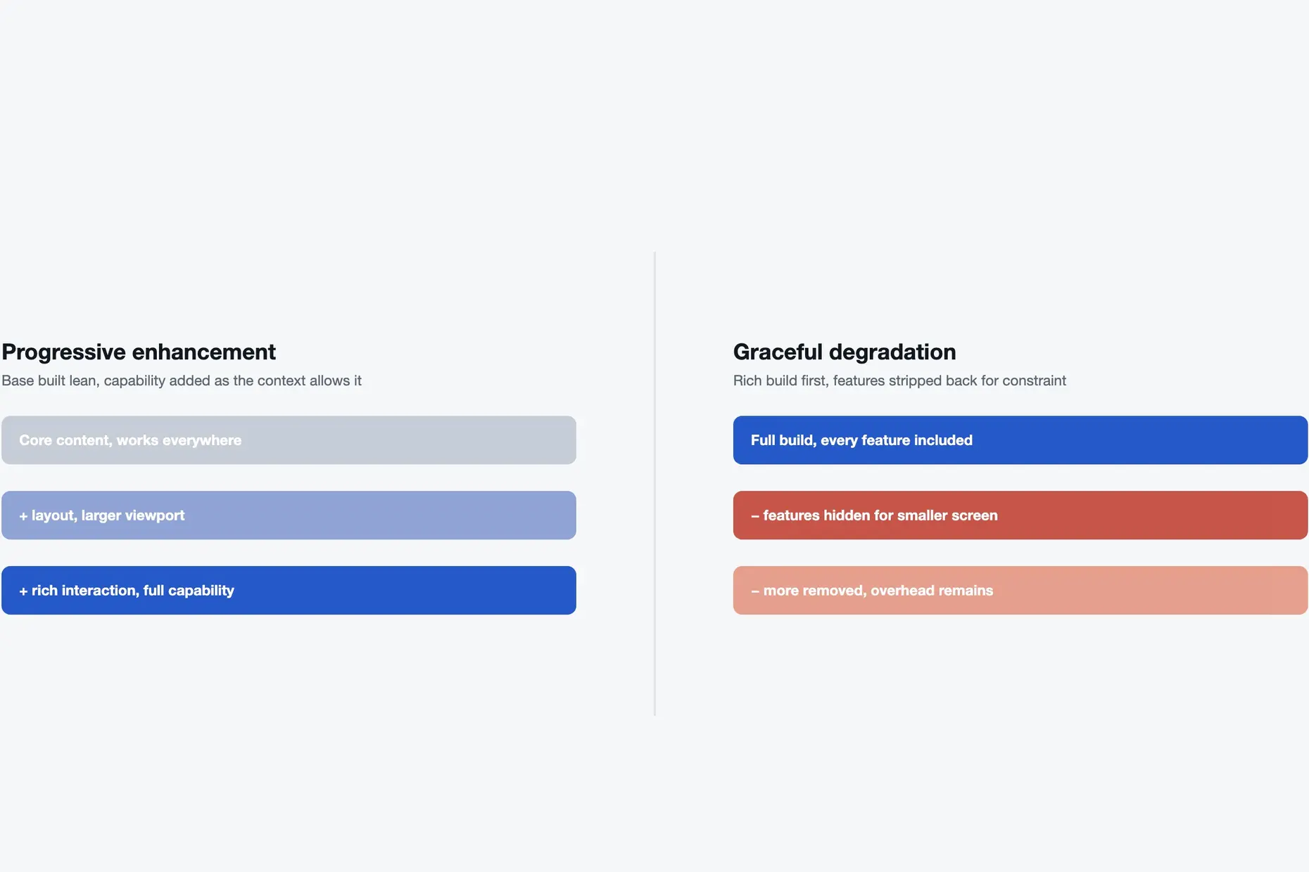
Two ways to build one design across many screen sizes produce different outcomes.
| Approach | Starting point | As screen size and capability grow |
|---|---|---|
| Progressive enhancement | The smallest, most constrained experience, built complete and usable on its own | Additional richness layers on top as space, connection, and processing power allow |
| Graceful degradation | The richest possible experience, built first for the most capable context | Features are stripped out again for smaller or slower contexts |
Graceful degradation fails for structural reasons, not stylistic ones. Removing a feature is a harder decision than adding one, because removing it means admitting it was never essential, and a codebase built rich from the start carries the overhead of everything it later has to hide. Progressive enhancement never has to make that admission. The base was built lean on purpose.
The constraint forces four decisions in particular, and this page keeps two.
| What the constraint forces you to decide | Where it is covered |
|---|---|
| Content order: what earns the first view | This page |
| Touch-target sizing and spacing, because a cursor’s precision is gone | accessibility-standards |
| Progressive enhancement itself: which capability is core and which is added richness | This page |
| Performance on a real connection, because weight is felt immediately on a constrained device | sustainable-design |
The grid structure and breakpoints that carry a settled order across screen sizes are a separate craft: basic grid systems cover the anatomy, and advanced grid systems cover container queries and component-level responsiveness. The specific interface pattern you land on, bottom tabs against a hamburger menu against a floating action button, is a pattern choice, covered in full by UX/UI design patterns.
Audit content before you open a design tool. List every element competing for space: every navigation item, every call to action, every image. Rank each one by what happens if a reader never sees it. An element that costs nothing when missing does not belong above the fold.
Design the smallest target width first, literally, not a desktop layout you intend to shrink later. Build the single-column, most-constrained version until it is complete and usable on its own, with no functionality deferred to “the desktop version.”
Use progressive disclosure for secondary content, never deletion. A tab, an expandable section, or a clearly labelled second screen lets a reader reach what they need without weighing it down on the first screen they see.
Only then design upward. Decide what a larger, faster, more attentive context earns: a second column, a persistent sidebar, a richer image. Treat every addition as a deliberate decision, not a reversion to how the page always looked on desktop.
Once it exists, hand the settled order to grid and pattern decisions. Basic grid systems and advanced grid systems turn the order into breakpoints and columns. UX/UI design patterns turn it into the specific navigation pattern. Accessibility standards set the touch-target conformance the build must meet, and sustainable design sets the performance budget.
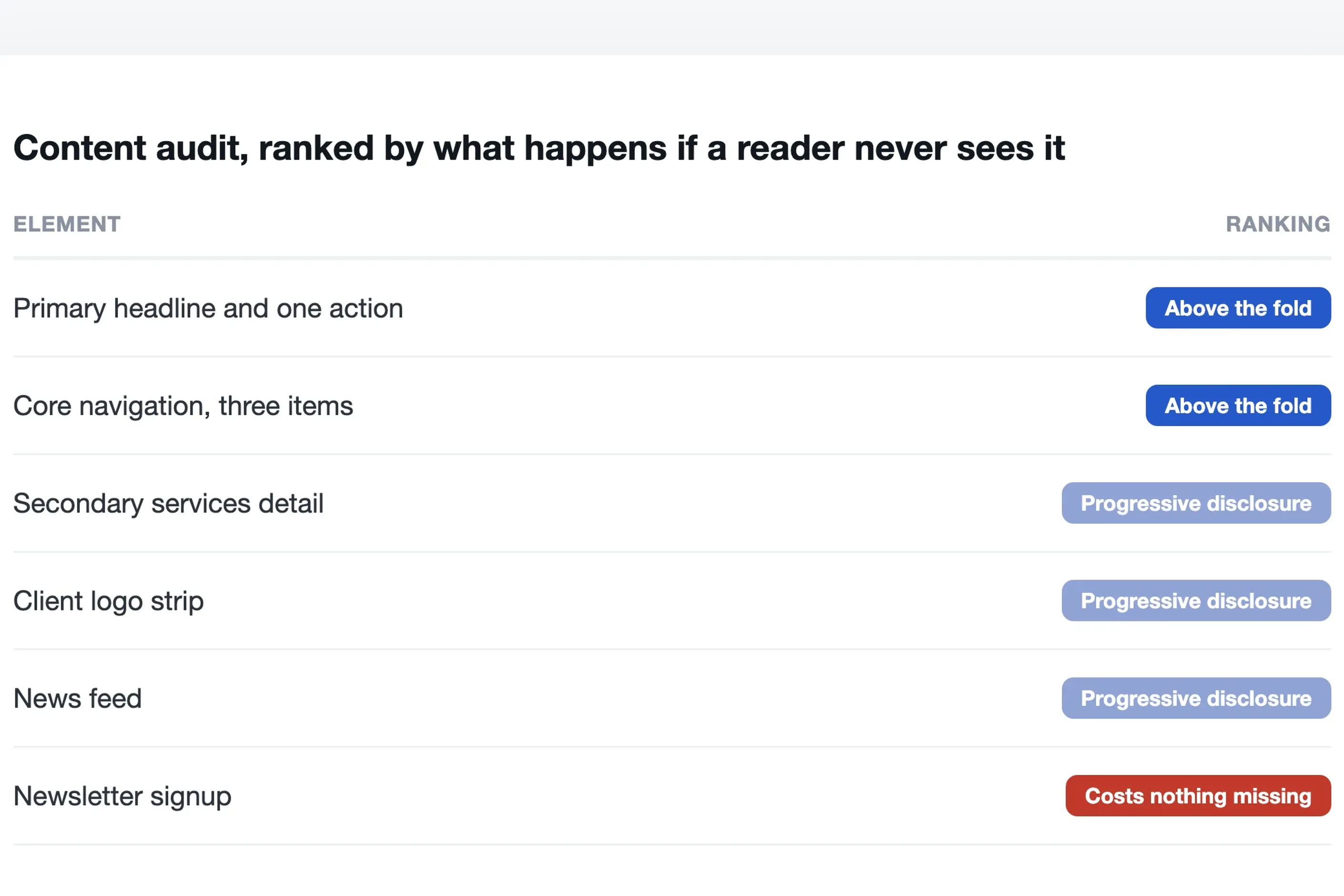
Take a homepage redesign for a mid-sized professional-services firm. The existing desktop layout carries a hero image, a four-item primary navigation, a client-logo strip, a services grid, a news feed, and a newsletter signup, all visible without scrolling on a wide monitor.
Start with the content audit. What must a visitor do here? Almost always: understand what the firm does, and find a way to get in touch or explore its services. The client-logo strip and the news feed matter to the business, but neither blocks that goal if it sits a scroll further down.
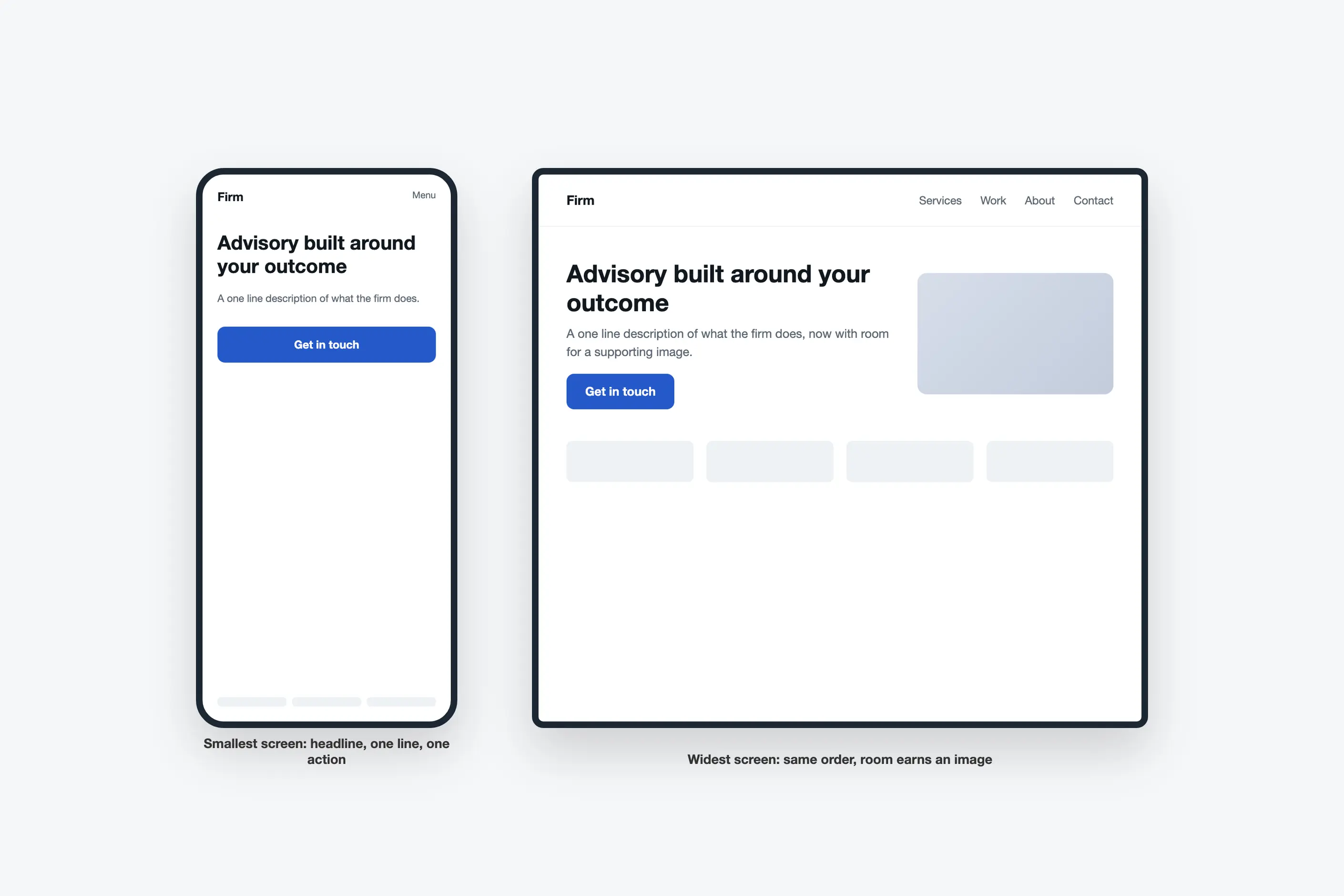
Design the smallest screen first. The hero collapses to a headline, a one-line description, and one primary action. Navigation becomes a short, clearly labelled set of destinations rather than every page in the sitemap. The logo strip and news feed move below the fold, reachable by scrolling rather than competing for the first view.
Expand upward from there. On a wider screen, the hero can carry a supporting image, because there is now room for it without pushing the primary action down. The navigation can show more items directly, because a pointer makes a longer menu bar usable. None of that expansion reopens the question of what matters most. It was already answered on the smallest screen.
I have watched a finished desktop design get narrowed for a smaller viewport and heard the result called mobile-first, because the project treated the term as a description of the output rather than a starting point. Squeezing a desktop layout into a phone-sized frame produces a cramped desktop layout, not a considered one, and it skips the prioritisation the method is meant to enforce.
I have seen breakpoints chosen from device names, an iPhone width here, an iPad width there, rather than from where the content itself starts to break. A layout must change when the current column count stops working for what sits inside it, not at a number copied from a device specification that goes stale the moment a new phone ships.
I have seen touch targets sized on a mouse-driven prototype, built and reviewed on a desktop monitor with a cursor, then shipped without anyone tapping it with a thumb. A target that looks generously sized next to a pointer is often too small the moment a real hand is involved.
And I have seen a hero image that costs more, in bytes sent to the device, than the entire page of content sitting beneath it. The image was chosen for how it looked in the design file, not for what it cost the reader waiting for it to arrive on a real connection.
Does mobile-first mean designing only for phones? No. It means starting from the most constrained screen and building upward from there. The output should serve every screen size, and the smallest one forces the priority decision first.
The constraint still earns its keep. A small screen is a forcing function for deciding what matters, not a bet on where traffic comes from, and a product built this way ships a desktop layout with the same settled priority instead of one assembled from whatever happened to fit.
Is mobile-first the same as responsive design? No. Responsive design is the technique, fluid grids and breakpoints, that lets one layout adapt across screen sizes; basic grid systems and advanced grid systems cover that technique. Mobile-first is the order you decide on before the technique runs.
Rarely, and mostly where a rich baseline genuinely cannot be avoided, a data-visualisation tool built for one large screen, for instance. Even then, the prioritisation work still has to happen somewhere. It is happening later, under more pressure.
Does mobile-first apply to a tool nobody opens on a phone? Less directly, but the discipline still helps. Even a desktop-only tool benefits from settling what a user needs first before deciding what they might also want.
| Fact | Detail |
|---|---|
| Core mechanism | Progressive enhancement: build the constrained baseline complete and usable, then layer capability on top |
| Main alternative and its failure mode | Graceful degradation, building rich first and stripping features for smaller contexts; removal is harder than addition, and the base carries overhead it was never built to shed |
| Responsive grid structure and breakpoints | Covered by basic-grid-systems and advanced-grid-systems, not this page |
| Touch-target sizing and conformance | Covered by accessibility-standards, not this page |
| Performance budgets and page weight | Covered by sustainable-design, not this page |
| Interface and navigation pattern choice | Covered by ux-ui-design-patterns, not this page |

A grid is a system of columns, gutters, margins, and baselines that fixes where content can sit before you place a single element.
Read it
An advanced grid system extends a single-column grid into a set of related structures: modular grids add rows to columns, compound grids layer two grids for extra intersection points, hierarchical grids nest smaller grids inside larger ones, and responsive grids reorganise the whole structure as the viewport changes.
Read it
Digital accessibility is the practice of building products people can use, whatever their permanent, temporary, or situational disability, measured against a published standard rather than opinion.
Read it
Sustainable design in digital work means cutting the energy and hardware a product needs: lighter pages, fewer requests, longer device life, and honest measurement of the savings.
Read it
An interface pattern is a solution to a recurring design problem, refined through enough use elsewhere that the person encountering it doesn’t have to figure out how to use it.
Read it