
2026-09-15
Nural Choudhury
Packaging design is the discipline of shaping a product’s container and its printed surfaces so the object protects what is inside, states what it is, and earns a second look next to its competitors on a shelf.
It sits where structural engineering, print production and information design meet, under a constraint no screen design faces: the finished object gets folded, shipped, stacked and picked up by a stranger.
This page covers packaging as a physical object and a shelf message: structure and material, the hierarchy that survives a two-second glance, and the regulatory content that must fit. Colour specification, gamut, and print proofing belong to colour systems, where a brand colour survives the press. A material’s life-cycle impact belongs to climate-conscious design.
a package that reads as itself at a distance, states what matters most first, and still works once folded, printed and shelved next to competitors under retail lighting.
any product that will be manufactured, shipped, stocked and picked up by a stranger who has not read your brief, from a single line to a multi-variant range.
build and fold a physical mock-up before you approve anything on screen. A design that only exists flat has not been tested against the constraint that defines this discipline.

A package is a three-dimensional object before it is a graphic surface, and the structure has to work before anything printed on it matters. Protection is the baseline: the product has to survive manufacturing, warehousing, shipping and handling intact, and a package that fails at that job fails regardless of how good its graphics are.
Closure and dispensing decide how the product gets used every day. A frustrating cap or a dribbling spout creates dissatisfaction with the product that has nothing to do with what is inside, so choose the format for how the product is actually used, not how it photographs.
The table below sets out the pack formats I reach for most often, what each suits, and the constraint that comes with it.
| Pack format | What it suits | Its constraint |
|---|---|---|
| Folding carton (paperboard) | Retail-ready dry goods, cosmetics, over-the-counter products | Needs a die line and a fold test before approval; graphics must survive the score |
| Corrugated case | Shipping, bulk and retail-ready secondary packaging | Flute choice trades cushioning against print quality |
| Flexible pouch or sachet | Powders, liquids, single-serve portions, refills | Cuts material and shipping weight but is difficult to recycle with current infrastructure |
| Rigid bottle or jar | Liquids, viscous products, anything sold on visible contents | The forming process fixes wall thickness and limits shape changes late |
Material choice inside a format has the same trade-off shape: what it protects against, and what it costs you elsewhere.
| Substrate | What it suits | Its constraint |
|---|---|---|
| Paperboard (SBS, FBB, kraft) | Cartons carrying high-quality print | Limited moisture and oxygen barrier without a liner |
| Corrugated board | Structural protection and stacking strength | Flute size trades thickness for print surface smoothness |
| Rigid plastic (PET, HDPE, PP) | Clarity, light weight, chemical resistance | Carries environmental associations that affect brand perception, independent of its actual footprint |
| Glass or metal | Premium perception, full barrier protection, infinite recyclability | Adds weight and shipping emissions; forming limits structural variety |
Substrates take ink differently: colour reads differently on coated stock, uncoated stock and clear plastic. Proofing on the actual substrate, rather than a generic swatch, is colour systems’ job, not this page’s, and a substrate’s recyclability and footprint are climate-conscious design’s.

A shopper takes in packaging fast, at a distance, under retail lighting, next to a wall of competitors. I will not put a number on how fast, because the figure that circulates in this field rarely traces back to a source worth trusting. What is defensible is the direction: design for a glance before you design for a read.
Build the hierarchy in the order it gets seen. At several metres, only shape, colour block and brand silhouette register, and the only question is whether the category and the brand are recognisable at all. Closer, at consideration distance, the product name and the single reason to choose it need to read.
In the hand, at decision distance, everything else earns its place: ingredients, instructions, the small print. Design for all three distances or the package fails at whichever one you skipped. Graphics that only work close up fail the shopper who never picks the pack up, and graphics that only work at distance fail the shopper who did.
The primary display panel carries the load: brand, product name, and one benefit, in that order, unless your category has a settled reason to reverse it. Everything else- ingredients, nutrition, company information- moves to a secondary panel, where it can be dense without competing for the first look.
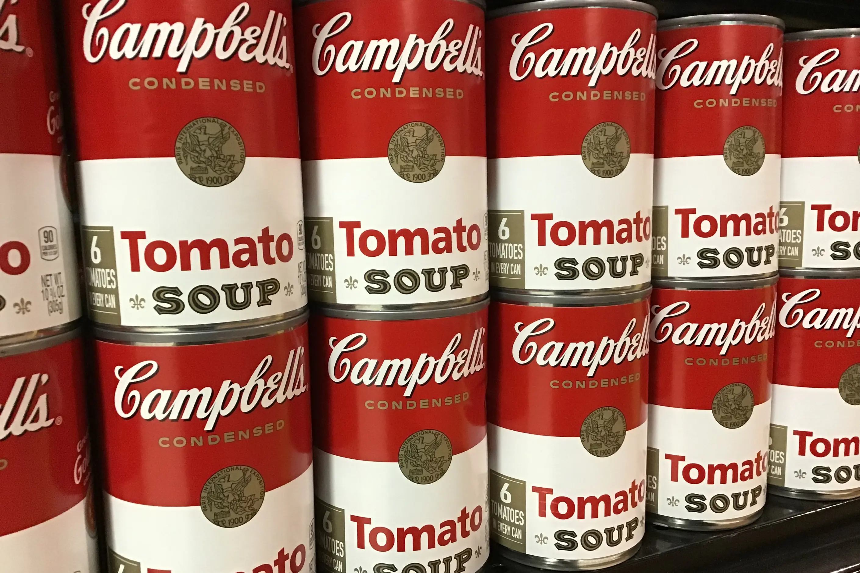
Facing and grouping change what the hierarchy has to do. A brand’s products shelved together create a billboard effect: consistent colour and logo placement across the range does more work than any single pack, and a family that redesigns every variant differently loses that multiplier. Differentiate against the category you are actually shelved in, not the category you wish you were in.
Every category carries mandatory content: legally required statements, minimum type sizes for some, and placement rules for others. These vary by market and by product category, so treat a regulatory specialist as required for anything binding.
Mandatory content is not optional, is often set in small type, and competes with everything a brand wants to say. Common categories include food and drink, where ingredient and allergen declarations are typical, and pharmaceuticals, alcohol and other age-restricted products, where warning statements and formats are typical. Treat all of it as fixed content you design around, not content you find room for at the end.
Bring mandatory content into the layout on day one, at its real minimum size, on the real substrate. A hierarchy built around a beautiful primary panel and a promise to sort the small print out later collapses the day a regulatory reviewer sends back a redline, and by then the structural die line is already tooled.

You must build and fold a physical mock-up before you approve any layout on screen. A flat proof cannot show you where a fold interrupts a headline or where a score line crosses a logo.
You must design the hierarchy for the distance it will actually be seen at, starting with what has to read from across an aisle. Test a reduced-size print-out or a physical mock-up against a real shelf or a convincing substitute, not a screen held at arm’s length.
You must place mandatory regulatory content into the layout before you finalise the primary display panel, not after. Treat it as fixed space, and design the rest of the hierarchy around what is left.
You must press-test any special finish, a foil, a spot varnish, a soft-touch coating, before you specify it for production. A finish that looks right in a digital render can crack, scuff or fail to adhere on the actual substrate and press.
You must proof colour and check legibility on the actual substrate the pack will be printed on, not a generic swatch. That proofing and gamut work belongs to colour systems.

Take a range relaunch: a confectionery brand consolidating several product lines onto one shared structural format, printed across multiple variants. The primary display panel design was approved on screen, at full size, looking sharp.
Folded around the actual carton, the brand mark’s baseline sat directly on the score line, and every fold introduced a visible kink in a curve that had read clean and flat on screen. Nobody had checked the design against the die line, because the flat digital proof and the folded carton had never been compared side by side.
I now fold a physical dummy, blank stock, scored and glued the same way as the final run, before any layout goes near sign-off. It costs time early, and it saves the far more expensive version of the same fix once every variant is already at press.

I have seen a design get signed off flat, on screen, and only meet its own fold for the first time on a press check. The fix at that stage means a fast, expensive and usually visible compromise, when a paper mock-up folded a week earlier would have caught it for free.
I have seen hierarchy that reads perfectly at A4 on a monitor collapse the moment it is reduced to sixty millimetres on an actual shelf. What looked like a clear headline and a supporting line becomes two blocks of grey at that scale, because nobody tested the design smaller than the screen it was designed on.
I have seen mandatory regulatory content treated as an afterthought, dropped in wherever space was left once the brand story was finished. It always needs more room than the space that is left, and it arrives late enough to force a redesign of a panel everyone thought was locked.
I have seen a finish, a foil, a soft-touch coating, a spot varnish, specified from a swatch book and approved without ever running on the actual substrate at production speed. Some finishes crack on a fold or fail to adhere to the chosen stock, and none of that shows up until the first production run is already committed.
What is the difference between primary and secondary packaging? Primary packaging touches the product directly: a bottle, a wrapper, a carton. Secondary packaging groups primary units for shipping or retail display, and its constraints are logistics and stacking rather than shelf hierarchy.
Is it true that shoppers decide within a few seconds at the shelf? No figure I can source stands behind that claim, and it circulates without one. What holds is the direction: shelf decisions happen fast, at a distance, under distraction, so design for a glance before you design for a read.
What is a die line, and why does it matter this much? A die line is the flat template showing every cut, score, and fold that turns a sheet into a three-dimensional pack. Every graphic decision has to survive folding, which is why a flat digital proof isn’t a finished review.
Does packaging design cover sustainability? Only the structural or communicative parts: protection, format choice, right-sizing for the product. Material’s life-cycle impact, recyclability and carbon footprint are covered in climate-conscious design.
Who is responsible for regulatory content on a pack? Design places it and keeps it legible; a regulatory specialist for the category and market confirms what it must say and where. Requirements vary by market and product, so treat this as a check you run, not a rule you memorise once.
| Item | Where it stands |
|---|---|
| Corrugated flute sizing | Flutes run from the thickest, A, through B, C and E, to the finest, F; thicker flutes give more cushioning, finer flutes give a smoother, more printable surface |
| Paperboard grades | SBS (solid bleached sulfate) gives a bright white surface for high-quality print; FBB (folding box board) trades some brightness for bulk and stiffness; kraft gives strength and an unbleached, natural surface |
| Substrate and print matching | Offset printing is the standard for high-volume paperboard cartons; flexography is standard for flexible film and pouches; digital printing suits short runs and versioning |
| Frustration-Free Packaging | Amazon’s own programme for shipping products in their own container, avoiding extra secondary boxing and rigid plastic clamshells for items shipped direct to a customer |

Colour management is the discipline of specifying a colour precisely enough that a printer, a signage vendor and a web team can all reproduce it the same way, then documenting that specification.
Read it
Climate-conscious design means weighing a decision’s climate impact across materials, manufacturing, the circular economy, digital services, and communications before the decision is locked in, rather than after it ships.
Read it
Typography is the craft of shaping and spacing type so readers can recognise its letters and follow its meaning without friction.
Read it