

2026-09-15
Nural Choudhury
A wireframe shows a screen’s structure without visual design, and a prototype simulates its behaviour, so a team can test both before committing to development.
Arguments over a design that cannot be settled by description, and committing engineering time to a flow nobody has tested. Structure disagreements are for the review, not for production.
Test the flow with real users before anyone writes code, and hand developers something concrete to build from once the structure has survived review.
An annotated wireframe, a tested prototype covering the error states, the empty states, and the mistake paths as well as the happy path, and the written rules behind the prototype’s behaviour, the piece that gets skipped when the prototype quietly becomes the specification.
Neither wireframe nor prototype names one method with one inventor, unlike the Eisenhower matrix or MoSCoW. Both terms arrived in interface design from older disciplines and kept their original job.
Wireframe comes from technical and architectural drawing, where a wireframe model shows an object’s skeleton without surface, colour or material. Interface designers borrowed the term as screen design split off from software engineering as its own craft, and it stuck because it makes the same claim: this shows structure, not finish.
Prototype is older still, standard practice in industrial and engineering design long before software existed. The design consultancy IDEO carried that habit into digital product work and made it visible outside engineering; Tom Kelley’s 2001 book The Art of Innovation documents the studio’s “fail often to succeed sooner” culture, built on cheap, fast prototypes. Carolyn Snyder’s 2003 book Paper Prototyping did the equivalent work for the lowest-fidelity end of that spectrum, showing that a prototype does not need pixels or code to test a flow.
The common misconception is that a wireframe is a rough draft of a screen and a prototype is a rough draft of a product. Neither is a draft. Each is a deliberately incomplete artefact, built to answer one question cheaply before you answer it expensively.

The wireframe, mockup, prototype, specification pipeline is no longer strictly sequential: Figma folds those stages into one platform, and the entry point has multiplied to paper, a low-fidelity wireframe, an AI-generated layout, or generated code. Nielsen Norman Group still calls wireframing an incredibly useful design technique, and the Interaction Design Foundation still treats it as a critical early step, so I keep low fidelity as the structure answer.
Inventory what the screen needs before you decide where it goes. List every piece of copy, image and function it must carry. This costs under an hour for a single screen and stops you designing a structure around content you invented rather than content you have.
Fix the information architecture before you lay out any screen. Decide how sections and pages connect, and what sits where in the navigation. Skipping this step is the single most common cause of a wireframe that needs reworking once real content arrives.
Sketch low-fidelity wireframes on paper or in a simple tool. Produce several competing structures rather than one, in minutes rather than hours. Low fidelity is what makes discarding a bad idea cheap.
Refine the strongest sketch into a digital wireframe with a consistent element vocabulary: boxes for content, text lines, labelled hotspots for interaction. Add annotations that explain behaviour a static image cannot show. Budget a few hours per screen.
Review the wireframe with stakeholders and developers before you build any interaction. Catch a structural disagreement while it costs an edit, not a rebuild.
Map the user journey you need to prototype, and choose fidelity to match what you are testing, not what looks impressive. A flow question needs clickable screens, a motion question needs real transitions, a technical feasibility question needs code. I default to paper or a grey-box wireframe until the structure has survived a review, and I only raise fidelity once I know what question I am asking.
Code-first tools such as v0, Lovable, Cursor, Bolt, and Figma Make can now generate an interactive prototype straight from a prompt, and Nielsen Norman Group has described AI-enhanced wireframes that users can test. Cheap and fast no longer means low fidelity by default, so I choose fidelity by the question, not the tool.
Build the prototype at that fidelity. Connect every screen the task requires, including the paths where the user makes a mistake, not only the one where everything goes right.
Test it with real users on real tasks, then revise before you hand it to development. A prototype nobody has tested is a wireframe with extra steps.

Say you are redesigning a three-step checkout: cart, delivery details, and payment.
You start with a content inventory: the line items, quantity controls, a delivery address form with six fields, a payment form with four, and an order summary. Fifteen minutes gets you the full list.
You sketch three competing structures on paper in under half an hour: one long scrolling page, three separate screens, and a single page with an expandable summary. You take the three-screen structure into a digital tool as a grey-box wireframe, an afternoon’s work, and annotate the six delivery fields to show which are required and which autofill from account data.
You review the wireframe with the engineer who owns the checkout API. They flag that the postcode lookup needs its own loading state, one the wireframe has not shown. You add it before you prototype anything.
You build a clickable prototype of the three screens: real copy, the loading state, and both the successful and failed payment paths. Building both takes a day. You run five-minute task-based tests with five people, each asked to complete a purchase. Three of five finish without help; two hesitate on the delivery step because the required fields are not visually distinguished from the optional ones. You fix that in the wireframe, rebuild the affected prototype screen, and test again with two more people before you hand the flow to development, with the annotated wireframe as the specification.

I have watched a stakeholder read a greyscale wireframe as a finished design, reacting to the absence of colour and imagery rather than the structure it was built to show. I label it and say so before I share it, or the review turns into a debate about a decision nobody has made yet.
I see the same failure in reverse with a high-fidelity prototype. Once it looks close to finished, feedback drifts toward colour, copy and polish, even when I built it to test flow. I match fidelity to the question, and when the question is structural, I keep the screen deliberately unfinished.
A prototype that covers only the happy path tells me the design works when everything goes right, which was the case I was least worried about. I build the error states, the empty states, and the paths where the user makes a mistake, or the test tells me nothing about the situations that cause support tickets.
The most expensive failure I have seen is the prototype that quietly becomes the specification. Developers build to what they can click through because it is more concrete than a document. Still, I never wrote down the rules behind its behaviour: what happens with a five-digit postcode, what happens offline, what happens at the character limit nobody tested. I write those rules down now, because a prototype shows one path through a system and a specification has to cover every path, including the ones nobody thought to click.
AI and code-first generation make this failure sharper, not smaller. “Vibe coding”, a term from February 2025, means shipping whatever the model generated with no design discipline behind it, and practitioners who work this way describe it as miserable at scale because the rules never get written down, the same gap described above with a different generator.
How long does it take to build a wireframe or a prototype? It depends entirely on fidelity. A paper wireframe takes minutes; a clickable prototype of a full flow takes a day or more. Match the time you spend to the question you are answering, not to how finished the deliverable looks.
start with wireframes when you are still deciding on structure. Go straight to a prototype only once the structure is settled and what you need to test is behaviour, such as a transition, a gesture or a piece of logic.
the lowest fidelity that still answers the question honestly. Use low fidelity for structure and flow, and high fidelity when the test depends on realistic interaction, such as timing or motion.
not on its own. A prototype shows the paths someone thought to click. It needs annotations covering the states and edge cases it cannot demonstrate, or development will guess at the rules behind it.
yes, for the wireframe stage. A prototype built for usability testing benefits from a second person to facilitate sessions while you observe, but a single designer can build and test both.
| Fact | Detail |
|---|---|
| Proper names | Wireframe (structural diagram); prototype (interactive simulation) |
| Origin | Borrowed from technical and architectural drawing (wireframe) and industrial design (prototype). Neither term has a single named inventor |
| Popularised for digital product design by | IDEO’s prototyping culture, documented in Tom Kelley’s 2001 book <i>The Art of Innovation</i>, and Carolyn Snyder’s 2003 book <i>Paper Prototyping</i> |
| Typical build time | Paper sketch: minutes. Digital wireframe: a few hours. Interactive prototype: hours to a few days. AI or code-first prototype: minutes to hours for a first pass |
| Typical team | One designer builds it; stakeholders and developers review it |

Task analysis is the systematic study of how people currently perform a task, breaking it down into the steps, decisions and knowledge each one requires.
Read it
Information architecture structures content so people can find it: choosing an organisation scheme, writing labels, building navigation and search, and testing whether the structure holds under a real task.
Read it
User research is the systematic study of what users do, need and struggle with, combining qualitative depth with quantitative scale to ground design in evidence.
Read it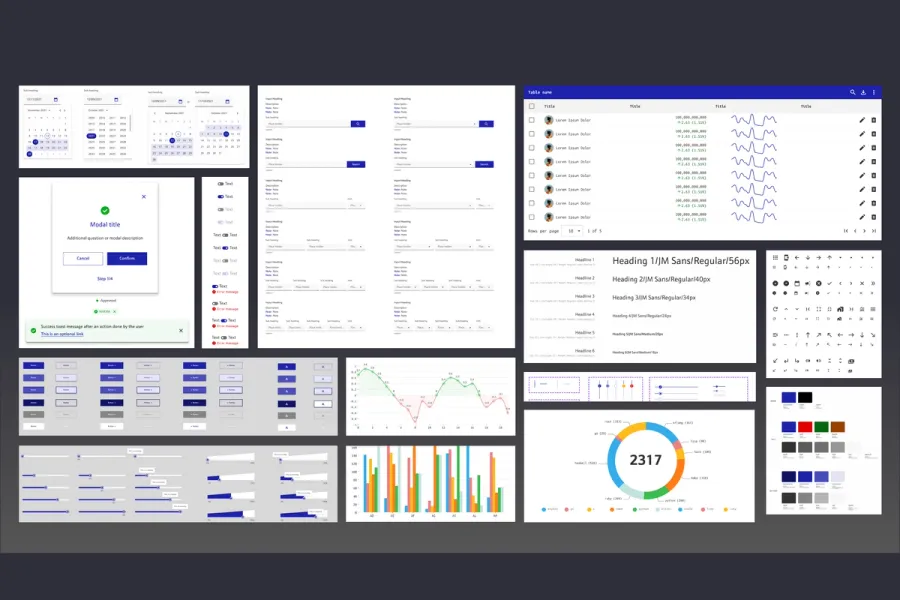
Design system methodology is the order in which you build a design system and the process you use to adopt it, distinct from what the system contains or how its code is structured.
Read it
An interface pattern is a solution to a recurring design problem, refined through enough use elsewhere that the person encountering it doesn’t have to figure out how to use it.
Read it
Digital accessibility is the practice of building products people can use, whatever their permanent, temporary, or situational disability, measured against a published standard rather than opinion.
Read it