

2026-09-15
Nural Choudhury
Brutalist graphic design is a raw, deliberately unpolished visual style in web and editorial design, built from system fonts, oversized type and exposed structure to reject the smooth optimisation of mainstream digital design.
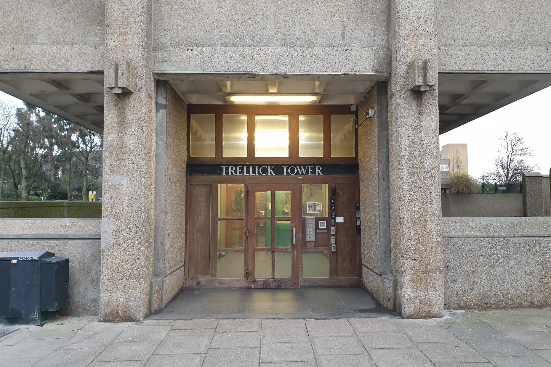
It takes its name from architectural brutalism, the mid-twentieth-century movement built on exposed concrete, or béton brut. Still, the connection is a name and an attitude, not a shared material practice. The architects were honest about concrete; graphic brutalism has no material to be honest about, so it substitutes friction instead.
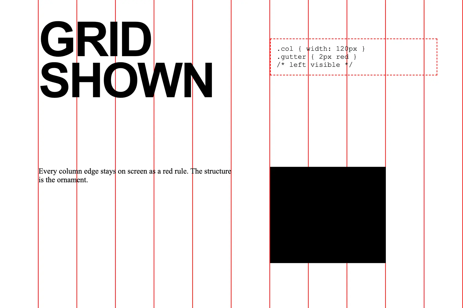
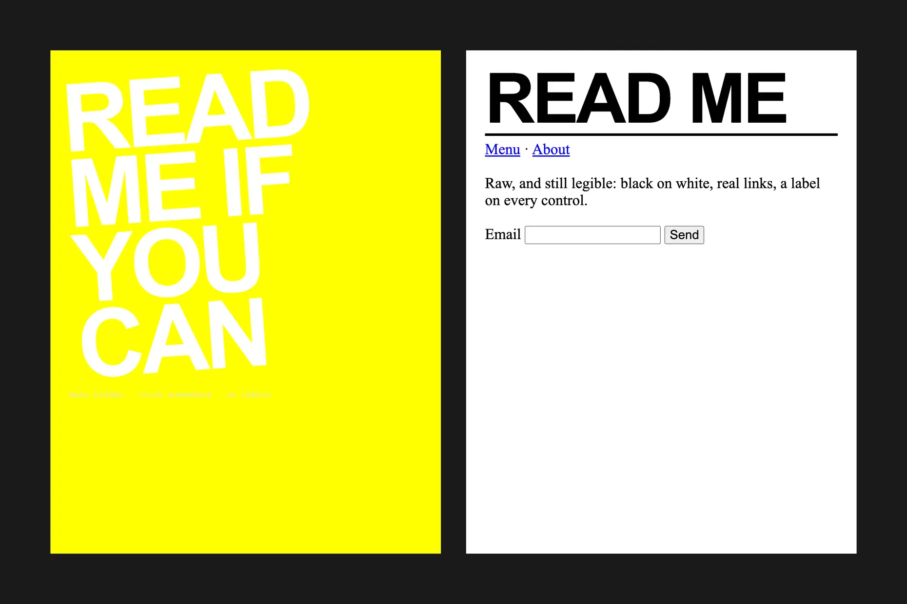
black text on white or white on black with little else, oversized headlines that sometimes fill a whole screen, system fonts such as Times New Roman, Arial or Courier left undressed, hyperlink blue and unstyled browser buttons left on display, a grid that is either broken or made visible as scaffolding.
mid-2010s web and editorial design, reacting against the template sameness of Bootstrap-era interfaces and the optimisation culture of data-driven product design, borrowing its name loosely from architectural brutalism’s béton brut.
cultural, editorial and experimental work that wants to provoke attention and question convention. Not transactional interfaces, medical information, government services, or anything that already carries an access barrier.
By the mid-2010s, digital design had achieved remarkable consistency, and remarkable sameness with it. Template-based website builders, UI frameworks such as Bootstrap and a converging set of “best practices” produced a landscape where hero images, hamburger menus, sans-serif type and generous white space appeared on site after site. That consistency reflected genuine gains in usability, mobile responsiveness and accessibility compliance, but it also let convention stand in for creativity and testing stand in for vision.
For designers who remembered a web that still felt weird and experimental, the professionalised landscape felt impoverished despite its polish, and brutalism became one way of naming what had been lost.
The term brutalism comes from architectural brutalism, the mid-twentieth-century movement characterised by raw concrete and monumental, uncompromising forms. Buildings by Le Corbusier and Louis Kahn expressed their materials and structure honestly, refusing to hide concrete behind decorative facing. Graphic brutalism borrowed the name and the refusal of polish, but not the principle behind it: digital design has no material to be truthful about, so the connection is atmospheric rather than structural, and some critics regard the borrowed name as a superficial appropriation.
The style also grew from a broader suspicion of Silicon Valley’s role in shaping digital experience, where the seamless interface that anticipates every need also tracks every action. Bloomberg Businessweek’s website and print design under creative director Richard Turley, from 2010 to 2014, showed that brutalist principles could succeed in mainstream business journalism, not only in experimental corners. Graphic designer David Rudnick built visual identities for musicians including Evian Christ and Oneohtrix Point Never using aggressive typography and visible technical structure, and Hassan Rahim carried a similarly raw aesthetic into fashion and music clients. The Yale School of Art website, editable by anyone with a yale.edu address, became a well-known example of the style pushed to its chaotic extreme: a constantly changing page that put its own construction on permanent display.
| Element | What brutalism does | The tell |
|---|---|---|
| Colour | Restricts to extremes, black on white or white on black, with an occasional single saturated accent | No harmonised palette. Colour arrives as an isolated event, not a scheme |
| Typography | Uses scale far beyond convention, sometimes a single word filling a screen, alongside undressed system fonts | Headlines running off the edge of the frame, or a body set in default Times New Roman or Courier |
| Layout and composition | Breaks the grid or leaves it absent, places navigation where a user does not expect it | The page resists the F-pattern that eye-tracking studies trained designers to serve |
| Structure and materials | Leaves the machinery of the page visible: grid lines, borders, code snippets, placeholder text | Scaffolding that a polished site would hide is left standing as content |
| Imagery and ornament | Accepts browser and OS defaults rather than styling over them | Unstyled buttons, plain form fields, hyperlink blue exactly as the browser renders it |

| Neighbour | What it shares with brutalism | What separates them |
|---|---|---|
| Utilitarian design | Both reject decoration added for its own sake and privilege raw function over gloss | Utilitarian design’s plainness serves the user’s task. Brutalism’s friction can work against the user’s convenience on purpose |
| Swiss design | Both can look severe, high-contrast and built on an exposed grid | Swiss design’s grid is a hidden order that produces clarity. Brutalism’s grid is broken, or displayed as a provocation, and clarity is not the goal |
| Y2K design | Both are willing to look rough or unrefined against a polished contemporary default | Y2K design’s rawness is nostalgic and maximalist. Brutalism’s rawness is critical and reductive |

You must decide the critical stance before you choose the forms. Name what the friction is arguing against before reaching for system fonts or oversized type, or the choice will have no basis. Set the palette to its extremes first, then let at most one accent colour carry whatever warmth the piece still needs.
Leave the grid visible or broken only where showing the construction serves the argument, never because a broken grid looks interesting on its own. Test the result against real accessibility harm before you ship it: a headline too large to scan, contrast that strains the eye and navigation hidden on purpose can cost users who never chose to be provoked. Reserve the style for editorial, cultural and experimental work where friction can earn attention, and keep it away from anything transactional.
Using the vocabulary, system fonts, oversized type, and an exposed grid, without a position to argue, produces a pastiche of the movement rather than the movement itself. State plainly what convention the piece is challenging, or the forms are decoration borrowed from somewhere with more to say.
Brutalism’s unconventional choices can create real accessibility problems. Typography that is difficult to read, navigation that is hard to discover and high contrast that strains the eyes can exclude users with disabilities or limited technical fluency. That cost falls hardest on people who already face barriers before the page even loads.
The exclusion is not always intentional, but it raises a fair question: if friction is the point, who is entitled to impose it, and on whom. Thoughtful practitioners keep the difficulty aimed at provoking thought rather than preventing access, which is a narrower target than it sounds.
Once the style became recognisable, tutorials and templates began teaching it as a look, and a movement defined by its refusal of rules does not survive being reduced to one. A brand borrowing the vocabulary purely for an edgy surface, with no critical target behind it, produces a costume rather than a critique.
Brutalism has largely followed the arc common to avant-garde movements: genuine transgression, then attention, then adoption by the fashion houses and agencies it once set itself against. Before trusting the label on a piece, ask what it specifically challenges and whether it would be any weaker built conventionally. If the answer is no, the brutalism is surface only.
it borrows a name and an attitude, not a shared material logic. Architects such as Le Corbusier and Louis Kahn were honest about concrete; graphic brutalism has no material to be honest about, so the link is closer to family resemblance than inheritance.
no. Oversized type, system fonts and an exposed grid without a target to argue against is surface styling, not the movement. The style’s critical substance comes from what it is challenging, not from the forms themselves.
for editorial, cultural or experimental work where friction can hold a reader’s attention and make a point. It is the wrong choice for medical information, government services or anything a user needs to complete quickly and without obstruction.
because tutorials, templates and commercial adoption followed the same path every avant-garde style tends to follow. Once the look could be taught, it stopped requiring the critical stance that produced it, and much of what now gets called brutalist is closer to a costume than a critique.
| Fact | Detail |
|---|---|
| Emerged | Mid-2010s, in web and editorial design |
| Term borrowed from | Architectural brutalism and its béton brut, mid-twentieth century |
| Referenced architects | Le Corbusier, Louis Kahn |
| Notable commercial example | Bloomberg Businessweek under creative director Richard Turley, 2010 to 2014 |
| Notable designers | David Rudnick, Hassan Rahim |
| Notable web example | Yale School of Art website, open to editing by anyone with a yale.edu address |
| Defining traits | Oversized type, undressed system fonts, exposed or broken grid, extreme black and white contrast |

Postmodernism in design is a movement that began in the late 1960s and crystallised through the 1970s and 1980s, rejecting modernism’s claim to universal rules: the grid, the neutral sans, the belief that “less is more.” Where the International Typographic Style and Bauhaus functionalism treated a small set of principles as correct for any brief, postmodernism treated those principles as one convention among many, worth quoting, distorting or discarding as the project demanded.
Read it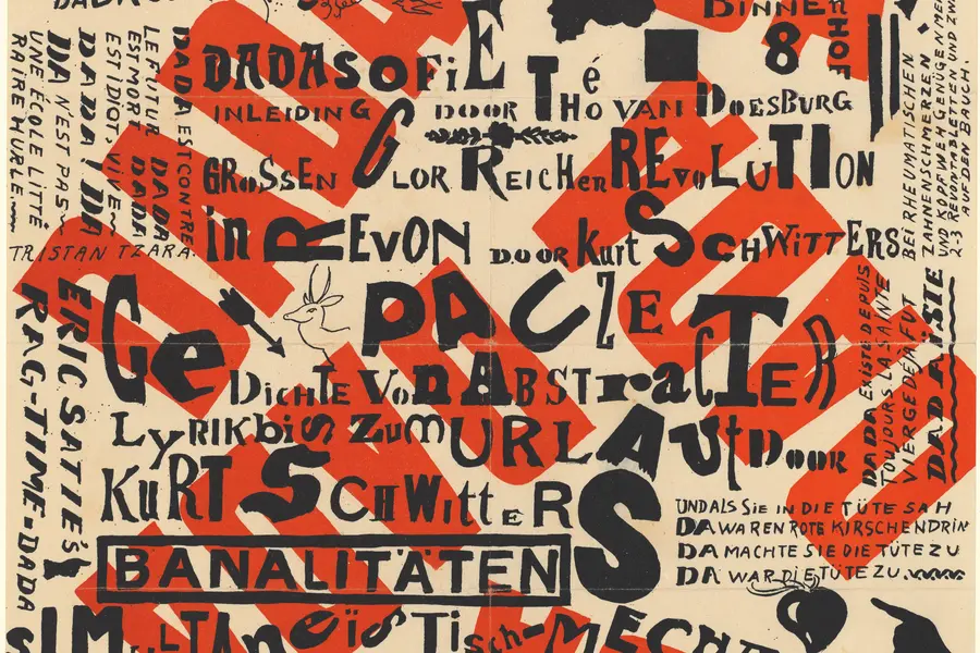
Dadaism is an anti-art movement that began in Zurich in 1916, using deliberate absurdity, chance operations and appropriated imagery to reject beauty, meaning and rationality after the First World War exposed their bankruptcy.
Read it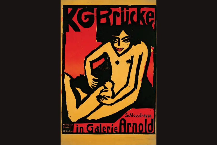
Expressionism is a design vocabulary of distortion in service of feeling rather than accuracy: elongated forms, non-naturalistic colour, raw carved texture, and compressed space, developed in Germany and Austria in the years before and after the First World War.
Read it
Graffiti design is the lettering-based visual culture that began with tags on Philadelphia and New York streets and subway cars in the late 1960s and early 1970s, then developed into throw-ups, pieces and wildstyle through decades of practice rather than formal schooling.
Read it
Swiss Design, more precisely the International Typographic Style, is a graphic design programme built on the mathematical grid: a single sans-serif typeface, asymmetric layout and photography treated as documentary fact, formalised in Zurich and Basel through the 1950s.
Read it
Minimalism in design reduces a composition to the elements it cannot function without, so colour, form, type, and space each carry more weight because there is less to look at.
Read it
Y2K design is the visual language of computers, gadgets, fashion, and web culture from roughly 1997 to 2003, built from translucent coloured plastic, chrome and metallic surfaces, rounded bubble forms, and a saturated synthetic palette that together expressed a moment when digital technology looked purely exciting rather than troubling.
Read it