
2026-09-15
Nural Choudhury
Graffiti design is the lettering-based visual culture that began with tags on Philadelphia and New York streets and subway cars in the late 1960s and early 1970s, then developed into throw-ups, pieces and wildstyle through decades of practice rather than formal schooling.
It shares hand-drawn letterforms with the hand-lettering renaissance, but graffiti is not a commissioned craft drawn once for reproduction. It is a name-based writing system produced in public space, often without permission, inside a subculture with its own hierarchy, its own standards of credit, and its own contested view of who gets to borrow its vocabulary.
letters built from a writer’s name, escalating from tag to throw-up to full piece to wildstyle, sealed inside a dark, consistent outline with a flat or gradient fill, dimensional shadow or extrusion, and often a supporting character, executed in spray paint and marker at a scale that fills its wall, train car or mural site.
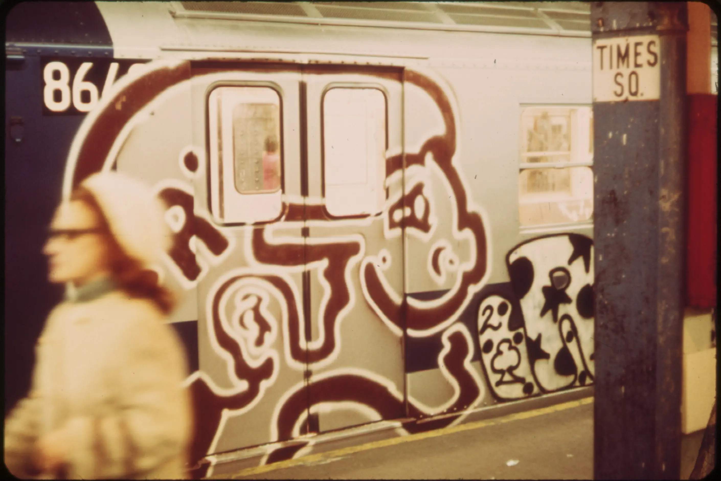
Philadelphia and New York, late 1960s to early 1970s; writers such as CORNBREAD and TAKI 183 tagged trains and streets until the New York subway became the movement’s defining canvas through the 1970s and 1980s.
youth, music, nightlife and streetwear work that wants genuine energy rather than a borrowed signifier, built with or crediting the writers whose vocabulary it draws on, not corporate work chasing an edgy surface.
Modern graffiti culture began in Philadelphia and New York in the late 1960s and early 1970s. CORNBREAD started tagging in Philadelphia, and in New York, a teenager writing as TAKI 183, a tag combining his name with his street, gained wide attention when the New York Times profiled him in July 1971. The coverage showed that a name repeated often enough in public space earned recognition, and more writers followed.
New York’s subway system became graffiti’s defining canvas. Trains ran through every borough and carried a writer’s name past millions of riders each day, so writers competed for visibility in train yards. Tags scrawled quickly for volume evolved into throw-ups, fast two-colour bubble letters, and pieces, short for masterpieces, full-colour works with backgrounds and characters that could take hours and cover a car whole or top to bottom. Wildstyle pushed the letterform furthest: interlocking shapes, arrows and abstract embellishment legible to other writers but not to outsiders.

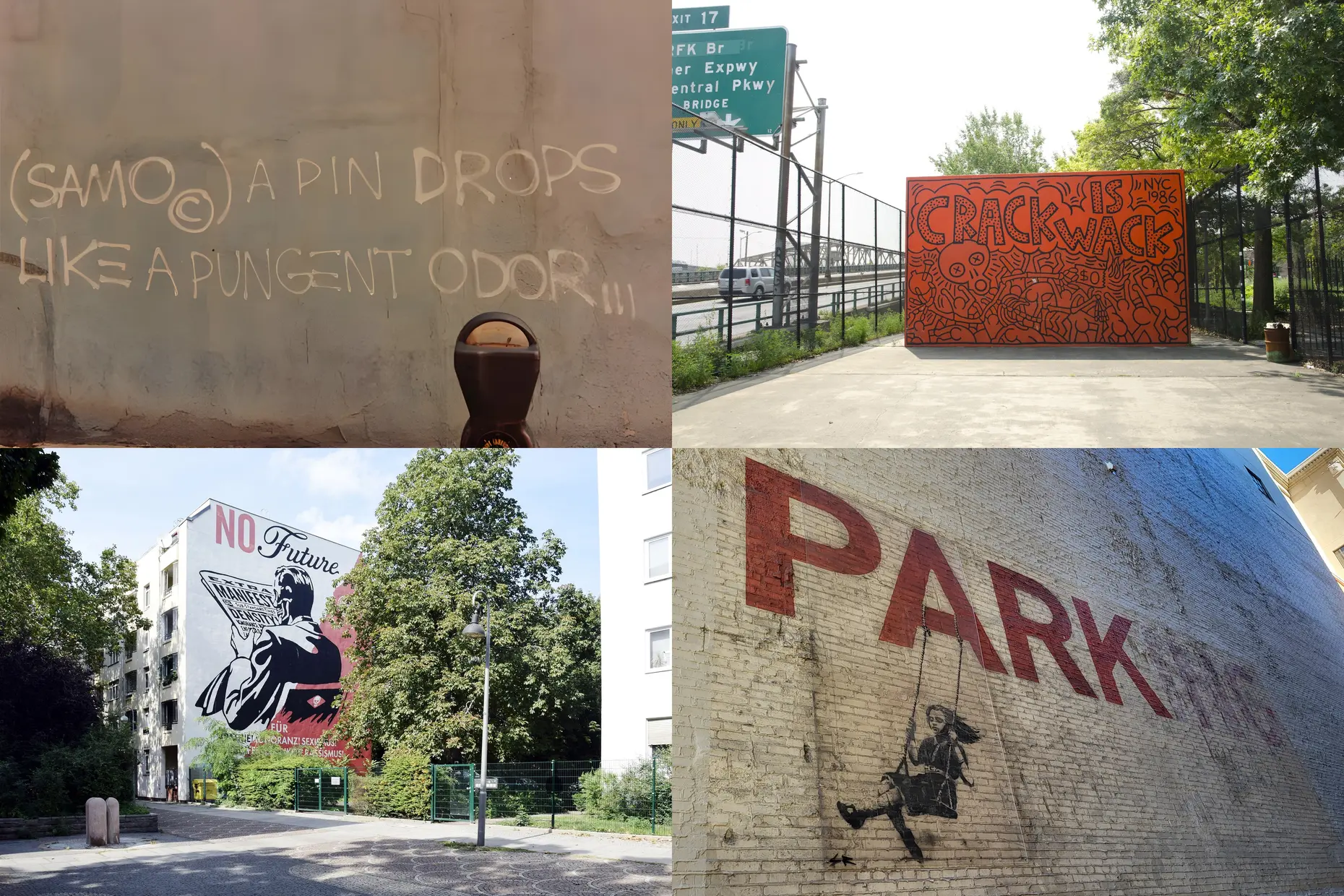
New York’s transit authority ended the subway era through the Clean Train Movement, which removed graffiti-covered cars from service as soon as they were tagged, between 1984 and 1989, taking away the visibility that made painting a train worth the risk. Writers moved to walls and freight trains, and the vocabulary spread internationally through magazines, videos and travelling writers. A broader street art grew from that base, adding stencils, wheat-paste posters and murals beyond lettering. Jean-Michel Basquiat wrote as SAMO before his gallery career, and Keith Haring, Shepard Fairey and Banksy carried elements of the same practice into legal murals, galleries and commissioned work, each renegotiating the line between street credibility and institutional acceptance.
| Element | What graffiti does | The tell |
|---|---|---|
| Colour | Uses saturated colour straight from the spray can, planned before execution since paint cannot be mixed on the wall, and builds fades through overlapping passes | A short, high-contrast palette, complementary or monochrome, rather than a blended scheme, with visible gradient banding from the spray technique |
| Form and shape | Builds an entire style system around a writer’s name, escalating from tag through bubble and block to wildstyle | Recognisable escalation: simple to increasingly interlocked, distorted forms that trade legibility for virtuosity |
| Typography | Treats a bold, closed outline as the letter’s structural skeleton, with fill, shadow and dimensional extrusion added on top | A dark, consistent-weight outline sealing every letterform, doing the job stroke contrast does in a designed typeface |
| Layout and composition | Scales the piece to its surface, a subway car’s length or a wall’s height, planning backgrounds, characters and dedications to fill the whole space | Whole-car or top-to-bottom coverage, composed for one fixed physical canvas rather than a reusable grid |
| Materials or texture | Works through spray can and marker, keeping the gestural evidence of the hand and the paint’s own spatter | Visible spray texture and hand-drawn imperfection rather than vector-smooth edges |
| Imagery or ornament | Adds characters, cartoon figures, portraits, mascots, beside or integrated with the lettering, alongside crew names and dedications | A signature character reappearing across a writer’s pieces, doing the work a logo does for a brand |

| Neighbour | What it shares with graffiti | What separates them |
|---|---|---|
| Hand-lettering renaissance | Both draw letters by hand as a personal skill rather than assembling them from a typeface | Hand-lettering is commissioned craft, drawn once for reproduction in a legal, commercial context. Graffiti’s letters are a name-based writing system produced at risk, in public space, inside a subculture with its own status economy of getting up and biting |
| Brutalist graphic design | Both reject conventional polish and prize raw, hand-evident execution over a smooth finish | Brutalist graphic design is a 2010s screen-based reaction made by designers working inside the commercial system it critiques. Graffiti is decades older, physical, and developed entirely outside that system, with illegality part of its meaning rather than an aesthetic pose |
| Pop Art | Both moved from an outsider practice toward galleries and commercial commissions, and both generate real debate about what institutional acceptance does to their meaning | Pop Art artists appropriated existing commercial imagery from within the art establishment. Graffiti writers generate their own imagery, their own name, without gallery backing, and the unauthorised claim on space is part of the work itself |
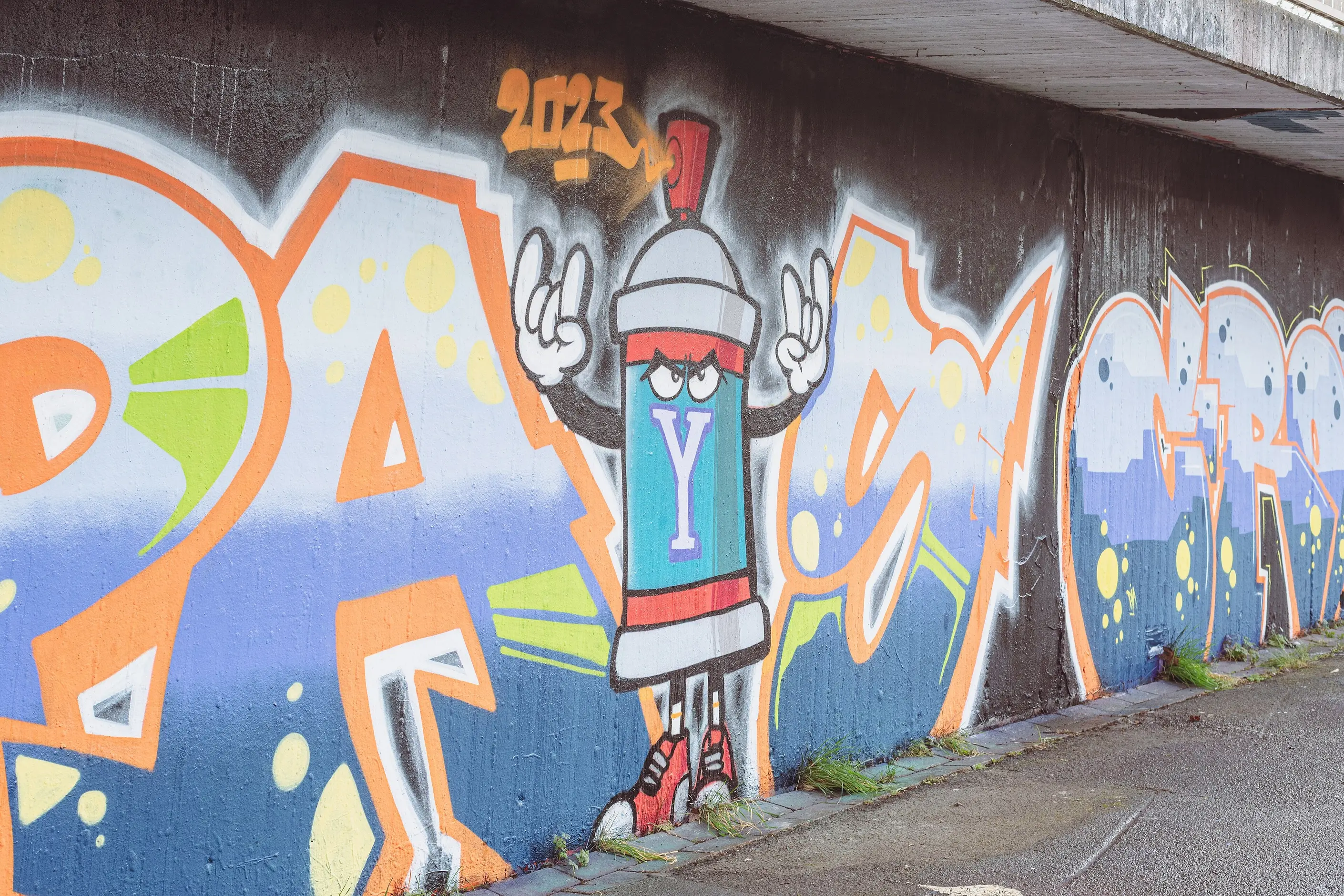
Study actual pieces before attempting the vocabulary. Examine how an outline closes, how a fill relates to it, and how a writer’s signature choices repeat across their work. Practise basic letterforms before wildstyle: the complexity has to sit on top of structural competence, not instead of it.
Keep the gestural evidence of the hand. Preserve spray texture, imperfection, and the confidence of a fast-moving line, and resist smoothing the work into vector-perfect refinement, which drains the vocabulary of what reads as graffiti rather than a graffiti-styled typeface. I wouldn’t reach for full wildstyle lettering on anything that needs to be read at a glance; that register isn’t for legibility.
Match the context to the association the style genuinely carries. It reads well on youth, music, nightlife and streetwear work, and reads as tone-deaf on anything demanding corporate gravitas or aimed at audiences likely to find “urban” signifiers condescending.
You must credit, and where the work uses a specific hand you must hire, the writers whose vocabulary it borrows. Using the look without any of the culture’s people, credit, or compensation is a pastiche risk, no matter how well the forms are executed.
Graffiti developed primarily among Black and Latino youth in New York, and commercial and fashion industries have borrowed its aesthetics for decades with uneven credit and compensation. Extracting the surface energy of graffiti while ignoring the culture and the people who built it is the style’s most common failure in commercial use, and its most serious one.
Legal, commissioned murals carry a different cultural weight from illegal work. The risk and the unauthorised claim on space were part of what gave graffiti its original meaning, and a client cannot purchase that meaning along with the mural. Vector-perfect, over-smoothed graffiti-style lettering, generated without a writer’s hand or a can of paint, reads as a costume rather than the practice, and anyone who knows the culture sees the difference immediately.
Corporate attempts to buy “urban” credibility through graffiti aesthetics, without engaging any real writers, produce work the community itself recognises as extraction rather than reference.
graffiti is lettering-based, built from tags, throw-ups and pieces that render a writer’s name. Street art is a broader category that grew from it, including stencils, wheat-paste posters and murals beyond letterforms.
CORNBREAD began tagging Philadelphia in the late 1960s. TAKI 183 brought the practice to wide attention through a July 1971 New York Times article about his New York tags.
graffiti’s most complex letter treatment, using interlocking forms, arrows and abstract embellishment that other writers can read and outsiders usually cannot.
New York’s transit authority’s Clean Train Movement removed graffiti-covered cars from service between 1984 and 1989, ending the visibility that made painting trains worthwhile.
Whether commercial use is ethical depends on engagement, not appearance; hiring graffiti artists, crediting sources, and compensating fairly are different from extracting the look without the culture behind it.
| Fact | Detail |
|---|---|
| Origin | Philadelphia and New York, late 1960s to early 1970s |
| Early figures | CORNBREAD, Philadelphia; TAKI 183, New York |
| Catalysing event | New York Times article on TAKI 183, July 1971 |
| Core forms | Tag, throw-up, piece, wildstyle |
| Subway era end | Clean Train Movement, New York transit authority, 1984 to 1989 |
| Crossover figures | Jean-Michel Basquiat as SAMO, Keith Haring, Shepard Fairey as OBEY, Banksy |
| Community vocabulary | Getting up, style, biting |
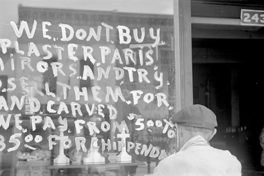
Hand lettering is the craft of drawing or painting custom letterforms for a single application, rather than setting a typeface.
Read it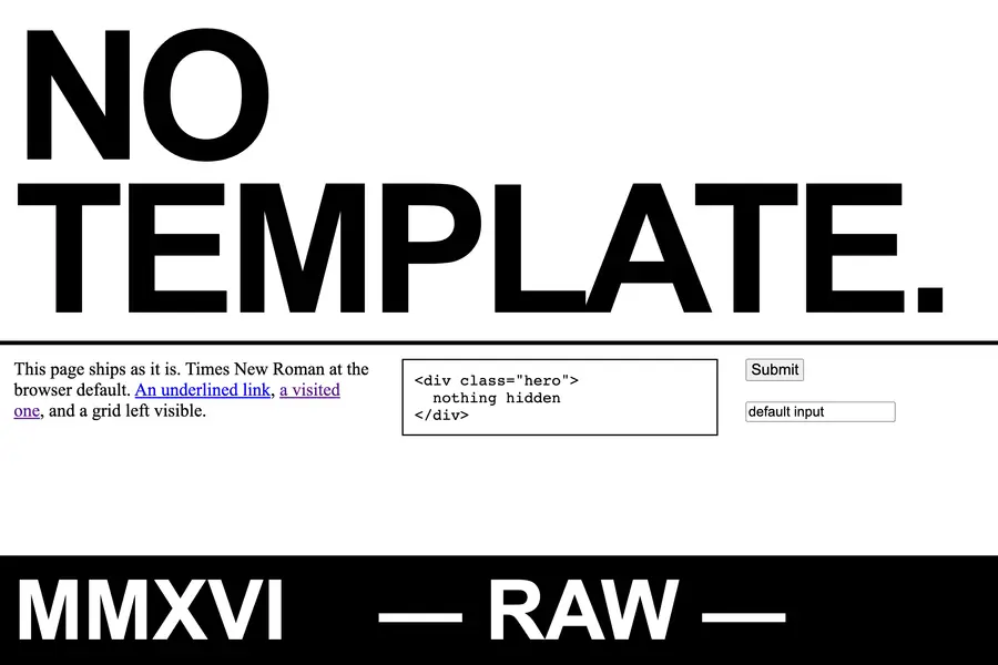
Brutalist graphic design is a raw, deliberately unpolished visual style in web and editorial design, built from system fonts, oversized type and exposed structure to reject the smooth optimisation of mainstream digital design.
Read it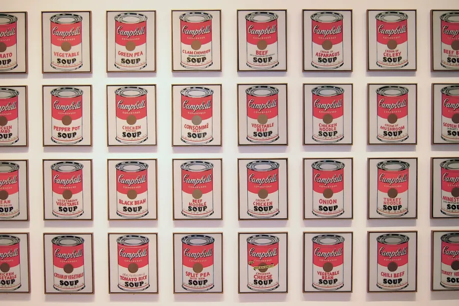
Pop Art is the movement that took commercial imagery- the soup can, the comic panel, the celebrity photograph- and treated it as fit subject matter for fine art, rendered flat, bright and mechanically precise.
Read it
Postmodernism in design is a movement that began in the late 1960s and crystallised through the 1970s and 1980s, rejecting modernism’s claim to universal rules: the grid, the neutral sans, the belief that “less is more.” Where the International Typographic Style and Bauhaus functionalism treated a small set of principles as correct for any brief, postmodernism treated those principles as one convention among many, worth quoting, distorting or discarding as the project demanded.
Read it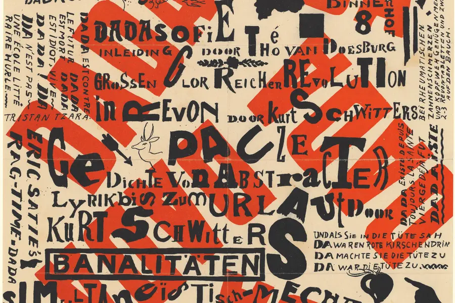
Dadaism is an anti-art movement that began in Zurich in 1916, using deliberate absurdity, chance operations and appropriated imagery to reject beauty, meaning and rationality after the First World War exposed their bankruptcy.
Read it
Typography is the craft of shaping and spacing type so readers can recognise its letters and follow its meaning without friction.
Read it