

2026-09-15
Nural Choudhury
Minimalism in design reduces a composition to the elements it cannot function without, so colour, form, type, and space each carry more weight because there is less to look at.
It is most often confused with Swiss design, which shares the reduced palette and the grid; the difference is that Swiss design reduces in service of a system that must scale across a whole publication. In contrast, minimalism reduces in service of a single object or screen and stops there.
a near-monochrome palette with one accent colour, generous white or negative space, a single sans-serif family at two sizes, rectangular forms with sharp or barely rounded corners, and a strict eight-pixel grid with nothing placed off it.
New York minimalist sculpture of the late 1950s and 1960s, Mies van der Rohe’s architectural reduction, and Dieter Rams’s industrial design for Braun (1961).
interfaces and communications where clarity and task completion matter more than emotional richness, and premium positioning that wants restraint read as confidence.
Minimalism emerged as an art movement in New York in the late 1950s and early 1960s, as a reaction against Abstract Expressionism. Where Abstract Expressionism prized gesture and the visible trace of the artist’s hand, artists including Donald Judd, Dan Flavin, Carl Andre, Sol LeWitt and Agnes Martin worked in geometry, industrial material and serial repetition, rejecting metaphor for literal physical presence. Judd’s metal boxes and Flavin’s fluorescent light installations asked to be experienced as objects in real space, not windows onto anything else.
Design minimalism has an earlier architectural root. Ludwig Mies van der Rohe popularised the phrase “less is more” and built it into the Barcelona Pavilion of 1929 and the Farnsworth House of 1951, where restrained materials and exact proportion carried buildings with almost no ornament. His furniture, including the Barcelona Chair, applied the same reduction to an object people sit in every day.
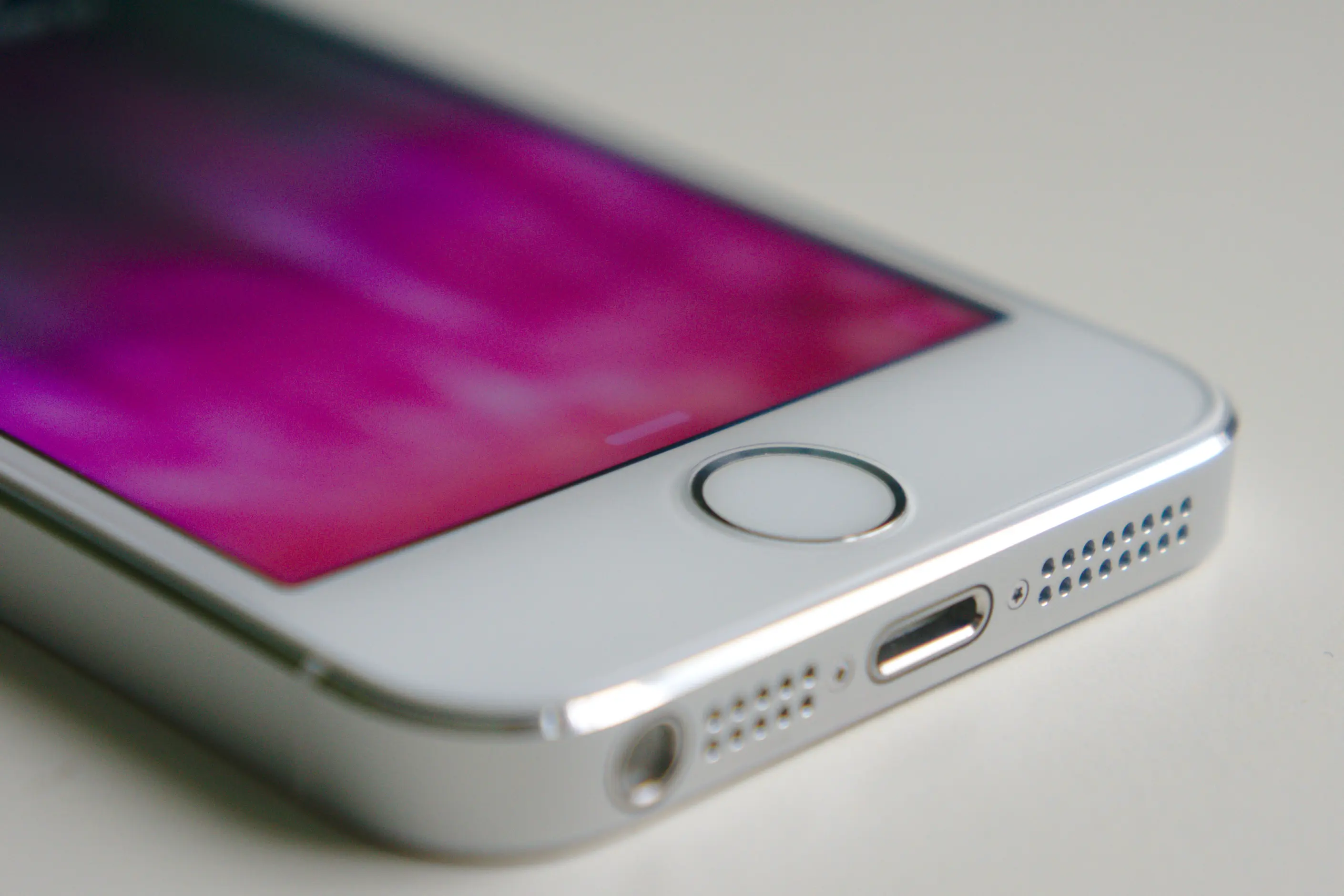
Dieter Rams, head of design at Braun from 1961 to 1995, translated this into product design through his ten principles of good design, among them the claim that good design is as little design as possible. His radios, record players, and shavers proved that consumer products could hold their aesthetic for decades through restraint rather than novelty. Rams’s influence on Apple’s products under Jony Ive, from the iPhone’s single home button to iOS’s flat interface, is the clearest line from mid-century industrial minimalism to the software on a phone today. The style also draws on Japanese aesthetic traditions of ma, or negative space, and wabi-sabi, an influence made explicit when Muji launched in 1980 as a brand of deliberately unbranded, stripped-back goods.
The style crossed into digital interfaces decisively with Apple’s iOS 7 in 2013, which replaced skeuomorphic textures such as leather and paper with flat colour and geometry. The Google homepage, a logo, a search box and two buttons, remains the most cited proof that a high-traffic interface can hold almost nothing on the page and still work.

| Element | What minimalism does | The tell |
|---|---|---|
| Colour | Restricts to monochrome or achromatic, with one functional accent | A single saturated colour, usually blue or red, marks every interactive element and nothing else |
| Form and shape | Uses simple geometric shapes at exact dimensions | Almost everything is a rectangle; the rare rounded corner is subtle, never decorative |
| Typography | Runs one sans-serif family at two sizes and at most two weights | Generous line height, often above 1.5 times type size, and left-aligned body text |
| Layout and composition | Builds on a rigid pixel grid, commonly an eight-pixel base | Space is designed before content and can occupy half a screen or more |
| Materials or texture | Favours honest, unadorned surfaces where physical | Natural wood, plain metal and matte finishes stand in for decoration |
| Imagery or ornament | Admits only imagery that earns its place | Photography is single-subject with a clean background, often in black and white; illustration is rare |

| Neighbour | What it shares | What separates them |
|---|---|---|
| Swiss design | Grid discipline, sans-serif type, restricted palette | Swiss design is a typographic and editorial system built to organise information across many pages; minimalism reduces a single object or screen and does not claim a publishing system |
| Utilitarian design | Restraint and a suspicion of ornament | Utilitarian design permits any form that earns its keep through function, including an unglamorous one; minimalism specifically prefers geometric, precise forms as an aesthetic choice, not only a functional one |
| Flat design | Reduction of surface detail, geometric shape, limited colour | Flat design is specifically the rejection of the skeuomorphic textures that preceded it, such as leather and drop shadows, and belongs to interface design in the 2010s; minimalism is a longer-running philosophy that predates and outlasts that one interface war |
Set your grid first, then choose colour, then choose type. Design space before content occupies it, not as leftover space after content is placed.
Restrict your palette to a neutral foundation with one functional accent, and use that accent for nothing else. Reserve it for interactive elements or states so the association stays legible.
Choose one sans-serif family and limit it to two sizes and, at most, two weights. Where a headline and body text cannot be told apart at a glance, the hierarchy has failed.
You must justify every remaining element rather than assume restraint alone earns its clarity. If you cannot state why a colour, a weight or a unit of space is there, cut it before you defend it.
Watch the pastiche risk directly: a white background and one sans-serif typeface do not make a design minimalist if the underlying layout is still cluttered and inconsistently spaced. Minimalism transforms the composition, not a coat of paint over an unreduced one.
Treat negative space as a designed element rather than leftover area. Decide how much of the canvas stays empty before you decide what fills the rest, since the proportion of space to content is what reads as minimalist rather than merely sparse.
Minimalism collapses into austerity when reduction removes elements a user needs, not merely elements they can do without. Low-contrast palettes and near-invisible affordances are a common failure, and they are an accessibility failure before they are a taste question: contrast ratios must meet accessibility standards regardless of aesthetic preference.
The style also risks reading as cold. Stripping colour, ornament, and gesture from a space or product built for a home rather than a laboratory can make it feel clinical, and that criticism has real force when minimalism is applied without regard for context or use.
A restricted vocabulary breeds uniformity. When most digital products share white backgrounds, one sans-serif family and a blue accent, users can struggle to tell them apart, and the market has visibly reached that point.
Minimalist interfaces can also hide complexity rather than remove it. Features concealed behind gestures or nested menus are not eliminated, only deferred, and a user who knows a feature exists but cannot find it experiences the opposite of the clarity minimalism promises. The failure mode named by the confusion with its neighbours holds here too: minimalism as reduction with intent is a discipline, but minimalism as an absence of decisions, where nothing was chosen and little was removed, only looks like the style without doing its work.
Is minimalism just a white background and a sans-serif typeface? No. That combination without a reduced, consistent grid and a genuinely restricted colour and content set is a superficial imitation, not the style itself.
Does minimalism mean removing as much as possible? No. It means keeping what is necessary and removing only what interferes with comprehension or use. Removing an affordance a user needs produces an impoverished design, not a minimalist one.
Why is minimalism associated with premium brands? Restraint reads as confidence and reduction reads as an implicit claim to quality, which is why luxury and professional-services brands reach for it. It is not automatically appropriate for entertainment or youth-oriented brands that need visual warmth.
Is monochrome the same as minimalist? Not necessarily. Minimalism usually favours monochrome or achromatic foundations, but its defining feature is reducing every element to what is necessary, not the number of hues on the page.
| Fact | Detail |
|---|---|
| Art movement origin | New York, late 1950s to 1960s: Donald Judd, Dan Flavin, Carl Andre, Sol LeWitt, Agnes Martin |
| Architectural phrase | “Less is more”, Ludwig Mies van der Rohe |
| Key buildings | Barcelona Pavilion (1929), Farnsworth House (1951) |
| Industrial design figure | Dieter Rams, head of design at Braun, 1961 to 1995 |
| Cultural influence | Japanese ma and wabi-sabi; Muji, founded 1980 |
| Interface shift | Apple iOS 7, 2013, flat design replacing skeuomorphism |

The Bauhaus is a German school of art, craft and design that operated from 1919 to 1933.
Read it
Swiss Design, more precisely the International Typographic Style, is a graphic design programme built on the mathematical grid: a single sans-serif typeface, asymmetric layout and photography treated as documentary fact, formalised in Zurich and Basel through the 1950s.
Read it
De Stijl is a Dutch modernist movement, founded in 1917, that limits its visual vocabulary to horizontal and vertical lines, rectangular planes, and the primary colours red, yellow, and blue, plus black, white, and grey.
Read it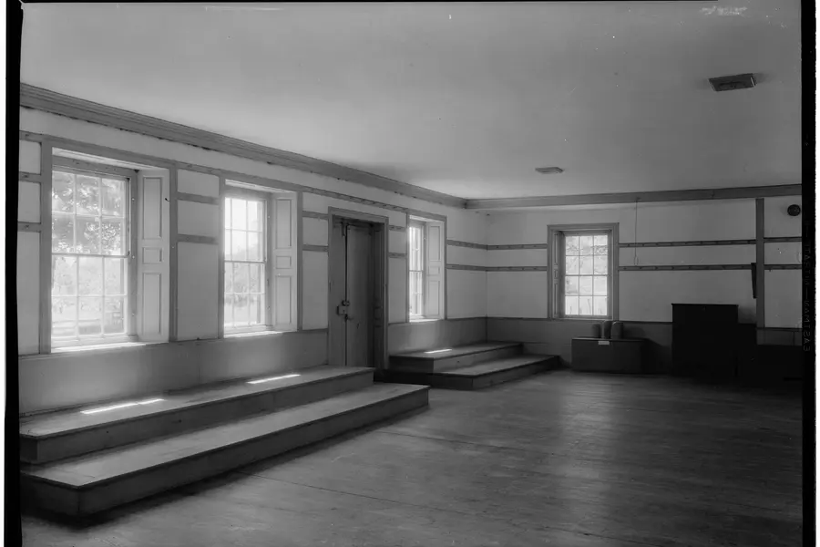
Utilitarian design justifies every visual decision by function alone: colour, form, material and ornament exist only where they serve a task, a safety requirement or comprehension.
Read it
Flat design is a digital interface style that replaces the shadows, gradients and simulated materials of earlier interface design with solid colour, geometric form and typographic hierarchy.
Read it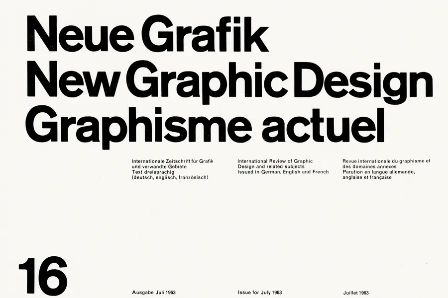
A grid is a system of columns, gutters, margins, and baselines that fixes where content can sit before you place a single element.
Read it
Layout is the arrangement of elements inside a frame: what a viewer sees first, second, and third, and what the space between things does as they look.
Read it
Typography is the craft of shaping and spacing type so readers can recognise its letters and follow its meaning without friction.
Read it
Digital accessibility is the practice of building products people can use, whatever their permanent, temporary, or situational disability, measured against a published standard rather than opinion.
Read it