

2026-09-15
Nural Choudhury
Postmodernism in design is a movement that began in the late 1960s and crystallised through the 1970s and 1980s, rejecting modernism’s claim to universal rules: the grid, the neutral sans, the belief that “less is more.” Where the International Typographic Style and Bauhaus functionalism treated a small set of principles as correct for any brief, postmodernism treated those principles as one convention among many, worth quoting, distorting or discarding as the project demanded.
clashing colour combinations that deliberately violate colour theory, historical ornament quoted out of context (a column, a pediment, a gable) and handled without reverence, layered compositions with no single focal point, and typography that breaks grid and hierarchy knowingly rather than by accident.
architecture and graphic design in the United States and Europe from the late 1960s, crystallising through the 1970s and 1980s as a reaction against International Style architecture and Swiss typography.
cultural commentary, satire, identity work for audiences who will read the references, and any brief where knowing rule-breaking communicates more than obedience does.
By the late 1960s, modernism had hardened from revolutionary method into corporate default. International Style buildings rose in glass and steel worldwide, largely indifferent to climate or context, and Swiss typography’s grids and neutral Helvetica had become, as its critics put it, a corporate uniform: every annual report resembling every other.
Robert Venturi’s Complexity and Contradiction in Architecture (1966) argued against modernism’s reductive clarity, preferring what he called “messy vitality over obvious unity” to the doctrine of “less is more.” His Vanna Venturi House (1964), designed for his mother, quoted a historical gable but split it with a void and disrupted its symmetry with irregular window placement, referencing tradition without reproducing it faithfully. Learning from Las Vegas (1972), written with Denise Scott Brown and Steven Izenour, treated the signage and decorated sheds of the commercial Strip as legitimate architectural subject matter. This claim scandalised the discipline at the time.
Design theorists drew on wider currents questioning Enlightenment certainty. Jean-François Lyotard’s The Postmodern Condition (1979) named “incredulity toward metanarratives,” a scepticism toward grand explanatory systems that applied as readily to modernism’s belief in universal design principles as to religion or politics. Jean Baudrillard’s writing on simulation influenced how postmodern designers thought about the image. In a culture saturated with reproductions, the distinction between original and copy grew unstable, and design could quote and recombine freely because no privileged original remained to be unfaithful to.
The Memphis Group, founded in Milan in 1981 by Ettore Sottsass, crystallised the movement in furniture and objects: bright clashing colour, plastic laminates, and geometric forms stacked precariously. Sottsass, already an established and respected designer, led the group in deliberately rejecting the refined “good taste” he himself had practised for decades. The Carlton Bookcase (1981), a totemic stack of coloured planes, became the group’s best-known object. Memphis disbanded in 1987, but its visual vocabulary outlasted it and has returned in periodic revivals since.
In typography, Wolfgang Weingart at the Basel School of Design trained rigorously in Swiss method and then systematically violated it from the early 1970s onward, layering type, varying letter spacing dramatically and treating type as image rather than only as text. “I didn’t abandon what I learned,” he said of the work. “I questioned it.” His students carried this approach elsewhere: April Greiman studied with him in Basel before becoming a leading American postmodern designer, notable for combining Weingart’s layering with early digital tools, as in her 1986 “Does It Make Sense?” poster made on an early Macintosh. David Carson, art director of Ray Gun magazine from 1992 to 1995, pushed the approach toward deliberate illegibility, fragmenting and overlapping text until reading itself became difficult or impossible.

| Element | What postmodernism does | The tell |
|---|---|---|
| Colour | Clashes deliberately: pastels beside bold primaries, combinations that violate colour theory | Hot pink, electric blue and mint green together, knowing rather than accidental |
| Form and shape | Quotes historical forms and then distorts them: columns, gables, arches used without structural need | An oversized or misplaced classical element, present but not sincere |
| Typography | Layered, grid-breaking, hierarchy deliberately unclear or absent | Overlapping type, letters used as texture as much as text |
| Layout and composition | Multiple competing focal points, no single dominant element | A page or object with nowhere obvious for the eye to land first |
| Materials and texture | Expensive materials combined with cheap laminates, mismatched on purpose | A precious surface set directly against plastic |
| Imagery and reference | Self-aware quotation that acknowledges its own status as a copy | A form referenced ironically, its arbitrariness visible in how it is used |

| Neighbour | What it shares | What separates them |
|---|---|---|
| Bauhaus | Both treat design as ideologically serious rather than merely decorative | Bauhaus sought one correct functional form per problem; postmodernism denies that a single correct form exists and quotes the historical ornament Bauhaus prohibited |
| Swiss design (International Typographic Style) | Both are typographically literate and grid-aware, and postmodern typography often emerges from within Swiss training itself | Swiss design treats the grid as the rule; postmodernism, through Weingart in particular, treats mastery of the grid as the licence to break it knowingly |
| Memphis style | Shares the clashing colour and geometric play, and Memphis is postmodernism’s best-known object-design output | Memphis is one dated furniture and product movement founded in 1981; postmodernism is the broader architectural, graphic and theoretical position it grew from |
| Pop art | Both engage popular and commercial culture rather than treating it as beneath serious design | Pop art presents mass-culture imagery as its subject matter; postmodernism recombines historical and stylistic reference, popular culture among them, as material to quote and distort |
| Brutalist graphic design | Both can look deliberately unresolved or hostile to polite convention | Brutalism signals rawness and structural honesty, stripped of ornament; postmodernism signals irony and historical quotation, and can be highly finished |

Understand the convention before you break it. Postmodern rule-breaking reads as mastery only when the audience can see what rule is being violated, so you must know the grid, the palette logic or the historical form you are quoting before you distort it.
Choose references your audience will genuinely recognise. Quotation without shared context lands as noise rather than commentary, so match the reference to what the audience already knows and can read back.
Reserve genuine illegibility for work where the difficulty itself is the point, as it was for Carson at Ray Gun. Most commercial briefs cannot carry it and need the message to arrive intact.
Treat the pastiche risk honestly. A postmodern surface applied without the knowing distance behind it is decoration wearing a movement’s clothes, not the movement itself, and a reader who understands the original will see the difference immediately.
I would not reach for postmodern irony on an interface that has to carry dense data or a first-time transaction: the knowing distance that makes the style work is exactly what erodes trust when a reader needs a straight answer fast.
Ironic distance can prevent genuine communication. If every reference is quotation and nothing is offered sincerely, work can read as clever about itself and empty of anything else.
Rejecting shared rules can produce visual chaos without coherence. If any combination is permitted, no particular combination carries meaning, and the plurality the movement celebrated collapses into arbitrary proliferation.
Legibility and usability suffer where the violation of convention is pursued for its own sake rather than for a reason. Text people cannot read, and interfaces that confuse users expecting functional logic are genuine failures, not evidence of daring.
A political critique followed the aesthetic one. By treating all positions as equally arbitrary, postmodern irony was accused of serving conservative ends, since a stance that nothing is more true than anything else makes it harder to argue that anything is worth changing. By the late 1990,s the movement’s coherent identity had dissolved into approaches that kept some of its insights and quietly dropped others.
Is postmodernism the same as Memphis style? No. Memphis is the furniture and object-design output of the Memphis Group, founded in Milan in 1981. Postmodernism is the broader movement in architecture, graphic design and theory that Memphis grew out of.
Why does breaking the Swiss grid count as postmodern rather than careless? Because the designers doing it, Weingart chief among them, had mastered the Swiss method first. The movement insisted on a distinction between knowing transgression and ignorant mistake.
Does postmodern irony rule out sincerity? Not by definition, but the critique that it can crowd sincerity out is one of the movement’s genuine weaknesses. Use irony where the audience shares the reference, and reserve directness for where the message must land unambiguously.
Is deliberate illegibility ever justified? Only when the difficulty itself does the communicative work, as in David Carson’s Ray Gun work. Most commercial design still needs to be read.
What is the difference between postmodernism and historicism? Historicism reproduces historical forms sincerely, aiming for faithful revival. Postmodernism quotes the same forms while signalling that the quotation is arbitrary, distorting scale, colour or placement to make that awareness visible.
| Fact | Detail |
|---|---|
| Period | Crisis of modernism from the late 1960s; movement crystallising through the 1970s and 1980s |
| Key architectural texts | Robert Venturi, Complexity and Contradiction in Architecture (1966); Venturi, Scott Brown and Izenour, Learning from Las Vegas (1972) |
| Theoretical touchstone | Jean-François Lyotard, The Postmodern Condition (1979) |
| Key architectural work | Vanna Venturi House (1964) |
| Memphis Group | Founded Milan, 1981, by Ettore Sottsass; disbanded 1987 |
| Key typographers | Wolfgang Weingart (Basel), April Greiman, David Carson (Ray Gun, 1992 to 1995) |
| Reacted against | International Style architecture, Swiss typography, Bauhaus functionalism |
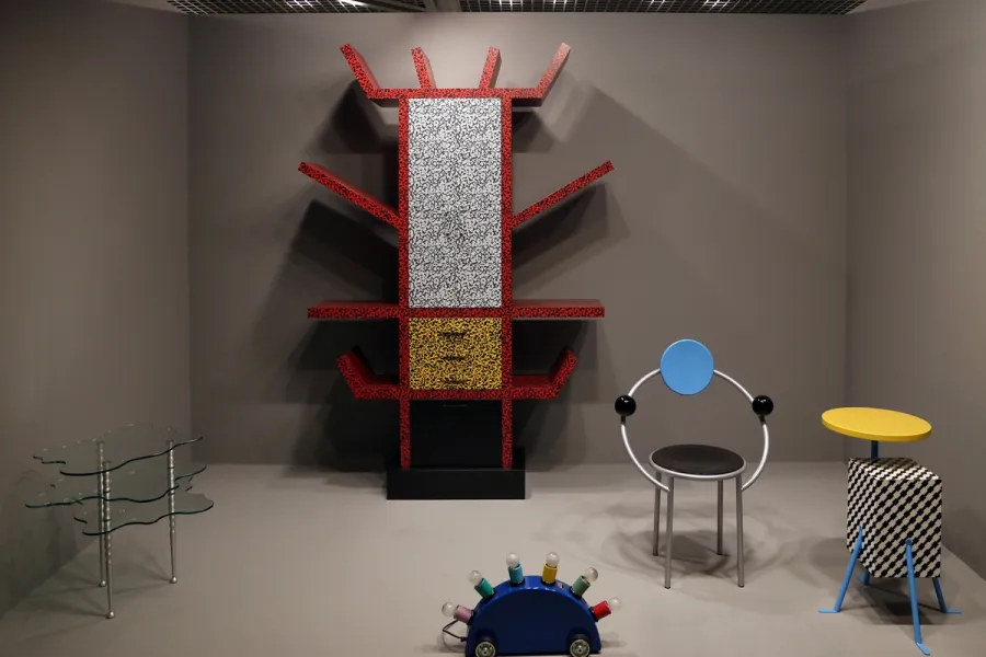
Memphis is a design movement founded in Milan in December 1980, known for stacked geometric forms, clashing colour and patterned plastic laminate applied to furniture, objects and graphics.
Read it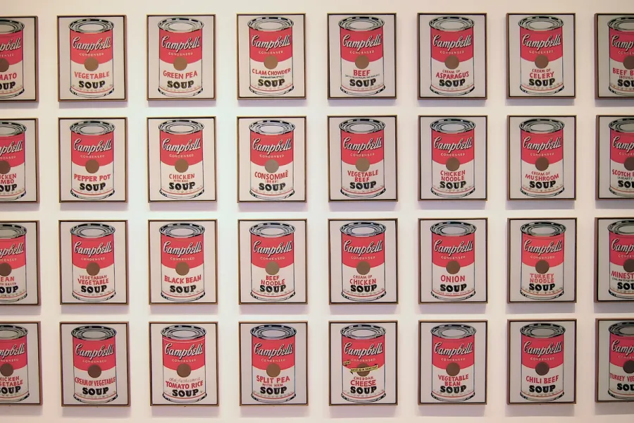
Pop Art is the movement that took commercial imagery- the soup can, the comic panel, the celebrity photograph- and treated it as fit subject matter for fine art, rendered flat, bright and mechanically precise.
Read it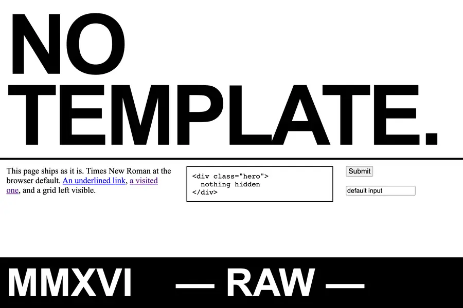
Brutalist graphic design is a raw, deliberately unpolished visual style in web and editorial design, built from system fonts, oversized type and exposed structure to reject the smooth optimisation of mainstream digital design.
Read it
The Bauhaus is a German school of art, craft and design that operated from 1919 to 1933.
Read it
Swiss Design, more precisely the International Typographic Style, is a graphic design programme built on the mathematical grid: a single sans-serif typeface, asymmetric layout and photography treated as documentary fact, formalised in Zurich and Basel through the 1950s.
Read it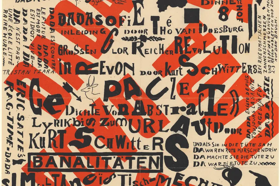
Dadaism is an anti-art movement that began in Zurich in 1916, using deliberate absurdity, chance operations and appropriated imagery to reject beauty, meaning and rationality after the First World War exposed their bankruptcy.
Read it
Y2K design is the visual language of computers, gadgets, fashion, and web culture from roughly 1997 to 2003, built from translucent coloured plastic, chrome and metallic surfaces, rounded bubble forms, and a saturated synthetic palette that together expressed a moment when digital technology looked purely exciting rather than troubling.
Read it