
2026-09-15
Nural Choudhury
Dadaism is an anti-art movement that began in Zurich in 1916, using deliberate absurdity, chance operations and appropriated imagery to reject beauty, meaning and rationality after the First World War exposed their bankruptcy.
It has no formal vocabulary built from agreed forms; instead, it is a strategy of refusal, working through collage, typographic chaos, and readymade objects. Surrealism grew directly out of Dada by 1924 but looked for hidden meaning in the unconscious through dream imagery and automatic writing; Dada rejected meaning altogether and offered only negation.
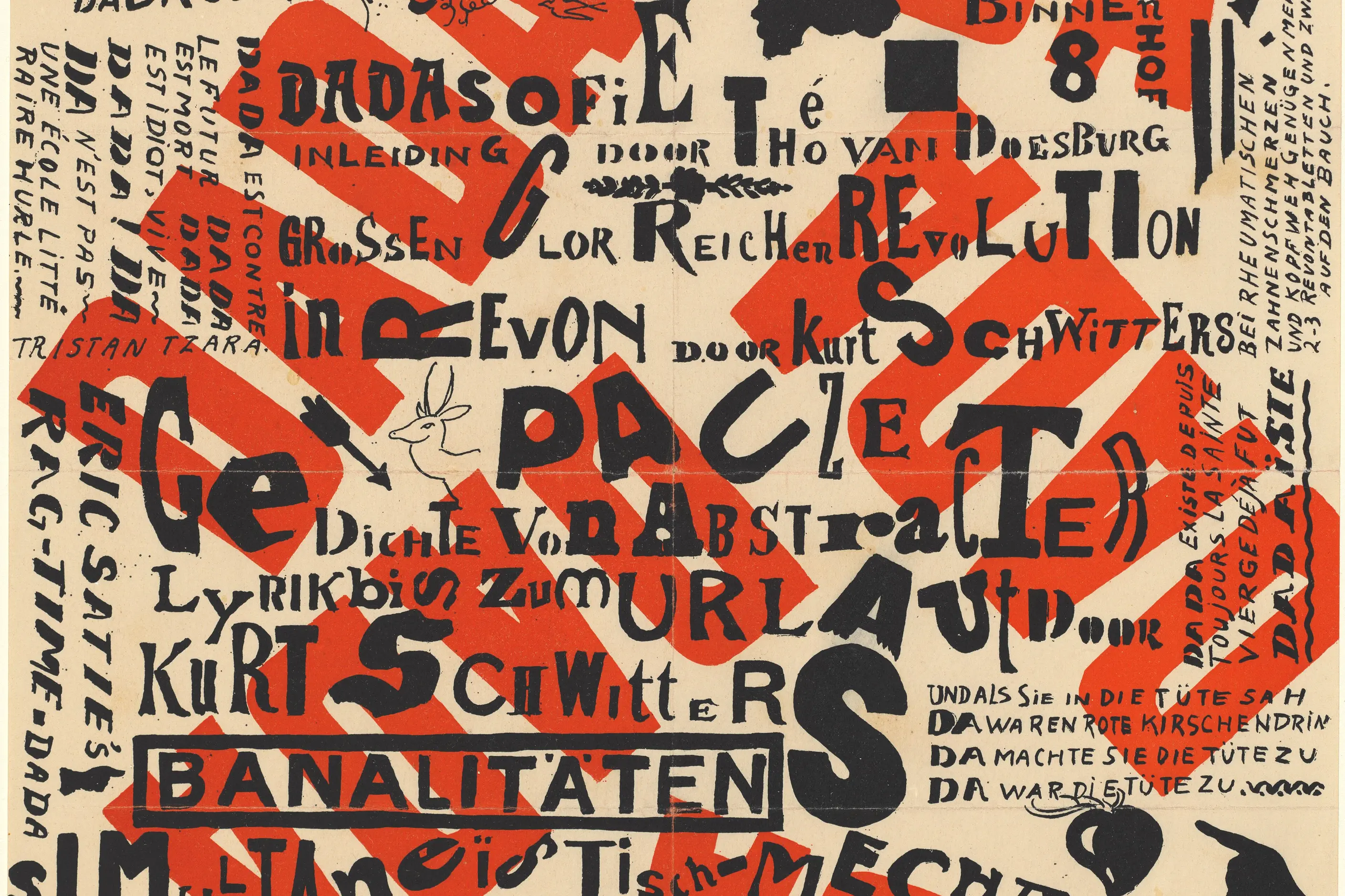
torn-edge photomontage combining photographs at incompatible scales; mixed, clashing typefaces set at competing angles and sizes, the cut-and-pasted “ransom note” look; colour that jars rather than harmonises, or none at all, raw newsprint grey; layouts with no resolved focal point, elements scattered without hierarchy.
Zurich, February 1916, at the Cabaret Voltaire, founded by Hugo Ball and Emmy Hennings among artists in wartime exile. It spread to Berlin, Paris and New York before dissolving into Surrealism by 1924.
work that needs to disrupt or confront rather than persuade: countercultural and music graphics, activist material aimed at a named convention or authority.
Dada began in Zurich, Switzerland, in February 1916, at the Cabaret Voltaire, founded by Hugo Ball and Emmy Hennings. Switzerland’s neutrality made the city a refuge for artists and writers fleeing the war. The cabaret’s performances combined poetry, music and visual art in deliberate cacophony: Hugo Ball recited sound poems in cardboard costumes, Tristan Tzara read simultaneous poetry in several languages at once, and Richard Huelsenbeck beat drums while others shouted.
The name “Dada” was chosen for its meaninglessness. In French it means hobby horse; in German and Romanian it suggests affirmation; in Russian, “da da” means “yes yes”. Tzara claimed to have found the word by opening a dictionary at random, a founding myth that made chance itself a Dada principle.
From Zurich the movement spread and changed character. Berlin Dada, from 1918, was explicitly political: Hannah Höch, Raoul Hausmann, John Heartfield and George Grosz used photomontage to expose the hypocrisy of a collapsing Germany. Paris Dada, from around 1920, connected to the French literary avant-garde through André Breton, Louis Aragon and Philippe Soupault, and laid the ground for Surrealism. New York Dada, centred on Marcel Duchamp, Man Ray and Francis Picabia, was cooler and more conceptual, built on the readymade rather than the performance.
Dada’s active period ran only from 1916 to about 1924. It dissolved not through suppression but through transformation: many of its figures moved into Surrealism, which systematised what Dada had left as pure negation. A movement built entirely on refusal cannot sustain itself indefinitely; it can only refuse for so long before it has to propose something, and Surrealism was that proposal.
The strongest individual works name the strategy precisely. Marcel Duchamp’s readymades, including “Fountain” (1917), “Bicycle Wheel” (1913) and “Bottle Rack” (1914), were ordinary manufactured objects presented as art without transformation, arguing that art’s status depends on designation rather than craft. Hannah Höch’s photomontage “Cut with the Kitchen Knife Dada Through the Last Weimar Beer-Belly Cultural Epoch of Germany” (1919) combined photographs of politicians, machines and Dada artists into a chaotic comment on Weimar Germany’s instability.
Kurt Schwitters worked at the movement’s edge, assembling urban detritus, tickets, wrappers, and newspaper scraps into a personal practice he called Merz, taken from a fragment of the word “Kommerz” found in an early collage. His Merzbau, a continuously evolving sculptural environment built inside his house in Hanover, extended the technique to an architectural scale before wartime bombing destroyed it. Raoul Hausmann’s self-portrait “ABCD” (1923 to 1924) combined a photograph of the artist shouting with scattered typographic fragments, turning Dada’s own techniques on itself.

| Element | What Dada does | The tell |
|---|---|---|
| Colour | Clashes deliberately, or is withheld in favour of raw newsprint monotone | Colour that refuses to resolve into harmony, or none at all |
| Form and shape | Torn paper, impossible scale shifts, photographic fragments recombined | The material’s origin stays visible: torn edges, visible glue, mismatched grain |
| Typography | Mixed typefaces, sizes and orientations, letters cut from different sources | The “ransom note” look: type behaving as image rather than as a container for text |
| Layout and composition | Elements scattered without hierarchy or a resolved focal point | The eye is refused a place to land |
| Materials and texture | Found urban detritus: tickets, wrappers, newsprint, reproduction artefacts | The source material is left legible rather than disguised |
| Imagery and ornament | Photomontage and the readymade: manufactured objects presented as art unaltered | A juxtaposition that could not exist in a straight, unedited photograph |

| Neighbour | What it shares with Dada | What separates them |
|---|---|---|
| Surrealism in design | Appropriation, collage, the same circle of Paris figures who carried Dada tactics forward | Surrealism searches for hidden meaning in the unconscious, through dream imagery and automatic writing; Dada refuses meaning as a category |
| Constructivism and the Russian avant-garde | The same era of geometric abstraction breaking with academic convention | Constructivism builds a positive social and political programme through order; Dada offers negation with no programme at all |
| Postmodernism in design | Deliberate rule-breaking, quotation, appropriation of found material | Postmodernism is a later, knowing quotation of historical styles, Dada included, working inside commercial and critical irony rather than wartime nihilism |

Name the target before you start. Dada disruption must have something specific to disrupt: a convention, an institution, or an audience expectation; otherwise, it’s just styling.
Let the material’s origin stay visible. Keep torn edges, visible glue lines and unretouched reproduction artefacts rather than smoothing them into a finished, polished object.
Mix typefaces and break hierarchy on purpose, and let the mixture read as assembled from incompatible sources rather than as a new, resolved system. Choose colour that clashes rather than colour that is merely unexpected but still harmonious.
Watch the paradox this produces. Designing something to look undesigned still requires design decisions, so contemporary Dada-influenced work is always a quotation of the historical movement rather than the genuine negation Zurich produced. Acknowledge that rather than pretending the work is spontaneous.
The clearest failure to avoid is composed chaos: an arrangement that looks random at a glance but resolves into conventional balance on inspection. If the work communicates cleanly and comfortably, it has not done the job.

Dada strategies collapse into decorative edginess whenever the disruption loses its target. Shock without a named convention or authority to confront is merely offensive, not critical, and reads as an aesthetic choice rather than a position.
The style is a poor fit wherever clarity, trust or professionalism are the actual requirement. In those contexts, disruption reads as incompetence, not critique.
Dada also carries a real political limitation. Its refusal of meaning rejected the rationalist justifications that had produced the war. Still, pure refusal proposes nothing: it can attack, but it cannot build a positive programme, which is why the movement lasted only about eight years before dissolving into Surrealism. Its strategies have since been repeatedly absorbed by the same commercial and institutional culture they set out to attack, from deconstructivist typography inside a commercial magazine to glitch effects sold as filters. Whether that absorption neutralises the disruption or gives it a new target remains an unresolved question, and a designer reaching for Dada today should be honest about which side they are on.
Is Dada the same as anti-design generally? No. Dada is the specific 1916 to 1924 movement that anti-design descends from; the term anti-design covers any later work that rejects design convention, whether or not it draws on Dada’s particular tactics of chance, photomontage and nonsense.
What is the real difference between Dada and Surrealism? Dada rejected meaning as a category and offered pure negation with no replacement; Surrealism, which grew out of Dada by 1924, looked for meaning again in the unconscious, through dream imagery and automatic writing.
Why did Dada only last about eight years? Pure negation cannot sustain itself. A movement that only says no eventually has to affirm something, even if only the value of refusal, and that affirmation is what became Surrealism.
Can Dada tactics be used in commercial work without contradiction? Only with real tension. Commercial deployment of disruptive imagery risks appropriating the appearance of confrontation while serving the establishment purposes Dada set out to attack, which is a contradiction worth naming rather than hiding.
Is glitch art a form of Dada? It shares the underlying move, using accident and system failure instead of chance operations and found materials. It targets a comparable pretence: digital culture’s claim to seamless perfection in place of the war-era claim to rationality.
| Fact | Detail |
|---|---|
| Founded | Zurich, Switzerland, February 1916 |
| Founding venue | Cabaret Voltaire, founded by Hugo Ball and Emmy Hennings |
| Active period | Approximately 1916 to 1924 |
| Major centres | Zurich, Berlin, Paris, New York |
| Key figures | Hugo Ball, Tristan Tzara, Marcel Duchamp, Hannah Höch, Kurt Schwitters, Raoul Hausmann |
| Defining works | Duchamp’s “Fountain” (1917); Höch’s “Cut with the Kitchen Knife Dada Through the Last Weimar Beer-Belly Cultural Epoch of Germany” (1919); Hausmann’s “ABCD” (1923 to 1924) |
| Dissolution | Absorbed into Surrealism following André Breton’s Surrealist Manifesto, 1924 |

Surrealism is the practice of placing real, recognisable things where they do not belong: a locomotive in a fireplace, an eye in a cloudless sky, a wristwatch draped over a branch like wet cloth.
Read it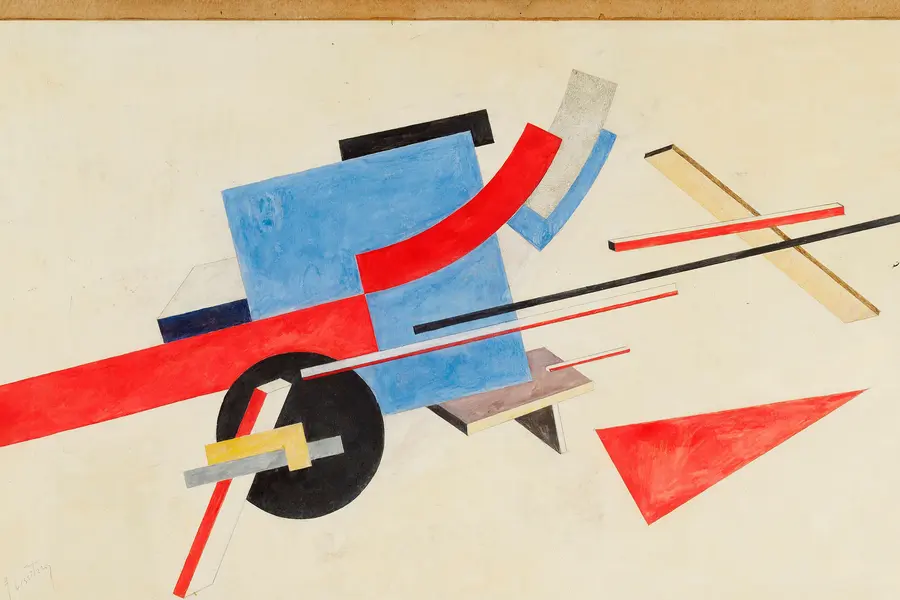
Constructivism is a Russian design movement that emerged after the October Revolution of 1917, when artists abandoned the idea of art as an autonomous aesthetic object and instead turned to posters, books, textiles, and architecture built to serve socialist construction.
Read it
Postmodernism in design is a movement that began in the late 1960s and crystallised through the 1970s and 1980s, rejecting modernism’s claim to universal rules: the grid, the neutral sans, the belief that “less is more.” Where the International Typographic Style and Bauhaus functionalism treated a small set of principles as correct for any brief, postmodernism treated those principles as one convention among many, worth quoting, distorting or discarding as the project demanded.
Read it
Graffiti design is the lettering-based visual culture that began with tags on Philadelphia and New York streets and subway cars in the late 1960s and early 1970s, then developed into throw-ups, pieces and wildstyle through decades of practice rather than formal schooling.
Read it
Pixel art is a raster art form built square by square on a fixed, visible grid, at a resolution low enough that every pixel is a deliberate decision rather than a technical accident.
Read it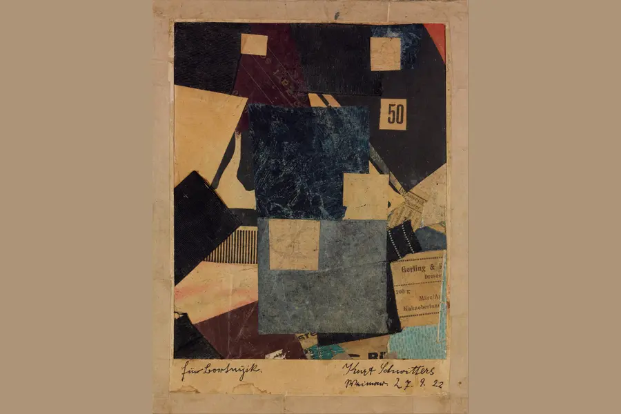
Mixed media design combines two or more materials or techniques, such as photography, illustration, hand-drawn mark-making, and digital compositing, inside one composition, so the contrast between media carries meaning no single medium could carry alone.
Read it
Typography is the craft of shaping and spacing type so readers can recognise its letters and follow its meaning without friction.
Read it
Layout is the arrangement of elements inside a frame: what a viewer sees first, second, and third, and what the space between things does as they look.
Read it