
2026-09-15
Nural Choudhury
Constructivism is a Russian design movement that emerged after the October Revolution of 1917, when artists abandoned the idea of art as an autonomous aesthetic object and instead turned to posters, books, textiles, and architecture built to serve socialist construction.
It shares Bauhaus’s geometric vocabulary and De Stijl’s love of pure form, but the distinction is directional. Where De Stijl restricted itself to horizontal and vertical lines in pursuit of universal harmony, Constructivism thrust everything onto the diagonal to signal force, motion and revolutionary change.
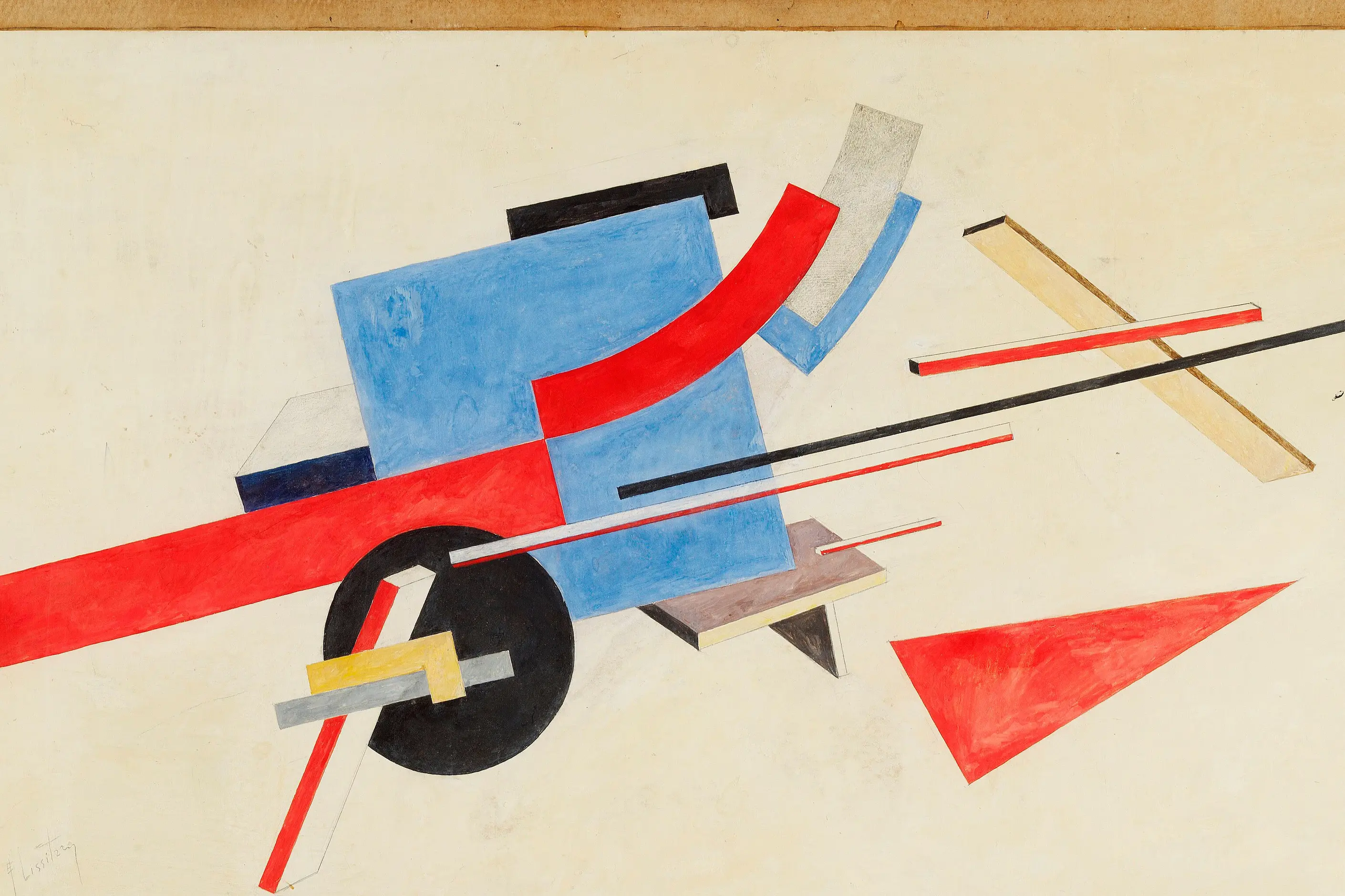
diagonal thrusts and tilted axes, a palette held to revolutionary red, industrial black and paper white and occasionally yellow, flat unshaded colour, geometric wedges, circles and rectangles standing in for machinery and architecture, bold sans-serif type set on the diagonal or fused directly into the image, and photomontage built from cropped, canted photographs.
Soviet Russia after the October Revolution of 1917, where artists including Vladimir Tatlin, Alexander Rodchenko, El Lissitzky and Varvara Stepanova turned from painting to what the movement called production art, design for posters, textiles and mass communication under the early Bolshevik state.
political and activist graphics, editorial spreads that need urgency and motion, and identity work that wants to signal energy and dissent, with the historical charge weighed honestly rather than borrowed for free.
The October Revolution of 1917 gave Russian avant-garde artists a mandate they had not had before, to help build a new society rather than produce autonomous art. The Commissariat of Enlightenment, led by Anatoly Lunacharsky, backed this experimentation through the revolution’s early years. Artists who had worked in abstraction before 1917 split over what should come next.
Kazimir Malevich continued to pursue pure abstraction for its own sake. Vladimir Tatlin and Alexander Rodchenko instead turned to what the movement called production art: design aimed at mass communication and industrial output. That split, between art’s autonomy and its utility, is the line Constructivism grew from.
Tatlin is usually credited with starting the movement through his counter-reliefs of 1914 to 1915, three-dimensional constructions built to explore materials rather than represent anything. His Monument to the Third International, designed 1919 to 1920, was never built: a spiralling steel tower conceived to rise higher than the Eiffel Tower, housing rotating government chambers inside glass volumes.
Rodchenko became the movement’s most versatile practitioner, moving between painting, photography, graphic design and advertising for state enterprises such as department stores and publishing houses. His photographs, shot from sharply raised or lowered angles, turned ordinary buildings and crowds into images that read as revolutionary rather than documentary.
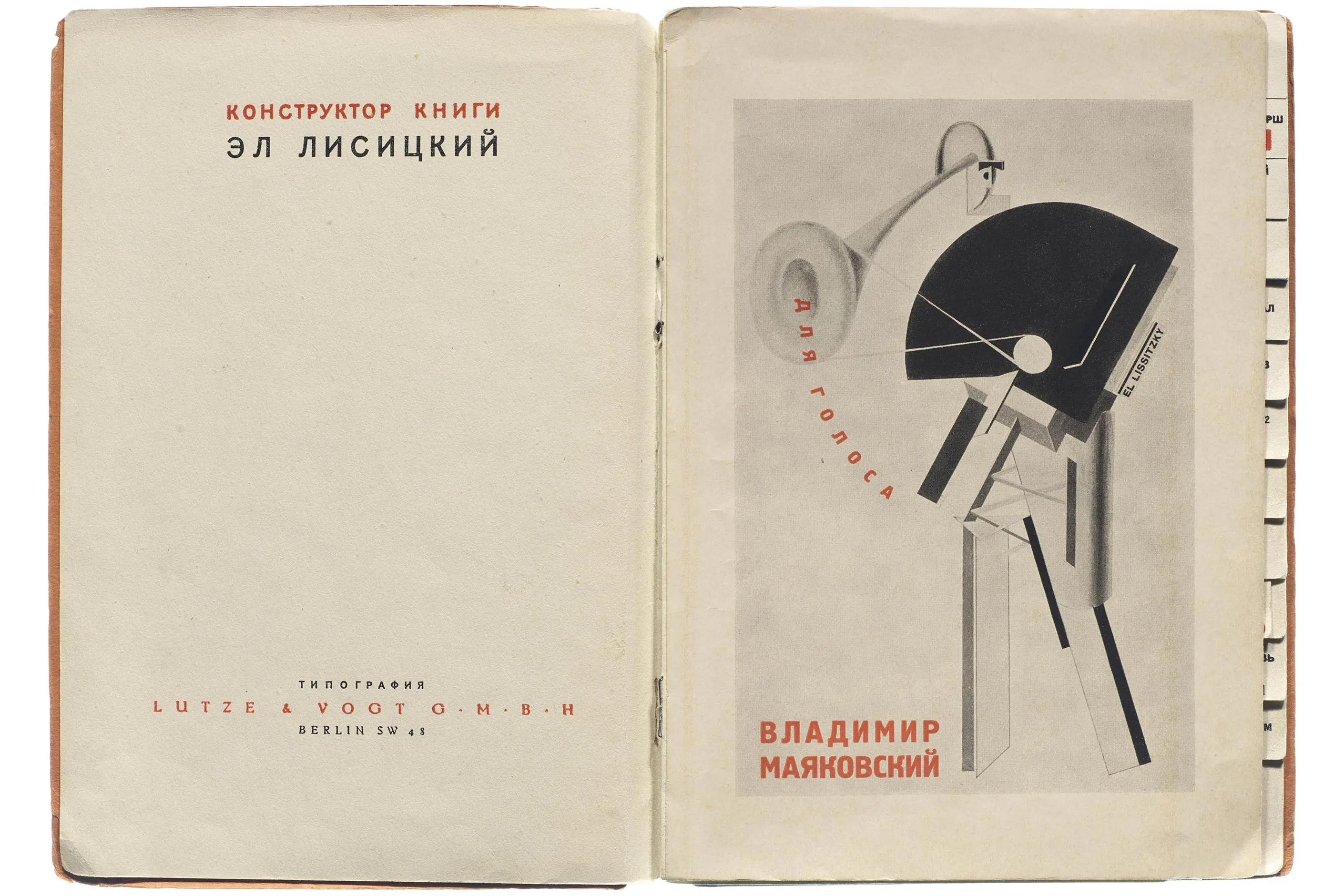
El Lissitzky carried Constructivist ideas into Germany and Switzerland while keeping his Soviet connections. His 1919 poster “Beat the Whites with the Red Wedge” reduced the civil war to a red triangle piercing a white circle, proof that the vocabulary could carry a political argument without a single figure in the frame.
Varvara Stepanova, married to Rodchenko, applied Constructivist geometry to textile and theatrical costume design for mass production. Georgii and Vladimir Stenberg built a photomontage-heavy film-poster practice from the mid-1920s until Georgii died in 1933, designing posters for Eisenstein and Vertov that captured a film’s energy rather than its scenes.

| Element | What Constructivism does | The tell |
|---|---|---|
| Colour | Restricts the palette to revolutionary red, industrial black and paper white, occasionally yellow, applied flat with no gradation | Flat, unshaded blocks of colour used symbolically rather than descriptively |
| Form and shape | Builds from geometric wedges, circles, arcs and rectangles that read as machine parts and architecture | The wedge, most famously Lissitzky’s red wedge driving into a white circle |
| Typography | Fuses bold sans-serif type into the image at dramatic scale and angle rather than setting it apart from it | Type running diagonally or vertically, with key words enlarged far past their neighbours |
| Layout and composition | Builds around a diagonal axis rather than a horizontal or vertical grid, with elements thrusting off the frame | Nothing settles on a horizontal or vertical line; everything reads as mid-motion |
| Imagery | Builds photomontage from cropped, canted and rescaled photographs combined to argue rather than document | A photograph treated as a compositional shape, not a faithful record |
| Materials and production | Works within the practical limits of scarce paper stock and limited ink during the revolutionary period | Flat colour blocks that read as production economy as much as aesthetic choice |
| Neighbour | What it shares with Constructivism | What separates them |
|---|---|---|
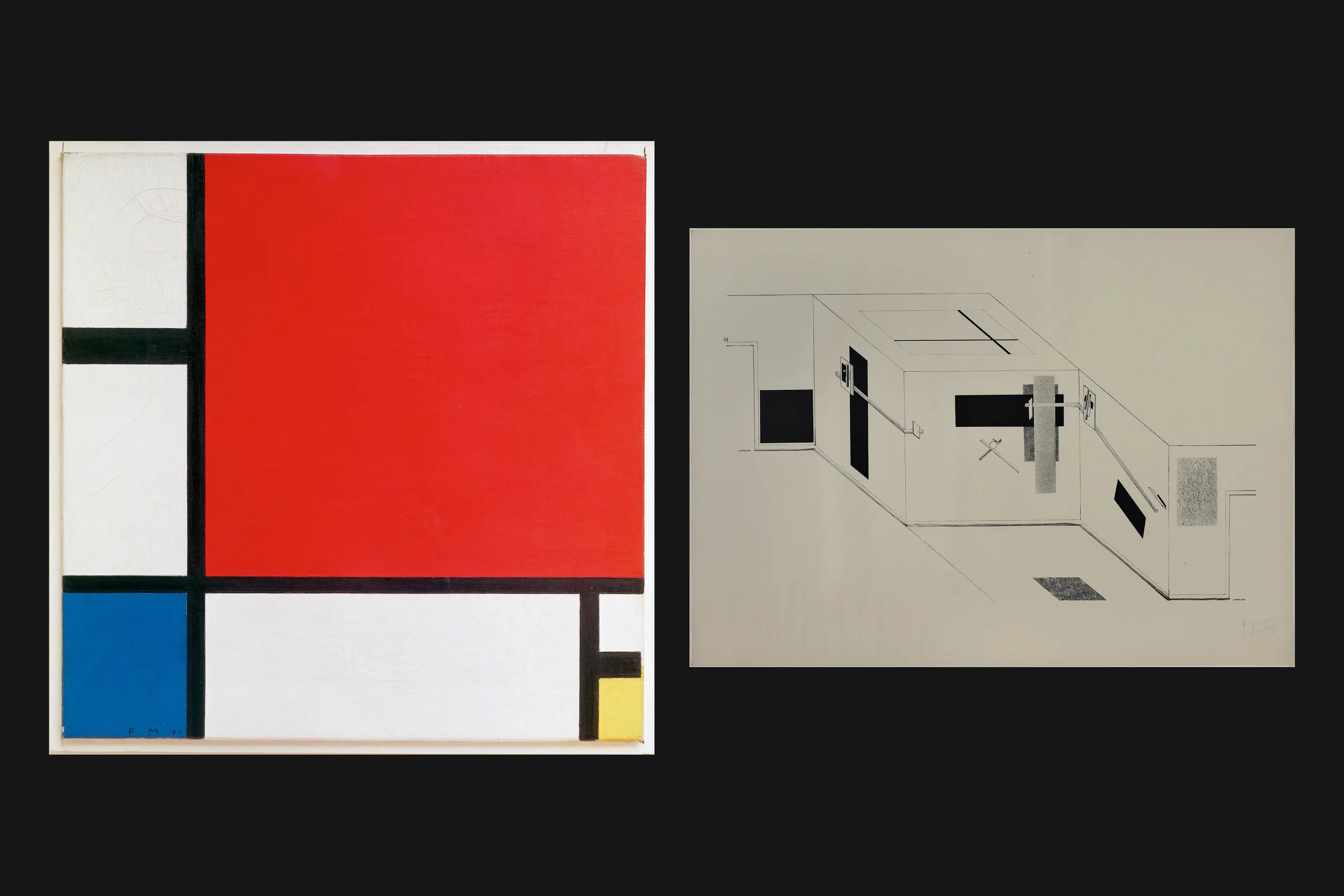
| De Stijl | Geometric abstraction, a restricted palette, and a rejection of representational imagery | De Stijl holds to horizontal and vertical lines in pursuit of universal harmony; Constructivism uses diagonals and photomontage to argue for a specific revolution, not for balance |
| Bauhaus | Integrated typography, geometric form, and a direct crossover through El Lissitzky’s time in Germany and László Moholy-Nagy’s teaching there | Bauhaus is a school with a pedagogy built for craft and industrial production; Constructivism is a movement built to serve one revolutionary state and stopped when that state stopped tolerating it |
| Brutalist graphic design | A rejection of decoration, raw materials treated as content, and a taste for stark contrast | Brutalist graphic design borrows Constructivist and Swiss rawness for a later, mostly Western register, often an ironic one; Constructivism’s rawness came from wartime scarcity and an explicit revolutionary programme |
Reach for this vocabulary first for political and activist work. The diagonal energy and reduced palette were built for exactly that job, and they still read as urgency in a poster or a protest graphic today.
Set the diagonal axis before you place type or image. Decide the angle your composition thrusts along first, because every other decision- type placement, image cropping, colour blocking- has to answer to that angle.
Hold the palette to red, black and white before you add a fourth colour. Fuse type into the image rather than laying a headline block over the top, and let key words carry the scale hierarchy instead of a separate heading.
Weigh the historical charge before you reach for this on a brand or a product. The vocabulary signals revolutionary and political, not a specific politics, so applying red-black diagonal photomontage to a launch campaign with no revolutionary content behind it is a pastiche risk: borrowing the costume without the argument.

Constructivism’s central claim, that effective visual communication could help build a more just society, collapsed against the history that followed it. Its techniques proved just as effective at manufacturing support for an increasingly repressive state as they had been at raising literacy or recruiting labour, because the vocabulary carries force and urgency regardless of what it is attached to.
The movement’s own end makes the point. Socialist Realism replaced Constructivism as official Soviet doctrine in the early 1930s as Stalin consolidated power, demanding figurative images of heroic workers over the abstraction Constructivism was built from. Some Constructivists adapted their skills to the new doctrine; others were marginalised, and several prominent avant-garde artists faced persecution during Stalin’s purges.
A second failure mode is quieter but common now. The vocabulary gets borrowed for its energy alone, stripped of the politics that gave it meaning, and a red-black diagonal identity for a consumer brand signals boldness without carrying, or answering for, the history it is quoting. That gap between the aesthetic and the content it once served is worth naming before use, not after.
Is Constructivism the same as De Stijl? No. Both reduce to geometric abstraction, but De Stijl restricted itself to horizontal and vertical lines and primary colours in pursuit of universal harmony, and Constructivism used diagonals, photomontage and a red-black-white palette in service of one specific revolution.
Why is the palette almost always red, black and white? Partly ideology: red for revolution, black for industry and labour, white as ground. Partly practicality: paper and ink were scarce in revolutionary Russia, and a restricted palette was cheaper to print at the scale propaganda required.
Can Constructivist vocabulary be used without its politics? It can be borrowed for energy and boldness alone, and often is, but a reader should know what is being quoted. The vocabulary was built to argue for a specific revolution, so using it with no content behind it risks looking like a costume rather than a reference.
What ended Constructivism? Socialist Realism replaced it as official Soviet doctrine in the early 1930s as Stalin consolidated power, demanding figurative images of heroic workers instead of abstraction. Several Constructivists adapted their practice; others were marginalised or persecuted.
Where does Constructivist design still show up? In political and protest graphics from the Spanish Civil War through 1960s counterculture to contemporary activism, in Shepard Fairey’s 2008 “Hope” poster for Barack Obama, and in punk graphics such as Jamie Reid’s photomontage and ransom-note work for the Sex Pistols.
| Fact | Detail |
|---|---|
| Origin | Soviet Russia, after the October Revolution of 1917 |
| Active period | Late 1910s through the early 1930s, ended by the rise of Socialist Realism |
| Key institution | Commissariat of Enlightenment, led by Anatoly Lunacharsky |
| Key figures | Vladimir Tatlin, Alexander Rodchenko, El Lissitzky, Varvara Stepanova, Georgii and Vladimir Stenberg |
| Defining works | Tatlin’s Monument to the Third International (1919 to 1920); Lissitzky’s “Beat the Whites with the Red Wedge” (1919) |
| Palette | Revolutionary red, industrial black, paper white, occasionally yellow |
| Successor doctrine | Socialist Realism, official Soviet policy from the early 1930s |

De Stijl is a Dutch modernist movement, founded in 1917, that limits its visual vocabulary to horizontal and vertical lines, rectangular planes, and the primary colours red, yellow, and blue, plus black, white, and grey.
Read it
The Bauhaus is a German school of art, craft and design that operated from 1919 to 1933.
Read it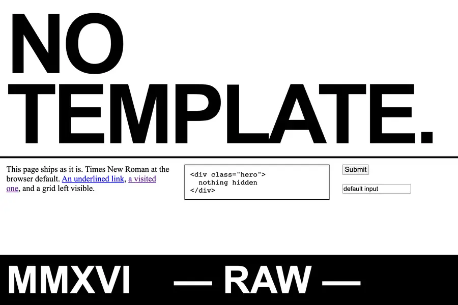
Brutalist graphic design is a raw, deliberately unpolished visual style in web and editorial design, built from system fonts, oversized type and exposed structure to reject the smooth optimisation of mainstream digital design.
Read it
Futurism is an early twentieth-century Italian art and design movement that turned speed, machinery and the violent rejection of the past into aesthetic values in their own right.
Read it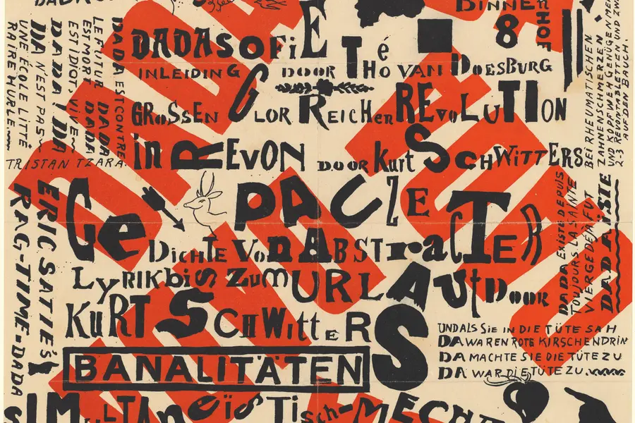
Dadaism is an anti-art movement that began in Zurich in 1916, using deliberate absurdity, chance operations and appropriated imagery to reject beauty, meaning and rationality after the First World War exposed their bankruptcy.
Read it
Postmodernism in design is a movement that began in the late 1960s and crystallised through the 1970s and 1980s, rejecting modernism’s claim to universal rules: the grid, the neutral sans, the belief that “less is more.” Where the International Typographic Style and Bauhaus functionalism treated a small set of principles as correct for any brief, postmodernism treated those principles as one convention among many, worth quoting, distorting or discarding as the project demanded.
Read it