

2026-09-15
Nural Choudhury
De Stijl is a Dutch modernist movement, founded in 1917, that limits its visual vocabulary to horizontal and vertical lines, rectangular planes, and the primary colours red, yellow, and blue, plus black, white, and grey.
Where Bauhaus is a school with a pedagogy and a workshop curriculum, De Stijl is a stricter proposition: a fixed rule set that a small circle of painters and designers applied without exception, in pursuit of what they called universal harmony. The discipline, not the look alone, is what distinguishes it.
only horizontal and vertical lines, never a diagonal or a curve; only rectangular planes, never a circle or triangle; only red, yellow and blue plus black, white and grey, applied as flat unmodulated colour with no gradients or shading; asymmetric composition with nothing centred and nothing mirrored.
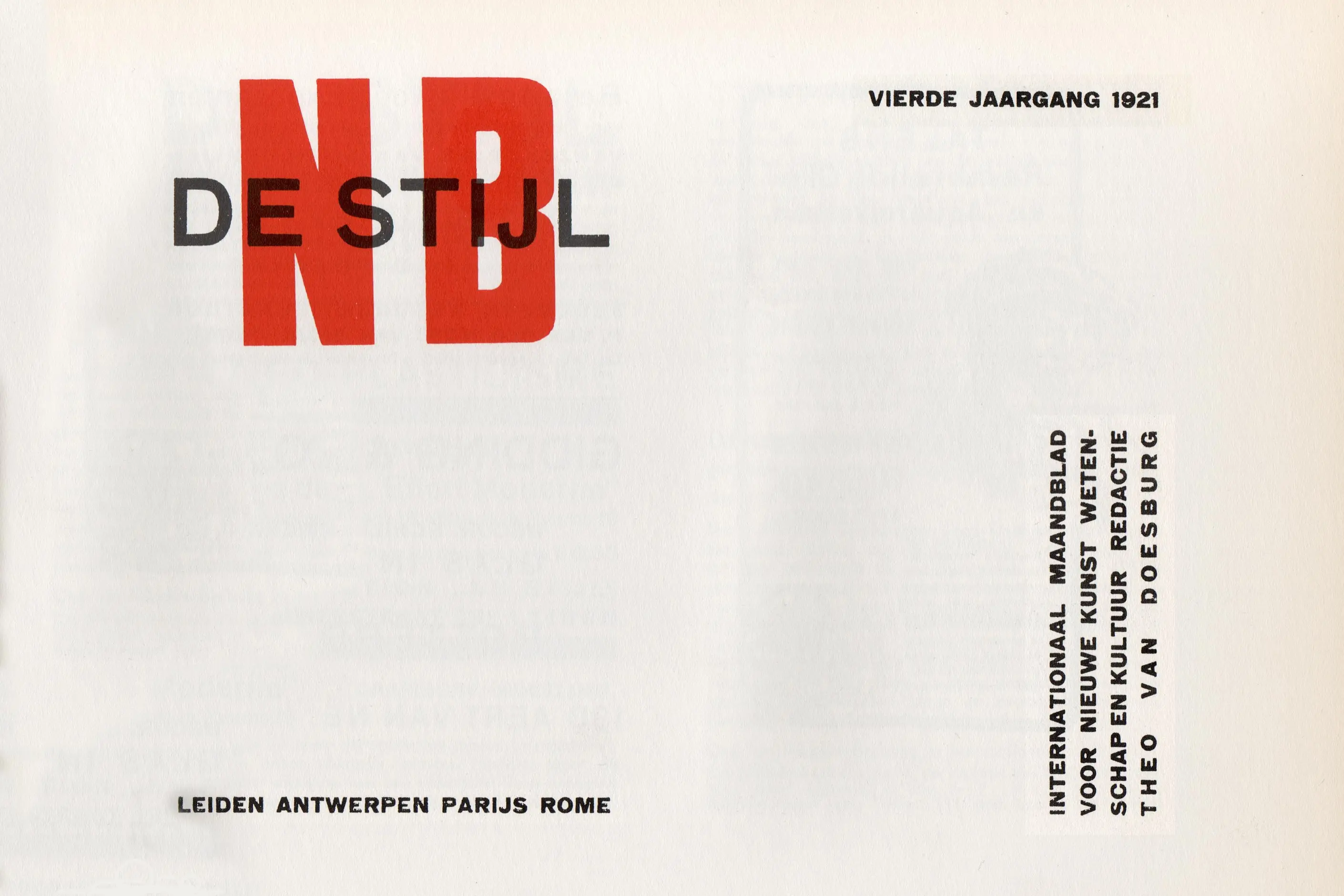
the Netherlands, from 1917, centred on Piet Mondrian and Theo van Doesburg and the journal De Stijl that gave the movement its name.
grid-disciplined layout systems, restricted colour identities and any brief that rewards visible, legible structure over decoration.
De Stijl emerged in the Netherlands during the First World War, one of the few European nations to stay neutral through the conflict. That neutrality left Dutch artists cut off from the wider European art world while still absorbing the war’s shock. Some concluded that the nationalism and subjective emotion of pre-war art had failed, and that a new art was needed, one aimed at universal values rather than individual expression.
Piet Mondrian had been in Paris when the war broke out and was stranded in the Netherlands for its duration. In that period he reduced his painting from recognisable landscapes to pure compositions of line and colour, a progression traceable through his work from around 1908 to 1920. Theo van Doesburg, younger and more of an organiser, founded the journal De Stijl in 1917, giving the movement its name and its platform, and promoted its ideas across Europe, including at the Bauhaus.
Mondrian’s reduction was not purely formal. He was influenced by Theosophy, a spiritual movement popular in early twentieth-century avant-garde circles that held a universal order lay beneath the diversity of the visible world. For Mondrian, the horizontal and vertical stood for cosmic oppositions, spirit and matter, and their equilibrium in a composition was meant to embody that harmony directly. A reader does not need to share this belief to use the vocabulary, but it explains the discipline behind it: the rules were not arbitrary; they were the method.
Gerrit Rietveld extended the vocabulary into three dimensions. His Red and Blue Chair (designed 1917, painted 1923) has a black linear frame with a blue back and red seat floating within it, and yellow accents at the rail ends. The Rietveld Schröder House (1924), designed with its owner Truus Schröder-Schräder in Utrecht, is the fullest architectural statement of the style: sliding planes rather than a solid enclosure, a dissolving corner, and an upper floor reconfigurable by sliding partitions. Van Doesburg’s own architectural work, including the Café Aubette interior in Strasbourg (1926 to 1928, with Hans Arp and Sophie Taeuber-Arp), introduced diagonal compositions under the name Elementarism. Mondrian saw this as a betrayal of the movement’s horizontal-and-vertical orthodoxy and left it, which shows how seriously the founders took their own constraints.

| Element | What De Stijl does | The tell |
|---|---|---|
| Line | Horizontal and vertical only, no diagonals or curves | Black grid lines of varying thickness carry the compositional weight |
| Colour | Restricted to red, yellow, blue plus black, white, grey | Flat, unmodulated planes with no gradient, tint or shade |
| Form | Rectangular planes only, defined by the grid rather than placed on it | Rectangles vary in proportion, from near squares to long strips |
| Composition | Asymmetric balance, nothing centred, nothing mirrored | Visual weight distributed by colour and size rather than by symmetry |
| Angle | The right angle is the only permitted intersection | Planes appear to float or interpenetrate, never overlap diagonally |
| Application | Furniture and architecture read as the grid built in three dimensions | Rietveld’s chairs and the Schröder House translate the painted plane into a room |
| Neighbour | What it shares with De Stijl | What separates them |
|---|---|---|
| Bauhaus | Grid thinking, primary colour, elementary forms; Van Doesburg taught informally near the Bauhaus and shifted it toward geometry | Bauhaus is a school with a pedagogy across three phases and 1919 to 1933; De Stijl is a small circle applying one fixed rule set with no curriculum |
| Constructivism and Russian avant-garde | Geometric abstraction and a utopian ambition for the visual language | Constructivism was made for a revolution, uses diagonal dynamism and photomontage, and De Stijl’s rules forbid both |
| Minimalism in design | Restraint, restricted palette, visible structure | Minimalism reduces toward absence and can mean fewer decisions altogether; De Stijl’s reduction is a positive rule set, not an absence, and it never drops the primaries or the orthogonal grid |

Commit to the grid before you touch colour or type. De Stijl’s discipline works because the horizontal and vertical structure comes first and stays fixed; do not break it for a single element unless you are prepared to justify the exception on every page that follows.
Restrict the palette to red, yellow and blue plus black, white and grey, and apply each as a flat plane. Do not tint, shade or gradient a colour drawn from this system, and do not add a fourth hue; the discipline is the entire point, and one extra colour collapses it into a generic geometric look.
Build balance through the distribution of weight, not through symmetry. A small red plane can balance a large white one because saturated colour carries more visual weight than pale colour, and a thick black line can balance several thin ones. Treat every element’s size, colour, and position as weight to distribute rather than a shape to centre.
Reserve this vocabulary for briefs where visible structure is an asset: identity systems built on a genuinely restricted palette, or interfaces where the grid itself should read as the design. Do not use it as decoration on top of a conventional layout. A De Stijl-referencing surface with a five-colour palette or a centred layout is not disciplined reduction; it is pastiche wearing the costume.

The rule set collapses easily into cliché: a red square, a black grid and a yellow rectangle applied to anything from a coffee cup to a website header, with none of the compositional judgement about weight and balance that the original work depended on. Reference without that judgement reads as a Mondrian print, not as De Stijl thinking.
The orthodoxy that made the movement rigorous also broke it. Van Doesburg’s introduction of the diagonal, which he called Elementarism, was enough to drive Mondrian out of the movement he had helped found. A rule set that treats its constraints as sacred rather than practical eventually expels the people who want to develop it, and a design team that imports De Stijl’s discipline without also importing that risk will find the same rigidity works against it once requirements change.
The style also carries a real gap between ambition and result. Mondrian pursued universal spiritual harmony through Theosophy; the Schröder House and the Red and Blue Chair are genuine architectural and furniture achievements, but whether living inside De Stijl’s geometry produces the harmony the movement sought is not something the work itself can settle. Treat the formal discoveries as usable on their own terms, and be honest that the spiritual claim behind them is unprovable rather than quietly true.
Is De Stijl the same as Bauhaus? No. Bauhaus is a school with a pedagogy running from 1919 to 1933 across several phases; De Stijl is a small circle of Dutch artists applying one fixed rule set, with no curriculum, that influenced the Bauhaus rather than being it.
Why only red, yellow and blue? Mondrian and the movement treated the primaries as elementary, colours that cannot be mixed from others, and therefore the most reduced vocabulary available. Secondary and tertiary colours, tints and gradients were excluded as derivative.
Can De Stijl use diagonals? Not within the movement’s own rules. Van Doesburg’s introduction of the diagonal under the name Elementarism was controversial enough that Mondrian left the movement over it.
What does De Stijl offer a contemporary designer? A model for how a strict, positive rule set, a fixed grid, a restricted palette, and asymmetric balance can produce more coherent work than an unlimited palette deployed without discipline.
| Fact | Detail |
|---|---|
| Founded | 1917, the Netherlands |
| Key figures | Piet Mondrian, Theo van Doesburg, Gerrit Rietveld |
| Founding publication | The journal De Stijl, founded by Van Doesburg in 1917 |
| Defining objects | Red and Blue Chair (designed 1917, painted 1923); Rietveld Schröder House, Utrecht (1924) |
| Palette | Red, yellow, blue plus black, white, grey |
| Split point | Van Doesburg’s diagonal Elementarism, which led to Mondrian’s departure from the movement |

The Bauhaus is a German school of art, craft and design that operated from 1919 to 1933.
Read it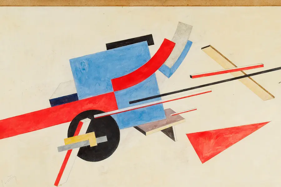
Constructivism is a Russian design movement that emerged after the October Revolution of 1917, when artists abandoned the idea of art as an autonomous aesthetic object and instead turned to posters, books, textiles, and architecture built to serve socialist construction.
Read it
Minimalism in design reduces a composition to the elements it cannot function without, so colour, form, type, and space each carry more weight because there is less to look at.
Read it
Swiss Design, more precisely the International Typographic Style, is a graphic design programme built on the mathematical grid: a single sans-serif typeface, asymmetric layout and photography treated as documentary fact, formalised in Zurich and Basel through the 1950s.
Read it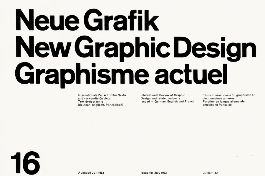
A grid is a system of columns, gutters, margins, and baselines that fixes where content can sit before you place a single element.
Read it
Colour theory is the study of how colours relate to each other on the wheel, across value, saturation, and temperature, and in combination so that you can reason through a decision rather than feel it.
Read it
A design system is a governed set of reusable components, patterns and rules that a team uses to build consistent digital products at scale, and it is neither a static style guide nor a component library on its own.
Read it