
2026-09-15
Nural Choudhury
Editorial design is the practice of shaping a sequence of pages or screens.
As a result, readers move through them in a deliberate order rather than treating each page as an isolated composition. This page covers pacing across that sequence, the relationship between text and image, and the systems that let a title stay itself from issue to issue. Grid structure belongs to basic grid systems, and type fundamentals belong to typography basics; neither is repeated here.
a publication, in print or on screen, that a reader moves through with intention instead of drifting off after the first spread or the first scroll.
any title published as more than one issue or edition, including magazines, reports, newsletters, and long-form digital features that run past a single screen.
fix the sequence’s rhythm before you finesse a single spread. A beautiful page that breaks the piece’s pacing works against the publication, not for it.
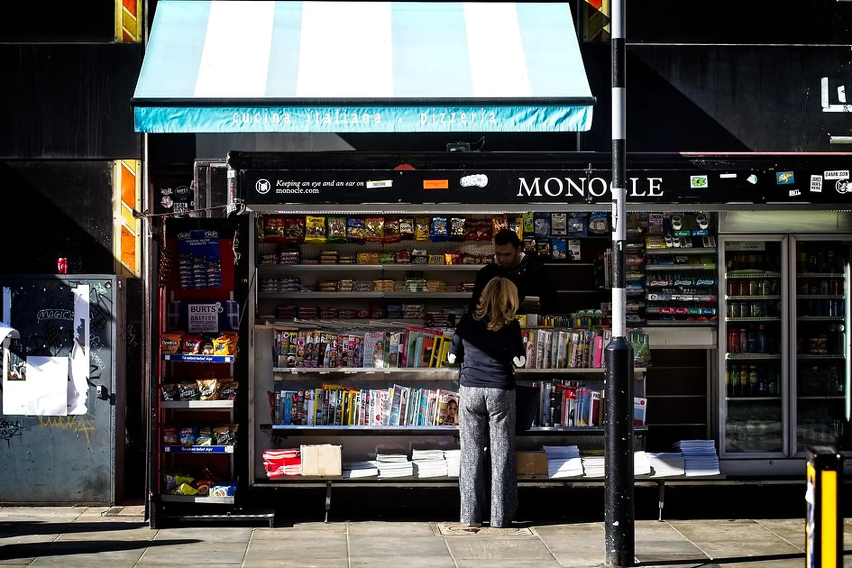
Editorial design’s grammar comes from magazine art direction. Titles such as The New Yorker built a reading experience from restrained typography and a long illustration tradition, and Vogue paired dramatic photography with a layout that kept the feature legible. Wired used experimental typography to signal a digital-era sensibility while keeping stories readable, and Monocle showed that a confident grid can feel both classic and current.
Book design extended the same thinking to a single, long-form work, with designers such as Chip Kidd and publishers such as Phaidon. The unit changed from an issue to a single volume, but the underlying problem, pacing a reader through a fixed sequence, stayed the same.
Editorial design is the only design craft built on sequence. A reader moves through a publication in order, spread by spread or screen by screen, and pacing shapes that movement. A well-paced piece controls when it is loud and when it is quiet, and repeats that pattern across a run of pages rather than treating each page as a composition on its own.
| Move | What it does | Typical treatment |
|---|---|---|
| Opener | Establishes tone and pulls the reader in | Dramatic typography, a full-bleed image, minimal text |
| Reading spread | Carries the argument | Quiet columns, restrained type, few interruptions |
| Punctuation spread | Maintains attention mid-piece | A pull quote or secondary image breaking the column |
| Closer | Signals the end | A deliberate visual move, quieter or louder than the opener by design |
Two spreads placed next to each other are never neutral. A quiet spread beside a loud one reads as contrast, and two loud spreads in a row read as fatigue. I plan the sequence as a set of contrasts before I lay out a single page, because a spread designed on its own cannot know what came before it or what follows.
Every page also has an entry point: the element a reader’s eye lands on first in print, usually the largest element on the spread. On a scroll, it is whatever sits in the first viewport. Get the entry point wrong,g and the reader has to search for where to start, which the rest of the design cannot recover from.
The second material is the relationship between text and image. An image can support the text by illustrating what it already says, interpret it by adding a reading the words do not state directly, or counterpoint it by working against the text’s grain. I decide which relationship I want before I brief a photographer or select stock, not after the images come back.
The third material is what keeps a title itself from issue to issue. A masthead, a typographic palette, and a small number of layout templates repeat unchanged, and everything else answers to the story. Fix too little and a reader cannot recognise the publication two issues on. Fix too much, and a template stops being a discipline and becomes a straitjacket.
Compositional principles such as hierarchy, balance, and white space on a single page are layout principles’ territory, and print production and colour management are colour systems’ territory. Both matter to a finished spread; neither is what makes a sequence read as a sequence.
You must map the sequence before you open a page layout. Mark where the piece opens, where it settles into reading, where it punctuates, and where it closes, on paper or in a thumbnail spread rather than inside the layout file.
You must design spreads in relation to their neighbours, not one at a time. Pull up the spread before and after whichever one is on your screen, and check the loud/quiet pattern across all three before you commit to either.
You must decide the text-image relationship for a piece before you brief a photographer or select stock. A photographer briefed on the relationship the image needs to carry shoots differently from one briefed only on a subject.
Keep a caption within reach of its image. If a spread break, a fold, or a scroll interruption sits between an image and its caption, move one of them rather than accept the separation.
Decide in advance which structural elements repeat unchanged across every issue, and hold that decision through the pressure to make one issue’s cover story an exception. A template that bends every time a story asks it to stops being a template.
Take a profile feature running across six spreads in print and as a single long scroll online, a useful test case for pacing.
In print, I map the sequence before opening a layout file. A full-bleed opening image carries a short headline and no body text; two quiet reading spreads carry the interview; one punctuation spread is built around a single portrait and a pull quote; and a closer returns to a smaller version of the opening image.
Online, the page turn disappears as a pacing device, so I rebuild the rhythm around the scroll instead. The opening image runs full width at the top, the reading sections keep a single narrow column, and the pull quote sits inside the text column rather than breaking across a page, because there is no facing page for it to break onto.
The elements that carry across both versions are the ones fixed in advance: the typographic palette and the caption style. Everything else, including the punctuation spread’s layout, answers to the story in front of it.
The most common failure is designing spreads one at a time. A designer opens a fresh page, makes it as good as it can be, and moves to the next page the same way. Each spread might be individually strong, yet the publication still has no rhythm, because rhythm exists only in the relationship between spreads, not within one.
The opposite failure is a template held too strictly. When every structural decision is fixed, and nothing is left to serve the story, every issue reads the same,e and a reader has no reason to open the next one. A template exists to be flexed within limits, not to remove judgement from the page.
Separating an image from its caption across a fold or a scroll break is a small mistake with a high cost. The reader reaches the caption after the image has already moved past their attention, or reaches the image without the context the caption was carrying. Either way, the relationship the two were built to have is broken.
Digital editorial designed as a page rather than a scroll carries over print thinking that does not survive the move. A layout built around a fixed page turn, forced onto a continuous scroll, loses the pacing device it was built around, and nothing replaces it
Should a digital feature scroll or paginate? Treat the two as different pacing systems, not one adapted to the other. A scroll has no natural page turn to punctuate the piece, so build the punctuation into the text column and the image sizing instead of forcing a spread-based rhythm onto a continuous page.
How many structural elements should a template fix? Fix the smallest set that lets a reader recognise the title at a glance, usually the masthead treatment, the typographic palette, and one or two layout templates. Leave the rest to answer to the story.
Does pacing matter for a short piece? Less than for a long-form feature, but a newsletter or a one-page report still has an opening move and a closing move, and what leads and what follows still shapes how it reads.
What is the difference between a spread and a page? A spread is the pair of facing pages a reader sees at once when a print publication is open. Pacing decisions in print are made at the spread level, not the single page, because that is the unit the reader actually looks at.
| Item | Where it stands |
|---|---|
| Lineage | The discipline’s pacing and hierarchy conventions come from twentieth-century magazine art direction, in titles such as The New Yorker, Vogue, Wired, and Monocle, and were extended to single, long-form works by book designers such as Chip Kidd and publishers such as Phaidon |
| Print pacing device | The spread and the page turn |
| Digital pacing device | The scroll, which removes the page turn and requires punctuation to be built into the column and the image sizing instead |
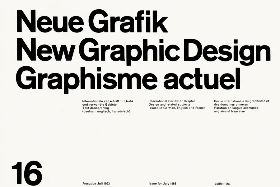
A grid is a system of columns, gutters, margins, and baselines that fixes where content can sit before you place a single element.
Read it
Layout is the arrangement of elements inside a frame: what a viewer sees first, second, and third, and what the space between things does as they look.
Read it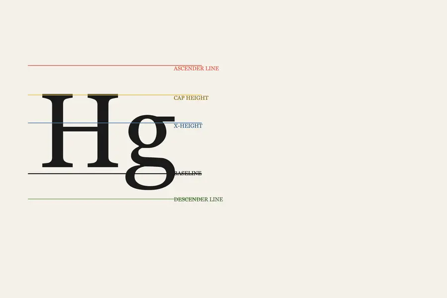
Typography is the craft of shaping and spacing type so readers can recognise its letters and follow its meaning without friction.
Read it
Colour management is the discipline of specifying a colour precisely enough that a printer, a signage vendor and a web team can all reproduce it the same way, then documenting that specification.
Read it