
2026-09-15
Nural Choudhury
Historical typography is the classification lineage that sorts Western printed letterforms into distinct construction families by era: blackletter, humanist old style, transitional, modern (Didone), and slab serif, each traceable to a specific press, punchcutter, or decade between the 1450s and the nineteenth century.
It differs from calligraphy, a handwritten discipline governed by the pen and the hand rather than by type cut, cast, or drawn to repeat identically at scale. It also differs from any single movement inside the lineage, Swiss design among them, which occupies one twentieth-century position in this history rather than the history itself.
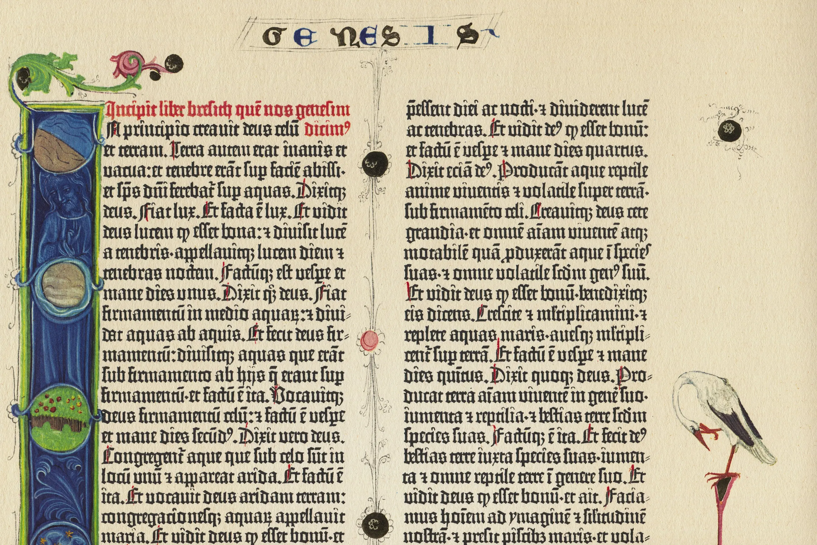
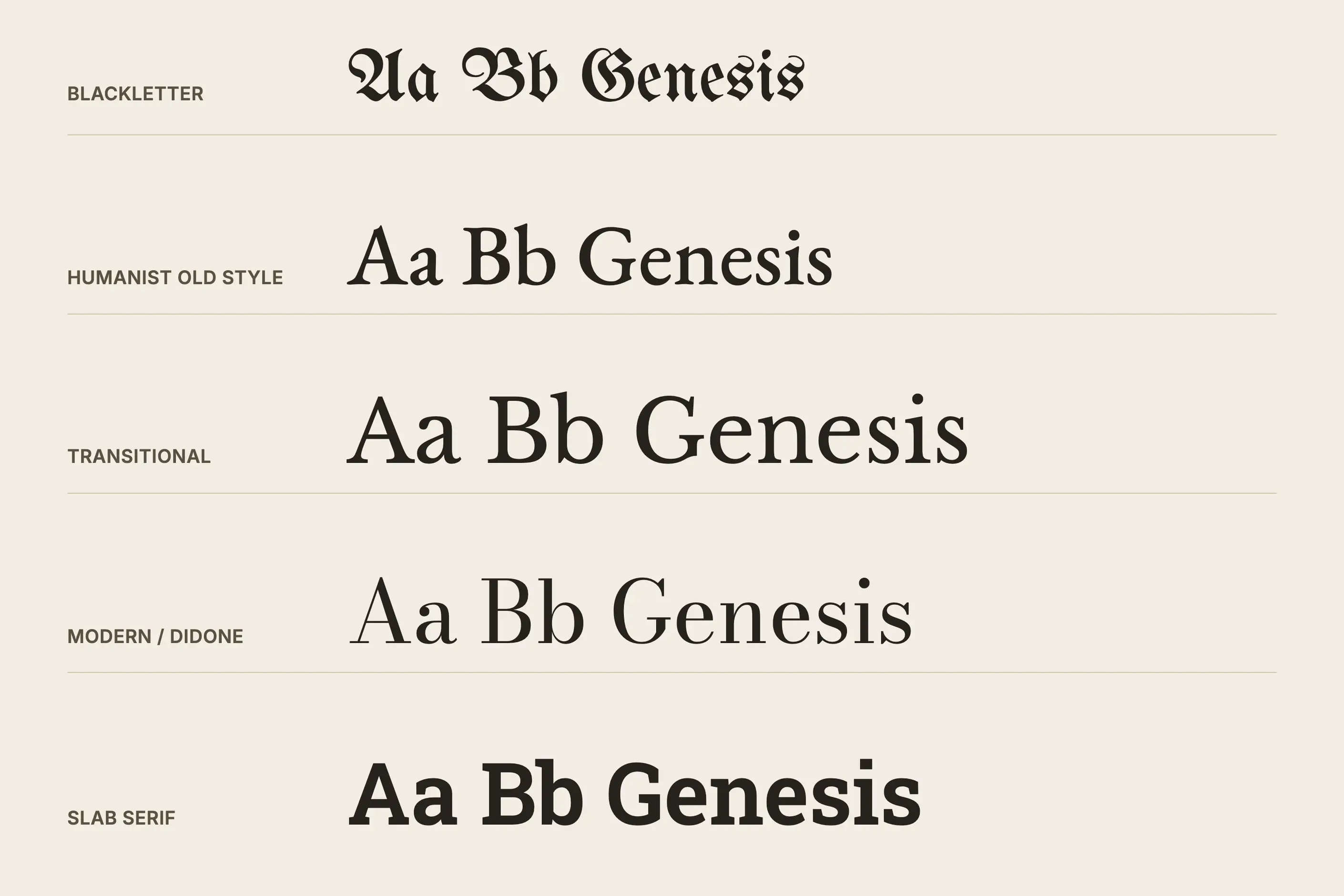
five construction families, identifiable by contrast and stress. Blackletter reads as a dense, angular mass with almost no curve. Humanist old style shows moderate contrast on a diagonal axis, with serifs that curve into the stem through a bracket. Transitional faces sharpen that axis toward vertical. Modern, or Didone, faces carry hairline, unbracketed serifs and near-vertical stress with dramatic contrast. Slab serif trades contrast for weight: near-uniform strokes and heavy, often square-cut serifs.
Mainz, from Johannes Gutenberg’s press around 1450. The lineage runs through Venice in the 1460s and 1470s, Birmingham in the 1750s, Paris and Parma in the 1780s and 1790s, and Britain’s nineteenth-century advertising trade.
dating an unfamiliar typeface by eye, reading the cultural associations a revival carries before you deploy it, and choosing a class deliberately rather than by habit.
Before movable type, European scribes worked from manuscript hands that later printers translated into metal. Gothic scripts grew increasingly angular and compressed from the twelfth century, a change that let more text fit a page of costly vellum. When Johannes Gutenberg developed movable type in Mainz around 1450, he based his letterforms on the Textura script already used in the liturgical manuscripts his market read, producing the dense blackletter of his 42-line Bible.
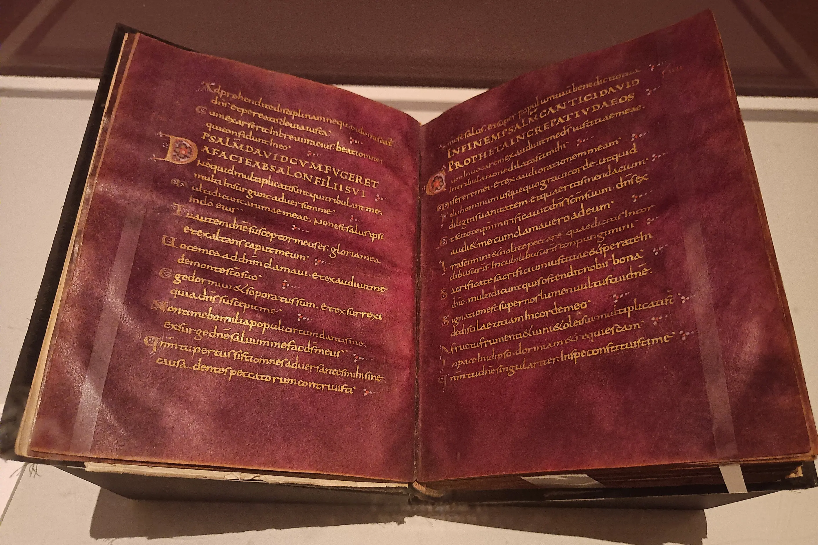
Italian printers took a different manuscript model. Humanist scholars recovering classical texts had adopted a round, clear script based on Carolingian minuscule that they mistakenly believed to be genuinely ancient, and Italian type followed their lead through the 1460s and 1470s.
Nicolas Jenson’s Venetian roman established conventions that still hold today. Aldus Manutius’s press, with the punchcutter Francesco Griffo, refined the roman further from the 1490s and introduced italic as a compact alternative for pocket editions, not as a device for emphasis.
By the eighteenth century, Enlightenment rationalism reached the letterform. John Baskerville, in Birmingham, cut the archetypal transitional face around 1757: sharper contrast than old style, on a straighter stress axis. He extended the same precision to his paper, ink, and presswork.
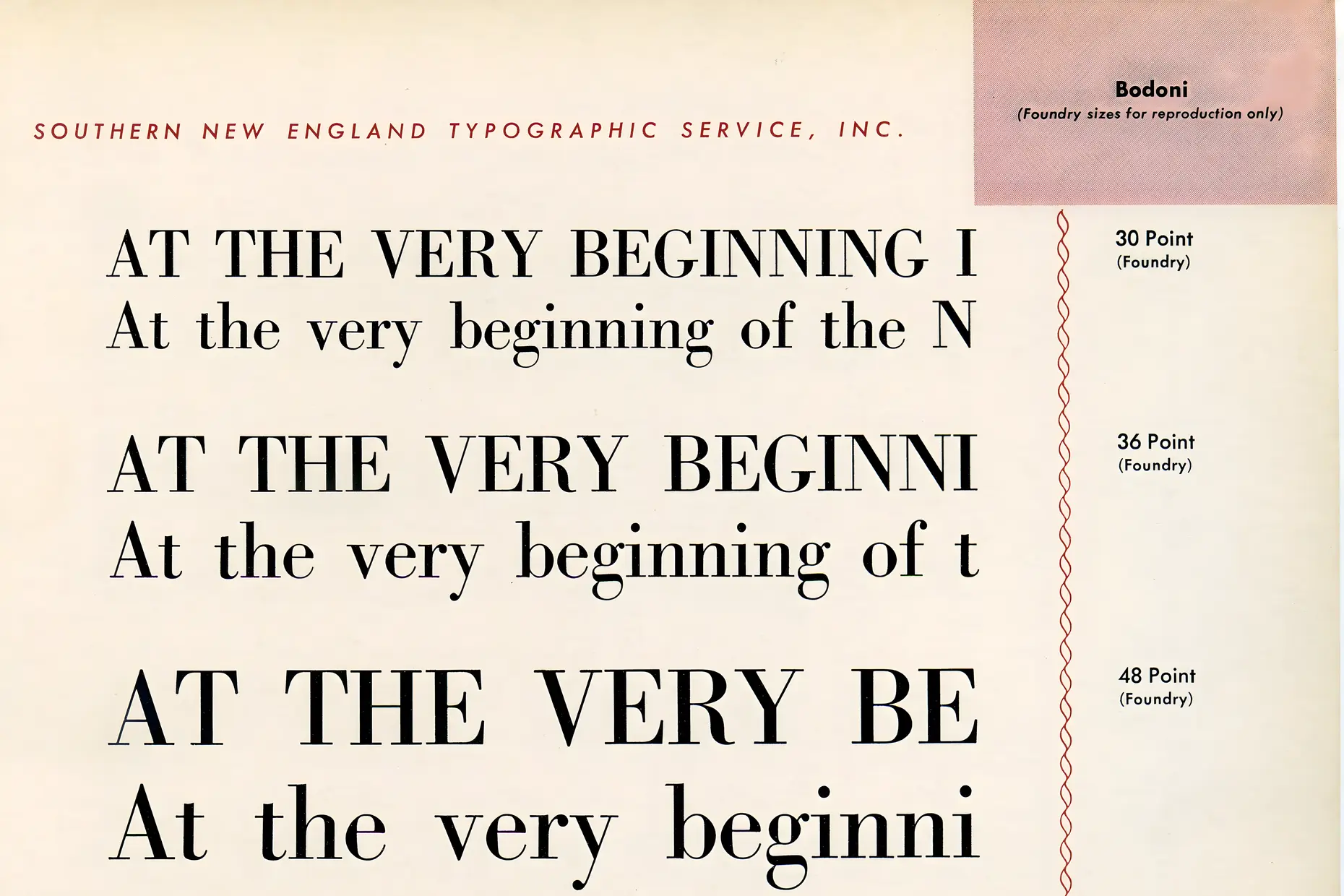
Giambattista Bodoni in Parma and Firmin Didot in Paris pushed that rationalism to its limit through the 1780s and 1790s. Their competing faces carried extreme stroke contrast, perfectly vertical stress, and hairline serifs meeting their stems without a curve, a style now called modern or Didone.
The Industrial Revolution’s advertising trade produced the fifth class. British founders developed slab serif faces, the Egyptian style, named for Napoleon’s Egyptian campaign, and Clarendon among them. These traded contrast for weight, with rectangular serifs close to the stem’s width.
The same commercial pressure produced the first sans serifs, initially dismissed as grotesque. A wave of decorative display type followed, which later tastemakers found excessive.
The lineage continues past these five classes into the twentieth-century geometric and grotesque sans serifs, and into Swiss design’s mid-century systemisation of a single sans family across a grid; see Swiss Design for that history. Desktop publishing, from the mid-1980s, and later variable font technology extended the same construction logic into digital type without replacing it.
| Element | What this style does | The tell |
|---|---|---|
| Blackletter | Compresses the manuscript hand into narrow, angular strokes with strong vertical emphasis and elaborate capitals | Diamond-shaped terminals, minimal curves, and frequent ligatures; the page reads as a dense, dark mass |
| Humanist old style | Follows the natural angle of a broad-nibbed pen, with moderate contrast and generous curves | A diagonal stress axis and serifs that curve into the stem through a bracket rather than meeting it sharply |
| Transitional | Sharpens old-style proportions toward greater regularity and a straighter axis | Stress moves closer to vertical and serifs thin, but the bracket survives |
| Modern (Didone) | Removes the pen’s influence and constructs letters from near-mathematical elements | Perfectly vertical stress, hairline unbracketed serifs, and dramatic contrast between thick and thin strokes |
| Slab serif | Trades contrast for weight, so every stroke sits close to uniform thickness | Heavy, rectangular, often unbracketed serifs close to the width of the stem itself |
| Neighbour | What it shares | What separates them |
|---|---|---|
| Calligraphy traditions | Both study historical letterforms and the tools that shaped them, and both trace type’s earliest classes back to a pen-driven hand | Calligraphy is a handwritten practice, one mark at a time, governed by its own scripts and rules. Historical typography classifies forms cut, cast, or drawn once and then repeated identically at scale |
| Swiss design | Swiss design’s neo-grotesque sans serifs sit inside this lineage, as a twentieth-century reaction against the ornament of earlier classes | Swiss design is one dated movement with a defined grid and a single typeface discipline. Historical typography is the five-century classification that Swiss design occupies one entry within, not the whole of it |
Name the class before you name the typeface. Confirm whether a face is blackletter, humanist old style, transitional, modern, or slab serif before deciding whether it fits the brief, because the class carries the association and a contemporary typeface name often does not.
Match the class to the era it needs to evoke, and check that era against the medium. A modern or Didone face demands care in body text and at small screen sizes: its hairline strokes were cut for letterpress on fine paper, not for a low-resolution display.
Research a blackletter typeface’s associations before you specify it. Its associations range from Germanic heritage and subcultural signalling in tattoo and metal culture to a documented history of extremist misuse, and a brief that wants the first association without knowing the second is a liability.
Use a revival deliberately or not at all. A genuine period reference researches the source face and its date. A vague gesture toward an “old-fashioned” type without a named class behind it reads as costume rather than reference, and that is the most common pastiche risk this style carries.
Work from the underlying construction logic, not the surface decoration, when you adapt a historical class to a contemporary interface. See Typography Basics for the anatomy, stroke, stress, and serif bracketing that these five classes are built from.
Blackletter carries the corpus’s most serious risk. German-speaking regions kept Fraktur in books, newspapers, and official documents into the twentieth century, until Hitler’s regime mandated Roman type in its place in 1941. Its subsequent adoption by white supremacist and extremist groups makes its use outside a genuinely researched historical or subcultural context a real liability, not a stylistic quirk.
The more common failure is anachronism without awareness. A Victorian display face on a digital interface, or a modern Didone face set as body text at small sizes, creates a technological mismatch its original cutters never had to solve. Audiences read the mismatch as carelessness even when they cannot name what is wrong.
Modern, or Didone, faces carry a specific technical failure. Extreme contrast can cause hairline strokes to disappear on inferior paper or a low-resolution screen. For this reason, the class remains a display choice more often than a text one.
Historical reference without a named class or date is the weakest version of this style. A designer who reaches for “old-timey” type without knowing which class, which decade, or which associations follow produces a page that looks historical to nobody who knows the history.
Is historical typography the same as calligraphy? No. Calligraphy is a handwritten discipline with its own scripts and tools, while historical typography classifies forms cut, cast, or drawn to repeat identically, not letters drawn fresh each time.
Why does blackletter still appear in contemporary branding? Designers reach for it to signal Germanic heritage, medieval or historical authenticity, tradition and establishment, or deliberate subcultural identity in metal and tattoo culture. Still, each use carries the style’s more troubling associations and needs research, not habit.
What separates old style from modern serif faces? The stress axis and the serif. Old style follows a pen’s diagonal angle with bracketed serifs; modern (Didone) faces sit on a vertical axis with hairline, unbracketed serifs and far greater contrast between thick and thin strokes.
Why do slab serifs look mechanical next to old style faces? Slab serifs trade the pen-derived contrast of old style for near-uniform stroke weight and heavy, often unbracketed, rectangular serifs, a nineteenth-century advertising solution built for attention rather than for extended reading.
Is reviving a historical typeface always safe? No. A revival needs to fit its new medium technologically and account for the associations the class has picked up since, particularly with blackletter, where the wrong context turns a period reference into something else.
| Fact | Detail |
|---|---|
| Blackletter origin | Manuscript roots from the twelfth century; Gutenberg’s 42-line Bible, Mainz, around 1450 |
| Humanist old style origin | Venice, through the 1460s and 1470s; the Aldine press active from the 1490s |
| Key humanist figures | Nicolas Jenson; Aldus Manutius and punchcutter Francesco Griffo |
| Transitional origin | Birmingham, around 1757 |
| Key transitional figure | John Baskerville |
| Modern (Didone) origin | Parma and Paris, through the 1780s and 1790s |
| Key modern figures | Giambattista Bodoni; Firmin Didot |
| Slab serif origin | Britain, early to mid nineteenth century, in the advertising trade |
| Blackletter’s formal end in Germany | Roman type mandated in place of Fraktur, 1941 |

Typography is the craft of shaping and spacing type so readers can recognise its letters and follow its meaning without friction.
Read it
Calligraphy is the practice of beautiful handwriting: letters formed in one continuous, tool-determined stroke rather than built up through repeated passes.
Read it
Swiss Design, more precisely the International Typographic Style, is a graphic design programme built on the mathematical grid: a single sans-serif typeface, asymmetric layout and photography treated as documentary fact, formalised in Zurich and Basel through the 1950s.
Read it
Hand lettering is the craft of drawing or painting custom letterforms for a single application, rather than setting a typeface.
Read it
Victorian design is the ornate, eclectic visual culture of Britain and its export markets during Queen Victoria’s reign, 1837 to 1901, when steam-powered printing and chromolithography made heavy ornament affordable to a middle class that had never been able to buy it before.
Read it
Art Nouveau is an international decorative style that ran from roughly 1890 to 1910, replacing the borrowed ornament of historical revivals with a single vocabulary drawn from plant growth, insect wings and the female form.
Read it
Art Deco is a design style of the 1920s and 1930s built on geometric precision, symmetrical order and luxury materials, applied across architecture, graphic design and objects.
Read it
The Bauhaus is a German school of art, craft and design that operated from 1919 to 1933.
Read it