
2026-09-15
Nural Choudhury
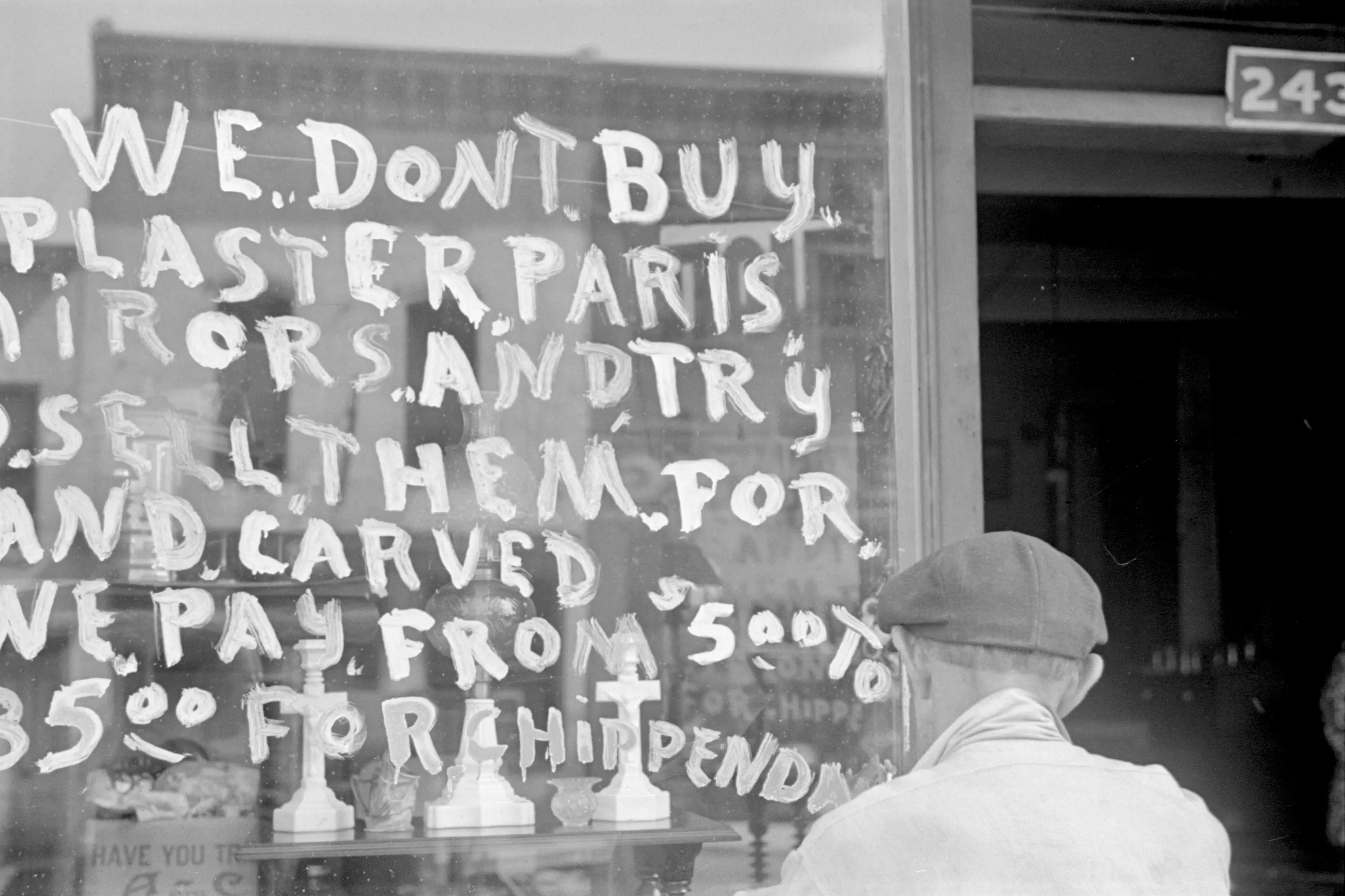
Hand lettering is the craft of drawing or painting custom letterforms for a single application, rather than setting a typeface.
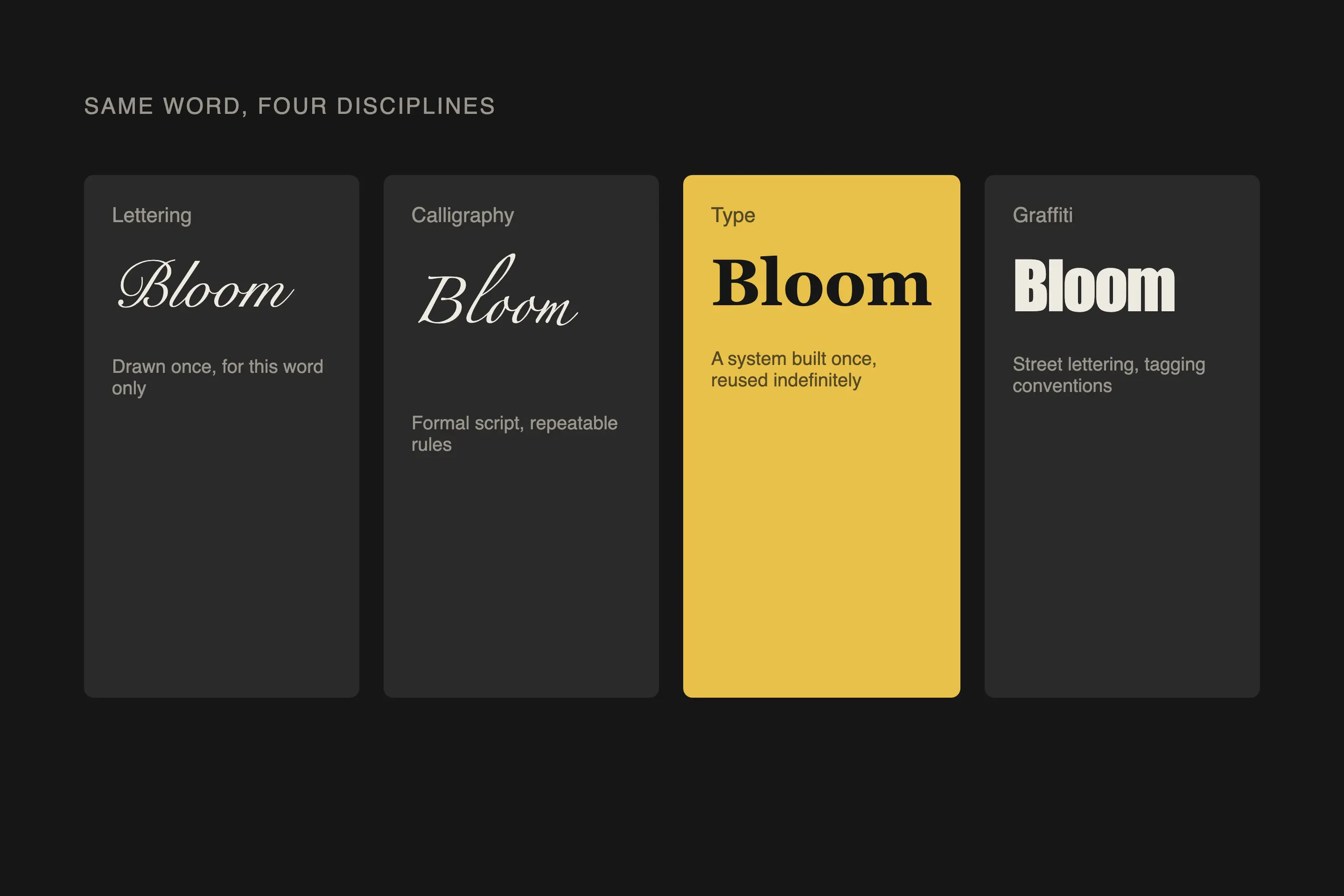
The key distinction is repeatability: type is a system built once to be reused indefinitely, and lettering is drawn once for the job in front of it. Since the early 2000s, a revival has turned this craft from a nostalgic curiosity into a working design discipline with its own practitioners, tools and commercial market.
letterforms drawn or painted for one specific word or phrase, not typeset. Thick-thin strokes that follow a brush, pen or chalk stick’s actual movement. Organic variation between repeated letters, irregular but controlled edges, and word shapes built for that word alone rather than assembled from a generic alphabet.
a reaction against digital typographic uniformity, the wider “maker movement” revival of physical craft, and image-led social platforms that made process visible and buildable into a following.
logotypes, packaging and headline moments where a brand needs a mark no competitor can license or download, and where evident human hand signals warmth or authenticity.
Desktop publishing and web fonts gave every designer access to thousands of professional typefaces by the 2000s, and that abundance produced sameness: a downloaded font belongs to everyone who downloads it. Hand lettering offered the opposite, a mark unique to its context and impossible to replicate with a licence purchase.
This coincided with the broader maker movement, the cultural turn back towards handcraft after decades of automation and outsourcing. Commercial sign painting, nearly extinct by the millennium, became the subject of documentaries, workshops and design courses, and calligraphic training returned to lettering education as a foundation rather than an antique skill.
Image-led social platforms then did for lettering what apprenticeship once did more slowly. Artists built audiences independent of agencies and publishers, process videos made the craft’s appeal visible, and tutorials spread techniques that had previously passed hand to hand. Visible audiences in turn attracted brand commissions, and commercial demand let practitioners work at lettering full time rather than as an occasional side practice. Jessica Hische’s work for Penguin Books and Wes Anderson productions, Dana Tanamachi’s large-scale chalk installations, and Mary Kate McDevitt’s teaching all trace this arc from hobbyist skill to professional discipline.
Commercial demand followed the audience. Brands sought lettering for the associations it signals: authenticity, since hand-drawn letters suggest human care and attention; uniqueness, since a custom mark cannot be copied by a competitor; and warmth, since hand-drawn elements humanise digital and corporate communication. That demand lets practitioners build sustained professional careers, not occasional side projects.

| Element | What this style does | The tell |
|---|---|---|
| Form and construction | Draws letters for the specific word, not from a reusable alphabet | Word shapes vary; the same letter differs between two different words to improve the overall form |
| Stroke and line | Follows the actual mechanics of the tool that made it: brush pressure, pen angle, chalk drag | Thick-thin variation that traces a real gesture, not a filter applied to set type |
| Texture and edge | Carries organic, controlled irregularity between repeated marks | Slight variation letter to letter, confident rather than hesitant edges |
| Tool signature | Brush script, chisel-pen, chalk and Victorian ornamental each read as a distinct family | Brush script: connected, rhythmic baselines. Sign painting: bold, structured, built for legibility at distance. Chalk: textured marks on a blackboard ground, often bordered with ornament. Victorian revival: inline, outline and shadow treatments with heavy flourish |
| Composition | Plans connections and hierarchy for the whole phrase, not letter by letter | Deliberate negative space and rhythm across the full composition, not a string of isolated glyphs |
| Digital integration | Analogue work scanned, cleaned and vectorised, or drawn directly on tablet | A hand-drawn mark reproduced at scale without losing its organic edge |
| Neighbour | What it shares | What separates them |
|---|---|---|
| Calligraphy traditions | Both are handwritten, tool-driven letterforms with formal stroke logic | Calligraphy follows a script system with rules that can be repeated and taught as a discipline of its own. Lettering is drawing, built once for a specific word or phrase, and often breaks a script’s rules deliberately for the sake of that one composition |
| Historical typography | Both can reference the same historical letterforms, Victorian display faces among them | Historical typography is the study and classification of type as a reusable system, set with movable type or digital fonts. Lettering renders those forms by hand for a single use, and never becomes a typeface unless it is separately drawn into one |
| Graffiti design | Both are hand-executed letterforms carrying a strong personal or cultural signature | Graffiti is a subculture with its own lineage, rules and view on commercial borrowing, built around tags, pieces and wildstyle on public surfaces. Hand lettering is a commercial craft discipline commissioned for brand and editorial work, with no equivalent subcultural code |

Match the tool logic to the application before you draw a single letter. A brush script must move as a brush moves, a chalk piece must respect chalk’s texture and limits, and mixing tool references in one composition reads as fake rather than eclectic.
Design the word, not the alphabet. Plan how letters connect, where the hierarchy sits across a multi-word composition, and where negative space carries weight, before refining individual forms.
Keep the variation controlled. Confident strokes and purposeful irregularity signal skill; a wobble that reads as a shaky hand signals the opposite. Never apply a digital “handwriting” filter to set type and call it lettering: the texture has to come from the actual hand process.
Where you draw on a historical style, particularly Victorian ornament, quote it knowingly rather than reproducing it wholesale. I would not reach for dense period pastiche on a brand that needs to read as contemporary; a single selective flourish usually carries the reference further than a full revival treatment.
Choose the tool for the job, not for convenience. Round brushes suit connected brush script, flat and one-stroke brushes suit sign-painting scale, and chisel-tip or chalk markers suit sketching and casual chalk work respectively. A brush pen is a reasonable substitute for a round brush when consistency matters more than the widest possible range of marks.
If you are commissioning rather than drawing, brief the practitioner on the application, audience and technical requirements before asking for options. Agree revision limits and usage rights up front. Custom lettering raises real intellectual property questions, and a clear agreement prevents later conflict over who owns the letters and how they can be reused.
The most common failure is fake authenticity: a regular typeface run through a distressing filter to fake a handmade look, which any trained eye reads as a substitute rather than the real process. A second is tool-form mismatch: letterforms that no brush, pen or chalk stick could produce, which undermines the credibility the style depends on.
Victorian and decorative revival work risks collapsing into excess, layering ornament until the letters disappear, and successful contemporary work edits that abundance hard. Commercially, underpricing is a real and recurring problem: lettering requires skill-development time on top of per-project labour, and undercharging damages both individual practitioners and the wider field’s rates. Clients who do not understand what hand lettering entails, its revision limits, or its licensing routinely create disputes that a clear brief and rights agreement would have prevented.
Is hand lettering the same as calligraphy? No. Calligraphy is a script system with formal, repeatable rules, while lettering is drawing, custom-built for one word or phrase and free to break those rules for that composition alone.
Why did hand lettering become commercially valuable again after decades of decline? Digital typefaces became universally available, so a hand-drawn mark became one of the few ways a brand could own a letterform outright rather than license it alongside every competitor.
Can hand lettering be turned into a reusable typeface? Only if you redraw it separately as a typeface. A piece of lettering built for a single phrase carries word-specific decisions, unusual connections and adjusted letterforms that a working typeface’s individual characters cannot carry.
How do you tell good hand lettering from a digital imitation? Check whether the strokes could be made by the claimed tool. Genuine brush, pen or chalk lettering shows thick-thin variation and edge texture that trace a real gesture, where a filtered typeface shows uniform, mechanically repeated distress.
What should you check before commissioning lettering? Review the practitioner’s portfolio for range and fit to your application, agree a clear brief covering audience and technical requirements, and settle revision limits and usage rights before the work starts.
| Fact | Detail |
|---|---|
| Defining reaction | Against digital typographic uniformity following the 2000s expansion of accessible professional typefaces |
| Named practitioners | Jessica Hische, Dana Tanamachi, Erik Marinovich, Jon Contino, Mary Kate McDevitt |
| Documentary reference | Sign Painters (2014), credited with reviving interest in traditional sign-painting technique |
| Core tool families | Round and flat brushes, brush pens, chisel-tip markers, pointed pens, chalk and chalk markers |
| Typical commissions | Logotypes and wordmarks, packaging, editorial headlines, environmental and event signage |

Calligraphy is the practice of beautiful handwriting: letters formed in one continuous, tool-determined stroke rather than built up through repeated passes.
Read it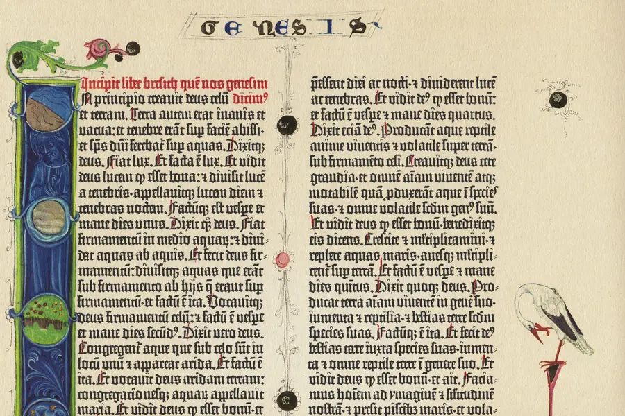
Historical typography is the classification lineage that sorts Western printed letterforms into distinct construction families by era: blackletter, humanist old style, transitional, modern (Didone), and slab serif, each traceable to a specific press, punchcutter, or decade between the 1450s and the nineteenth century.
Read it
Graffiti design is the lettering-based visual culture that began with tags on Philadelphia and New York streets and subway cars in the late 1960s and early 1970s, then developed into throw-ups, pieces and wildstyle through decades of practice rather than formal schooling.
Read it
Typography is the craft of shaping and spacing type so readers can recognise its letters and follow its meaning without friction.
Read it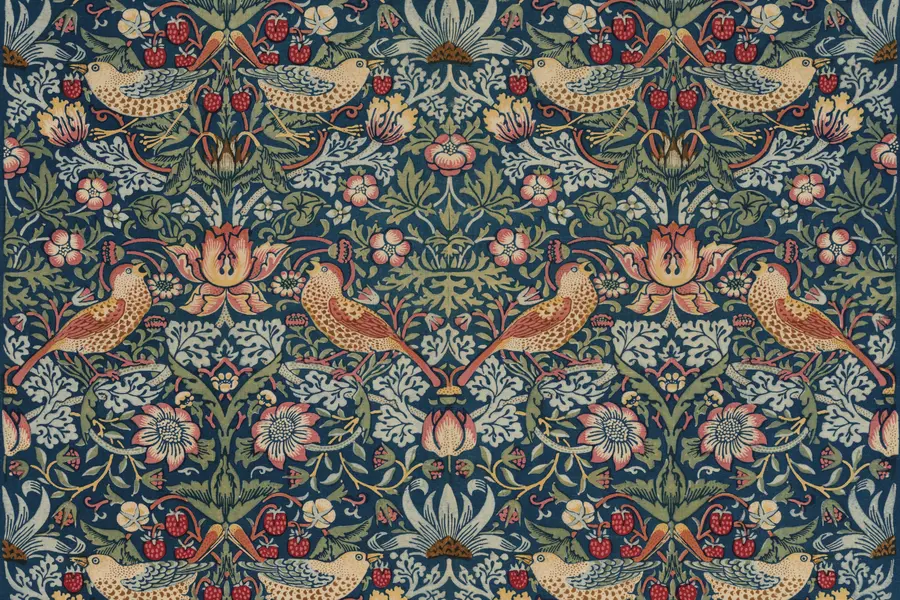
The Arts and Crafts movement is a design and social reform movement that began in Britain in the second half of the nineteenth century, built around dense botanical patterns, honest materials and visible handcraft, as a direct reaction against industrial factory production.
Read it
Victorian design is the ornate, eclectic visual culture of Britain and its export markets during Queen Victoria’s reign, 1837 to 1901, when steam-powered printing and chromolithography made heavy ornament affordable to a middle class that had never been able to buy it before.
Read it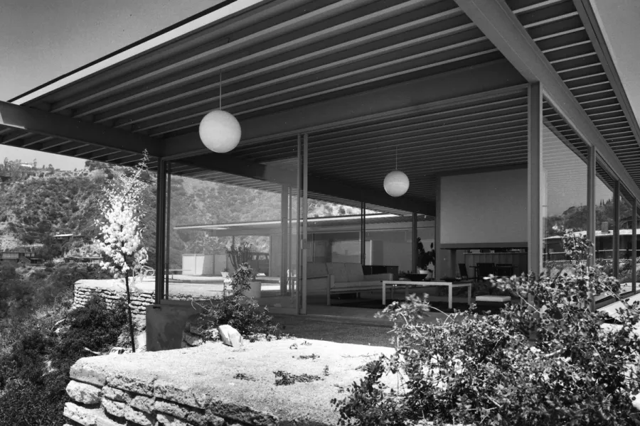
Mid-century modern design describes the wave of modernist furniture, architecture and graphic design that flourished across the United States and Scandinavia from roughly 1933 to 1965, when Bauhaus rigour met American industrial optimism and Scandinavian craft.
Read it