

2026-09-15
Nural Choudhury
Calligraphy is the practice of beautiful handwriting: letters formed in one continuous, tool-determined stroke rather than built up through repeated passes.
It is not one style but four largely separate traditions: Arabic and Islamic, Chinese, Japanese, and Western, each with its own tools, scripts, and rules. What separates it from hand lettering is repeatability of intent: calligraphy writes within an inherited script system trained over years, while lettering draws a single word or phrase for one job and can break any rule the composition needs.
a stroke that thickens and thins according to the angle or pressure of a specific tool, not an applied filter. Arabic Naskh or Thuluth in flowing black ink, Chinese or Japanese characters with visible brush loading and tapering ends, Western broad-nib or copperplate hands holding a consistent slant. Small, deliberate variation between repeated letters, evidence of a hand rather than a mould.
independently, in each tradition, over centuries. Arabic and Islamic calligraphy grew from the religious status of the Quran as revealed text, Chinese calligraphy from a character system that carries meaning directly rather than phonetically, and Western calligraphy from Roman inscriptional capitals through medieval and Renaissance scribal hands.
wordmarks and logotypes that need a mark no typeface licence can replicate, editorial titling and drop caps, and ceremonial or devotional work where the specific tradition’s own rules genuinely apply, never as a generic decorative texture standing in for a culture.
Calligraphy predates typography and graphic design by centuries in every tradition that practises it, and its four major lines developed independently rather than from one shared root.
Arabic calligraphy holds its status because Islam treats the Quran as the literal, revealed word of God, so writing it is an act of worship rather than transcription. Islamic civilisation’s general avoidance of figurative imagery in sacred contexts, which varies by period and region, channelled artistic energy into calligraphy and geometric pattern instead. Ibn Muqla, a tenth-century calligrapher, codified the proportions of Naskh script on a mathematical system based on the rhomboid dot the pen produces.
Chinese calligraphy ranks above painting and sculpture in its own tradition, because Chinese characters carry meaning directly as ideographic forms rather than as phonetic symbols, so a scholar’s brushwork was read as a mark of character and cultivation. Its five principal script styles developed across successive dynasties, from the archaic Seal script derived from bronze inscriptions to the abbreviated Cursive script, with the Clerical script emerging during the Han dynasty for bureaucratic use.
Japanese calligraphy, known as shodo, developed after Chinese writing reached Japan, and it retains kanji written to Chinese convention alongside the purely Japanese hiragana and katakana syllabaries. Zen Buddhism shaped its later character. The ensō, a circle drawn in a single breath and stroke, is its clearest statement that complete expression can sit inside minimal gesture.
Western calligraphy runs from monumental Roman capitals carved in stone, through Carolingian minuscule, standardised in Charlemagne’s court around 800 CE and the ancestor of today’s lowercase letters, to the angular Gothic blackletter hands of the twelfth century and the pressure-driven copperplate scripts of the seventeenth. Its most recent revival came through the Arts and Crafts movement: Edward Johnston revived formal calligraphy as a teachable discipline in early twentieth-century England, and Rudolf Koch and Hermann Zapf carried handcrafted letterform values into the type design that followed.

| Element | What this style does | The tell |
|---|---|---|
| Tool | Arabic and Persian hands cut a qalam, a reed pen, to a specific angle for each script. Chinese and Japanese hands use an animal-hair brush that varies width through pressure rather than angle. Western hands use a broad-nib pen for angle-driven strokes or a pointed steel nib for pressure-driven ones | The thick-thin pattern in a stroke names its tool before it names its tradition: angle-cut nib work looks nothing like brush work at any scale |
| Defining scripts | Arabic runs from angular, architectural Kufic through the balanced everyday Naskh to the ornate Ottoman Diwani. Chinese calligraphy has five styles, Seal, Clerical, Regular, Running, and Cursive. Japanese shodo shares kanji with Chinese practice and adds hiragana and katakana. Western hands include Roman capitals, Carolingian minuscule, Gothic blackletter, and Copperplate | Naming the specific script identifies both the tradition and the period; a generic label such as “Asian calligraphy” identifies neither |
| Materials | Arabic calligraphy prepares reed, soot ink, and sized paper or parchment as part of the craft itself. Chinese and Japanese calligraphy centres on the Four Treasures of the Study, brush, ink stick, inkstone, and xuan paper, and grinding the ink is itself part of the ritual. Western calligraphy uses quill or steel nib on prepared paper, closer to drafting than to ritual preparation | Where material preparation is itself part of the discipline, as with grinding Chinese ink, that status is visible in how seriously the tradition treats its tools |
| Status and training | Islamic civilisation reserves its highest artistic prestige for calligraphy, because writing the Quran is worship. Chinese tradition ranks calligraphy above painting and sculpture and reads brushwork as character. Japanese shodo carries Zen values of spontaneity and presence. Western calligraphy carries no comparable sacred status and trains, since its Arts and Crafts revival, as a teachable craft discipline | How a tradition trains its calligraphers, through ritual preparation, fixed stroke order, or open instruction, tells you what status it holds |
| Contemporary application | Contemporary Arabic calligraphers experiment with Latin letterforms and Western calligraphers study Asian methods. Chinese and Japanese brushwork feeds directly into type design and brush lettering. Western calligraphic stroke logic underlies most serif and script typefaces still in use | A typeface’s stroke logic betrays its calligraphic ancestor: broad-nib logic in serif contrast, brush logic in a script face’s taper |

| Neighbour | What it shares | What separates them |
|---|---|---|
| Hand lettering renaissance | Both are hand-made, tool-driven letterforms | Calligraphy writes within an inherited script system, with rules trained for years and taught as a repeatable discipline. Hand lettering draws a single word or phrase for one job and is free to break a script’s rules for the sake of that composition |
| Historical typography | Calligraphic stroke logic is the direct ancestor of serif contrast and script typeface families | Historical typography classifies and reproduces letterforms mechanically; movable type or digital fonts set the same character identically every time. Calligraphy is the hand-made original act that typography later systematised |
| Islamic design traditions | Arabic calligraphy sits inside the wider Islamic tradition and shares its religious grounding and general aniconism in sacred contexts | Islamic design traditions cover the full visual system of Islamic civilisation: architecture, geometric pattern, and arabesque, as well as script. Calligraphy traditions cover the global practice of hand-writing across several unrelated cultures, Chinese, Japanese, and Western hands included, that share no history with Islamic civilisation |

Match the tradition to the context before you commission or draw a single stroke. A wedding invitation calling for Western copperplate needs a different practitioner and a different rule set from a devotional inscription calling for Naskh, and the two are not interchangeable.
You must commission a calligrapher trained in the specific script and tradition a project needs, rather than a generalist approximating the look. Sacred and ceremonial scripts carry rules a design brief cannot override.
Treat calligraphic reference in typography as a study of stroke logic, not a costume. Look at how a broad-nib pen produces serif contrast, or how a brush produces a script face’s tapering strokes, and let that logic inform construction rather than copying a historical hand’s surface texture.
Where a project genuinely needs Arabic, Chinese, or Japanese calligraphy, brief a practitioner trained in that tradition. A designer approximating Chinese brushwork without training produces characters that read as wrong to anyone literate in the script, a legibility failure as well as a cultural one.

The most visible failure is manufactured pastiche: brush-stroke serifs bolted onto Latin letters to signal an entire continent’s script on packaging or signage that has no connection to Chinese or Japanese writing. This is not calligraphy. It is a costume built from a stereotype, and design criticism has treated it as such for decades.
The same failure appears with Arabic calligraphy used decoratively on products or interiors with no relationship to the language, the text, or the religious weight the script often carries, and with fonts sold as generic “Asian” or “Arabic” display faces that approximate a script’s surface texture without its structure. A reference studies a tradition’s actual rules; a costume borrows only its silhouette.
Sacred calligraphy carries a further line a designer cannot cross casually. Quranic text is not decorative material, and reproducing it as a pattern or background graphic without regard for its devotional meaning is extractive rather than referential. The difference between studying a tradition and stripping it for parts is whether the borrowing respects what the form means to the people who made it.
Away from appropriation, calligraphy fails commercially in more ordinary ways: when clients expect typeface-level consistency from hand-made work, when a digital handwriting filter gets sold as calligraphy, or when a practitioner with no training in a tradition’s stroke discipline produces forms a reader immediately reads as wrong.
Is calligraphy the same as hand lettering? No. Calligraphy writes within an inherited script tradition whose rules a student trains for years to master, while hand lettering draws a single word or phrase for one job and can break those rules for the sake of the composition.
Which calligraphic tradition should a designer learn first? Match the choice to the context you work in rather than to novelty. Western broad-nib calligraphy is the more accessible entry point technically; East Asian brush calligraphy asks for a longer initial investment before the tool becomes controllable; and Arabic calligraphy calls for study with a tradition-trained teacher from the start because its proportions are codified.
Can calligraphy be turned into a typeface? Yes, and it regularly is. Many serif type families encode broad-nib pen logic in their stroke contrast, and script typefaces encode brush or pointed-pen movement, but turning a hand into a typeface is a separate discipline from writing calligraphy, since every character in a font must repeat identically.
Is it acceptable to use another culture’s script decoratively? Only if the work studies and respects that tradition’s actual rules and meaning, ideally with a practitioner trained in it. Using brush-stroke serifs to signal a culture on packaging, or reproducing sacred text as background pattern, borrows the silhouette of a script without its substance, and reads to anyone who knows the tradition as a costume rather than a reference.
Why does calligraphy still matter to typography and branding? Because the stroke logic that produced beautiful letters by hand is the same logic type designers still work from, and a hand-drawn mark remains one of the few brand assets a competitor cannot license from a font foundry.

| Fact | Detail |
|---|---|
| Arabic script proportion system | Codified by Ibn Muqla, tenth century, based on the rhomboid dot the pen produces |
| Principal Arabic scripts | Kufic, Naskh, Thuluth, Nastaliq, Diwani |
| Chinese Four Treasures of the Study | Brush, ink stick, inkstone, paper |
| Five Chinese script styles | Seal (Zhuanzi), Clerical (Lishu), Regular (Kaishu), Running (Xingshu), Cursive (Caoshu) |
| Japanese term and scripts | Shodo; kanji alongside the syllabic hiragana and katakana |
| Carolingian minuscule | Standardised around 800 CE in Charlemagne’s court |
| Western revival figures | Edward Johnston, early twentieth-century England; Rudolf Koch; Hermann Zapf |
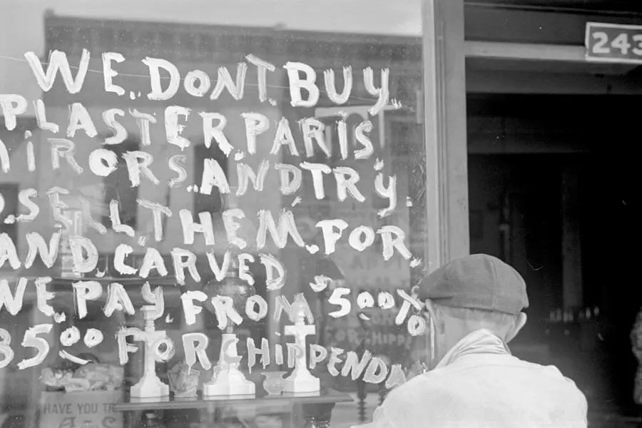
Hand lettering is the craft of drawing or painting custom letterforms for a single application, rather than setting a typeface.
Read it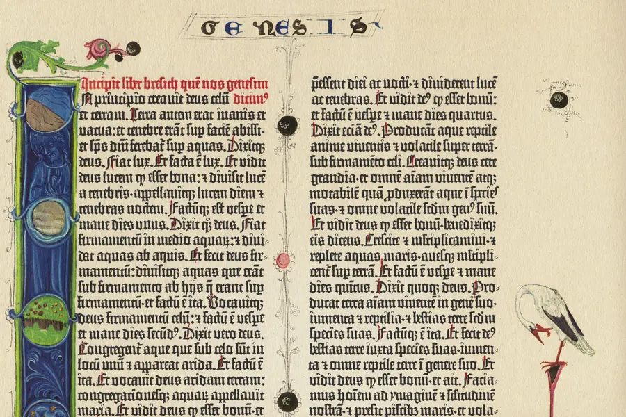
Historical typography is the classification lineage that sorts Western printed letterforms into distinct construction families by era: blackletter, humanist old style, transitional, modern (Didone), and slab serif, each traceable to a specific press, punchcutter, or decade between the 1450s and the nineteenth century.
Read it
Islamic design traditions are interlinked visual systems (geometric patterns, calligraphy, and arabesques) that developed over fourteen centuries and across three continents, from Spain to Indonesia.
Read it
International typography is the design and setting of text in writing systems other than Latin script: Arabic, Chinese, Devanagari, Cyrillic, Japanese, Korean and hundreds more, each with its own structural logic, calligraphic heritage and technical requirements.
Read it
Typography is the craft of shaping and spacing type so readers can recognise its letters and follow its meaning without friction.
Read it
Chinese design principles are the visual and spatial conventions developed across successive dynasties of Chinese civilisation, from Bronze Age ritual bronzes through the fall of the Qing dynasty in 1912 and into contemporary China’s design industry.
Read it
Japanese design philosophy names a group of aesthetic concepts, among them wabi-sabi, ma, kanso, shizen, and yugen, developed over centuries in Zen Buddhist and Shinto practice and applied to ceramics, gardens, architecture, and graphic design.
Read it