

2026-09-15
Nural Choudhury
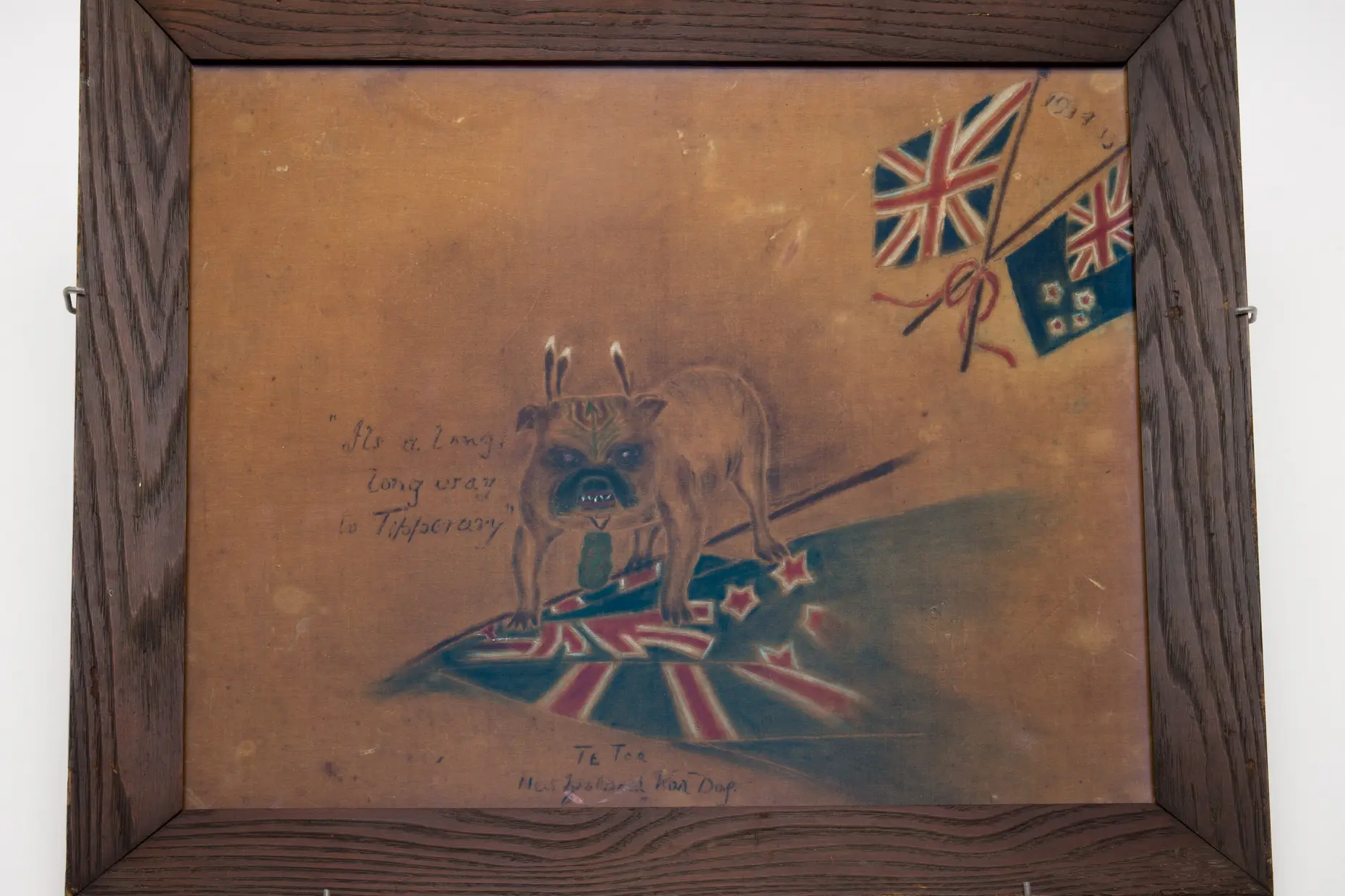
Kitsch is a critical term before it is a design vocabulary: coined in nineteenth-century Munich to describe cheap, sentimental art sold to tourists and undiscriminating buyers, it names objects that chase immediate emotional pleasure rather than sophisticated restraint.
A velvet Elvis painting, a garden gnome, a plastic Madonna and a crying-clown portrait all qualify: mass-produced, sincere, and indifferent to the taste hierarchies that dismiss them. Where Pop Art borrows the same mass-culture imagery but holds it at ironic distance, kitsch means exactly what it shows, and treating the word as a legitimate design category today deliberately reclaims what began as an insult.
saturated, unharmonised colour alongside metallic gold or silver abundance; sentimental, instantly legible subjects such as cute animals, romantic domestic scenes and mass-produced religious icons; horror vacui decoration applied to objects that do not need it; materials that imitate rather than declare themselves, plastic standing in for wood, marble or gold leaf; and emotion delivered without ambiguity, tears streaming and hearts overflowing with nothing left for the viewer to interpret.
Munich art markets of the 1860s and 1870s, coined for cheap art sold to tourists; turned into a critical target by Clement Greenberg’s 1939 essay “Avant-Garde and Kitsch”; rehabilitated through Pop Art’s appropriation of commercial imagery in the early 1960s and, later, Jeff Koons’s fine-art kitsch objects.
greeting cards, gift and souvenir markets, nostalgia-led branding and themed hospitality, plus knowing camp commentary, wherever a brief wants warm, sincere and popularly legible emotion rather than restrained sophistication.
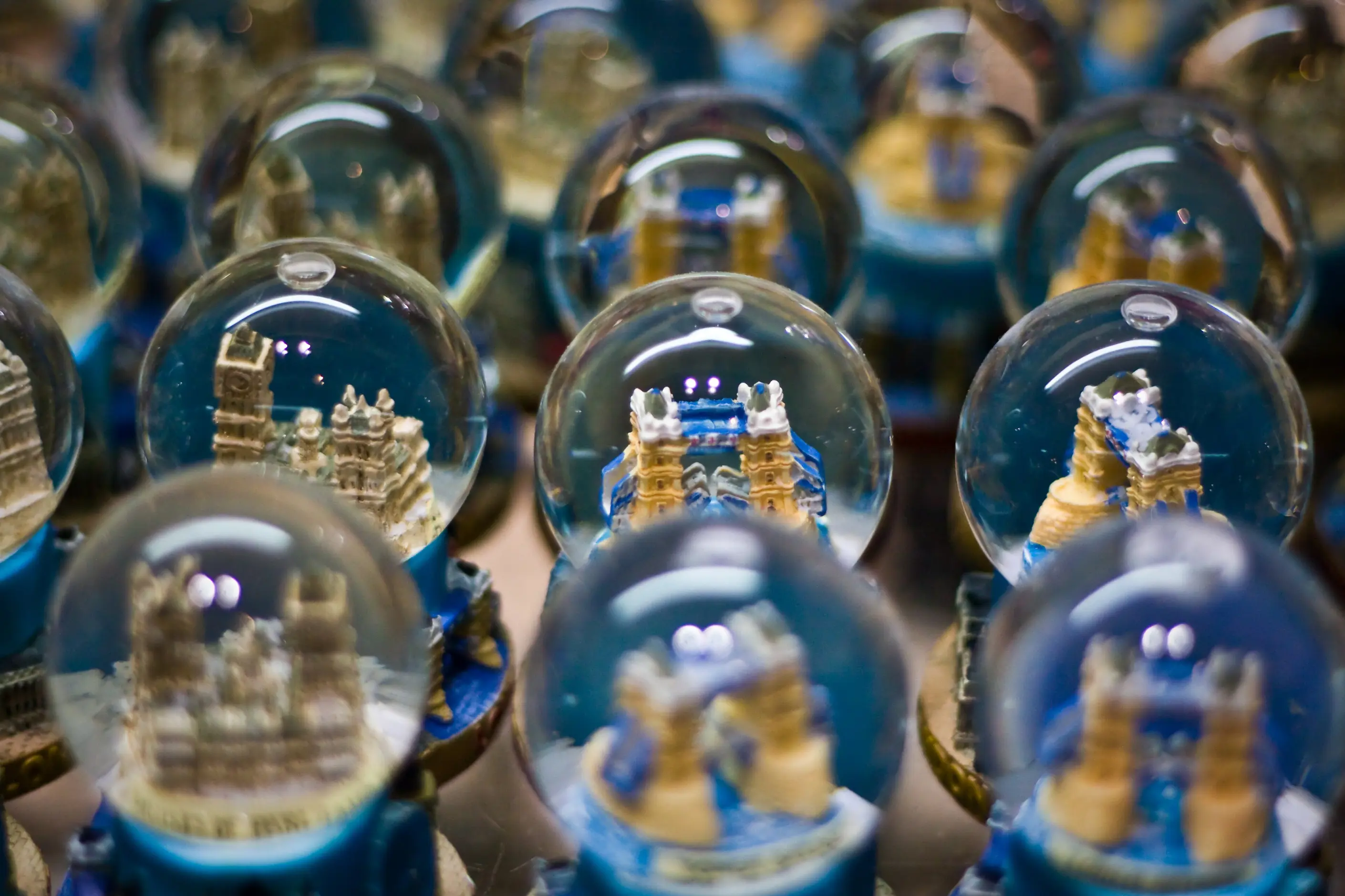
The word “kitsch” apparently originated in Munich art markets around 1860 to 1870, possibly from the German verkitschen, to make cheap, or kitschen, to scrape together. Its emergence coincided with industrial mass production, which could turn out decorative objects cheaply for an expanding middle class, and with a tourism boom that created demand for portable, affordable souvenirs regardless of artistic merit.
The word also did class work from the start. Objects an aspiring middle-class consumer bought to demonstrate refinement instead revealed its absence, and Munich’s dismissal of that market anticipated a hierarchy the twentieth century would formalise.
Clement Greenberg’s 1939 essay “Avant-Garde and Kitsch” turned the dismissal into a critical framework: high culture against low, authenticity against imitation, difficulty against ease. Modernism’s own principles, form follows function and honest material expression, defined themselves against kitsch’s ornament and against the plastic that stood in for marble.
Postmodernism reopened the argument rather than settling it. Susan Sontag’s “Notes on Camp” (1964) distinguished a knowing, ironic appreciation of kitsch’s failures from kitsch’s own sincerity: kitsch means it, camp takes pleasure in watching it try and fail. Pop Art’s appropriation of soup cans and comic strips, and later Jeff Koons’s fine-art kitsch objects, porcelain puppies and balloon animals among them, forced the question of who decides which pleasures count as legitimate.
| Element | What kitsch does | The tell |
|---|---|---|
| Colour | Uses saturated, unmoderated hues in combinations trained designers avoid, plus gold and silver abundance that suggests preciousness | Hot pink against electric blue with no harmonising palette, or gold paint standing in for gold leaf |
| Subject matter | Chooses universally legible, sentimental subjects: cute animals, romantic domestic scenes, mass-produced religious icons, idealised sunsets | An image that tells you exactly how to feel, with no room left for the viewer’s own reading |
| Decorative approach | Adds ornament rather than restraint, so no surface stays bare | Decoration applied to objects that need none, a tissue box or a toilet seat treated like a canvas |
| Materials | Imitates rather than presents materials honestly: plastic for wood or marble, gold paint for gold leaf, synthetic flowers for real ones | A surface that claims a value or a material it demonstrably is not |
| Emotional register | Delivers feeling without ambiguity and without requiring cultural context to read | Exaggerated expression, tears streaming or hearts overflowing, where subtlety would undercut the point |
| Neighbour | What it shares with kitsch | What separates them |
|---|---|---|
| Pop art | Both treat mass-produced, commercial imagery as serious visual material | Kitsch is sincere: the sentiment is the point. Pop art holds the same imagery at a cool, ironic distance and comments on it rather than endorsing it |
| Memphis style | Both embrace bold, clashing colour that trained taste would moderate | Memphis invents an abstract, arbitrary vocabulary with almost no representational content; kitsch’s colour clash serves sentimental, recognisable subjects such as animals and religious icons |
| Shabby chic | Both trade in nostalgia and reject high-design polish | Shabby chic signals authenticity through visible wear, faded paint and muted pastels; kitsch signals abundance through shine, saturated colour and materials that look new and synthetic |

Decide your intention before you choose a colour: ironic, nostalgic or sincere. Each demands different execution. Half-committed kitsch satisfies nobody, not ironic enough for camp and not sincere enough for genuine warmth.
Match the aesthetic to its audience and context. A club flyer can carry kitsch that a corporate report cannot, so decide before you start whether your audience will read the work as commentary or as sincere expression.
Bring genuine affection to the material, not condescension. Ironic kitsch still needs warmth: cold, cynical use of the style mocks the audience that likes it sincerely, and that contempt shows through in the finished work.
Execute with craft. Choose colour combinations that read as deliberately kitsch rather than merely garish, edit accumulation into organised abundance rather than chaos, and remember that production values can run high even when the aesthetic is deliberately cheap-looking.
Treat kitsch reached for purely as stylistic novelty, without a clear stance and without warmth, as a pastiche risk. An audience that cannot tell whether you mean it will read the work as confused rather than knowing.
Kitsch fails fastest as cold appropriation. Irony without affection reads as contempt for the popular taste it borrows from, and the class politics underneath that contempt are real. Condemning kitsch as bad taste has functioned historically as an elite dismissal of working-class and middle-class pleasure. That dismissal defines “good taste” to exclude people without the cultural capital to spend on it.
Kitsch’s own catalogue of subjects includes a genre built on ethnic and cultural stereotype: reductive tourist-shop signifiers such as a national costume reduced to a punchline or a culture flattened into a souvenir figurine. That imagery is not a historical footnote confined to old postcards. A designer reaching for kitsch vocabulary must exclude reductive ethnic caricature rather than treat it as available material because older kitsch objects used it.
Kitsch cannot carry a brief that needs restraint, gravitas or dense information. Its clashing colour and unambiguous sentiment work against subtlety and against legibility, so a corporate or serious-subject audience reads the choice as a mismatch rather than as playful confidence.
An audience that cannot tell whether kitsch is offered ironically or sincerely receives neither pleasure. Make the framing legible through context and exaggeration if the intent is ironic, or commit to the sentiment fully if it is sincere: a hedge between the two positions satisfies no one.

Is kitsch just another word for bad taste? No. It names a category modernist critics used to dismiss mass-produced, sentimental objects. Still, the same objects give real pleasure to real audiences, and postmodern designers reclaimed the term specifically to argue that popular taste deserves study rather than dismissal.
What is the difference between kitsch and camp? Kitsch is sincere: the maker and the audience mean the sentiment. Camp is a knowing appreciation of kitsch’s failures: it takes pleasure in the gap between what an object aims for and what it achieves so that the same velvet painting can read as kitsch to one viewer and camp to another.
Clement Greenberg’s 1939 essay “Avant-Garde and Kitsch” opposed kitsch to the avant-garde as low culture to high. Susan Sontag’s 1964 “Notes on Camp” reopened the question a generation later by taking kitsch’s failures seriously as a source of pleasure.
Greeting cards, souvenir and gift markets, nostalgia-led branding and themed hospitality, anywhere the audience wants warm, legible sentiment rather than restrained sophistication and the designer approaches that audience with genuine respect rather than condescension.
Can kitsch imagery ever be off-limits? Yes. Reductive ethnic caricature packaged as tourist kitsch, a national costume turned into a punchline or a culture flattened into a souvenir figurine, stays off-limits regardless of how knowingly it is framed.
| Fact | Detail |
|---|---|
| Term origin | Munich art markets, circa 1860s to 1870s |
| Possible etymology | German verkitschen, “to make cheap” |
| Defining critical essay | Clement Greenberg, “Avant-Garde and Kitsch,” 1939 |
| Camp distinguished from kitsch | Susan Sontag, “Notes on Camp,” 1964 |
| Postmodern rehabilitation | Pop Art’s appropriation of commercial imagery; Jeff Koons’s fine-art kitsch objects, including porcelain puppies and balloon animals |
| Representative objects | Velvet Elvis paintings, garden gnomes, plastic Madonnas, crying-clown portraits |
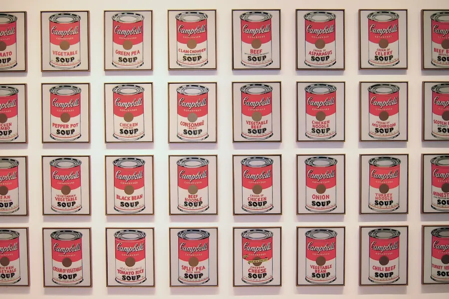
Pop Art is the movement that took commercial imagery- the soup can, the comic panel, the celebrity photograph- and treated it as fit subject matter for fine art, rendered flat, bright and mechanically precise.
Read it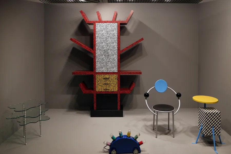
Memphis is a design movement founded in Milan in December 1980, known for stacked geometric forms, clashing colour and patterned plastic laminate applied to furniture, objects and graphics.
Read it
Shabby chic is an interior and graphic design aesthetic built on distressed paintwork, faded pastel colour and accumulated vintage objects, popularised by British designer Rachel Ashwell from the late 1980s.
Read it
Postmodernism in design is a movement that began in the late 1960s and crystallised through the 1970s and 1980s, rejecting modernism’s claim to universal rules: the grid, the neutral sans, the belief that “less is more.” Where the International Typographic Style and Bauhaus functionalism treated a small set of principles as correct for any brief, postmodernism treated those principles as one convention among many, worth quoting, distorting or discarding as the project demanded.
Read it
Y2K design is the visual language of computers, gadgets, fashion, and web culture from roughly 1997 to 2003, built from translucent coloured plastic, chrome and metallic surfaces, rounded bubble forms, and a saturated synthetic palette that together expressed a moment when digital technology looked purely exciting rather than troubling.
Read it
Kawaii (かわいい) is Japan’s cute aesthetic: rounded forms, oversized, simplified eyes, childlike proportions, and a pastel palette, developed since the 1970s into a design language for characters, consumer products, and institutional communication.
Read it