
2026-09-15
Nural Choudhury
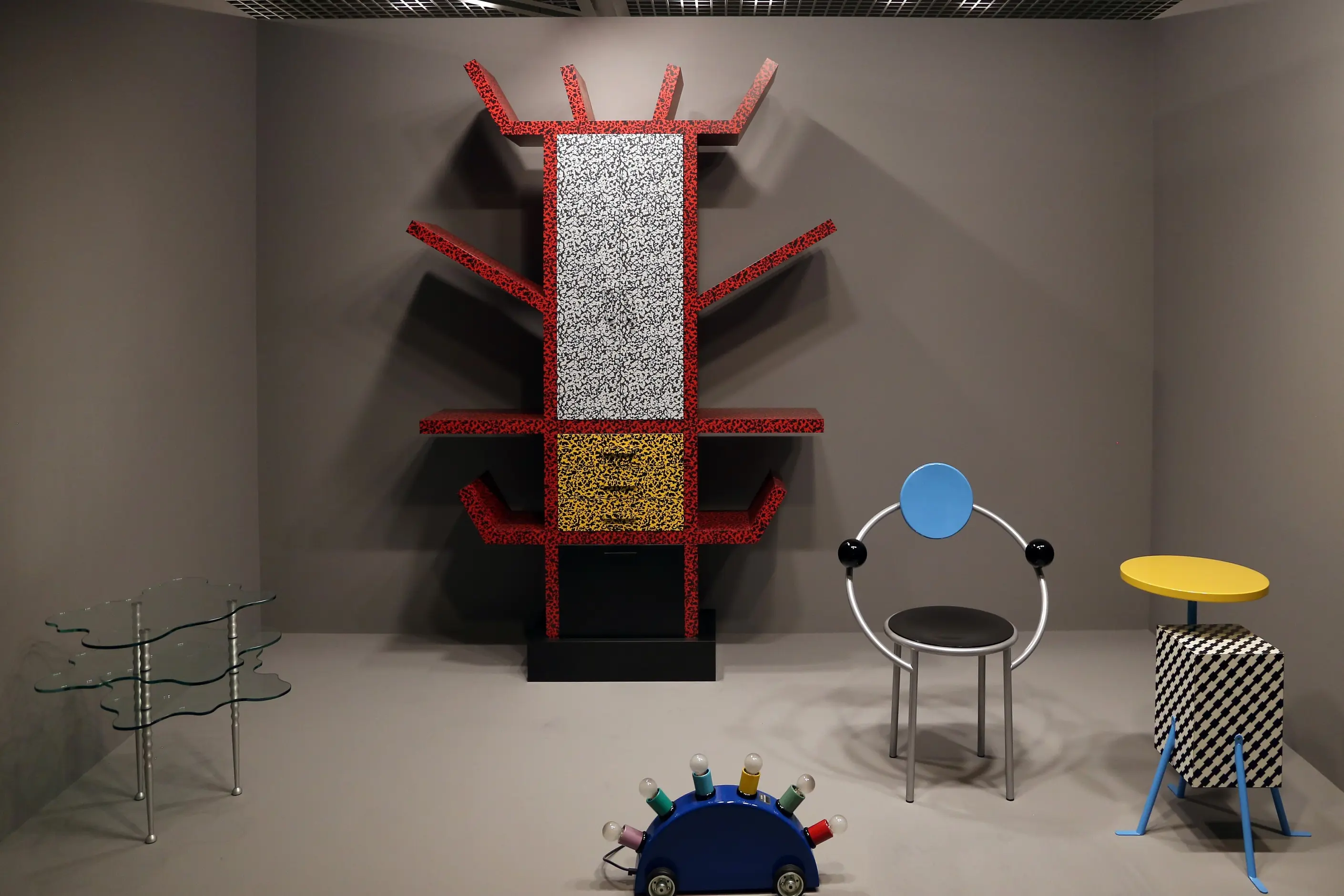
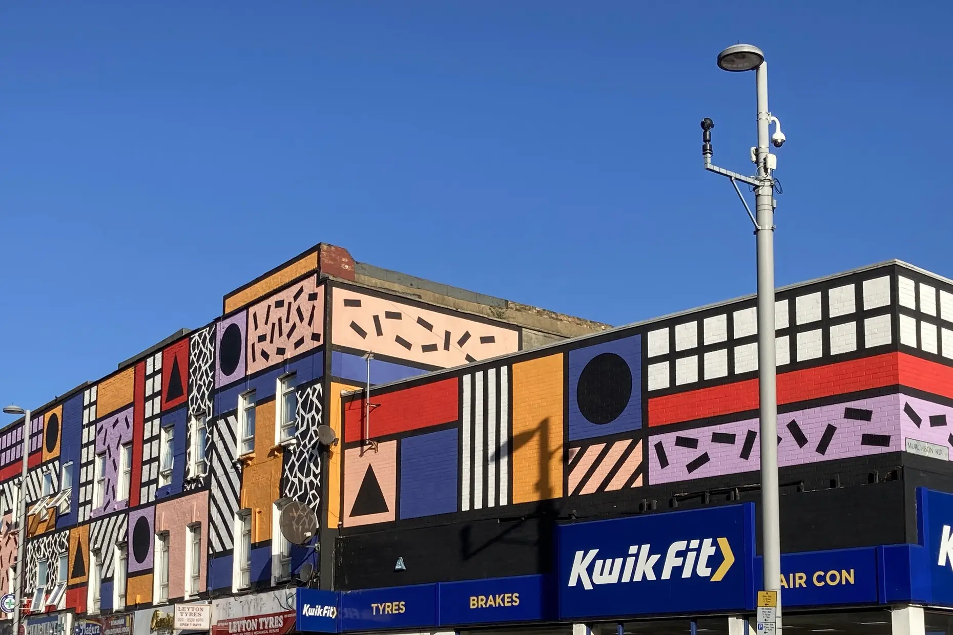
Memphis is a design movement founded in Milan in December 1980, known for stacked geometric forms, clashing colour and patterned plastic laminate applied to furniture, objects and graphics.
Where postmodernism in design more broadly borrows and quotes historical ornament, Memphis borrows almost nothing: its vocabulary is invented, arbitrary and deliberately cartoonish rather than a wink at the classical past.
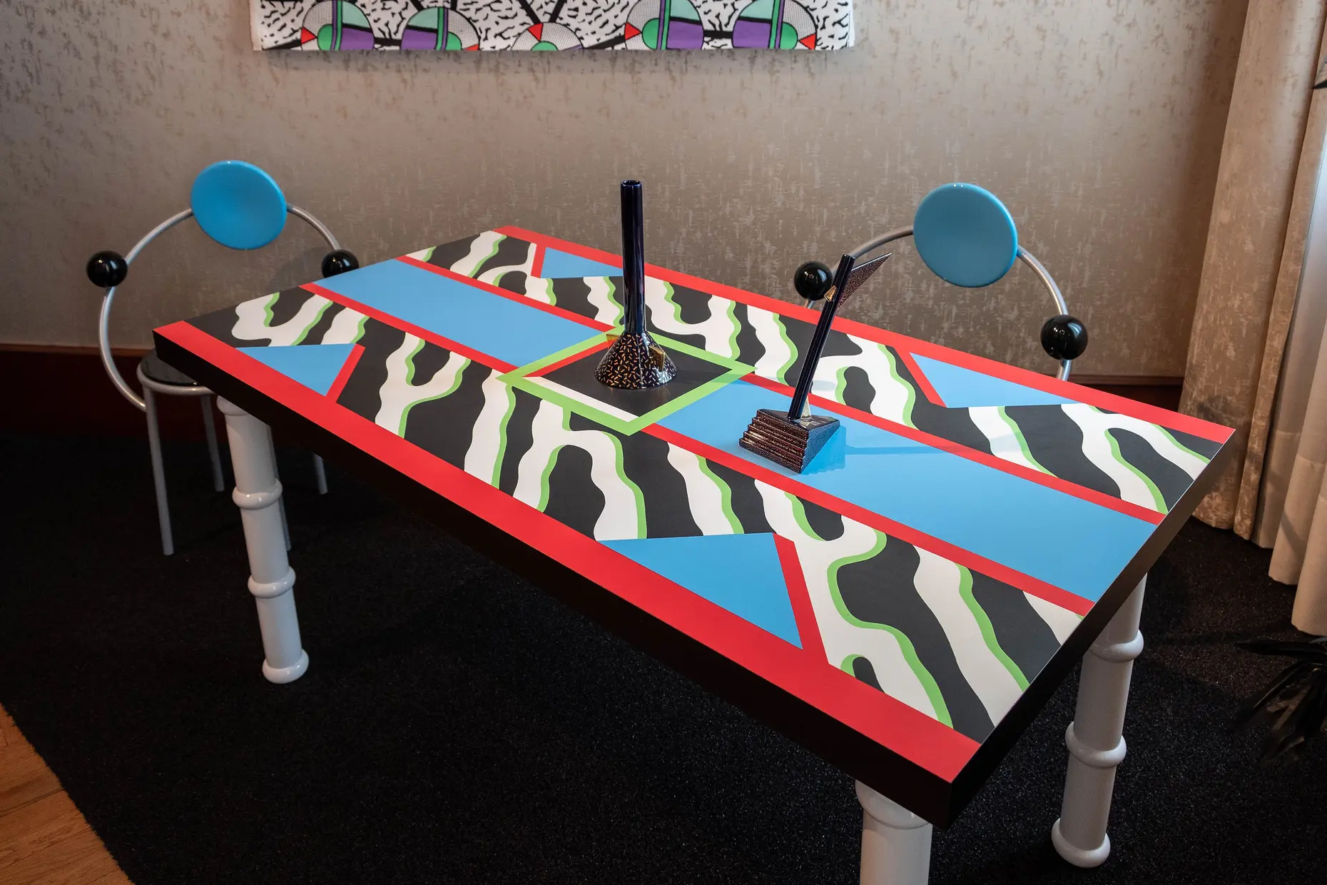
asymmetric stacks of circles, triangles and rectangles that look precariously balanced rather than joined; hot pink against electric blue against bright yellow with no coordinating palette; surfaces in patterned plastic laminate, including terrazzo speckle and squiggle patterns, standing in for wood or leather; flat, unshaded colour with no gradation.
Milan, founded by Ettore Sottsass in December 1980, debuting at the Milan Furniture Fair in September 1981, disbanded in 1987.
brand identities and objects that need to read as playful, exuberant and deliberately unconventional, where a serious or coordinated palette would undersell the energy.
Memphis was founded in Milan on 11 December 1980, when Ettore Sottsass gathered a group of younger designers, including Michele De Lucchi, Marco Zanini, Matteo Thun, Aldo Cibic and Martine Bedin, at his apartment. According to the group’s own account, Bob Dylan’s “Stuck Inside of Mobile with the Memphis Blues Again” played repeatedly on a turntable that evening, and the name stuck. The name pointed to ancient Egypt and Elvis Presley’s hometown, and to design history not at all, which was the point.
The group worked through the winter of 1980 to 1981 and debuted at the Milan Furniture Fair in September 1981. Established critics called the work juvenile. Karl Lagerfeld bought the entire first collection, and David Bowie became a known collector, so the controversy became a commercial success almost immediately.
Sottsass, born in 1917, was already an established figure by 1980, known for refined work for Olivetti, including the 1969 Valentine typewriter in bright red plastic. He described feeling trapped by “good design” and its demand for careful, restrained refinement. Memphis was his route out of that restraint, built with designers young enough to have no reputation to protect.
Sottsass’s Carlton Bookcase (1981) became the object that defines the movement: shelving units stacked asymmetrically to about six feet, painted red, blue, yellow, green, pink and black, with shelves that tilt rather than sit level. Nathalie Du Pasquier designed the majority of the movement’s surface patterns, including its terrazzo and squiggle motifs, which spread from furniture into textiles and graphics. Christoph Radl designed much of Memphis’s official graphic material.
Memphis officially disbanded in 1987. Members continued to practise individually, and the group judged that once designers understood the rules could be broken, maintaining Memphis’s specific rule-breaking as an ongoing institution would have contradicted its own point.

| Element | What Memphis does | The tell |
|---|---|---|
| Colour | Clashing, unharmonised hues applied flat, with no shading or gradation | Hot pink, electric blue, bright yellow and mint green in the same object, none of them coordinated |
| Form and shape | Circles, triangles, rectangles and cylinders stacked in asymmetric arrangements | Shapes appear balanced rather than structurally joined, echoing construction toys |
| Composition | Deliberate imbalance and precariousness rather than symmetry or grounded stability | A piece looks as though it could still be mid-assembly |
| Materials | Plastic laminate standing in for wood, leather or stone | A printed pattern that imitates no natural material and does not try to |
| Pattern | Terrazzo speckle, the “bacterio” squiggle, confetti dots and geometric repeats | A surface pattern instantly readable as Memphis independent of the object it covers |
| Typography and graphics | Bold geometric shapes combined with plain sans-serif type | Graphic material that reads as an extension of the furniture, not a separate discipline |

| Neighbour | What it shares with Memphis | What separates them |
|---|---|---|
| Postmodernism in design | Rejection of modernist restraint and a taste for irony | Postmodernism quotes and distorts historical ornament; Memphis invents an arbitrary vocabulary with almost no historical reference |
| Y2K design | Bold colour, playful geometry and a period-specific commercial spread | Y2K is late 1990s to early 2000s techno-optimism built around chrome, translucency and bubble forms; Memphis is Milan, a decade earlier, built around clashing colour and laminate |
| Kitsch design | Deliberate embrace of what refined taste rejects | Kitsch reclaims sentimental or mass-market imagery as a critical position; Memphis rejects material and formal convention while inventing wholly new forms, not borrowed ones |

Commit to full colour clash before you draw a single shape. Memphis colour fails as an accent: one bold hue among neutrals reads as a mistake, where full commitment to several clashing hues reads as intentional.
Build the geometry to look intentional even when it looks precarious. Stack shapes so a viewer can sense a logic behind the imbalance, and avoid arranging forms at random and hoping the clash reads as confidence.
Choose surfaces over materials. If the brief calls for a printed, patterned, or laminate-like finish rather than a material claiming to be natural, that choice belongs to Memphis; don’t soften it with wood grain or leather texture.
Reserve this style for a brief that genuinely wants exuberance: a creative-industry identity, a youth-oriented product, a cultural event. Applying Memphis patterns to a brief that needs restraint or gravitas produces pastiche, a surface reference with no underlying commitment to the movement’s logic.
Memphis collapses fastest into decoration without conviction: a pattern and a clashing palette borrowed for novelty, with none of the internal logic that held the original objects together. The tell is a design that looks busy rather than confident.
The style cannot carry dense information. Its clashing colour and asymmetric stacking work against legibility and hierarchy, so it has no place on an interface or document that needs to communicate data clearly.
By the late 1980s, Memphis’s own commercial success turned it into shorthand for “the 1980s” rather than for provocation, the fate of any rebellious style whose vocabulary becomes reproducible. A 2010s revival, picked up by brands including American Apparel, often took the patterns and colours without the theoretical position behind them. That gap between surface and intent is the standing risk whenever the style is revived.
Who founded Memphis, and when? Ettore Sottsass founded the group in Milan on 11 December 1980, with younger designers including Michele De Lucchi, Marco Zanini, Matteo Thun, Aldo Cibic and Martine Bedin.
Why is the name Memphis? The group named itself after Bob Dylan’s “Stuck Inside of Mobile with the Memphis Blues Again,” which reportedly played on repeat the night the group formed. The name evokes ancient Egypt and Elvis Presley’s Memphis, and connects to neither, which fits the movement’s rejection of meaningful design-historical reference.
What is the single object to know? Sottsass’s Carlton Bookcase (1981), a roughly six-foot stack of asymmetric, brightly painted shelving units with shelves that tilt rather than sit level.
Is Memphis the same as postmodernism? No. Memphis is one strand of the broader postmodern reaction against modernist restraint. Still, where postmodernism typically quotes and distorts historical ornament, Memphis invents its own vocabulary with almost no reference to design history.
Can Memphis carry a data-heavy interface? No. Its clashing colour and deliberate imbalance work against legibility, so it belongs on identity and object work that wants energy, not on anything that has to communicate dense information clearly.

| Fact | Detail |
|---|---|
| Founded | 11 December 1980, Milan |
| Founder | Ettore Sottsass |
| Founding members | Michele De Lucchi, Marco Zanini, Matteo Thun, Aldo Cibic, Martine Bedin |
| Debut | Milan Furniture Fair, September 1981 |
| Defining object | Carlton Bookcase, Ettore Sottsass, 1981 |
| Primary pattern designer | Nathalie Du Pasquier |
| Graphic designer | Christoph Radl |
| Disbanded | 1987 |

Postmodernism in design is a movement that began in the late 1960s and crystallised through the 1970s and 1980s, rejecting modernism’s claim to universal rules: the grid, the neutral sans, the belief that “less is more.” Where the International Typographic Style and Bauhaus functionalism treated a small set of principles as correct for any brief, postmodernism treated those principles as one convention among many, worth quoting, distorting or discarding as the project demanded.
Read it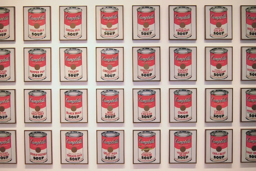
Pop Art is the movement that took commercial imagery- the soup can, the comic panel, the celebrity photograph- and treated it as fit subject matter for fine art, rendered flat, bright and mechanically precise.
Read it
Mid-century modern design describes the wave of modernist furniture, architecture and graphic design that flourished across the United States and Scandinavia from roughly 1933 to 1965, when Bauhaus rigour met American industrial optimism and Scandinavian craft.
Read it
Art Deco is a design style of the 1920s and 1930s built on geometric precision, symmetrical order and luxury materials, applied across architecture, graphic design and objects.
Read it
Y2K design is the visual language of computers, gadgets, fashion, and web culture from roughly 1997 to 2003, built from translucent coloured plastic, chrome and metallic surfaces, rounded bubble forms, and a saturated synthetic palette that together expressed a moment when digital technology looked purely exciting rather than troubling.
Read it
The Bauhaus is a German school of art, craft and design that operated from 1919 to 1933.
Read it
De Stijl is a Dutch modernist movement, founded in 1917, that limits its visual vocabulary to horizontal and vertical lines, rectangular planes, and the primary colours red, yellow, and blue, plus black, white, and grey.
Read it