

2026-09-15
Nural Choudhury
Material Design is Google’s design language for building interfaces: a codified set of colour roles, type scale, shape rules, elevation and motion, shipped as ready-made components for Android, Flutter and the web.
This page covers it as a design language: its principles, its component model, and how to use it or deliberately diverge from it. UX/UI design patterns covers interface patterns in general, and design systems covers building your own system from the ground up.
a production-ready interface system, colour, type, shape, elevation, motion and components already decided and accessible by default, so a small team ships a coherent product without designing a system from zero.
Android-first products, cross-platform apps built in Flutter, and any team whose design budget is better spent on the product than on inventing a system from scratch.
decide how far you will customise before building a single screen. Retrofitting brand identity onto Material after launch costs far more than deciding it up front.
Google introduced Material Design in 2014, under the internal codename Quantum Paper. The system’s founding idea was to treat digital surfaces as if they were paper and ink: surfaces have edges, cast shadows and move according to consistent physical rules, and content sits on them the way ink sits on a page.
It arrived as a direct response to flat design’s biggest usability complaint. Flat interfaces removed shadow and depth so thoroughly that users often could not tell a button from a label, and Material’s elevation and shadow restored that affordance cue.
Three founding principles shaped the first release: Material as the metaphor, bold and graphic intent borrowed from print design, and motion that communicates rather than decorates. Those three ideas have outlasted every visual revision since.

Material has moved through three major versions, each loosening what the last one fixed in place.
| Version | Years | What changed |
|---|---|---|
| Material 1 | 2014 to 2017 | A single, prescriptive aesthetic: a fixed grid, defined elevation levels and one visual identity across every Google product. Consistent, but every app built with it read as a Google app. |
| Material 2 | From 2018 | Material Theming: brands could set their own colour palette, typography and corner shapes within the same component set. The system moved from a fixed look to a customisable framework. |
| Material 3, “Material You” | From 2021, current | Dynamic colour: the interface derives its palette from the user’s own device rather than the brand’s guideline. Colour, shape, type and motion are all defined as tokens rather than hardcoded values. Material 3 is the version in current use. |
Each Material component, a card, a button, a navigation bar, a floating action button, reads its colour, shape and elevation from those tokens rather than from hardcoded values. Change a token and every component that references it updates together. That is the same token concept design systems teaches in general terms, and Material is one vendor’s implementation of it. The token hierarchy itself, and the component APIs built on it, belong to design systems architecture.
| Element | What Material defines |
|---|---|
| Colour | Semantic roles (primary, secondary, tertiary, surface, error), each with a container and on-container pairing, plus a tonal palette spanning light to dark. |
| Type | A named scale (display, headline, title, body, label) rather than raw point sizes. |
| Shape | Corner-radius categories from extra small to extra large, applied consistently across component sizes. |
| Elevation and motion | Tokenised depth levels and named transition patterns. The easing curves and duration bands that make them work belong to animation principles. |
Material’s components ship with contrast, focus and touch-target defaults built in. Meeting a conformance level and testing for it is its own discipline, covered by accessibility standards.
Adoption cost, divergence cost and the brand consequence are the real decision. The table below is a starting point, not a substitute for the judgement.
| Situation | Adopt, adapt or avoid |
|---|---|
| Android-first product, small team, tight timeline | Adopt. The accessible baseline and finished component library outweigh the cost of looking like other Material products. |
| Cross-platform product spanning Android, iOS and web | Adapt. Use the token system for consistency, but expect to override navigation patterns where iOS convention conflicts with Material’s. |
| Consumer brand whose visual identity is the product’s main differentiator | Avoid, or adapt hard. Colour theming alone rarely reads as distinct enough. A brand that must stand apart usually needs its own type and shape decisions too, which pushes toward a custom system: see design systems. |
| Enterprise or internal tool with many screens and a small design team | Adopt. Component comprehensiveness matters more than brand differentiation for software people use because they must, not because they chose it. |

You must decide, before you start, whether you are adopting Material or borrowing from it. Full adoption buys you a finished component library and an accessible baseline. Borrowing costs you the coherence Material provides.
If you adopt it, you must customise only through the token system. Set your palette, type and shape through Material Theming rather than overriding component styles directly, or you lose the ability to update the whole interface from one change.
You must pick your divergence points before launch, not during it. Colour, typography and shape carry most of the brand expression Material allows, so decide which of the three you will bend hardest and leave the others close to default.
Test on a real, low-powered device before you commit to heavy elevation and motion. Shadows and transitions are not free, and an interface that feels sharp on a design laptop can stutter on the hardware your users own.
Match platform conventions where they conflict with Material. An iOS user expects iOS navigation, and Material’s cross-platform consistency is a target for your product, not an obligation that overrides what your users already know.
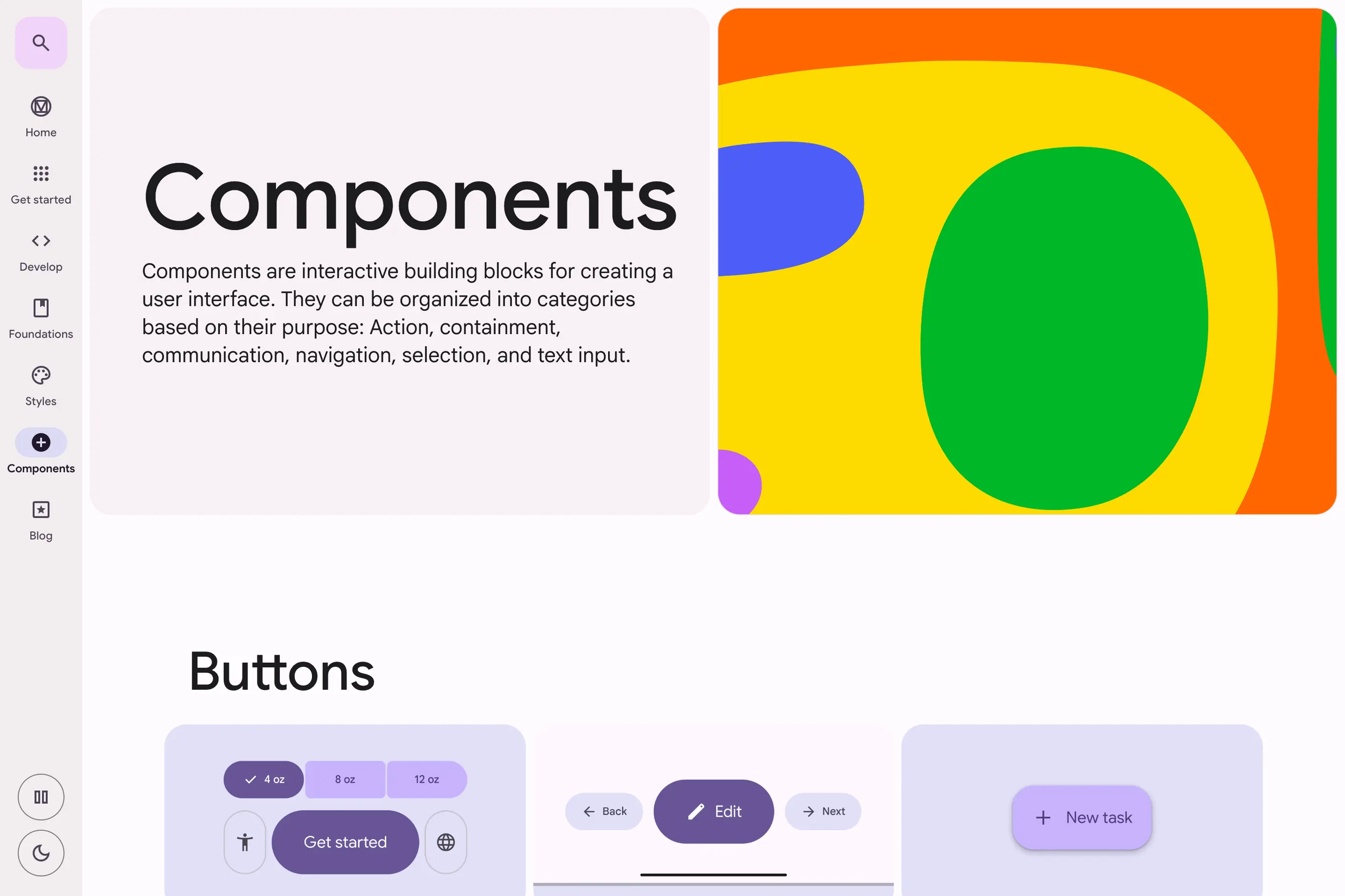
Consider a business-software product built for Android first, with a small design team and a tight timeline. Adopting Material in full gives the team a finished component library on day one: forms, navigation, cards, and dialogues that are already accessible and consistent with each other.
The team’s real decision is where to spend its two or three customisation moves. It sets a brand colour through Material Theming. Hence,o the primary palette reads as the company’s own, keeps the type scale close to default because reading speed matters more than personality in a data-heavy product, and leaves shape and elevation untouched because neither carries much of the brand.
Eighteen months later, the interface still reads as a considered use of Material rather than an unbranded one. That outcome depended on deciding the customisation budget before the first screen was built, not on any single component choice.
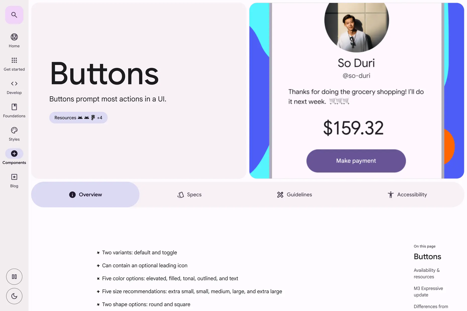
I have watched teams adopt Material and then fight it for eighteen months once the product needed to feel like something other than a Google app. The fight is expensive because it happens component by component, after launch, under the same deadline pressure that led to adopting Material in the first place.
The failure is rarely the choice to adopt Material. It is overriding components one at a time instead of setting the tokens once. A button restyled here, a card restyled there, and within a few sprints there is no upgrade path left, because Material ships a new component version that no longer matches the overrides sitting on top of the old one.
The other failure is quieter. A team changes the primary colour and calls the rebrand done. Everything else- the type scale, the shape language, the motion- stays at Material’s defaults, and the product still reads as a Google product with a different accent colour. Colour alone is rarely enough divergence to read as its own brand.
Yes. Google publishes it as an open specification, with free component libraries for Android, Flutter and the web.
No. Components ship with sensible defaults, but conformance testing, contrast ratios and legal deadlines are their own discipline, covered in accessibility standards.
Can I use Material without my product looking like a Google product? Yes, if you customise through the token system deliberately rather than overriding components one at a time. Colour alone is rarely enough; typography and shape carry more of the brand.
Yes. Material 3, branded Material You, introduced dynamic colour derived from the user’s own device and is the version in current use.
No. Component libraries exist for Flutter and for the web, independent of Android development.
| Fact | Detail |
|---|---|
| Introduced | 2014, by Google, internal codename Quantum Paper |
| Founding principles | Material is the metaphor; bold, graphic, intentional; motion provides meaning |
| Material 2 | From 2018, introduced Material Theming for brand customisation |
| Current major version | Material 3, “Material You”, launched 2021, defined by dynamic colour |
| Component libraries | Jetpack Compose for Android, Flutter, and web implementations including MUI and Material Web |
| Governance | Published and maintained by Google as an open specification |
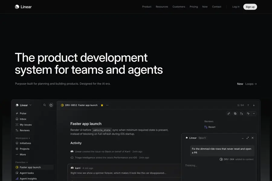
An interface pattern is a solution to a recurring design problem, refined through enough use elsewhere that the person encountering it doesn’t have to figure out how to use it.
Read it
A design system is a governed set of reusable components, patterns and rules that a team uses to build consistent digital products at scale, and it is neither a static style guide nor a component library on its own.
Read it
Design systems architecture is the set of structural decisions that let a design system keep working as an organisation grows: how tokens layer, how components are organised and configured, and how the code that implements them is housed, built, and shipped.
Read it
Animation principles are the small set of rules, developed for hand-drawn character animation, that make movement read as caused by weight and intent rather than as an arbitrary jump between two states.
Read it
Digital accessibility is the practice of building products people can use, whatever their permanent, temporary, or situational disability, measured against a published standard rather than opinion.
Read it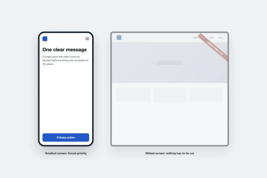
Mobile-first design starts with the smallest, most constrained screen and builds upward, rather than shrinking a finished desktop design to fit.
Read it