
2026-09-15
Nural Choudhury
Most performance dashboards fail before a single number lands on them because the team picked metrics that were easy to collect rather than ones tied to a decision somebody was going to make.
The monthly report nobody acts on, and the argument where marketing, product, and design each bring a different number for the same month and none of them is wrong.
Walk into a review with one agreed set of figures, say which lever moved which number, and defend a budget decision with something other than a story.
A shortlist of tracked KPIs with an owner against each, a definition per metric that survives a challenge, a dashboard or sheet that reports month over month, and a standing review where the numbers change a decision.
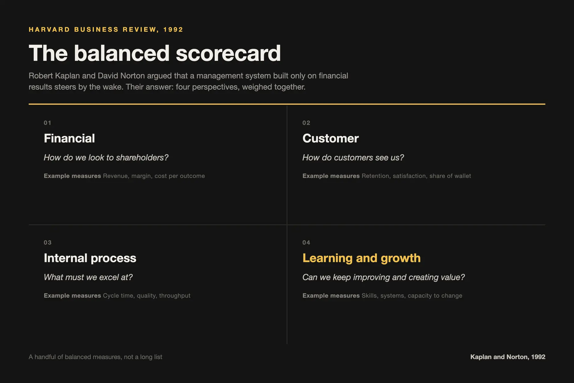
The idea that an organisation needs a small balanced set of measures rather than a single financial one is usually traced to Robert Kaplan and David Norton, whose balanced scorecard was published in the Harvard Business Review in 1992. They argued that financial results report the past, so a management system built only on them steers by the wake.
Marketing and digital measurement inherited that logic and then lost the discipline attached to it. The scorecard’s point was that a handful of measures, chosen deliberately and balanced across perspectives, beats a long list. Most teams now run the long list because modern analytics platforms make collection free and selection expensive.
That is the whole problem in one line: when gathering a metric costs nothing, the constraint moves from what you can measure to what you are willing to ignore.
Five steps. Steps 1 and 2 decide whether the rest is worth doing, and teams are the ones that skip them.
1. Name the decision before the metric. For each number you are considering, write down who will act differently depending on what it says. If nobody will, the metric is reporting, not measurement, and it does not go on the dashboard. I run this as a written exercise rather than a discussion, because a decision nobody will write down is a decision nobody owns.
2. Choose across the five categories, not within one. Lead generation, website and traffic, search, paid media, and social each answer a different question, and a dashboard weighted into one category tells you a great deal about one channel and nothing about the business. Take a small number from each rather than everything from the one your tooling reports best.
3. Write a definition per metric, and make it survive a challenge. A metric with two definitions is two metrics wearing one name, and that is the source of most reporting disputes. Define what counts as a lead, what window a conversion is attributed in, and what is excluded. I write these down before the first report, because afterwards every definition change reads as moving the goalposts.
4. Build the thing somebody will open. A dashboard tool if you have one, a spreadsheet if you do not. The tool matters far less than whether it reports the same figures on the same cadence without somebody rebuilding it by hand each month.
5. Put it in a standing review with a decision attached. Track month over month, and each cycle name one thing the numbers changed. A dashboard that has never altered a decision is a cost, and I would rather retire it than keep reporting it.

The trap here is that measurement is the easiest thing for a leader to keep doing personally. You know the definitions, you built the sheet, and it is faster to update it yourself than to explain it. Do that for two quarters, and you own a dashboard instead of a team that measures.
What I hand over and what I keep. I hand over collection, the monthly update, and the first read of what moved. I keep the metric set itself, because adding and removing metrics is the decision that determines everything downstream, and it needs to be scarce. A team that can add a metric will add metrics.
What I check, and when. I check the definitions, not the numbers. Once a quarter,r I ask somebody to explain what counts as a lead in their own words, and if two people answer differently,y the dashboard has drifted regardless of what it displays.
The conversation that goes wrong. It is the one where a number has fallen, and the person presenting it arrives defensive, having pre-built an explanation. That is a reporting culture, and it produces commentary instead of insight. The question that fixes it is not “why is this down” but “what would you need to know to tell whether this matters”, which moves the conversation from defending a figure to designing the next check.
How I know they have got it. They propose removing a metric. Anyone can add one. Someone who argues for taking a number off the dashboard because nothing has ever been decided from it has understood the discipline rather than the tool.

A small team wants to prove that a site redesign was worth funding.
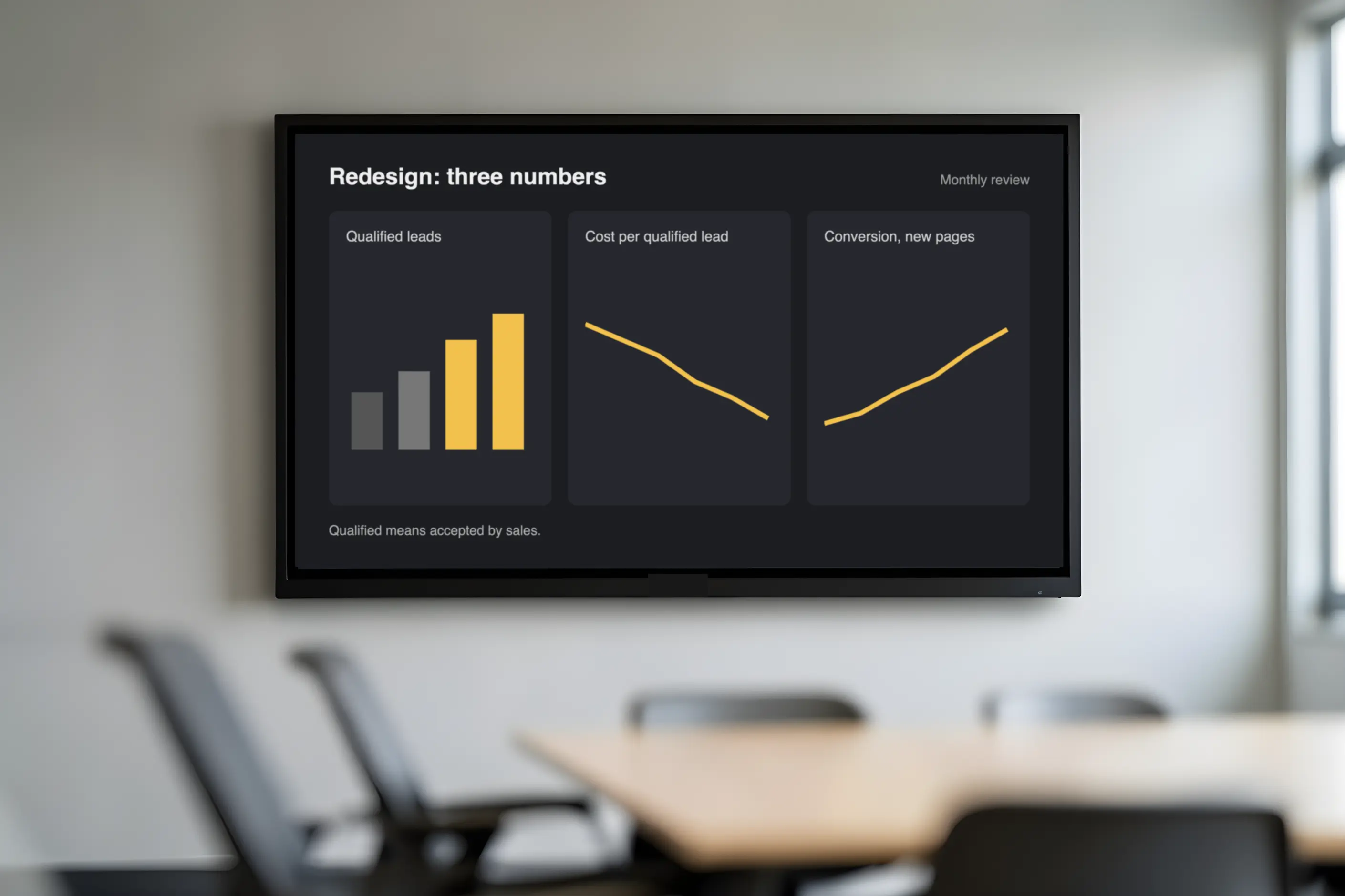
The tempting dashboard is everything the analytics platform offers: sessions, bounce rate, time on page, page views per visit. You can collect every one of those, but none answers the question: did the redesign produce more qualified enquiries at an acceptable cost?
Applying step 1 cuts the list hard. The decision is whether to fund a second phase, and the budget holder makes it. That makes the metric set small: qualified leads per month, cost per qualified lead, and conversion rate from the redesigned pages. Sessions stay off the dashboard because more traffic wouldn’t change the decision either way.
Step 3 then does the real work. “Qualified” has to mean something before the first report, or the second month’s figures become an argument about the first month’s definition. Agreeing that a qualified lead is one the sales side has accepted, and writing that down, is what makes the eventual comparison defensible.
The dashboard ends up with three numbers. That is the point, not a compromise.

The metric that moves while the business does not. I have watched a team celebrate a traffic increase that came entirely from a channel producing no enquiries. The number was real, the reporting was accurate, and the conclusion was wrong, because the metric had never been tied to the decision it was supposed to serve.
Definitions that drift silently. Nobody announces a definition change. It happens when a tool is reconfigured, a tag is added, or a new person interprets “lead” differently, and the dashboard keeps reporting confidently across the seam. This is the failure mode I have seen do the most damage, because it discredits the whole exercise once it is discovered.
Collecting because collection is cheap. A dashboard with thirty numbers on it is a dashboard nobody reads, and it usually signals that no one was willing to argue about which five mattered. The long list is not thoroughness; it is a deferred decision.
Governance, which is the honest limit on all of this. Most organisations don’t lack metrics; they lack agreed practice for capturing, cleaning, and presenting data, and the cultural willingness to act on what it says. No dashboard fixes that. If the last three reports changed nothing, the problem isn’t the metric set, and a better tool won’t fix it.
Few enough that you can name the decision attached to each one. I have never found a dashboard improved by its tenth number, and I have often found one improved by dropping to five.
What is the difference between this and product metrics? These answer channel and acquisition questions, which is where you decide a marketing budget. Product metrics answer retention and value questions, which is where you decide the roadmap. Teams conflate them and then wonder why the dashboard cannot explain churn.
No. A spreadsheet that reports the same definitions on the same cadence beats a platform nobody has configured properly. Buy the tool when manual updates are the constraint, not before.
Say so in the report, rather than reporting the number with a caveat nobody reads. Then fix the collection before the next cycle. A figure everyone privately distrusts is worse than a gap, because it still gets quoted.
Rarely, and deliberately. I review the set once or twice a year, and treat a mid-cycle addition as a request that has to displace something rather than join it.
| Fact | Detail |
|---|---|
| What it is | A deliberately small set of tracked KPIs, each tied to a decision, reported on a fixed cadence |
| Lineage | The balanced scorecard, Robert Kaplan and David Norton, Harvard Business Review, 1992: a small balanced measure set rather than a single financial one |
| The five categories | Lead generation, website and traffic, search, paid media, social |
| Selection test | Name who will act differently depending on what the number says. If nobody will, it is reporting rather than measurement |
| The real constraint | Not collection, which is now close to free, but the willingness to ignore what you could collect |
| Hardest part | Holding definitions steady, because nobody announces a definition change |
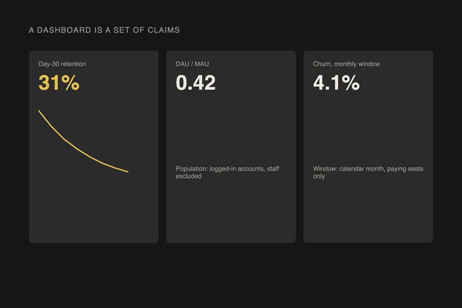
Choosing a product metric is a design decision, not an analytics task, because the metric you pick decides the behaviour a team produces.
Read it
Data analysis for design is the practice of testing decisions against measured evidence, usage data, and controlled experiments, rather than defending them by opinion alone.
Read it
A content audit is a catalogue of every piece of content you own, scored against what it is supposed to do, so you can decide what to keep, fix, merge or kill.
Read it
A team isn’t misaligned because it lacks a vision; it is misaligned because the cadence that surfaces disagreement before it hardens doesn’t exist.
Read it