
2026-09-15
Nural Choudhury
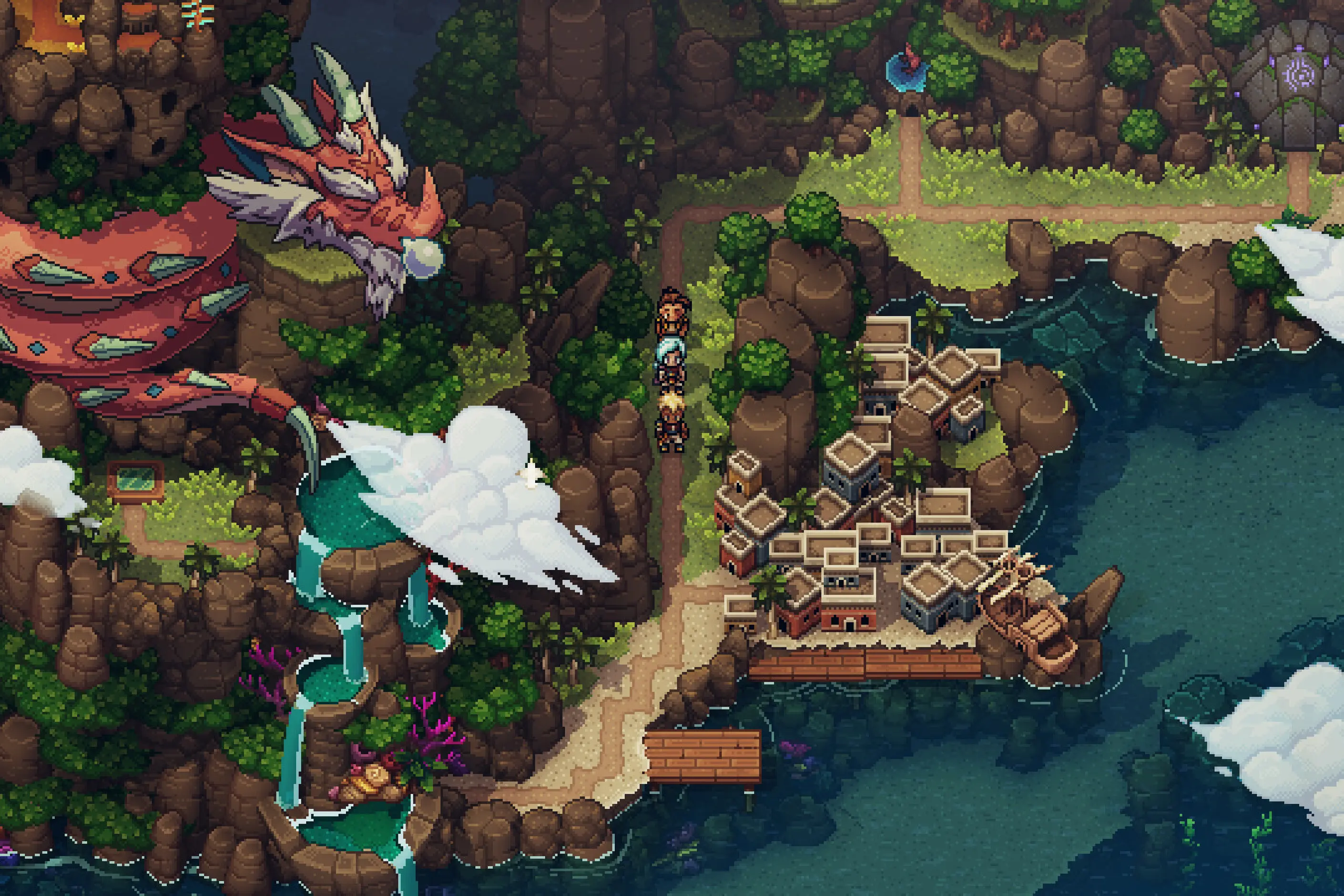
Pixel art is a raster art form built square by square on a fixed, visible grid, at a resolution low enough that every pixel is a deliberate decision rather than a technical accident.
It began in the 1970s and 1980s as a direct consequence of hardware limits on early computer and game displays, and it outlived those limits to become a style artists choose on purpose. Where synthwave design borrows 1980s neon and chrome imagery as a retro-futurist reference with no resolution limit of its own, pixel art’s low resolution and restricted palette are structural: the grid is the medium, not a decorative nod to a decade.
a visible square pixel grid at low resolution; hard-edged diagonal lines built from stair-stepped squares, with anti-aliasing placed by hand only where it earns its keep; a small, fixed colour palette with planned shading ramps; and checkerboard or noise dithering standing in for gradients the palette cannot render directly.
1970s and 1980s arcade and home computer hardware, the Apple II, Atari 2600, Commodore 64, NES and Game Boy among them, which could only address a fixed low-resolution grid and a small colour palette. This constraint produced conventions that outlived the hardware and were deliberately revived from the 2010s onward.
indie game assets, retro-referencing UI, nostalgic branding, and any brief that wants economy of form and instant recognisability at small display sizes rather than photorealistic detail.
Pixel art’s origins lie in hardware, not choice. The Apple II offered 280×192 resolution with 6 colours.
The Atari 2600 supported 160×192 with a palette of 128 colours but severe restrictions on how many could appear on screen at once. The Nintendo Entertainment System provided 256×240 resolution and drew on a 64-colour palette, of which only 52 colours could display at once.
The constraints varied by platform and produced distinct visual signatures that still read as period references. The Commodore 64’s characteristic brown-and-orange palette came from its hardware colour limitations. The original Game Boy’s green-tinted, four-shade monochrome display created one of the medium’s most recognisable looks.
Artists working inside these limits developed a working vocabulary: hand-placed anti-aliasing at stair-step edges, dithering patterns that optically mixed two palette colours into a third, and animation built from a handful of frames.
Through the 1990s and 2000s, as hardware resolution climbed, pixel art looked headed for obsolescence. It persisted through ROM-hacking communities, digital art forums and retro gaming enthusiasts who valued the form for itself rather than as a technical necessity. That continuity meant the vocabulary was intact when indie game developers began looking for it again.
The 2010s brought pixel art back to prominence. Games including Undertale, Celeste, Stardew Valley and Shovel Knight achieved commercial and critical success with pixel art as a deliberate aesthetic choice rather than a nostalgic recreation. NFT culture embraced the style separately, through projects such as CryptoPunks, 10,000 unique 24×24-pixel character portraits that became a widely cited digital collectable regardless of how one views the market around it.

| Element | What pixel art does | The tell |
|---|---|---|
| Colour | Restricts the palette to a small, deliberately chosen set, often 16 to 32 colours, and plans shading ramps in advance | A limited, coherent palette rather than colour reduced from a larger image |
| Form and shape | Builds every curve and diagonal from square pixels and applies anti-aliasing by hand only at edges that need it | Visible stair-stepping on some edges beside crisp, unsmoothed ones elsewhere in the same piece |
| Typography | Uses bitmap fonts drawn on the same pixel grid as the artwork, with no smooth curves | Blocky letterforms with visible pixel steps, scaled to match the sprite resolution |
| Layout and composition | Builds scenes from repeating tiles on a fixed grid and treats readable silhouette as the primary carrier of form | A background built from a visibly repeating tile set; a character that reads correctly as a solid black silhouette |
| Materials or texture | Simulates gradients and textures the palette cannot render directly through dithering, the patterned placement of two colours the eye blends into a third | Checkerboard, noise or directional dither patterns standing in for a smooth gradient |
| Motion | Suggests movement through a small number of frames and single-pixel position shifts rather than smooth interpolation | Animation cycles in which each frame changes only a handful of pixels |

| Neighbour | What it shares with pixel art | What separates them |
|---|---|---|
| Synthwave design | Both carry a retro, digital association and both surface in game and app interfaces referencing earlier eras | Synthwave is a retro-futurist style built from 1980s neon, chrome and grid-horizon imagery with no resolution constraint of its own; pixel art’s low resolution and visible grid are the actual medium, not a colour and shape reference to a decade |
| Y2K design | Both read as nostalgic call-backs to earlier computing and gaming | Y2K design draws on the chrome, bubble forms and techno-optimism of the late 1990s to early 2000s rendered at full resolution; pixel art is defined by its resolution limit itself, whatever era it references |
| Pointillism | Both build an image from small, discrete units of colour the eye blends, and dithering is a direct technical descendant of Pointillism’s optical mixing | Pointillism is a hand-painted technique working at full resolution on canvas; pixel art is locked to a fixed raster grid, where the dot is the display’s own smallest addressable unit rather than a brush mark |
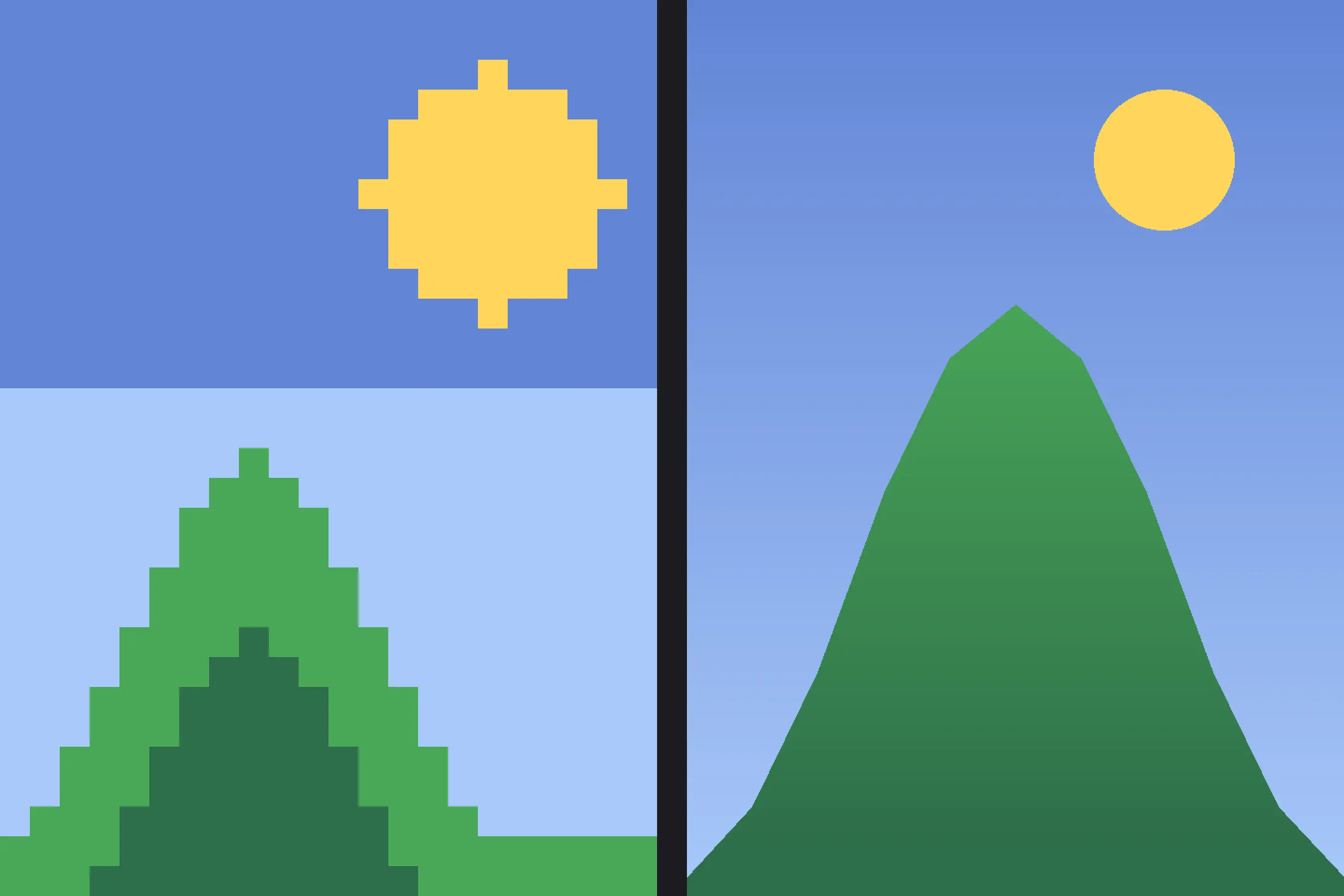
Fix the resolution before you place a single pixel, and hold it throughout the piece. Decide the sprite or tile dimension you are working at and never mix pixel sizes within one image; a single inconsistently scaled element breaks the constraint for the whole piece.
Build the palette before you build the artwork. Sixteen to thirty-two colours is a workable range for most contemporary work. Plan colour ramps for shading in advance rather than choosing colours as you go, and shift hue in shadow, orange highlights against purple shadow rather than a flat darker version of the same colour, to make a small palette read as richer than its count suggests.
Use anti-aliasing selectively, only where a jagged edge would distract from the form being communicated. Over-smoothing produces the mushy, undefined edges that pixel artists treat as a failure of the technique, not a refinement of it. Test every design as a black silhouette: if a form doesn’t read without colour or internal detail, it hasn’t solved the constraint yet.
Reference a specific hardware era deliberately- NES, Game Boy, SNES- if you want that period’s particular look, and do not mix conventions from different eras in one piece. SNES-quality gradients on NES-style proportions read as a mistake, not a fusion.
Pixel art applied to a brief that wants a premium or photorealistic register is a pastiche risk. The constraint communicates economy, clarity and nostalgia specifically, and a brief that wants none of those is better served by a different style entirely.

Pixel art’s most common failure isn’t technical. It is treating the look as a filter: a pixelation effect applied to artwork built at full resolution, without ever working within a fixed grid or a genuine palette limit. Pixel art communities, PixelJoint and Lospec among them, draw a sharp line around this “faux pixel” work, because the filtered version keeps none of the economy of decision that a real grid forces on the artist.
The named technical failures recur for the same underlying reason: each one is a way of not respecting the constraint. Pillow shading, light that follows the outline of a shape rather than a consistent light source, ignores the discipline a small palette is meant to enforce. Banding, unintended stripes appearing in a gradient, and resolution inconsistency, mixed pixel sizes within one piece, are the same failure appearing at different scales.
Pixel art’s association with NFT projects, CryptoPunks foremost among them, drew the style into debates about speculation and market volatility that have nothing to do with the craft itself. A designer reaching for pixel art because a client wants an NFT-adjacent look should keep the visual vocabulary, which has a genuine hardware history and a technical ancestor in optical colour mixing, separate from a market that has used the look as a wrapper.
Why does pixel art still exist when high resolution is available everywhere? Because artists and studios choose it deliberately, for production economy, instant visual distinction and genuine nostalgic association, not because hardware forces it. Indie developers in particular find it more manageable than high-polygon 3D or hand-frame animation at scale.
No. Applying a pixelation filter to a full-resolution image removes the deliberate, per-pixel decision-making that defines the practice. Pixel art communities call this faux pixel work and distinguish it sharply from artwork built on a genuine fixed grid.
Do I need specialised software to make pixel art? Dedicated tools such as Aseprite, Pro Motion and Piskel provide pixel-level control, onion skinning for animation and palette management that general image editors lack. A general editor such as Photoshop or GIMP can produce pixel art. Still, you must turn off its automatic anti-aliasing first, which is one of several reasons dedicated software is preferred for serious practice.
What resolution should I work at? There is no fixed correct number. Historical references range from 8-bit era sprites of a few dozen pixels to 16-bit era work with considerably more detail; choose a resolution that suits your subject and platform, and stick with it rather than borrowing a number without understanding its constraints.
| Fact | Detail |
|---|---|
| Origin | 1970s to 1980s, arcade and home computer hardware |
| Apple II | 280×192 resolution, 6 colours |
| Atari 2600 | 160×192 resolution, 128-colour palette with severe simultaneous display limits |
| NES | 256×240 resolution, 52 colours displayable from a 64-colour palette |
| Commodore 64 | Signature brown-and-orange palette, a direct result of hardware colour limits |
| Game Boy | Four-shade green-tinted monochrome display |
| Contemporary revival | 2010s onward, through indie games including Undertale, Celeste, Stardew Valley and Shovel Knight |
| Notable NFT project | CryptoPunks, 10,000 unique 24×24-pixel character portraits |
| Dedicated software | Aseprite, Pro Motion, Piskel |
| Community hubs | PixelJoint, Lospec |

Synthwave design is a retro-futurist visual style built decades after the decade it evokes: a neon, grid-lined, chrome-lettered vision of the 1980s assembled in the late 2000s from arcade games, science-fiction film and electronic music.
Read it
Y2K design is the visual language of computers, gadgets, fashion, and web culture from roughly 1997 to 2003, built from translucent coloured plastic, chrome and metallic surfaces, rounded bubble forms, and a saturated synthetic palette that together expressed a moment when digital technology looked purely exciting rather than troubling.
Read it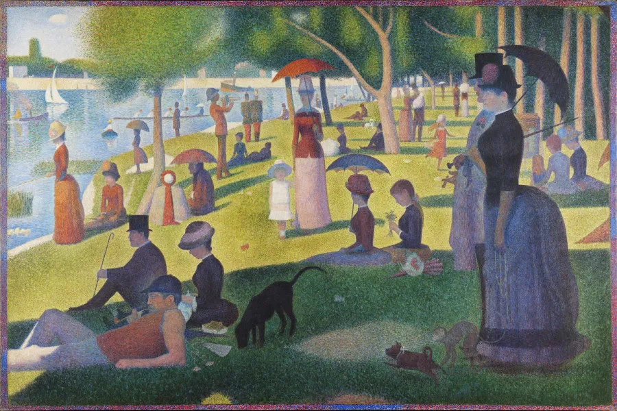
Pointillism is a painting technique developed in France in the mid-1880s that builds an image from small, separate dots of pure colour rather than colours mixed on a palette.
Read it
Minimalism in design reduces a composition to the elements it cannot function without, so colour, form, type, and space each carry more weight because there is less to look at.
Read it
The Bauhaus is a German school of art, craft and design that operated from 1919 to 1933.
Read it
Kawaii (かわいい) is Japan’s cute aesthetic: rounded forms, oversized, simplified eyes, childlike proportions, and a pastel palette, developed since the 1970s into a design language for characters, consumer products, and institutional communication.
Read it