
2026-09-15
Nural Choudhury
Synthwave design is a retro-futurist visual style built decades after the decade it evokes: a neon, grid-lined, chrome-lettered vision of the 1980s assembled in the late 2000s from arcade games, science-fiction film and electronic music.
It is not an 1980s style, since nothing in it was made during the decade it references. It is a contemporary reconstruction of how the 1980s imagined its own future, and digital tools let that reconstruction look more saturated and more polished than the era’s actual technology ever allowed.
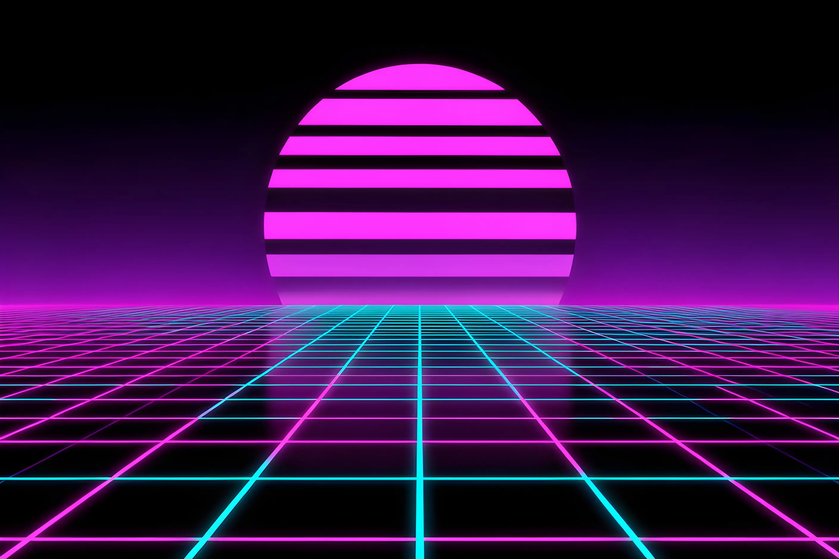
hot pink and cyan glowing against black or deep purple, a perspective grid receding to a low horizon, a large striped or divided sun sitting on that horizon, dimensional chrome lettering, and artefacts such as scan lines and chromatic aberration layered over digitally clean art.
emerged alongside the synthwave music genre in the late 2000s, its visuals built to match album art and pull from VHS cover art, arcade cabinet graphics, and science-fiction cinema.
entertainment, gaming, nightlife, and youth-culture branding wanting escapist, nostalgic energy. Reach for it when the audience will read the reference; avoid it where the brief calls for gravitas.
Synthwave began as a musical genre before it had a visual identity. Artists including Kavinsky, Perturbator, and Carpenter Brut made electronic music that referenced John Carpenter’s film scores, Tangerine Dream’s atmospherics, and Italo disco production. The visual vocabulary matched that sound and drew on the same sources: VHS cover art, arcade cabinet graphics, 1980s commercial illustration, and science-fiction film imagery such as Tron and Blade Runner.
Album art needed to communicate what the music evoked, so the visuals and the sound developed together rather than one following the other.
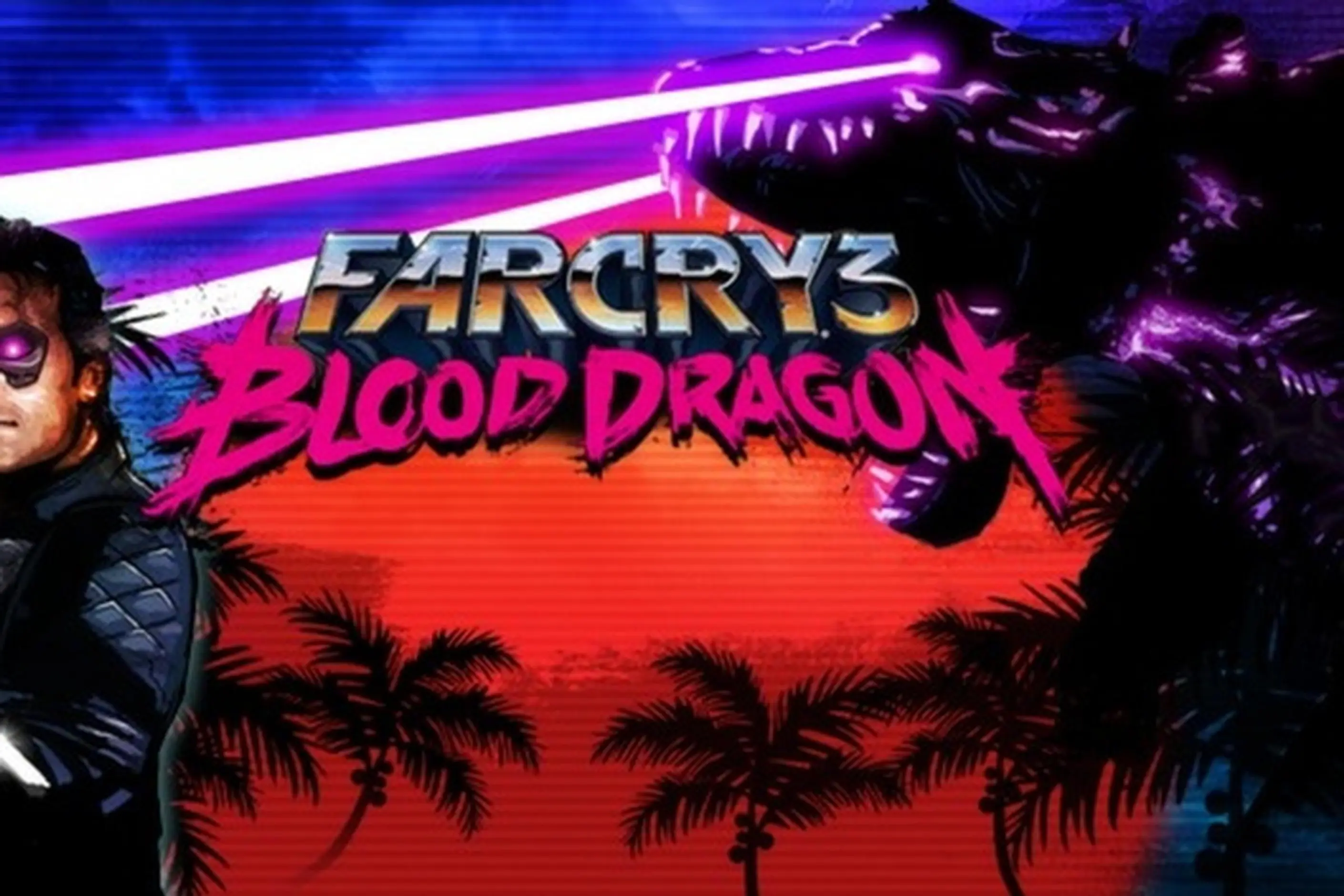
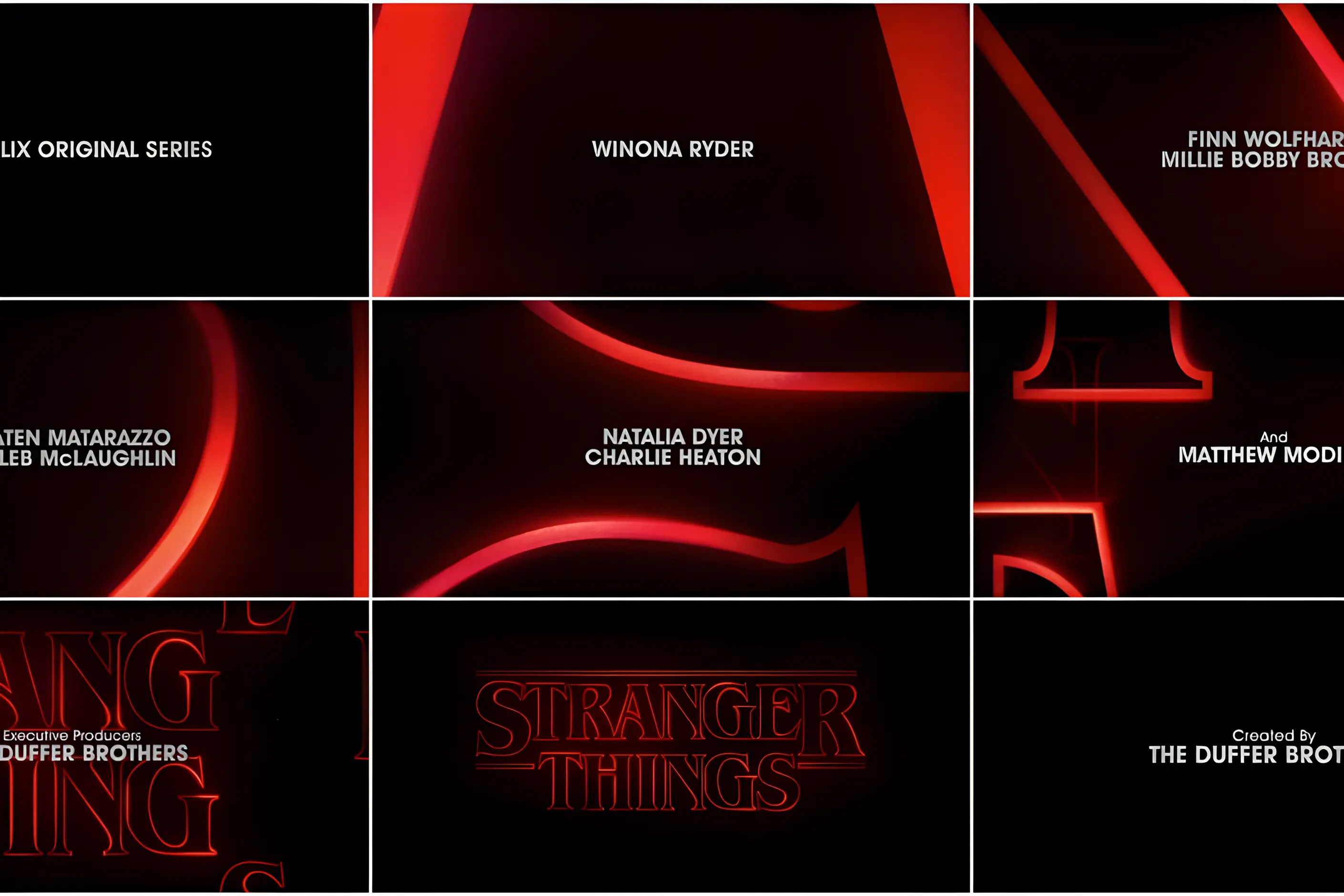
The style stayed largely within music fan communities through its first years. By the mid-2010s, it had spread into advertising, gaming, fashion, and film, appearing in productions such as Drive, Stranger Things, and Blade Runner 2049, and in games including Hotline Miami and Far Cry 3: Blood Dragon. Digital tools made the look easy to reproduce, which spread it quickly and also flattened it: the same elements repeated without variation became a recognisable risk of the style almost as soon as it reached the mainstream.
The term “outrun”, taken from the 1986 arcade game of the same name, is often used interchangeably with synthwave. However, some designers reserve it for the more specifically automotive strand of the aesthetic.

| Element | What this style does | The tell |
|---|---|---|
| Colour | Hot pink, magenta, and electric cyan glow against black or deep purple grounds, with occasional sunset orange | Colours read as light sources, not reflected surfaces: a saturation and glow beyond what period print or a CRT screen could produce |
| Form and shape | A perspective grid recedes toward a vanishing point at a low horizon; the sun sits on or below that horizon, often divided by horizontal bands | Mathematically regular grid spacing and the horizontally striped sun disc, both borrowed from early 3D computer graphics |
| Typography | Chrome or metallic lettering, modelled with dimension and reflective highlights | The chrome surface reflects the surrounding neon palette rather than a neutral studio environment |
| Layout and composition | The grid functions as ground, the horizon and sun establish depth, and other elements are staged in front of that space | Strong symmetry organised around a single vanishing point, with the sky given more room than the ground |
| Materials or texture | VHS tracking distortion, CRT scan lines, chromatic aberration, and bloom are layered over otherwise clean digital art | The imperfections are applied deliberately to new work rather than inherited from a genuine analogue original |
| Imagery and ornament | Sports cars, palm trees, neon-lit cityscapes, arcade cabinets, and silhouetted figures populate the scene | The objects are rendered with more polish and drama than the decade’s own tools could have achieved |
| Neighbour | What it shares | What separates them |
|---|---|---|
| Y2K design | Chrome effects, bright saturated colour, and a technologically optimistic mood | Y2K references the millennium turn, roughly 1997 to 2003, and its own forms: bubble shapes, translucency, and metallic plastic. Synthwave’s fixed references are the perspective grid, the striped sun, and 1980s film and arcade imagery |
| Aurora gradients | Glowing colour and smooth gradient technique | Aurora gradients are a general light effect with no attached decade or narrative. Synthwave’s palette is inseparable from its iconography: without the grid, the sun, and the retro-futurist imagery, the colours alone are not synthwave |
| Pixel art | A shared origin in arcade game graphics and retro-gaming reference | Pixel art is defined by a hardware constraint made visible: a grid of discrete, individually chosen pixels. Synthwave uses smooth gradients, glow, and dimensional chrome, the opposite of a resolution-limited surface |
Commit to the full atmosphere before you touch any single element. Choose the palette, the grid, and the sun together, since synthwave communicates through their combination rather than through any one part on its own.

Build the composition in order: set the horizon and perspective grid first, place the sun on it, then add chrome typography and neon accents, and layer scan lines or chromatic aberration last, sparingly. Artefacts must read as a deliberate finish, not a rescue for weak composition underneath.
Execute the chrome and gradients smoothly. Banding in a gradient or poorly kerned chrome lettering reads as an amateur pastiche rather than a considered use of the style.
Reserve synthwave for briefs that want escapist, nostalgic energy: entertainment, gaming, nightlife, and youth culture are its natural home. It carries real pastiche risk in corporate, healthcare, or financial contexts, where the same glow and grid read as a costume rather than a considered choice.
The style’s own vocabulary is now a formula, and formula invites cliché. The same palette, grid, and sun combination has been reproduced at such volume across social platforms that repetition without variation now reads as generic rather than distinctive, and execution quality is often the only thing separating genuine synthwave work from a stock “80s-style” filter.
Commercial use frequently takes the surface elements- the pink and cyan, the grid, the chrome- without the atmospheric coherence that gave them meaning in the first place. The result signals “retro” in general rather than synthwave specifically.
The style also depends on a selective memory of the decade it references. It keeps the neon optimism and the science-fiction promise of new technology. It leaves out the decade’s real anxieties: the Cold War, economic inequality, the limits of the actual technology available at the time. That editing is the aesthetic’s whole method, not an accident, but it means synthwave should never be mistaken for a documentary account of the 1980s.
Finally, its emotional register is narrow. Escapist and unambiguously romantic, it can feel dated or misplaced wherever a brief calls for seriousness, complexity, or restraint.
Is synthwave a 1980s style? No. It was assembled in the late 2000s as visual accompaniment to a music genre. Contemporary digital tools rendered an imagined version of the 1980s that the decade’s own technology could not have produced, and treating it as a period style rather than a later reconstruction is the most common misreading.
What does “outrun” mean? It comes from the 1986 arcade racing game of the same name, and is often used interchangeably with synthwave. Some designers keep the term for the more automotive-focused strand of the aesthetic rather than the whole category.
Why do synthwave images always feature a grid and a striped sun? Both come from identifiable sources: the grid from early 3D computer graphics and arcade backgrounds, the striped sun from a stylisation that referenced scan-line rendering. Their repetition is what signals genre membership to a viewer, not decoration for its own sake.
Can synthwave work for a serious or corporate brand? Rarely. Its associations with nostalgia, escapism, and youth culture clash with most briefs that need gravitas. It fits entertainment, gaming, nightlife, and youth-facing work far more naturally than it fits healthcare, finance, or corporate communications.
How do I keep synthwave from looking generic? Treat execution quality as the differentiator: smooth gradients, well-modelled chrome, and a coherent atmosphere across every element. Distinction now comes from unexpected colour choices, unusual imagery paired with the standard treatment, or craft that exceeds the flood of formulaic work already in circulation.
| Fact | Detail |
|---|---|
| Emerged | Late 2000s, alongside the synthwave music genre |
| Early artists | Kavinsky, Perturbator, Carpenter Brut |
| Referenced sources | John Carpenter film scores, Tangerine Dream, Italo disco; Tron, Blade Runner |
| Alternate term | Outrun, named after the 1986 arcade game |
| Signature imagery | Perspective grid, striped sun, chrome lettering, neon pink and cyan |
| Mainstream carriers | Film and television including Drive, Stranger Things, Blade Runner 2049; games including Hotline Miami, Far Cry 3: Blood Dragon |
| Nearest confusable neighbours | Y2K design, aurora gradients, pixel art |

Y2K design is the visual language of computers, gadgets, fashion, and web culture from roughly 1997 to 2003, built from translucent coloured plastic, chrome and metallic surfaces, rounded bubble forms, and a saturated synthetic palette that together expressed a moment when digital technology looked purely exciting rather than troubling.
Read it
Aurora gradients are a colour technique: three or more hues blended along curving, non-linear paths rather than interpolated in a straight two-colour fade, built to evoke the shifting curtains of the aurora borealis, cosmic nebulae or bioluminescent water.
Read it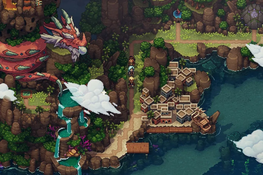
Pixel art is a raster art form built square by square on a fixed, visible grid, at a resolution low enough that every pixel is a deliberate decision rather than a technical accident.
Read it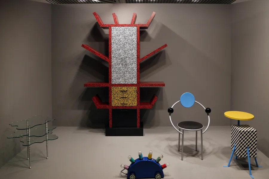
Memphis is a design movement founded in Milan in December 1980, known for stacked geometric forms, clashing colour and patterned plastic laminate applied to furniture, objects and graphics.
Read it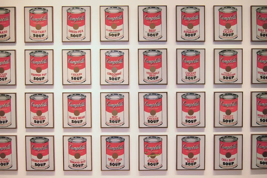
Pop Art is the movement that took commercial imagery- the soup can, the comic panel, the celebrity photograph- and treated it as fit subject matter for fine art, rendered flat, bright and mechanically precise.
Read it
Postmodernism in design is a movement that began in the late 1960s and crystallised through the 1970s and 1980s, rejecting modernism’s claim to universal rules: the grid, the neutral sans, the belief that “less is more.” Where the International Typographic Style and Bauhaus functionalism treated a small set of principles as correct for any brief, postmodernism treated those principles as one convention among many, worth quoting, distorting or discarding as the project demanded.
Read it