
2026-09-15
Nural Choudhury
Pointillism is a painting technique developed in France in the mid-1880s that builds an image from small, separate dots of pure colour rather than colours mixed on a palette.
Georges Seurat originated it, and Paul Signac developed it alongside him; the two called it Divisionism or Neo-Impressionism for the systematic division of colour it demanded. Its neighbour is pixel art: both build images from a fixed grid of discrete colour units, but pixel art turns a hardware constraint into an aesthetic. At the same time, Pointillism is a nineteenth-century theory of how the eye itself mixes colour.
a surface built entirely from small, distinct dots or short strokes of unmixed colour, visible as separate marks up close and blending into continuous hues at a distance. Complementary colours (orange and blue, red and green) sit next to each other rather than mixed on the palette. Subjects are calm, contemporary and carefully composed, with figures often static or frozen.
Paris, the mid-1880s, led by Georges Seurat and Paul Signac, drawing on the colour science of Michel Eugène Chevreul and Ogden Rood.
teaching optical colour mixing, and as the historical anchor for halftone printing and pixel-based display, not as a general decorative texture.
Pointillism grew directly out of colour science unrelated to painting. Michel Eugène Chevreul, a chemist who directed dyes at the Gobelins tapestry works, published “The Law of Simultaneous Contrast of Colours” in 1839, showing that adjacent colours change each other’s apparent temperature and intensity. Ogden Rood’s “Modern Chromatics” (1879) distinguished additive mixing, where light colours combine as they later would on a screen, from subtractive mixing, where pigments combine as they do on a palette. Hermann von Helmholtz’s work on optics and perception supplied the physiological account of how the eye processes colour.
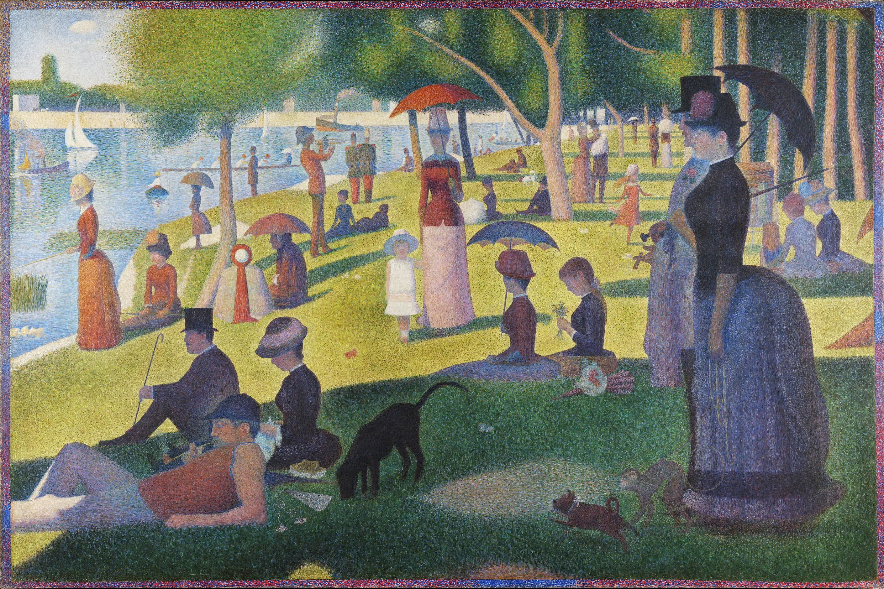
Georges Seurat (1859 to 1891), trained at the École des Beaux-Arts, took these findings as a mandate for a scientific method of painting rather than an intuitive one. His “A Sunday Afternoon on the Island of La Grande Jatte” (1884 to 1886, Art Institute of Chicago), nearly seven by ten feet, took around two years to complete and announced the technique at the final Impressionist exhibition in 1886. Paul Signac (1863 to 1935) worked alongside Seurat and, after Seurat’s early death, became the movement’s theorist: his 1899 book “D’Eugène Delacroix au Néo-impressionnisme” codified the principles for other practitioners. Signac’s own work moved toward larger, more visible dots and maritime subjects, looser than Seurat’s fine-grained method. Camille Pissarro adopted the technique briefly in the late 1880s before returning to looser Impressionist handling, and Henri-Edmond Cross’s decorative Neo-Impressionism fed directly into Fauvism.

| Element | What this style does | The tell |
|---|---|---|
| Colour | Pure, unmixed hues applied directly from the tube, never blended on the palette | Complementary pairs sit adjacent: an orange object’s shadow is built from blue dots, not a darkened orange |
| Form | Small, relatively uniform dots or short strokes, each a discrete unit | The mark itself is the unit of construction, not a line or a wash |
| Composition | Carefully planned tonal structure established before colour is applied | Figures are static, often in profile, arranged with geometric deliberateness rather than caught mid-motion |
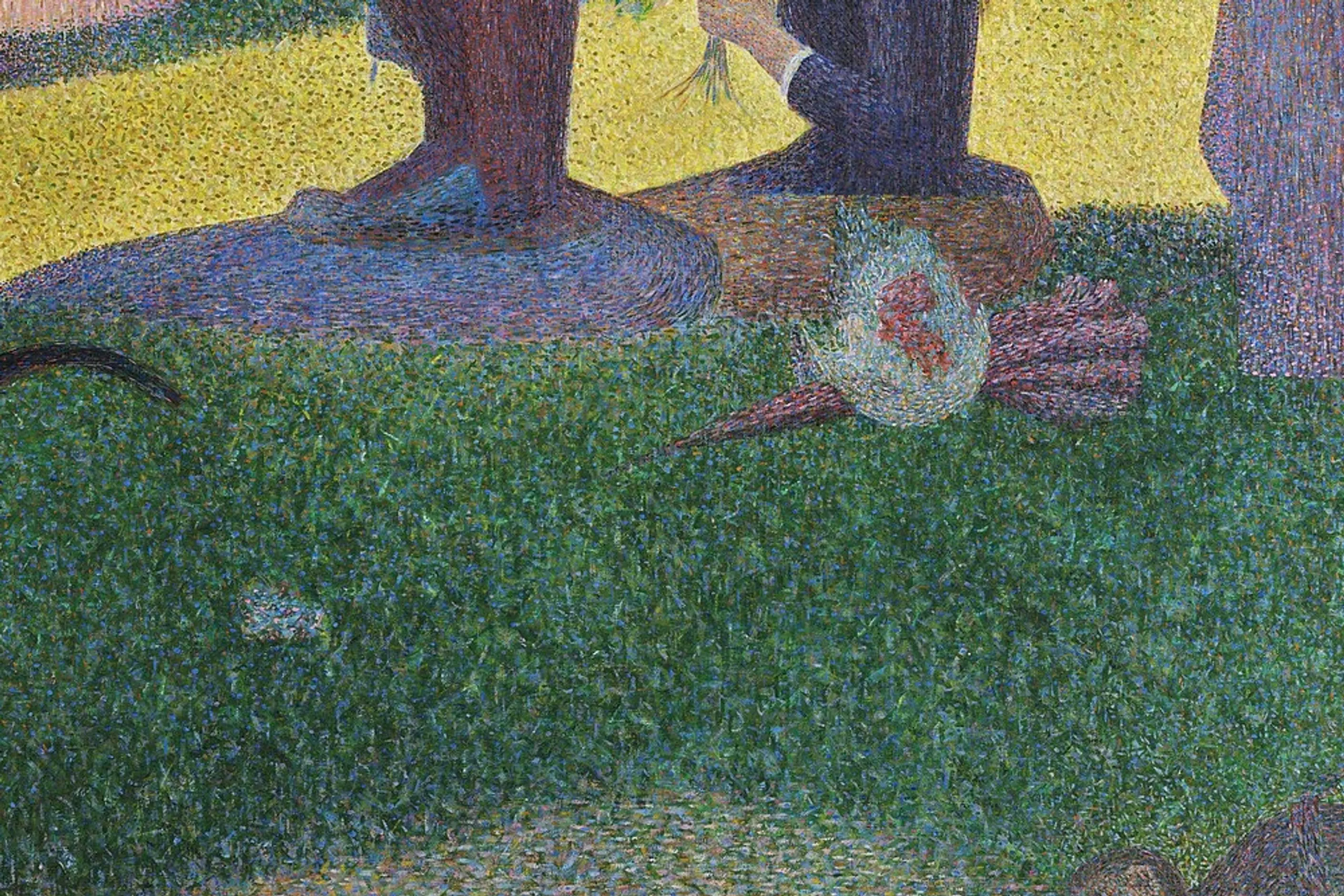
| Surface | Millions of individual marks accumulate into one continuous field | Up close, only dots; only at the correct viewing distance does the image resolve |
| Subject | Contemporary middle-class leisure, rendered with unusual formal rigour | A scene that would suit loose Impressionist handling is instead frozen and monumental |
The key mechanism is optical mixing itself. Physically mixed pigments absorb more light than pure pigments do, because each pigment absorbs its complementary wavelength before the mixture even reaches the eye. A dot of pure orange beside a dot of pure blue reflects both colours in full, and the eye averages them into a grey more luminous than one mixed on the palette. That single physical fact is why Pointillism reads as glowing rather than muddy, and it is the same principle that makes a halftone print or an LED screen resolve into a photograph rather than a field of dots. Pointillism did not invent optical mixing. It made it into a deliberate, systematic method of painting for the first time.
| Neighbour | What it shares | What separates them |
|---|---|---|
| Pixel art | Both build an image from a fixed grid of discrete, unmixed colour units that read as a whole only from the right distance | Pixel art starts as a hardware constraint, the limited palette and resolution of early displays, later kept as a deliberate aesthetic. Pointillism starts as a theory about the eye, applied by hand with a paintbrush |
| Optical illusions in design | Both rely on the eye doing work the image itself does not physically do | Op art exploits perceptual tricks such as apparent motion or depth reversal. Pointillism exploits one specific mechanism, colour averaging at a distance, and does not aim to disorient the viewer |
| Tessellation and pattern systems | Both build a surface from a repeated small unit | Tessellation’s unit tiles the plane by geometric rule, with no gaps or overlaps. Pointillism’s dots do not tile: they are placed by eye to build tonal and colour relationships, and their count and density vary across the canvas |

Use Pointillist thinking where you need to teach or demonstrate optical colour mixing, not as a decorative dot texture. Establish the tonal structure first, light against dark, before any colour decision: Seurat’s underdrawing did this work before a single dot was placed, and skipping it is the fastest way to a muddy result. Place complementary colours adjacent when you want a surface to read as more luminous than a flat, pre-mixed colour would, and reserve that vibration for the areas that need it rather than the whole composition.
Test at the intended viewing distance, not at your working distance. A Pointillist or halftone effect that works printed at postcard size will not necessarily hold at a poster’s viewing distance, and the reverse also fails. If you are referencing the style rather than practising optical mixing itself, say so: a pattern of dots dropped onto an image is a texture, not Pointillism, unless the dot colours are doing the mixing work. Cross-reference Colour Theory Basics for the underlying colour wheel and harmony rules rather than re-deriving them here.
The technique is punishing to execute and easy to fake badly. Dots applied without genuine tonal planning underneath produce a decorative stipple rather than the luminosity the method promises, and viewers can tell the difference at a glance because the image never quite resolves. Contemporary critics of Seurat’s own time raised a charge that still holds: a wholly systematic method risks looking mechanical, cold and short of the spontaneous life that looser brushwork carries. Seurat’s own broader theory, that specific line directions carry fixed emotional meanings (upward for joy, horizontal for calm, downward for sadness), did not hold up and is now treated as the weaker, more culturally contingent part of his thinking. Do not import it as settled colour or form theory.
The other failure is treating “Pointillism” as any dotted surface. A grid of dots that does not use complementary or near-complementary colour to build luminosity through the eye is not doing what Seurat’s method does. It is worth the extra sentence in a brief or a critique to say which one you mean.
Why did Pointillist colours look more luminous than mixed paint? Because unmixed pigments each reflect their full colour, while physically blended pigments absorb more light before it reaches the eye. The eye, not the palette, performs the averaging, and averaging in the eye loses less light than averaging in paint.
Is Pointillism the same as halftone printing? No, but halftone is its direct industrial descendant. Halftone printing, developed in the late nineteenth century, uses dots of varying size rather than varying colour to produce tonal gradation, and CMYK colour separation applies the same optical-mixing principle to full colour on a printed page.
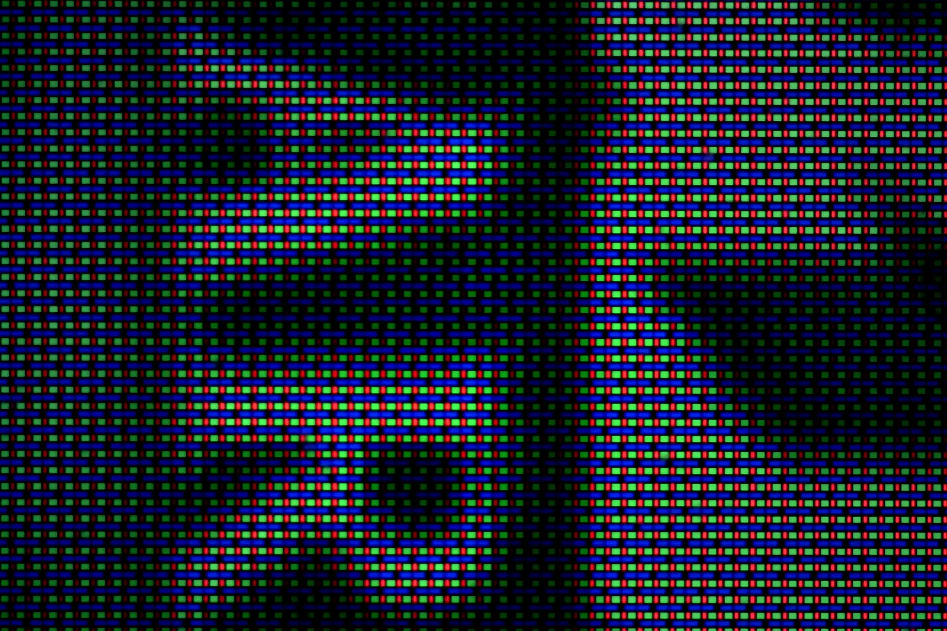
How does Pointillism relate to a digital pixel? A pixel is a discrete colour unit that blends optically with its neighbours to form a continuous image, exactly the mechanism Seurat systematised by hand. RGB sub-pixels on a screen are performing Pointillist colour mixing at a scale too small to see the individual dots.
Did Roy Lichtenstein revive Pointillism? Not directly. Lichtenstein enlarged Ben-Day dots, the halftone dots used in comic-book printing, to a monumental scale, making the reproductive process itself the subject. Where Seurat wanted the dots to disappear into colour, Lichtenstein wanted them emphatically visible, an ironic reference to mechanical reproduction rather than a return to optical mixing.
Who kept practising Pointillism after Seurat? Paul Signac carried the technique for decades after Seurat’s death in 1891, developing larger dots and brighter colour, and painters including Maximilien Luce, Henri-Edmond Cross, and Théo van Rysselberghe applied it to industrial, decorative, and portrait subjects, respectively.
| Fact | Detail |
|---|---|
| Origin | Paris, mid-1880s |
| Founders | Georges Seurat (1859 to 1891), Paul Signac (1863 to 1935) |
| Also called | Divisionism, Neo-Impressionism |
| Colour science sources | Michel Eugène Chevreul, “The Law of Simultaneous Contrast of Colours” (1839); Ogden Rood, “Modern Chromatics” (1879) |
| Defining work | “A Sunday Afternoon on the Island of La Grande Jatte”, Georges Seurat, 1884 to 1886, Art Institute of Chicago |
| Signac’s key text | “D’Eugène Delacroix au Néo-impressionnisme” (1899) |
| Direct descendants | Halftone printing, CMYK colour separation, digital pixels |

Pixel art is a raster art form built square by square on a fixed, visible grid, at a resolution low enough that every pixel is a deliberate decision rather than a technical accident.
Read it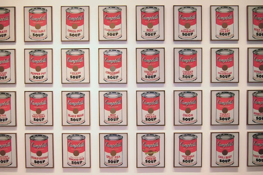
Pop Art is the movement that took commercial imagery- the soup can, the comic panel, the celebrity photograph- and treated it as fit subject matter for fine art, rendered flat, bright and mechanically precise.
Read it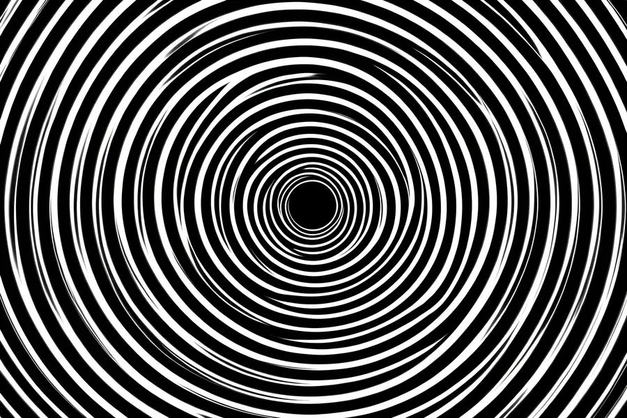
An optical illusion is a visual pattern that reliably makes the brain construct a percept that contradicts the physical stimulus: a line that is not really longer, a surface that does not really move, a figure that is not really three-dimensional.
Read it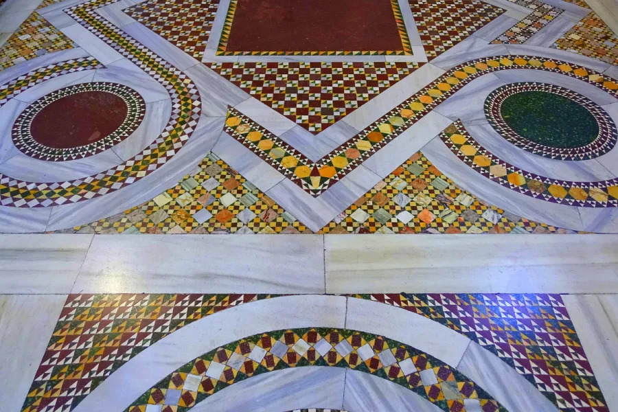
Tessellation is the covering of a plane with shapes that meet edge to edge, with no gaps and no overlaps, and it follows a small, provable set of mathematical rules rather than taste.
Read it
Colour theory is the study of how colours relate to each other on the wheel, across value, saturation, and temperature, and in combination so that you can reason through a decision rather than feel it.
Read it