

2026-09-15
Nural Choudhury
Baroque design is a dramatic, ornamented style that used scale, contrast, and movement to overwhelm the viewer emotionally rather than persuade them rationally.
It flourished from the early seventeenth century through the mid-eighteenth, first in Rome and then across Catholic and royal Europe. Where its lighter heir, Rococo, is playful, pastel, and intimate, Baroque is heavy, saturated, and built to intimidate: Rococo softened the Baroque into a drawing-room style, but Baroque itself was built for cathedrals and thrones.
deep reds, royal blues, and abundant gold against dark grounds; dramatic single-source lighting; spiralling diagonal composition; dense acanthus and floral ornament; and ornate serif type with heavy swashes and high stroke contrast.
Rome, late sixteenth century, as the Catholic Church’s answer to the Protestant Reformation, then adopted by absolute monarchs, above all Louis XIV at Versailles, as a language of political power.
luxury branding with heritage associations, immersive or theatrical environments, and any project that needs to communicate authority and emotional weight rather than clarity or restraint.
The Baroque emerged in Rome in the late sixteenth century as the visual arm of the Catholic Counter-Reformation. The Council of Trent, which sat from 1545 to 1563, held that religious art should instruct and move the faithful, not merely illustrate scripture. While Protestant churches stripped imagery back to plain rooms centred on the word, Catholic patrons commissioned art and architecture designed to overwhelm the senses and bind believers to the Church through feeling rather than argument.
The style quickly became the preferred language of absolute monarchy and the Church. Louis XIV of France used Baroque grandeur at Versailles, built between 1661 and 1715, to make royal authority visible at overwhelming scale. The Hall of Mirrors there multiplies seventeen windows across three hundred and fifty-seven mirrors, and its painted ceiling extends the room into an illusionistic sky, so architecture, decoration, and light were coordinated into a single overwhelming environment rather than treated as separate crafts. The association the palace established between style and power has stayed with it: Baroque design communicates not just wealth but dominance, and it asks the viewer to feel small in front of it.
Painters gave the style its two most exportable techniques. Michelangelo Merisi da Caravaggio (1571 to 1610) placed figures against near-black backgrounds lit by a single strong source, establishing the extreme, tenebristic end of Baroque lighting. Peter Paul Rubens (1577 to 1640) built large compositions around spiralling, diagonal movement that guides the eye through a scene while holding it together tonally. Both remain the reference points for how the style handles light and composition.
To understand what the Baroque was doing, it helps to see what it was reacting against. The Renaissance had built its aesthetics on rational proportion, balanced composition and even light that revealed form clearly. Baroque designers knew those Renaissance principles well and broke them on purpose: dynamic asymmetry instead of balance, selective dramatic light instead of even illumination, ornament that overwhelmed structure instead of serving it. The trade was serenity for intensity and clarity for revelation.

| Element | What this style does | The tell |
|---|---|---|
| Colour | Deep, saturated hues, above all reds, royal blues, greens and gold, set against dark grounds for maximum contrast | Gold is used abundantly and structurally, not as an accent, and communicates material wealth as much as light |
| Form and shape | Curves drawn from organic movement (a shell’s spiral, a wave’s curl) replace the compass-drawn arc, and diagonals dominate over horizontal or vertical stability | Asymmetry that still balances, through weight rather than mirroring: a strong diagonal countered by a contrary curve |
| Typography | Ornate serif letterforms with elaborate swashes and high contrast between thick and thin strokes, with decorative initials and ornamental borders folded into the composition | Display type is oversized and heavily decorated while body text stays functional, so the hierarchy itself is dramatic |
| Light and shadow | Chiaroscuro: light is used selectively to create psychological effect, not evenly to reveal form. Its extreme form, tenebrism, lets darkness dominate while a single implied source illuminates only part of the scene | Figures appear to emerge from near-black shadow, with the lit portion reading as heightened by the surrounding dark |
| Ornamentation | Acanthus scrolls, floral garlands, putti, allegorical figures and cartouches combine at high density with almost no bare ground | Horror vacui: filled space signals value and sustained attention, so empty space reads as indifference rather than restraint |
| Depth and illusion | Trompe l’oeil and painted ceilings dissolve the boundary between the real room and the depicted space | Ceilings that appear to open onto sky, and painted architecture that extends a real room into an illusionistic one |

| Neighbour | What it shares | What separates them |
|---|---|---|
| Rococo | Ornamental richness, asymmetry, curved and organic form | Rococo lightens the palette to pastels, shrinks the scale, and swaps awe for charm. It followed Baroque in the early eighteenth century and domesticated it for drawing rooms rather than cathedrals and palaces |
| Tenebrism | The same dramatic, selective use of light against dark | Tenebrism is a lighting technique within the Baroque period, not a separate style. It names the extreme end of chiaroscuro, where darkness dominates the whole composition and the light source is implied rather than shown |
| Neoclassicism | A shared historical hinge: one defines itself against the other | Neoclassicism rejected the Baroque on principle, in the late eighteenth century. It replaced dynamic asymmetry with rational balance, dense ornament with deliberate restraint, and emotional appeal with an address to intellect |
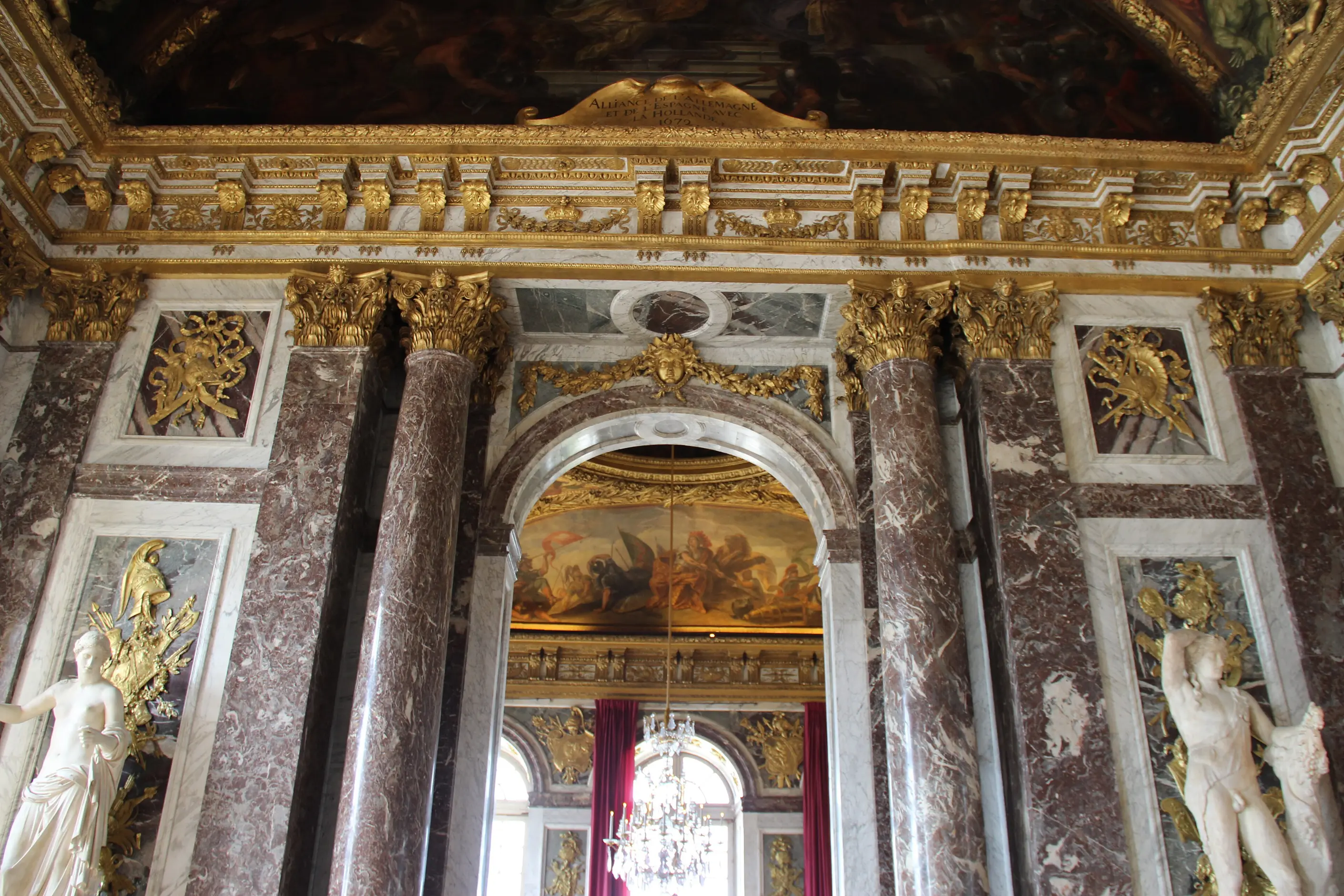
Let drama drive every compositional decision. Arrange for tension and energy, not calm balance, and treat asymmetry as the default, not an exception.
Commit to rich, saturated colour and strong tonal contrast. Avoid the neutral palettes that read as Modernist restraint, and use gold or metallic elements deliberately where you want a premium or heritage association.
Light the work selectively rather than evenly. A single strong source, deep shadow and a clear focal point carry more Baroque character than any amount of added ornament.
Choose serif type with ornamental potential and push the contrast between display and body text hard. Decorative initials, swashes and ornamental borders should read as part of the composition, not as afterthoughts bolted on.
Transform the whole composition, not just its surface. Ornament applied to an otherwise Modernist grid reads as pastiche: it must grow out of an asymmetrical, dynamic structure or it will look stuck on. If your palette is pastel and your scale is intimate, you are reaching for Rococo, not Baroque, and should name it as such.
The Baroque’s association with absolute power is not incidental to the style, and it is worth stating plainly. It was developed to make religious and monarchical authority feel overwhelming and to make the individual viewer feel small before it. The same techniques that create awe can create intimidation, and the same richness that signals genuine quality can mask a lack of it. Anyone borrowing the style for contemporary luxury branding is also borrowing that history of persuasion, and should use it deliberately rather than by accident.
The most common execution failure is applying dense ornament to a fundamentally Modernist or minimalist composition. The decoration reads as applied rather than integrated, because Baroque ornament depends on an asymmetrical, dynamic structure to sit inside. A second common failure is confusing Baroque with Rococo: pastel colour and a light touch belong to Rococo’s later, gentler register, and using them while claiming Baroque intensity produces neither. On screen, dense ornament, heavy contrast, and layered depth effects also collide with real constraints: loading performance, responsive layout, and accessibility requirements for contrast all push back against the style’s historical excess, and a workable digital Baroque has to negotiate those limits rather than ignore them.
Is Baroque the same as Rococo? No. Rococo grew out of Baroque in the early eighteenth century but lightened its palette, reduced its scale and swapped grandeur for charm. A pastel, playful piece with light ornament is Rococo; a dark, saturated, monumental one is Baroque.
Is tenebrism its own style? No. Tenebrism is the end of Baroque chiaroscuro, where darkness dominates a composition and a single implied light source picks out select elements. It belongs to the Baroque toolkit rather than standing apart from it.
When does Baroque work for a contemporary brief? When a project needs emotional weight, heritage association or an immersive, theatrical effect, most often in luxury branding, hospitality or experiential design. It works against you on anything that needs functional clarity, democratic accessibility or a youthful, contemporary tone.
Why does Baroque use so much gold? Gold carried both a material and a symbolic charge in the period: it signalled real wealth and, in religious settings, spiritual significance, and its reflective surface shifts constantly under changing light. Contemporary use of metallic elements draws on the same association with premium positioning.
What is the single biggest mistake designers make with Baroque references? Adding ornamental detail to an otherwise balanced, Modernist composition instead of building the whole structure around drama and asymmetry from the start. Ornament placed on top of a calm grid looks applied, not authentic.
| Fact | Detail |
|---|---|
| Origin | Rome, late sixteenth century, as visual expression of the Catholic Counter-Reformation |
| Defining period | Early seventeenth century through the mid-eighteenth century |
| Doctrinal trigger | Council of Trent, 1545 to 1563 |
| Key political patron | Louis XIV of France, Palace of Versailles, built 1661 to 1715 |
| Defining lighting technique | Chiaroscuro, associated with Michelangelo Merisi da Caravaggio (1571 to 1610) |
| Defining compositional dynamism | Peter Paul Rubens (1577 to 1640) |
| Successor style | Rococo, early eighteenth century |
| Reaction against it | Neoclassicism, late eighteenth century |

Rococo is the light, asymmetrical, pastel decorative style that flourished in French interiors, furniture and painting from around 1720 to 1780.
Read it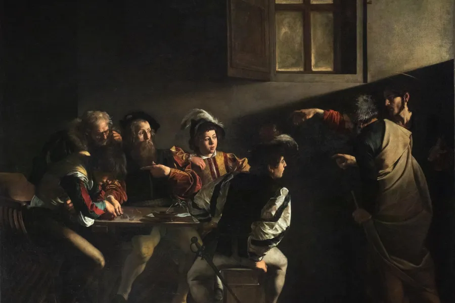
Tenebrism is a technique of extreme light-dark contrast, developed by Caravaggio in Rome in the 1590s, in which a figure emerges from near-total darkness under a single, focused light source.
Read it
Neoclassicism is the design language of Enlightenment rationalism: geometric form, bilateral symmetry, architectural neutrals and high-contrast serif type, applied from the 1760s through the mid-nineteenth century to argue that good design discovers universal order rather than invents personal expression.
Read it
Victorian design is the ornate, eclectic visual culture of Britain and its export markets during Queen Victoria’s reign, 1837 to 1901, when steam-powered printing and chromolithography made heavy ornament affordable to a middle class that had never been able to buy it before.
Read it
Gothic design is the pointed-arch, vertically emphasised architecture, manuscript illumination and decorative art of Latin Christian Europe, built from the 1140s to the early sixteenth century around stained glass, tracery, and dramatic light.
Read it
Art Deco is a design style of the 1920s and 1930s built on geometric precision, symmetrical order and luxury materials, applied across architecture, graphic design and objects.
Read it
Layout is the arrangement of elements inside a frame: what a viewer sees first, second, and third, and what the space between things does as they look.
Read it
Typography is the craft of shaping and spacing type so readers can recognise its letters and follow its meaning without friction.
Read it
Colour theory is the study of how colours relate to each other on the wheel, across value, saturation, and temperature, and in combination so that you can reason through a decision rather than feel it.
Read it
A design system is a governed set of reusable components, patterns and rules that a team uses to build consistent digital products at scale, and it is neither a static style guide nor a component library on its own.
Read it