
2026-09-15
Nural Choudhury
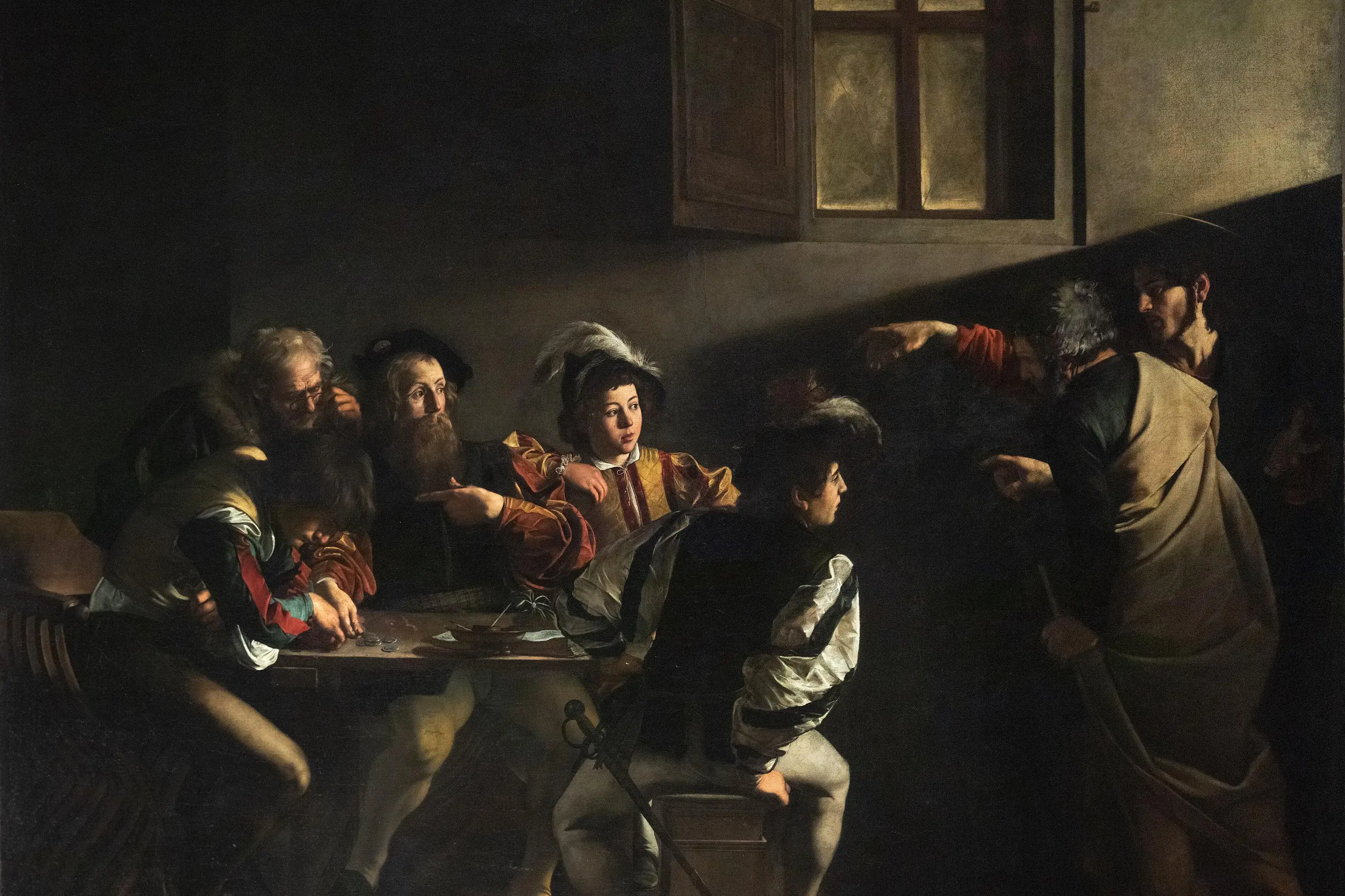
Tenebrism is a technique of extreme light-dark contrast, developed by Caravaggio in Rome in the 1590s, in which a figure emerges from near-total darkness under a single, focused light source.
It is narrower than chiaroscuro, the general term for using tonal contrast to model three-dimensional form: chiaroscuro spans the full range from soft modelling to hard fall-off, while tenebrism commits to one extreme of that range, near-black grounds, minimal midtones and a single beam that reveals a subject rather than shading it. Within Baroque painting, it is one lighting device among several, not the period’s whole visual language, and plenty of Baroque work is lit evenly and brightly.
a background pushed to near or full black, one directional light source, a hard rather than gradual edge where light meets shadow, and almost no middle tones. The subject appears isolated, with no visible room, horizon or setting around it. Colour, where it survives at all, concentrates in the lit area; the shadow runs close to neutral.
Rome in the 1590s, through Caravaggio, then across Italy, the Netherlands, Spain and France through the seventeenth century as his followers adapted the technique.
photography, film, and branding that need focused, theatrical drama; isolation of a single subject; or a signal of premium intensity. It does not suit dense information or a friendly, approachable tone.
Michelangelo Merisi da Caravaggio arrived in Rome in the 1590s and developed a way of painting figures materialising from near-total darkness, illuminated by a single strong source, without the preliminary drawing and idealised staging his contemporaries relied on. He worked from live models in darkened studios with directed light, and applied the result to religious subjects: The Calling of Saint Matthew uses light as an act of divine intervention, Judith Beheading Holofernes uses the same contrast for violence, and The Entombment of Christ for sacred grief. The technique drew on theatre, where a spotlight isolates a performer against a dark stage.
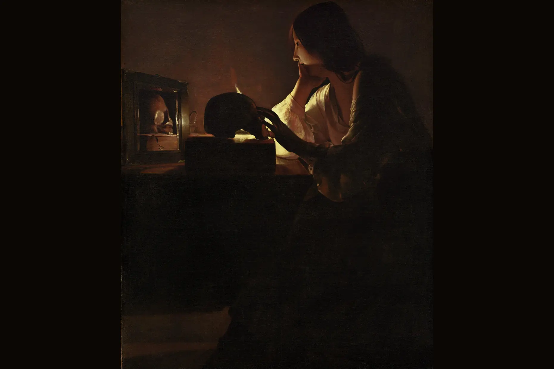
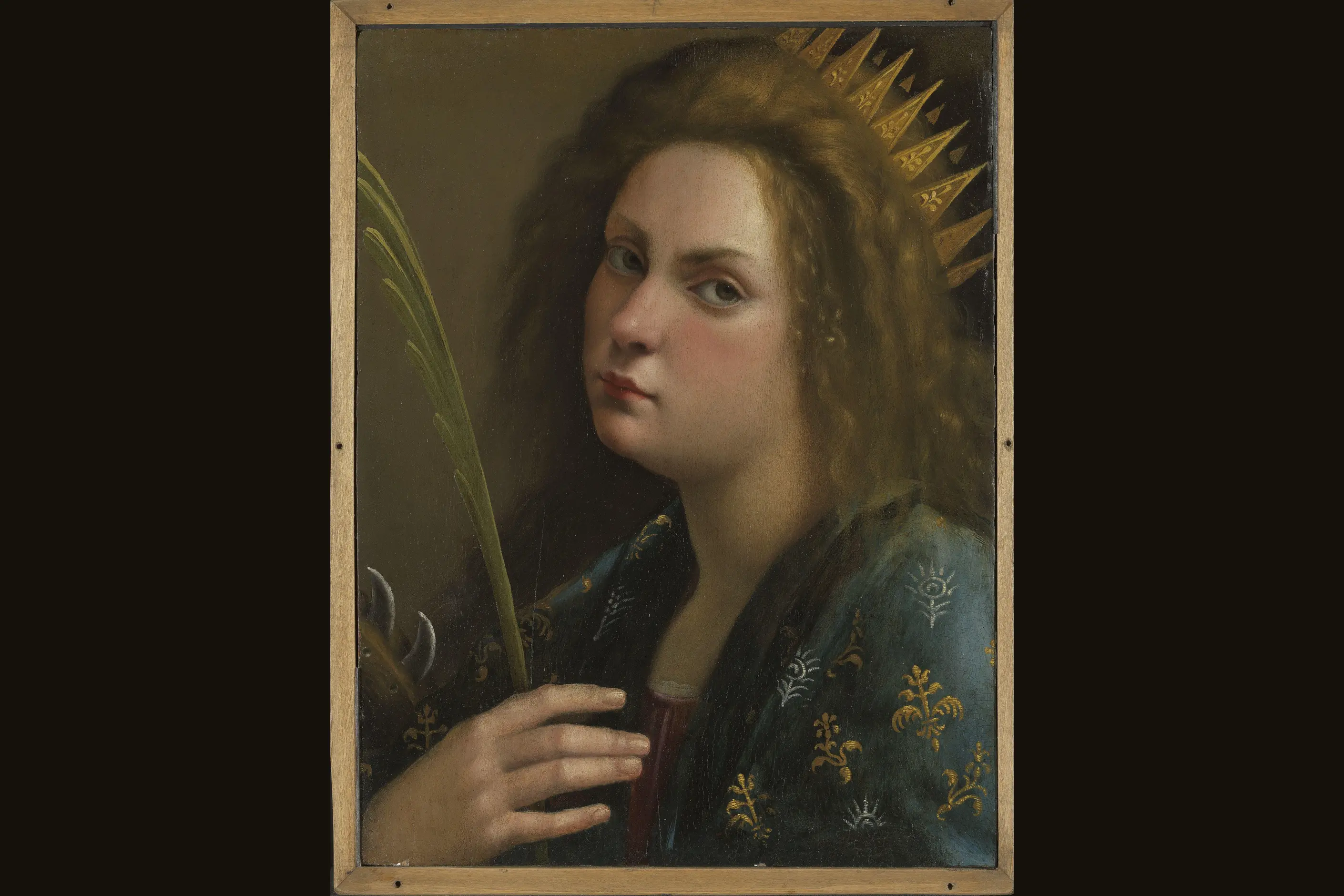
Caravaggio’s approach spread through painters who became known as the Caravaggisti. In Italy, Orazio Gentileschi, his daughter Artemisia Gentileschi and Giovanni Baglione adopted the contrast while developing their own variations. Dutch painters who had studied in Rome, including Gerrit van Honthorst, Hendrik ter Brugghen, and Dirck van Baburen, carried it to Utrecht, where it fed into the Dutch Golden Age and influenced Rembrandt. In Spain, Jusepe de Ribera and Francisco Ribalta absorbed the technique, with Velázquez and Zurbarán working in its wake. In France, Georges de La Tour developed a distinctive strand built around candlelit scenes and geometric simplification.
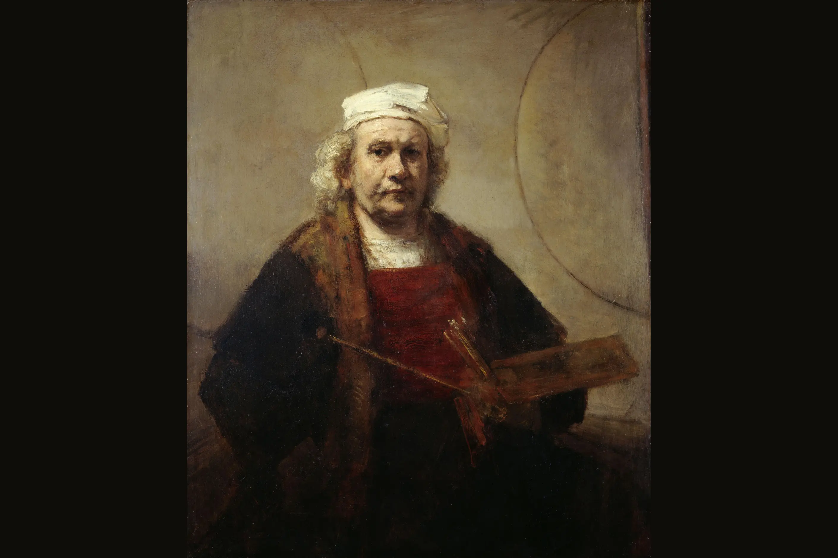
Rembrandt was never strictly a tenebrist: his later light is warmer and his tonal range wider, closer to chiaroscuro than to tenebrism’s extremes. Nineteenth-century Romantic painters, Turner and Géricault among them, revived dramatic contrast for emotional and sublime effect. Early photography, constrained by available technology, favoured high contrast by necessity before it became a choice. Film noir and German Expressionist cinema carried tenebrist lighting logic directly into moving pictures, and it remains visible in genre film and prestige television today.
| Element | What tenebrism does | The tell |
|---|---|---|
| Light | Uses a single, strong, directional source, often implied outside the frame | Shadow edges are hard, not gradual; there is one clear direction the light comes from |
| Shadow and ground | Pushes backgrounds and unlit areas to near or full black | Little or no detail survives once you leave the lit zone |
| Colour | Concentrates saturation in the lit subject and lets shadow run close to neutral | Colour reads as belonging only to what the light touches |
| Composition | Isolates the subject against an unbroken dark field, with context removed | No visible room, horizon or setting, only the figure and the void |
| Surface and material | Uses matte, light-absorbing grounds and negative fill to keep the dark deep | Sets, props and interfaces avoid glossy or reflective surfaces that would lift the black |
| Graphic and typographic use | Reserves text or interface elements for the lit zone and leaves the rest dark | Type or content sits inside the pool of light rather than spreading across the whole frame |
| Neighbour | What it shares with tenebrism | What separates them |
|---|---|---|
| Baroque design | Theatrical drama, heightened emotion, and the period tenebrism grew up inside | Baroque is a full compositional and ornamental programme: diagonal movement, gilding, elaborate ornament. Tenebrism is one lighting device Baroque painters used, not the movement’s whole visual language, and much Baroque work is lit evenly |
| Chiaroscuro | The basic mechanism of using light and dark to reveal form | Chiaroscuro spans a full tonal range for modelling volume, from soft transitions to hard fall-off. Tenebrism sits at its most extreme end: near-black grounds, minimal midtones, background elimination. Every tenebrist image uses chiaroscuro; most chiaroscuro is not tenebrist |
| Expressionism in design | Emotional intensity delivered through visual extremity | Expressionism distorts form, colour and line to externalise feeling. Tenebrism keeps form and colour naturalistic and builds its intensity from the physics of light alone, without distorting the subject |
Commit to the darkness before you touch anything else. You must push backgrounds and unlit areas to genuine near-black, not grey or murky: an undercommitted dark reads as a mistake, not a technique.
Decide what the single subject is before you light it. Tenebrism works through one focal point; splitting attention across several equally lit elements defeats the technique’s purpose.
Use one directional light source and add fill only if the shadow becomes entirely featureless. Negative fill, dark and non-reflective surfaces placed to absorb stray light, deepens the black without a second visible source.
Reserve tenebrism for content that can carry its weight: luxury goods, portraiture, editorial and cinematic work, and moments that need to feel significant. Do not reach for it on content that needs to show many elements clearly, or on a brand that needs to read as approachable rather than serious.
Treat a dark colour scheme and tenebrism as different things. A dark-mode interface that spreads even, low-contrast illumination across the whole screen is not tenebrist; it borrows the palette without the single-source logic that makes the technique work.
The most common failure is purposeless drama: applying extreme contrast to a subject that does not warrant theatrical treatment, which reads as an empty signifier of luxury rather than an earned effect. The second is technical undercommitment, shadows that land grey rather than black, producing murk instead of drama.
A tenebrist image can also lose its subject rather than reveal it, letting the figure disappear into the dark it was meant to emerge from. The technique does not scale to information density: anything that needs a viewer to read several elements at once fights the isolation tenebrism is built to create. And it conflicts directly with a friendly or accessible brand tone, since its whole grammar is concealment, intensity and selective revelation rather than openness.
The most persistent contemporary misuse is naming. Any sufficiently dark interface or photograph gets called tenebrist, when the label fits only work built on directional light, a genuine near-black ground, and a subject that visibly emerges from it.
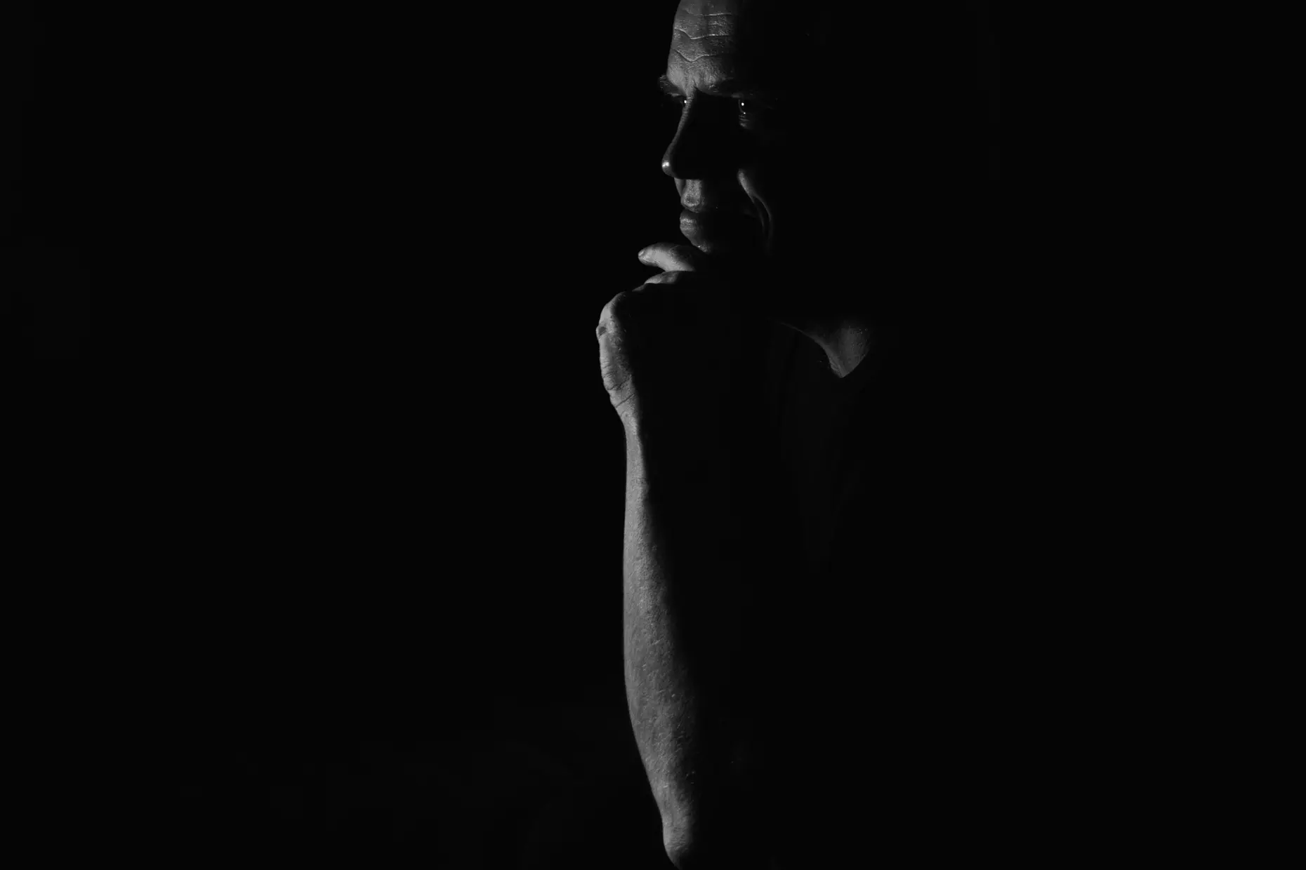
No. Chiaroscuro is the general technique of using light and dark tones to model form, and it covers a wide range from soft transitions to hard contrast. Tenebrism is the end of that range: near-black grounds, almost no midtones, and a background stripped away entirely.
Did Caravaggio invent tenebrism? He is the painter credited with developing it in Rome in the 1590s and giving it its dramatic force. A generation of followers, known as the Caravaggisti, carried the technique across Italy, the Netherlands, Spain and France, each adapting it to their own subjects.
Yes. The same physics- a single directional source, hard fall-off and a dark ground- translate directly into portrait and product photography, into film noir and genre cinematography, and into editorial and brand imagery that wants to isolate a subject with drama.
Is a dark-mode interface tenebrist? Not on its own. Dark mode is a colour choice, usually with even, low-contrast illumination across the whole surface. Tenebrism requires a directional light logic, a genuine near-black ground and a subject that reads as emerging from it, not just a dark background colour.
When should you avoid tenebrism? When the content needs to show several elements at once, since isolation and concealment work against legibility, and when the brand or message needs to read as approachable rather than serious. The technique communicates intensity, and intensity is not always the right register.
| Fact | Detail |
|---|---|
| Originator | Michelangelo Merisi da Caravaggio |
| Origin | Rome, 1590s |
| Broader term | Chiaroscuro, of which tenebrism is the extreme, near-monochrome end |
| Period | Baroque, with revivals in Romantic painting and continuous use in photography and film |
| Key works | The Calling of Saint Matthew, Judith Beheading Holofernes, The Entombment of Christ |
| Caravaggisti, Italy | Orazio Gentileschi, Artemisia Gentileschi, Giovanni Baglione |
| Caravaggisti, Utrecht | Gerrit van Honthorst, Hendrik ter Brugghen, Dirck van Baburen |
| Caravaggisti, Spain | Jusepe de Ribera, Francisco Ribalta |
| Caravaggisti, France | Georges de La Tour |
| Later influence | Rembrandt, Romantic revival through Turner and Géricault, film noir, German Expressionist cinema |

Baroque design is a dramatic, ornamented style that used scale, contrast, and movement to overwhelm the viewer emotionally rather than persuade them rationally.
Read it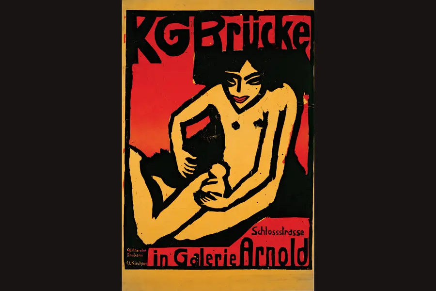
Expressionism is a design vocabulary of distortion in service of feeling rather than accuracy: elongated forms, non-naturalistic colour, raw carved texture, and compressed space, developed in Germany and Austria in the years before and after the First World War.
Read it
Gothic design is the pointed-arch, vertically emphasised architecture, manuscript illumination and decorative art of Latin Christian Europe, built from the 1140s to the early sixteenth century around stained glass, tracery, and dramatic light.
Read it
Minimalism in design reduces a composition to the elements it cannot function without, so colour, form, type, and space each carry more weight because there is less to look at.
Read it
Colour theory is the study of how colours relate to each other on the wheel, across value, saturation, and temperature, and in combination so that you can reason through a decision rather than feel it.
Read it