

2026-09-15
Nural Choudhury
A variable font is a single file that stores a continuous range of a typeface’s design, so weight, width, slant and other properties become numbers you set precisely rather than named styles you pick between.
This page covers using variable font technology to create responsive, efficient and animated letterforms that adapt to context. Typography basics covers the fundamentals underneath it: type anatomy, legibility, hierarchy and spacing, so it is not repeated here.
One font file that replaces a shelf of static weights and widths, adapts continuously to viewport and reading conditions, and animates between states without a jump cut between files.
Responsive headlines and body text, brand systems that need many weights without many files, and interface feedback where the type itself signals a state change.
Choose axis values for what they mean to the reader, not because the font exposes them. Optical size is the axis people skip, and skipping it is why display type looks thin and loose at caption size.
Type designers had interpolated between master drawings for years before the practice had a shared file format. The OpenType 1.8 specification, published in 2016, defined the variation tables that let one file hold that continuous design space instead of one file per style.
Adobe, Apple, Google, and Microsoft developed it jointly, then committed their platforms to it, which is why the format spread so quickly. Support has kept broadening across browsers, operating systems, and design tools, though it isn’t universal in every context, so it’s still worth planning a fallback.

A type designer draws master designs at the extremes of each axis: the lightest weight and the heaviest, the narrowest width and the widest. The file stores those masters plus the mathematics to interpolate between them, so a request for weight 450 with masters at 400 and 500 produces a calculated in-between letterform rather than a stored one. Every value between the extremes is generated on request, not drawn in advance, which makes the range continuous.
Variation happens along axes, and the specification registers five with standard behaviour.
| Axis | Tag | What it varies | What to watch |
|---|---|---|---|
| Weight | wght | Stroke thickness, from hairline near 100 through regular at 400 to black near 900 | Interpolation quality can drop near the extremes; test the values the design uses, not just 400 |
| Width | wdth | Horizontal proportion; 100 is normal, below is condensed, above is expanded | Extreme condensed settings can close counters and hurt legibility at small sizes |
| Slant | slnt | Oblique angle in degrees, applied to the upright design | Slant tilts the existing letterforms; it is not a true italic and reads differently from one |
| Italic | ital | A switch, sometimes continuous, between the upright design and a separate italic drawing | A continuous italic axis left mid-range can strand text in a half-italic state |
| Optical size | opsz | The drawing itself, redrawn for the size it renders at rather than scaled | The axis people skip; skip it and an 8-pixel caption inherits the drawing meant for an 80-pixel headline |
Type designers can add custom axes beyond the five registered ones. Grade, tagged GRAD is the most common: it shifts visual weight without changing character widths, so a layout built on one grade value keeps its line breaks at another. A custom axis has no shared registry defining what it does, so check the specific font’s documentation before you rely on one.
A single variable file often weighs less than the static weights it replaces, because interpolation stores the range mathematically instead of storing every style as a separate drawing. Loading one file instead of four or five also cuts the requests a page has to make, which matters most on a slow connection. That saving isn’t automatic: a variable font carries data for every axis it defines whether you use it or not, so a font with axes a project ignores can lose the size advantage the format promises.

Set an axis with font-variation-settings, which takes any axis tag and a numeric value: font-variation-settings: ‘wght’ 500, ‘wdth’ 85;. For the five registered axes, use the matching standard CSS property where you can instead; font-weight: 450; sets the weight axis without touching font-variation-settings directly, and it degrades more gracefully on a font that lacks the axis. Reach for font-variation-settings for slant, optical size or any custom axis, since none of those has a dedicated property.
Store the values you use as CSS custom properties rather than as literals scattered through a stylesheet. That gives you one place to change a value and one place to read it back when you check what a component is doing at a given breakpoint.
Scale weight or width with the viewport by writing the axis value as a clamp() against the same custom property that drives your fluid type size, so the two move together instead of independently. You must check the calculated value at both ends of its range, because a formula that looks right at the midpoint can push an axis past the point where the font holds its quality. Where a variable font ships an automatic optical size, let the browser apply it by rendered size rather than fighting it with a fixed value.
Animate an axis the way you animate any other CSS property: name font-variation-settings in a transition or an animation, and the browser interpolates the frames in between. Pick the timing the way you pick timing for any motion; animation principles have their own easing curves and duration bands, so use their guidance rather than a value chosen by feel. Respect prefers-reduced-motion for an axis animation exactly as you would for a transform, because a shifting typeface reads as motion to a user who asked for less of it.
Animating a variable axis costs more per frame than animating opacity or a transform, because the browser recalculates glyph outlines instead of compositing an existing layer. Test an animated axis on the slowest device your audience uses, not the machine on your desk, before you ship it as a default rather than a light enhancement.

Take a page heading that needs more visual weight on a wide desktop viewport than it needs on a phone, without loading a second font file for the difference. Set the weight axis through a custom property, --heading-weight and drive it with a clamp() between 500 at the narrowest supported viewport and 650 at the widest, tied to the same breakpoint logic as the heading’s font size. Apply the property through font-variation-settings: 'wght' var(--heading-weight); on the heading rule alone, so the rest of the page keeps one predictable weight.
Check the result at three widths, not two: the narrowest, the widest and a point in between, because a linear clamp() can land on a mid-range value the font renders less cleanly than either endpoint. If it does, adjust the clamp’s bounds instead of accepting the dip. The axis exists so you choose the value; it should not choose one for you by accident.
The mistake I see most often is loading the full variable file when a project only ever calls two weights. A variable font’s size scales with the range it stores, so if a brand only ever uses regular and semibold, two static files are usually smaller, and always simpler, than one variable file carrying axes nobody touches.
The second is animating an axis because it can move, not because the movement says anything. A weight that pulses on hover for no reason reads as decoration; a weight that shifts because a button just became active reads as feedback. If I cannot name the state change an animation communicates, I cut the animation.
The third is treating a variable font as one drawing at every size and leaving optical size unset. Set opsz low for an 8-pixel caption and high for an 80-pixel headline and let the font redraw itself for each. Leave it unset, and the caption inherits the headline’s proportions: heavier strokes and wider spacing than a small size needs.
A single font file that stores a continuous range of a typeface’s design, so weight, width and other properties are numbers you set rather than named styles you pick between.
No. You can set every axis value from CSS alone; a design tool only matters if you are drawing or editing the masters yourself, and that is the type designer’s job, not the implementer’s.
Does a variable font always load faster than static weights? Only if the axes it carries are the ones the project uses. A file with five axes when a project needs one is not smaller than two well-chosen static weights, so check the file size rather than assume the format wins by default.
Can I animate a custom axis the same way as a registered one? Yes. font-variation-settings accepts any axis tag the font defines, registered or custom, and the browser interpolates it the same way regardless of type.
The standard CSS properties, such as font-weight, still resolve to the nearest fixed value the browser can render, so plan a sensible static fallback rather than assume universal support.
| Fact | Detail |
|---|---|
| Governing specification | OpenType 1.8, published 2016 |
| Joint developers | Adobe, Apple, Google, and Microsoft |
| Registered axes | Five: weight (wght), width (wdth), slant (slnt), italic (ital), optical size (opsz) |
| Common custom axis | Grade (GRAD): shifts visual weight without changing character widths |
| Primary CSS property | font-variation-settings, for any axis tag |
| Standard CSS shorthand | font-weight maps directly to the wght axis on a variable font |
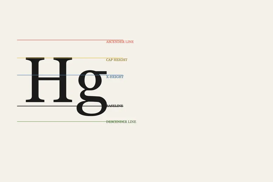
Typography is the craft of shaping and spacing type so readers can recognise its letters and follow its meaning without friction.
Read it
Type design is the practice of drawing a typeface: a coherent system of letterforms, numerals, punctuation, and symbols built to work together across combinations their designer cannot predict in advance.
Read it
Display typography is set large enough that individual letterforms function as graphic elements rather than as carriers of continuous prose.
Read it
Animation principles are the small set of rules, developed for hand-drawn character animation, that make movement read as caused by weight and intent rather than as an arbitrary jump between two states.
Read it
Luxury typography is the practice of choosing and setting type so a brand reads as exclusive, established and refined before a viewer processes a single word.
Read it