

2026-09-15
Nural Choudhury
Display typography is set large enough that individual letterforms function as graphic elements rather than as carriers of continuous prose.
It appears in headlines, posters, signage, and branding, where a viewer takes in a whole word or line at a glance rather than reading it over time. That is a different job, and it carries the opposite priority: display type puts visual impact and immediate impression first, ahead of the extended readability that governs body copy.
This page covers using large-scale letterforms as primary graphic elements to command attention in headlines, posters, signage, and branding: how optical sizing, detail resolution at scale, and the historical development of display faces shape that work. Typography basics own type anatomy, legibility, hierarchy, and spacing, the fundamentals that apply at any size, and I do not repeat them here. Luxury typography owns the prestige register within display work, the restraint and material cues that signal quality; this page is the wider craft it sits inside.
the ability to choose and set type that reads as intended at poster or headline scale, where flaws invisible in a twelve-point paragraph become the whole message.
headlines, posters, signage, wordmarks, and any composition where type is the primary graphic element rather than a container for reading.
choose or licence a genuine display cut, or test the text cut at the actual output size, before you touch tracking or colour. Most display type failures start with a typeface never designed to be enlarged.
Display typography grew out of nineteenth-century commercial printing. Growing trade demanded type that could compete in a crowded street of posters and shop signs, and typefounders answered with fat faces; extreme, Bodoni-style contrast pushed to an attention-grabbing edge; heavy Egyptian and slab serifs; and a wave of decorative inline, outline, and shadowed variants. Wood type, cut in large sizes because metal type of that size was impractical, gave posters their own coarse-grained character.
Art Nouveau, around the turn of the twentieth century, turned display letters into illustration: flowing, whiplash curves and botanical ornament that made the poster artists Toulouse-Lautrec, Mucha, and Chéret as much typographers as painters. Modernism reversed the mood.
The Bauhaus and the Swiss International Style built display letterforms from circles, squares, and grid relationships, and sans-serifs such as Futura, Helvetica, and Univers became the movement’s display faces, prized for order over ornament. Phototypesetting then let designers compress, stretch, and overlap letters in ways metal type never allowed.
The late twentieth century broke the rules again. David Carson and Neville Brody treated display type as expression before communication, trading conventional legibility for mood. Desktop publishing, and more recently variable font technology, put that same freedom in front of any designer, so a single font file can now shift continuously between a cautious text weight and an extreme display one.
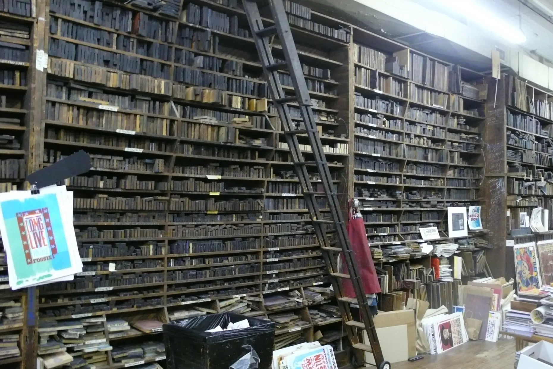
Text type is built to disappear: a reader should absorb the words without noticing the letters. Display type does the opposite.
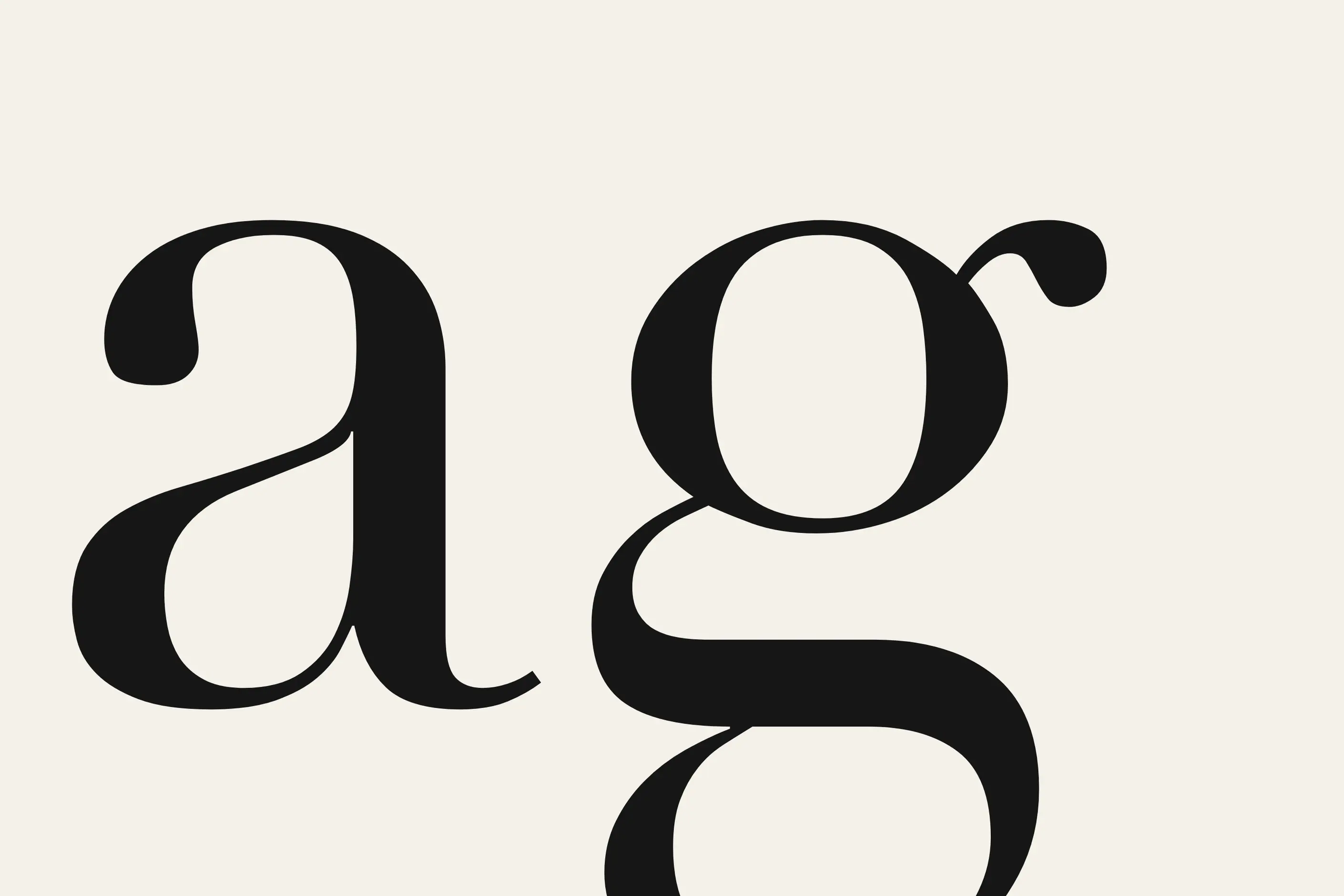
At a metre high, or across a room, the curve of a bowl, the angle of a terminal, and the contrast between thick and thin strokes are no longer background noise. They are the design.
Many type families ship several optical sizes cut for exactly that difference, and choosing the wrong one is the most common display failure I see.
| Optical size | Built for | Typical treatment |
|---|---|---|
| Display cut | Headlines, posters, signage | Tighter spacing, higher stroke contrast, refined fine detail |
| Text cut | Body copy, extended reading | Sturdier strokes, open spacing, moderate contrast |
| Caption cut | Small print, captions, footnotes | Open counters, minimal contrast, generous spacing |
A variable font can move continuously between these cuts instead of jumping between fixed ones, which helps when the same word runs from a mobile headline to a poster.
Detail resolution works the other way around from optical sizing: elements invisible at text size become the character of the face at display size.
| Detail | What becomes visible at scale |
|---|---|
| Terminals | Rounded, squared, pointed, or tapered stroke ends |
| Curves | Geometric, organic, tense, or relaxed curve quality |
| Stroke contrast | The relationship between thick and thin strokes |
| Serifs | Hairline or bracketed, horizontal or angled, prominent or subtle |
Spacing changes too. Tracking that reads correctly in a paragraph looks loose once the same face is set at ten times the size, because the eye now measures the gaps between letters rather than skimming across them.
Start from purpose, not preference. Ask whether the content is serious, playful, elegant, or urgent, and pick a typeface whose personality matches before you consider anything else.
Use a genuine display cut where one exists. Do not take a text weight and scale it up: test it at the actual output size, on the actual medium, before you commit.
Tighten tracking as size increases. What reads correctly in a paragraph reads loose in a headline, so tighten letter spacing by eye once the type passes text scale, and adjust kerning by hand on the closest pairs.
Check contrast against the background deliberately. On a photograph, a busy sign, or a coloured brand panel, check contrast at the size and distance the type will be seen, not on a laptop screen at arm’s length. Accessibility standards define contrast ratios and testing methods; use them rather than guessing.
Test at scale before production. A screen preview does not tell you how a typeface performs across a street or a shop floor. Print a full-size proof, or view the file at one hundred per cent, before you sign it off.

Take a poster brief for a single-word headline that has to work from across a room. I start by setting the word in the display cut of the chosen family at the actual finished size, not a scaled-up screen mock-up, because that is the only way to see whether the strokes hold their contrast at that scale.
Next I tighten tracking by eye. The kerning that looked right in a ten-point proof usually looks slack once the word fills a metre of wall, so I close the gaps between the widest pairs first, then check the word again at reading distance.
Finally, I check contrast against the actual background the poster will sit on, in daylight if it is an outdoor site, and against the contrast method owned by accessibility standards rather than a rule of thumb. A typeface that passed every test on screen can still fail at the wall.
The mistake I see most often is choosing a typeface at fourteen pixels and approving it on a laptop screen, then enlarging it to two hundred pixels or printing it at poster scale without anyone testing it there. Fine details that read as texture at reading size become clumsy or thin at display size, and by the time anyone notices, the file is already at the printer.
The second is tracking left at text defaults on a headline. Letter spacing tuned for a paragraph looks loose the moment the same face triples in size, and nobody catches it because the difference is invisible in a document and obvious on a wall.
The third is display type that reads at desk distance but not across a room. A typeface tested at arm’s length on a monitor can still fail as signage, because the eye at three metres needs more contrast and simpler shapes than the eye at thirty centimetres. Always test at the distance the type will be read.
What size counts as display? There is no fixed threshold, but type set above roughly eighteen points, or the screen equivalent, usually enters display territory: sizes where fine detail becomes visible and extended reading is not expected.
Can I scale up a text typeface? You can, but it usually looks wrong. Text cuts are built with sturdier strokes and open spacing for small sizes, and enlarging them exposes proportions that a genuine display cut was drawn to avoid.
How much should I tighten tracking at display size? Enough that the word reads as a single unit rather than a row of separate letters, judged by eye at the size and distance the type will be seen, not by a fixed percentage.
Does display type need to meet the same accessibility standards as text? Yes. The contrast ratios and testing method are the same; accessibility standards cover them in full.
What is the difference between display typography and luxury typography? Display typography is the broader craft of large-scale letterforms for impact. Luxury typography is the prestige register within it: the restraint, spacing, and material cues that signal quality rather than volume.
| Fact | Detail |
|---|---|
| Conventional size threshold | Type is generally considered display above roughly eighteen points, or the screen equivalent; there is no fixed boundary |
| Origin | Display type developed in the nineteenth century to meet the demands of commercial advertising and printing |
| Early high-impact designs | Fat faces and Egyptian slab serifs were early high-contrast, high-impact display designs |
| Modernist display faces | Futura, Helvetica, and Univers became dominant sans-serif display faces through the Bauhaus and Swiss International Style |
| Postmodern rule-breakers | David Carson and Neville Brody prioritised expression over conventional legibility in late-twentieth-century display work |
| Variable fonts | Variable font technology allows a single file to move continuously between display and text optical sizes |
| Contrast requirement | Display type must meet the same WCAG contrast requirements as text; see accessibility standards |

Typography is the craft of shaping and spacing type so readers can recognise its letters and follow its meaning without friction.
Read it
Luxury typography is the practice of choosing and setting type so a brand reads as exclusive, established and refined before a viewer processes a single word.
Read it
Digital accessibility is the practice of building products people can use, whatever their permanent, temporary, or situational disability, measured against a published standard rather than opinion.
Read it
A variable font is a single file that stores a continuous range of a typeface’s design, so weight, width, slant and other properties become numbers you set precisely rather than named styles you pick between.
Read it
International typography is the design and setting of text in writing systems other than Latin script: Arabic, Chinese, Devanagari, Cyrillic, Japanese, Korean and hundreds more, each with its own structural logic, calligraphic heritage and technical requirements.
Read it
Motion graphics is design that treats time as a material, alongside space, colour, and type.
Read it