

2026-09-15
Nural Choudhury
Web3 aesthetics is the visual language of interfaces built for decentralised applications: cryptocurrency wallets, trading interfaces, and other blockchain-native tools.
It combines dark backgrounds, neon gradients, glassmorphism and three-dimensional motion into a look that visibly rejects the flat, restrained style of mainstream corporate software. Unlike blockchain-and-NFT aesthetics, which is the narrower vocabulary for displaying and trading digital collectables, Web3 aesthetics covers the whole application interface: connecting a wallet, reading a gas fee, signing a transaction, not just showing off a collection.
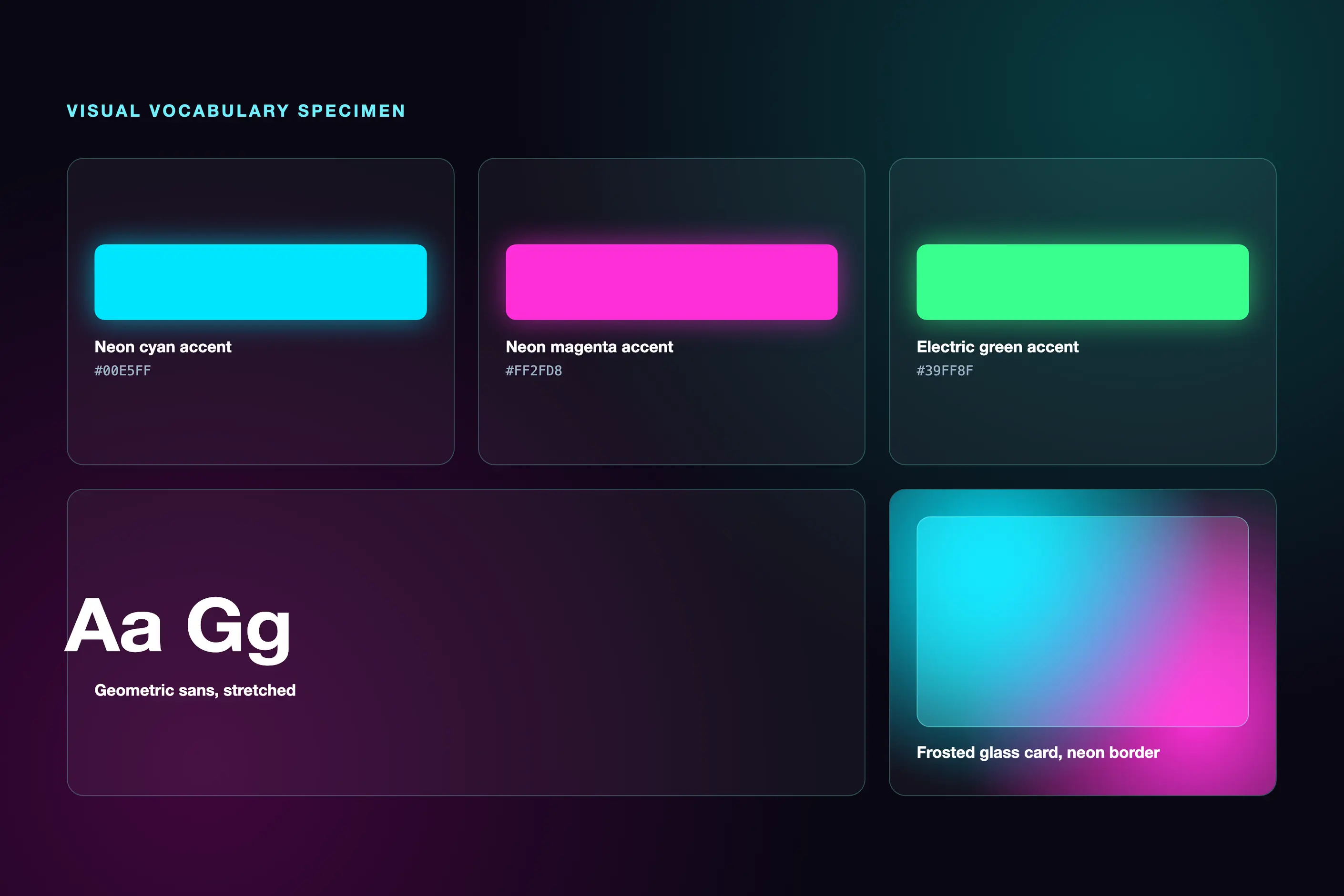
near-black or deep-purple backgrounds; neon cyan, magenta, and electric-green accents laid on as gradients, glows, and mesh-gradient atmospheres; frosted-glass cards with a thin neon border; large geometric sans-serif display type, often stretched or condensed; floating three-dimensional spheres, crystals, or abstract forms; ambient background motion that runs with no user input.
gaming-interface conventions (dark modes, neon accents, and layered depth) fused with cyberpunk visual culture, carried into product design as cryptocurrency interfaces moved from technical tools for technical users toward broader adoption.
cryptocurrency wallets, trading interfaces, and other decentralised application tools that need to signal they are not a conventional corporate web app while still walking a user through an unfamiliar, high-stakes transaction.
Web3 aesthetics draws on two traditions that predate blockchain. Gaming interfaces supplied dark modes, neon accents, and layered depth, conventions built for immersive, motion-rich screens. Cyberpunk visual culture supplied the colour language: neon against darkness, dense technological typography, and a narrative association between that palette and ideas of liberation from institutional control.
Early cryptocurrency interfaces were largely utilitarian: technical tools built for technically literate users, with little attention paid to visual design. As the category sought a broader audience, dedicated crypto UX practice developed and the aesthetic matured alongside it. Much of that development was explicitly reactive: the clean, minimal, corporate look that defined successful Web 2.0 platforms was treated as something to reject, and the resulting maximalism now signals community identity as much as a design choice.
The term “Web3” names an ideological commitment as much as a technology: the industry that coined it treats decentralisation, digital ownership, and trustless verification as settled values, not as a design brief still open to argument. Treat those commitments as the category’s stated position, not as a fact about any given product.

| Element | What this style does | The tell |
|---|---|---|
| Colour | Near-black or deep-purple base with neon cyan, magenta, and electric-green accents, applied as gradients and glows rather than flat fills | Mesh gradients and aurora-like colour flows used as atmospheric backgrounds, not simple two-stop gradients |
| Typography | Bold, large-scale geometric sans-serif for display text, stretched or condensed for effect, monospace for wallet addresses and transaction data | Type behaves as a visual object, overlapping, diagonal, or oversized, rather than sitting inside a conventional grid |
| Depth | Three-dimensional spheres, crystals, and abstract forms rendered in real time (commonly WebGL or Three.js), combined with glassmorphism cards | Frosted-glass panels with a neon border accent, floating over an animated background rather than sitting flat on it |
| Motion | Ambient background animation running with no user input, plus pronounced hover and click feedback: glows intensify, particles react to the cursor | The interface reads as alive even when nobody is doing anything to it |
| Layout and composition | Cards and text escape the conventional grid: overlapping backgrounds, diagonal placement, and elements that appear to float rather than sit on a surface | Lifted shadows and hover animation on components that imply an infinite background space, not a bounded page |
| Materials and texture | Frosted glass, blur, and glow standing in for physical material | A thin semi-transparent border plus backdrop blur, the CSS signature of the look |
| Neighbour | What it shares | What separates them |
|---|---|---|
| Blockchain and NFT aesthetics | Same dark-plus-neon palette, same crypto-native audience, and the same cyberpunk influence | Web3 aesthetics is the interface language for the whole application: wallets, transactions, and gas fees. Blockchain and NFT aesthetics is the narrower vocabulary for displaying, trading, and signalling ownership of digital collectibles, generative art, and profile-picture collections |
| Metaverse design | Both use three-dimensional motion and depth cues, and both often sit on the same crypto-adjacent platforms | Web3 aesthetics is a visual skin applied to a flat browser screen. Metaverse design is spatial design for a navigable, persistent virtual world, judged against depth cues, comfort, and field of view rather than against a webpage’s palette |
| AI-generated aesthetics | Both are recent, contested categories, and both are frequently accused of being a trend rather than a tradition | AI-generated aesthetics describes the recognisable visual signature of images produced by generative models: a rendering style with no necessary link to blockchain technology. Web3 aesthetics is an interface design language tied to a specific technology category, with no necessary connection to AI-generated imagery |

Set the dark base first. Choose a near-black or deep-purple background, and check every neon-on-dark colour pairing against contrast ratios before you commit, because the same brightness contrast that creates visual impact is also what most often fails an accessibility check.
Design every wallet and transaction state before you design the atmosphere around it. Not-connected, connecting, connected, pending, confirmed, and failed must each carry a clear, distinct visual treatment: a beautiful interface that hides a failed transaction is worse than a plain one that shows it.
Layer glassmorphism and glow with restraint. Reserve full-intensity neon and blur for hero moments and identity elements, and keep functional text, data, and monospace transaction detail in plain, high-contrast type that does not compete with the atmosphere around it.
You must build a reduced-motion path. Ambient animation, parallax, and particle effects have to degrade to a static equivalent when a user requests reduced motion, not merely switch off and leave a blank space behind.
Treat the aesthetic itself as a risk, not a default. A project can look Web3 convincingly by adding neon-on-dark and a glass card to any layout without solving a single UX problem the style was built to address. That pastiche (style without the underlying wallet, transaction, and trust design) is the category’s most common failure.
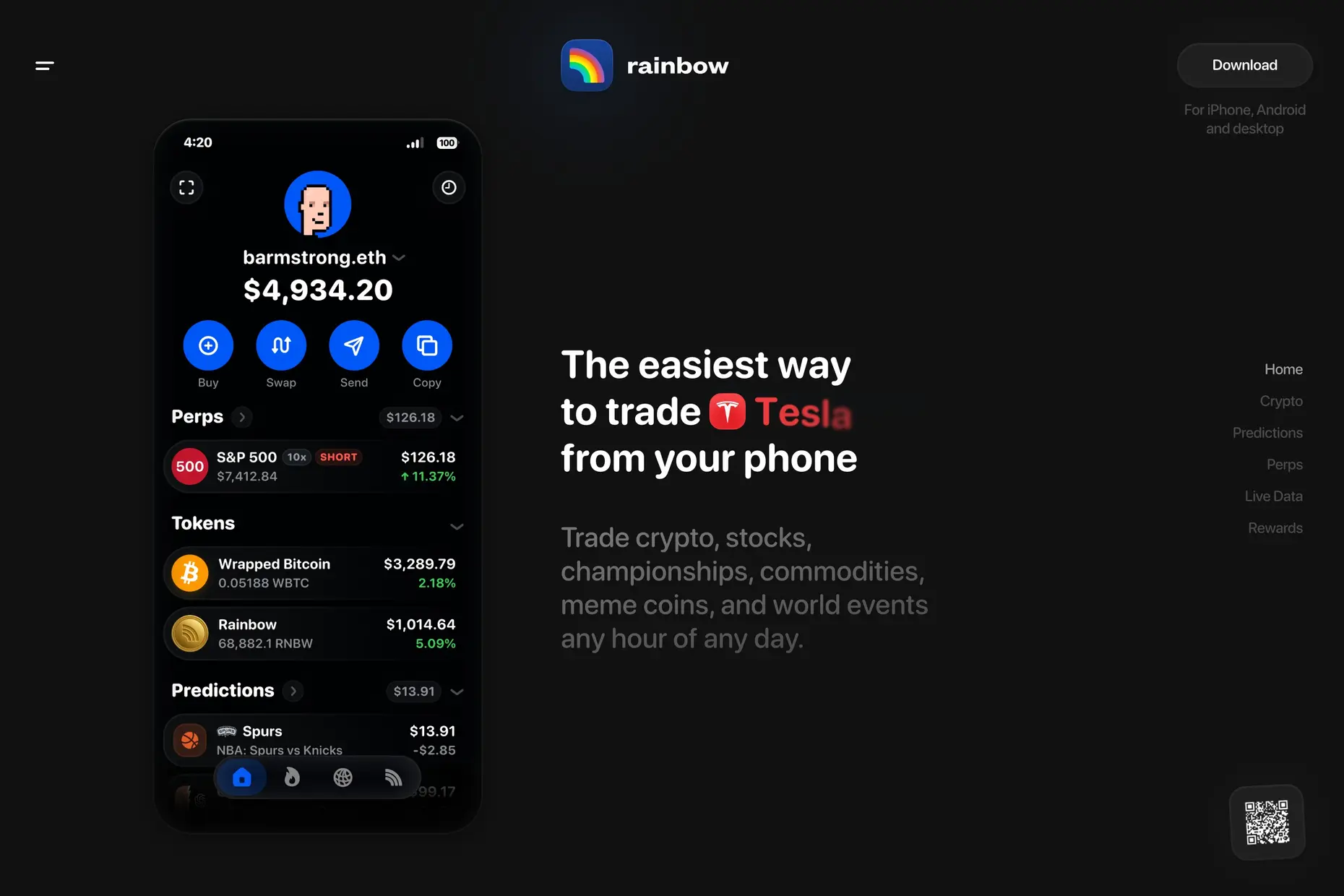
The central criticism is that the aesthetic prioritises visual impact over usability. Neon-on-dark colour schemes, unrequested motion, and unconventional layouts routinely fail basic accessibility checks: insufficient colour contrast, motion without user control, and interactions with no keyboard or screen-reader support.
The look is also easy to copy without understanding what it is meant to signal, so individual projects converge on the same palette, three-dimensional treatments, and layout patterns. A style built to signal that a project is not generic corporate software risks becoming a generic look of its own.
Web3 interfaces also carry a double learning curve. Users must learn unfamiliar financial and technical concepts (wallets, gas fees, transaction signing) while also learning an unfamiliar visual language, and together they overwhelm a first-time user more than either would alone. Where a project’s audience includes people who neither know nor care about the underlying technology, that combination is a genuine barrier to adoption, not a stylistic quirk.
Is Web3 aesthetics the same as blockchain and NFT aesthetics? No. Web3 aesthetics is the interface language for the whole application: wallets, transactions, and gas fees. Blockchain and NFT aesthetics are the narrower vocabulary built specifically around displaying and trading digital collectables, and the two are frequently confused because they share a palette and an audience.
Does a project need three-dimensional elements and neon to count as Web3 design? No. The visual signature is recognisable, but the category’s substance is the UX problem it addresses: helping a user connect a wallet, understand a transaction, and trust a system with no central authority. A project can solve those problems without neon, and a project with neon but none of the underlying UX work is a pastiche.
it creates contrast for neon accent colours, reduces eye strain during extended use in trading applications, and references the gaming interfaces the style draws on. It is a deliberate foundational choice, not a default.
largely, yes. Insufficient colour contrast, uncontrollable motion, and poor keyboard and screen-reader support are documented, common failures in the category, not an occasional lapse, and a project that wants the look must budget separately for fixing them.
| Fact | Detail |
|---|---|
| Core palette | Near-black or deep-purple base, neon cyan, magenta, and electric-green accents |
| Originating influences | Gaming interface conventions, cyberpunk visual culture |
| Primary UX challenge | Wallet connection and transaction signing under irreversible, trustless conditions |
| Common technical tools | WebGL and Three.js for real-time 3D, CSS glassmorphism and glow effects, Figma for interface design |
| Typical applications | Cryptocurrency wallets, trading interfaces, decentralised application dashboards |
| Closest neighbours | Blockchain and NFT aesthetics, metaverse design, AI-generated aesthetics |

Blockchain and NFT aesthetics are the visual vocabulary that emerged from the cryptocurrency ecosystem to communicate digital ownership, decentralisation, and community membership.
Read it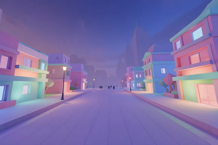
Metaverse design is the discipline of building persistent, shared virtual worlds where people are present through avatars rather than screens: spaces that keep existing, keep changing and keep accumulating history whether or not any particular user is logged in.
Read it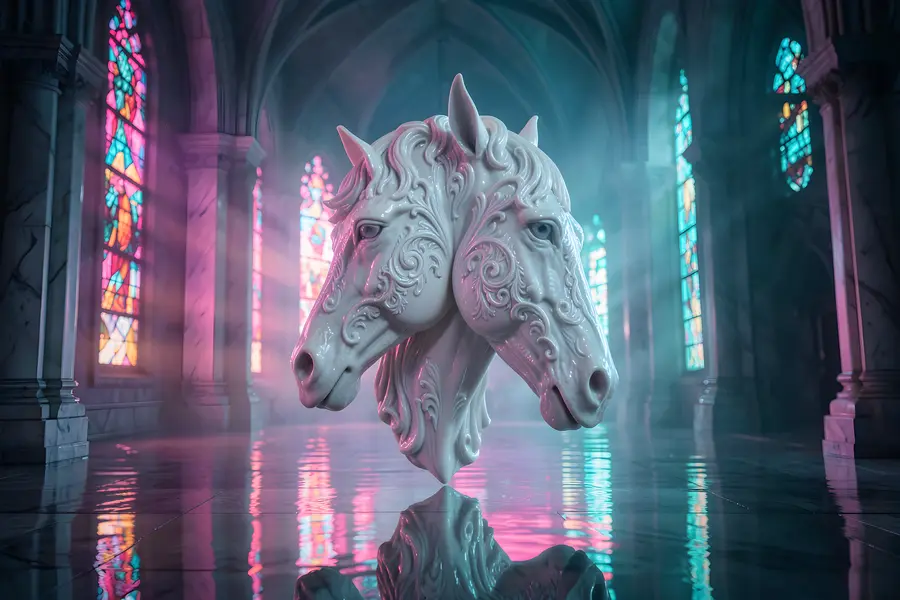
AI-generated aesthetics are the visual characteristics produced when a machine learning model, trained on large numbers of existing images, renders new imagery from a text or image prompt.
Read it
Spatial computing redesigns interfaces by moving from flat, screen-based displays to three-dimensional, depth-aware experiences.
Read it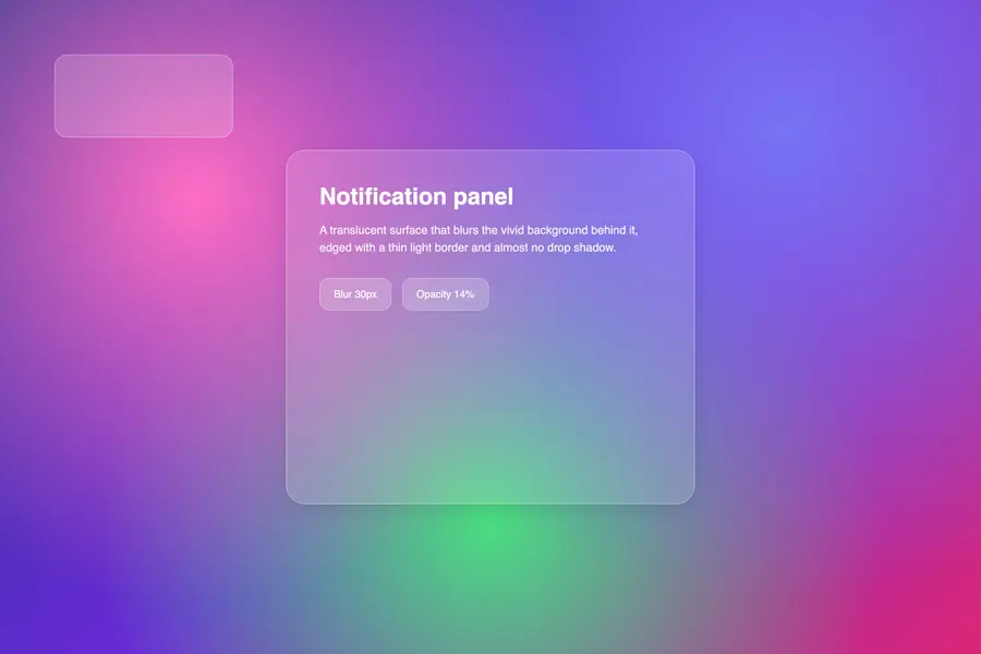
Glassmorphism renders interface panels as frosted glass: translucent surfaces that blur whatever sits behind them and let it show through as softened colour rather than hiding it behind a shadow.
Read it
A design system is a governed set of reusable components, patterns and rules that a team uses to build consistent digital products at scale, and it is neither a static style guide nor a component library on its own.
Read it
Digital accessibility is the practice of building products people can use, whatever their permanent, temporary, or situational disability, measured against a published standard rather than opinion.
Read it